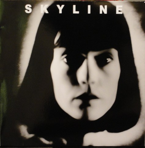
I don’t know anything about the band called Skyline, but they released a 12″, 5-track bootleg album in 1978 on the Four Stars label (catalogue No. FS001) with a cover picture of Manhattan. On the rear of the cover the photo was credited to “A. Warhol.”
The album had totally impossible credits beside the “Warhol” cover credit. The musicians were listed as Johnny Thunders (Lead Vocals, Guitar), Lonnie Davis (Keyboards), Peter Ford (Drums, Percussion) and Charles La Croix (Bass, Keyboards, Vocals). However, the album became a kind of underground disco hit and was re-issued with a different cover.
Skyline’s 1978 EP “I’m Gonna Fall in Love” with cover picture of Susanne de Maria from a Warhol screen test.
A few years ago Guy Minnebach, who has an encyclopaedic memory about Andy Warhol‘s art, and Raimund Flöck recognised the cover photo of Susanne de Maria as being from one of Andy Warhol‘s 1964 screen tests and is published in a book of them. And since then this version of the record has been in demand not only by fans of the disco music but now also by collectors of Andy Warhol‘s record cover art. Interestingly, the original bootleg lacked the photo credit to A. Warhol on the rear. I have been looking for a copy for my collection and saw one recently on Ebay on which I bid unsuccessfully. However, I noticed in the photos on Ebay that the cover had the “Photo by A. Warhol” credit on the rear cover and also included a photo of Susanna de Maria (note the correct spelling of Susanna), which sparked my curiosity..
About a month later the seller contacted be via a second chance offer and told me he had another copy for sale, and a deal was done. The record duly arrived and I realised this must be a reprint of the original 12″. It is on a different label–Paint the Case Productions–and has no obvious catalogue number. Included in my copy were two photos of Susanna de Maria; one with “No 49” on the rear and the other with “No 49 out of 50” on the back. Could it be that this repressing was limited edition of just 50 copies?
The repressed version of Skyline’s 12″ EP.
As anyone can see, the image is much less sharp than on the original 1978 pressing (no, it’s not due camera shake). Even the included photos of Susanna are not 100% focused.
One of the posters included with the album.
Anyway, the album is a nice addition to my collection of Andy Warhol covers. But I suspect I’ll still look for one of the original 1978 pressings.* After a discussion with Guy Minnebach who originally recognised the photo as being from one of Andy Warhol‘s screentests, I conclude that this must be a bootleg of a bootleg! Guy pointed out that bootlegs have previously always been about making music recently an LP version of Paul Anka‘s “Amigos” album appeared. This album was only officially released on CD so the vinyl version seems to be a bootleg only produced for it Warholian cover art. This seems to be the reason for the new pressing of the Skyline album.
*I finally found a copy on 8th August 2017. Hooray!
2016 is drawing to a close and it’s time for a summary. It’s been a great year with important additions to all five of my chosen artists’ collections. Perhaps the biggest thrill, however, was being invited to show my collection of record covers by the artist known as Banksy in the major retrospective at Rome’s Palazzo Cipolla in May.
I realized some time ago that collecting all the record covers that five artists have produced would be a full time job and had promised myself that I would not start collecting any additional artists. However, this year I succumbed to temptation and added two more artists to my list of collectible record covers. The first was not really a designer, but an icon. I realized that I already had some of the rarest covers with portraits of Kate Moss and that collecting the ten or so remaining covers might not be too difficult. The second artist I started to collect is Jeff Koons. So far, though, I have only found three covers with his art, so that hasn’t been too taxing.
I’ll take you through the additions to my collection artist by artist.
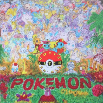
Banksy: Well. It’s been a poor year for new record covers with Banksy art. However, I did find one by Junichi Masuda, who composes for computer games and is a director at Pokémon. He released an album in 2015 called simply “Pokémon” with a cover that was a pastiche of the “Sgt. Pepper’s Lonely Hearts Club Band” cover
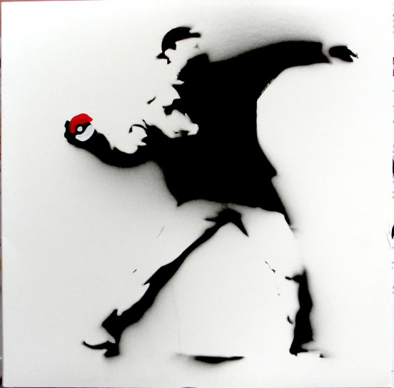
There are at least three different variants of this album pressed on coloured vinyl: blue/red swirl, red/white swirl and red/clear swirl. each colour was released in limited editions of 500, 200 and 100, respectively. But, there was also a test pressing released in a limited edition of 100 with a completely different cover:
This is a hand-sprayed version of Banksy‘s “Flower Thrower“–but instead of throwing flowers he is about to throw a Pokémon ball. As I mentioned, there were intended to be 100 copies of this cover, but the stencil didn’t last for the whole edition and the last few copies were given a different design: Again this was based on Banksy‘s “Girl With Balloon” design. Probably less than ten covers had this design. However, I had the “Pokémon” album with the “Sgt Pepper” cover and the “Flower Thrower” cover, so I didn’t think this particularly “Banksy” enough to include in my collection.
When the invitation to show my Banksy collection in Rome arrived I decided that I had to get the original first pressing of the Paris Hilton CD “Paris“. Luckily two came up on Ebay at prices way below what the CD had been auctioned for just a couple of years ago, so I made what I thought was a cheeky offer and, to my surprise, my offer was accepted. My joy was, however, tempered a couple of weeks later when the other copy sold for less than I had paid. Oh, well. At least the CD could be included in the Rome show.
Sir Peter Blake: It’s been a good year for my Peter Blake collection with some new releases and some older items that I had missed.
I have already owned up to my obsession with Eric Clapton‘s “24 Nights” recording. Well this year I have really fed it.
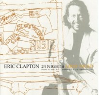
The first additions to my collection were two bootleg CDs from the “24 Nights” concerts at the Royal Albert Hall. These were for the first and fourth nights, respectively. Both CDs had original artwork that incorporated Peter Blake’s drawings.
I also bought the 7″ single “Wonderful Tonight/Edge of Darkness” with its Peter Blake cover.
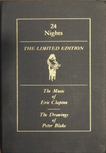
Then, finally, I splashed out on the magnificent “24 Nights Limited Edition–Music by Eric Clapton/Drawings by Peter Blake” box set published by Genesis Publications in 1991. I was lucky enough to find one of the promotional copies (Number XXV/200), signed by both Clapton and Blake. The box set contains two CDs “24 Nights” that include 3 previously unreleased tracks, purported not to be available anywhere else.
Well, that proved untrue as I found a “Collectors Edition” CDEP entitled “Wonderful Tonight” that included these three tracks among the six on this double CD.
The cover of the Collectors Edition CD EP of “Wonderful Tonight”.
I June, I was walking along St Eriksgatan in my hometown, Stockholm, where there still are several record shops and secondhand record stores and as I passed The Beat Goes On I noticed a record with Peter Blake‘s 2015 portrait of Eric Clapton on the cover. It was the newly released “I Still Do” double album and I bought it on the spot.
The front and rear covers of Clapton’s 2016 album “I Still Do”.
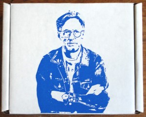
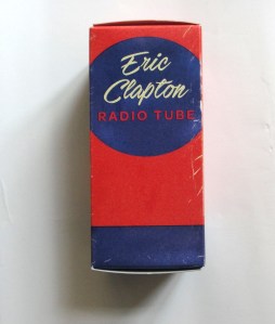
Then I started to do some research and found that Eric Clapton‘s own site had sold limited editions of the album–a box set with the CD, a photo and a USB in the form of a radio valve with the album including two extra tracks and a film of an interview with Clapton and the album’s producer Glyn Johns. The box had sold out on Clapton‘s site, so I turned to Ebay and a search quickly turned up some affordable copies and I ordered one. Sweden’s postal service is not what it once was and I still hadn’t received the box after a month. I had been tracking the parcel and to my horror found that Postnord (the Swedish postal service) listed the parcel as “delivered”. But I couldn’t find it anywhere. I was desperate. After a further ten days or so I decided it was lost forever and ordered a second copy. A few days later, when the second copy was already on its way, the original parcel turned up! So now I have two copies, one still sealed. Then I saw that there was a further limited edition with just the USB in a box like radio valves were sold in. I found a cheap copy in Australia and after 4-5 weeks it duly arrived. Then in August, one of the moderators on the Rate Your Music site tipped me off about a Blake cover that I had never heard of. It turned out to be the only classical music cover Peter Blake has so far designed. It was a recording of George Gershwin‘s “An American In Paris” coupled with “Rhapsody in Blue” and Ferde Grofé’s “Piano Concerto in F” played by Steuart Bedford and the English Chamber Orchestra.
The cover art for Music For Pleasure’s 1983 album of Gershwin’s “Rhapsody in Blue/American in Paris” LP.
In addition to the recordings, I have managed to find some rare memorabilia relating to Blake’s record covers. I found one of Sony Music’s Peter Blake dartboards given away as prizes for a competition in connection with Oasis‘ “Stop the Clocks” release. The dartboard figured on the cover of the LP and CD versions of “Stop the Clocks” and on the CDs themselves as well as on the covers of the limited edition double 7″ and CDEP also entitled “Stop the Clocks“.
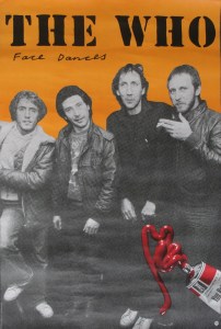
And I found a tour poster for The Who‘s 1981 Face Dances tour of the US in mint condition. I also got hold of copies of the programme sold at Eric Clapton’s 70th birthday concerts at Madison Square Garden and The Royal Albert Hall . These are LP sized with the same Peter Blake portrait of Clapton as on the “I Still Do” album cover. I fully expected that this portrait would be used on the cover of the triple LP set “Slowhand at 70” which was the official release of the Albert Hall Concerts. But I hadn’t realised that Clapton was saving it for the “I Still Do” cover.
In addition I bought two music-related books:
a. Paul Weller‘s “Surburban 100“; a collection of Weller‘s song lyrics with cover designed by Weller‘s friend Peter Blake.
The copy I bought was even signed by Paul Weller–an added plus!
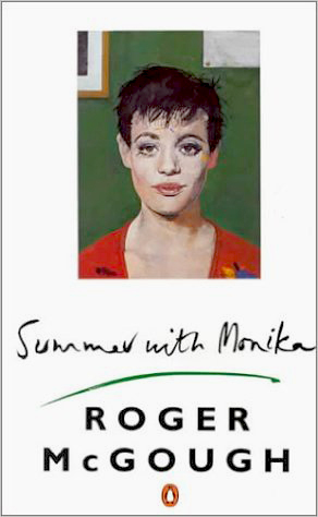
b. I already had the first paperback edition of Roger McGough‘s “Summer With Monika” with Peter Blake‘s rather racy cover painting of a nude woman lying on her bed. Penguin Books decided that they couldn’t use that cover picture so they chose another rather more platonic Blake painting for their edition.
My new copy is signed by both Peter Blake and Roger McGough.
Damien Hirst: As far as I am aware there has only been one new release with Damien Hirst‘s art so far this year–Jeff Wootton‘s brilliant solo album “The Way the Light“. For those who don’t know of Jeff Wootton he is a 29-year-old guitarist from Manchester who has an impressive CV. He has played with Damon Albarn (in Gorillaz, among other combinations), with Noel Gallagher in Gallagher’s post-Oasis band High Flying Birds.
“The Way the Light” was released in February 2016 as a digital download and as a 500 copy numbered, limited edition vinyl album which included a lavish booklet with 10 new spin paintings by Damien Hirst. Even the LP’s back cover had a spin painting.
Jeff Wootton’s 2016 album “The Way the Light”Damien Hirst’s spin painting on the rear cover of the “The Way the Light” album (almost identical to that illustrating track 7 in the booklet.
The limited edition sold out in just over six months.There were a number of promotional singles, tracks from the album. released either as downloads or on CD or CD-rom. I have managed to find three of these CD/CD-roms (there might be a fourth, which I have to trace). These are “The Eternal” (a one-track CD-rom with no catalogue number), “Sonik Drips” (a one-track CD-single with catalogue number JWPROMO02) and “Reverie” (another one-track CD-single with catalogue number JWPROMO04) . Each has a Damien Hirst spin painting on its inlay.The “The Way the Light” album had a Japan-only release as a CD with an extra track (“The Eternal Reconstructed“).
During the autumn I saw a copy of “The Way the Light” for sale on Ebay and snapped it up to find that it was unnumbered! I suppose it must be a promotional copy, but it didn’t have any indication, other than the lack of a number, that it was. So now I have both a numbered (No. 409) and an unnumbered copy.
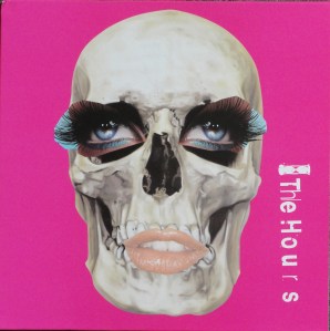
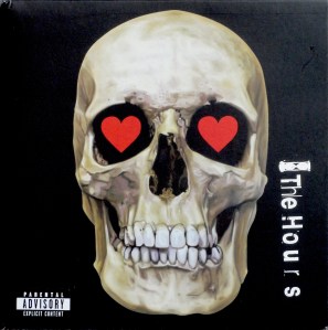
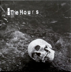
I have spent much of 2016 searching for the five singles produced by The Hours in 2006-7. I had four of these in my collection but they mysteriously vanished–I suspect when I sold the bulk of my record collection in 2013. They are limited editions with picture covers designed by Damien Hirst and Jason Beard and inner picture inner sleeves, too. The singles are “Ali in the Jungle/Nothing“, “Back When You Were Good/Back When You Were Good (remix)“, “Love You More/Mum and Dad“, “Ali in the Jungle/For a Moment” and “Big Black Hole/Killing Time”. I managed to collect then all again–but they cost quite a bit more this time around.
4. Klaus Voormann: I have a great many additions to my Klaus Voormann collection this year. 2016 saw the 50th anniversary of the release of The Beatles’ “Revolver” with its Klaus Voormann cover art. Apparently, Robert Whittaker had taken photos of the Fab Four for a cover, but John Lennon wanted something different and contacted Klaus, who was then living in London and playing with Manfred Mann. I already had my copy of revolver signed by Klaus but I bought his lovely book “Revolver 50: Birth of an Icon” from him and received a beautiful signed copy. I also found that he had written another book about his time with The Beatles called “Four Track Stories” and he sent be a signed copy of that too, with a signed postcard!
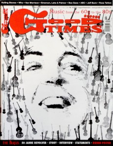
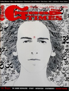
The German music magazine Good Times devoted its August/September number this year to “Revolver” and there were five different covers; four of which each had a new portrait of a Beatle, drawn in Revolver style by Klaus Voormann, on the covers and the fifth had a composite of all four Beatles. The magazine has also produced t-shirts with Voormann‘s Beatle portraits, but I haven’t invested in those.
I discovered a really poor booklet published in America purporting to be a catalogue of Klaus Voormann‘s record covers. When it arrived I found out that it only included covers listed in Wikipedia. The only useful information I got out of it was the fact that Klaus had designed covers for two CD-singles by Wet, Wet, Wet that I had not heard about. They were easy to find–and cheap! CD 1 and CD 2 cover art for Wet Wet Wet’s 2007 single “Too Many People”
Klaus also designed the covers for two CDs by his friend Volkwin Müller which Thorsten Knublauch told me about. The first called “Strawberry Songs” was by Volkwin & Co and released in 2012.
Volkwin Müller’s “Strawberry Songs” CD with Klaus Voormann’s portrait of John Lennon.
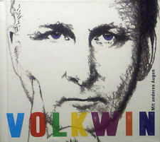
The second was simple titled “Volkwin” and released earlier this year.
The cover of Vokwin Müller’s CD “Mit anderen Augen” with Klaus Voormann’s portrait of him.
Klaus Voorman even had time in 2016 to design the cover for Albert Lee & Hogan’s Heroes‘ CD “Frettening Behaviour“.
Cover art for Albert Lee & Hogan’s Heroes CD “Fretterning Behaviour”.
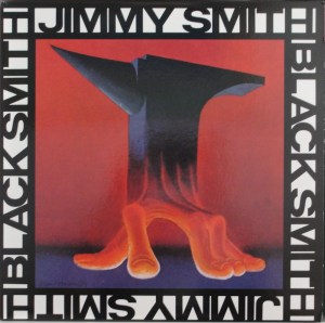
Another unexpected find was the cover of Jimmy Smith‘s 1974 album “Black Smith“. I had no idea that Klaus Voormann had designed a cover for Jimmy Smith until i saw a copy advertised on Ebay with cover art credited to Klaus. I found a mint copy for a couple of dollars on Discogs.
The last Voormann cover I bought this year was a signed copy of the single “Lu La Le Lu“– a Klaus Voormann song he recorded for Apple in the sixties but that was not released until now. The song was recorded and released by Wishful Thinking in 1972. This single issued for charity had a remixed version of Klaus Voormann‘s recording on the A side and Wishful Thinking‘s version on the B side.
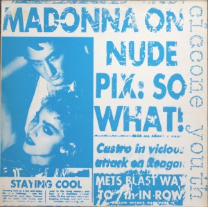
Andy Warhol: I managed to find fifteen covers with Warhol designs, only four of which were actually released in Andy‘s lifetime. These are Artie Shaw‘s EP “Both Feet in the Groove“, Aretha Franklin’s “Jimmie Lee” and “Rock-a-Lott” 12″ Maxi singles and a rare Debbie Harry 12″ picture disc version of “In Love With Love“. I also found a copy of Sonic Youth‘s “Into the Groove(y)/Burnin’ Up” 12″ single released under the moniker Ciccione Youth. The cover is a play on Warhol‘s design for Madonna‘s Wedding photo, but the cover isn’t really a Warhol cover. There are a myriad of different re-issues of the magnificent “Velvet Underground & Nico” and I collected a couple of picture disc versions this year–one in a die-cut card cover, the other in a transparent plastic sleeve. Both apparently produced in Russia. The version in the die-cut cover is quite rare and the disc differs slightly from the version without the cover.
Vinyl Lovers picture disc in die-cut card sleeve.
A group called Land of Sex & Glory released a 7″ single called “I Always Wanted to Be Andy Warhol’s Movie Star” in 1984 in a poster sleeve and I found a mint copy. Another 7″ single that I bought was The Weaklings‘ “It’s So Criminal/Real Cool Time” with cover photo by Richard Avedon of Warhol‘s scarred abdomen after he had been shot by Valerie Solanas.
Richard Avedon’s photograph of Andy Warhol’s abdomen after he was shot in 1968 on the cover of The Weaklings’ 1999 single.
There were some CDs with Warhol art that I picked up just for fun. Marilyn Monroe‘s “Happy Birthday Mr. President“, “Warholes or All Andy Would Enjoy (And Fear) / Warhol Memory Disorder” by unpronounceable Lengow & Heʸᵉrmeᵃʳs, Otomo Yoshihide & Sachiko M. that has a Warhol cow on the cover punctuated with bullet holes. The final CD with Warhol‘s art was “John Cage to David Byrne: Four Decades of Contemporary Music” a various artists compilation released in conjunction with the exhibition “Jasper Johns to Jeff Koons: Four Decades of Art from the Broad Collections“. The exhibition showed at the Los Angeles County Museum of Art from 7th October 2001 to 6th January 2002. The inlay had pictures of works by several popular 20th Century American artists, including Jasper Johns, Andy Warhol, Jeff Koons, Sharon Lockhart, StephanBalkenoi, and Jean-Michel Basquiat.
However, my greatest finds were made as the 2016 faded. At the beginning of December I found a near mint copy of Moondog‘s “Story of Moondog” on the Prestige label, a mint copy of Skyline‘s bootleg album with Warhol’s portrait of Susanna de Maria, and the turquoise variant of the 1949 “Alexander Nevsky” album with Warhol‘s illustration. These haven’t yet arrived so I’ll have to post pictures in the new year.
Miscellaneous: As I mentioned at the beginning of this post (but which you have probably forgotten by now) I have started collecting two further artists, Jeff Koons‘ record cover art and covers with Kate Moss‘s portrait.
A. Jeff Koons: I have thus far only discovered three covers with Jeff Koons‘ art: Everyone know about Lady Gaga‘s “ARTPOP” album but the other two are less well-known. Tenor saxophonist Arthur Doyle‘s single-sided 12″ “Live at the Alterknit” released in 2008 and the “John Cage to David Byrne: Four Decades of Contemporary Music” CD that I mentioned in the section on Andy Warhol.
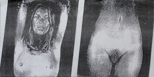
B. Kate Moss covers: I already had both versions of Dirty Funker‘s “Let’s Get Dirty” 12″ with their Banksy portraits of Kate on front and rear covers, Damien Hirst‘s “Use Money, Cheat Death” single-sided, white vinyl 12″ and a compilation promotional CD for handbag manufacturers Longchamp that was compiled by Kate and called “Kate Moss for Longchamp – An Iconic Selection by Kate Moss”. This year’s additions to the Kate Moss collection include The Unholy Two‘s “Kutter/Porkys” 7″ single that uses what looks like photocopies of Chuck Close‘s 2005 portraits of a nude Kate Moss. The outer spread of The Unholy Two’s “Kutter/Porkys” single.The inner spread of The Unholy Two’s “Kutter/Porkys” single.
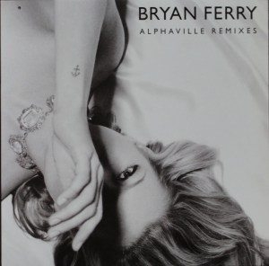
I also found a dealer in California who was offloading three of Bryan Ferry‘s limited edition singles from his 2010 album “Olympia“. The Vinyl Factory in London had produced these beautiful six 12″ in strictly limited editions of 200 or 300 copies and they sold out almost immediately.
Having got these, I found a copy of of the Vinyl Factory limited edition “Olympia” album with its art portrait of Kate enclosed. So that was added to my collection.
There is also a digital download with all the remixes of the tracks on the Vinyl Factory remix singles, with a playing time of about 4 hours called “Olympia Remixes”
I also found a Dutch promotional CD of “Heartache by Numbers” which I also added to my collection.
As far as I can tell there are fifteen covers with Kate Moss‘s portrait and I now have ten of them. Those outstanding are the two remaining Bryan Ferry 12″ Vinyl Factory singles, “You Can Dance” and “Alphaville“, Babyshambles‘ album “Shotter’s Nation“, Primal Scream and Kate Moss “Some Velvet Morning” and possibly 6majik9‘s “Kate Moss” CDS.
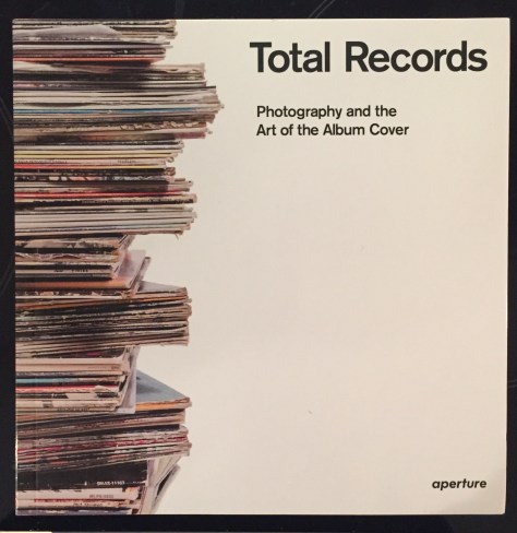
I just found out that I had missed yet another major exhibition of record cover art, this time in Arles in southwest France. The exhibition, called “Total Records” was first presented at Les Rencontres d’Arles from June to September 2015 and is said to be travelling round France. The exhibition catalogue has just (October 2016) been published as a free-standing book also called “TOTAL RECORDS – Photography and the Art of the Album Cover”.
The cover of the “Total Records” book.
I bought the 448 page book as it promised an introduction to how photographers and the record covers they took photographs for came together. However, the short introduction in English at the start of the book doesn’t live up to the promise. You have to turn to the end of the book for the full stories but, unfortunately for me, this section is only in French. Quelle horreur! Zut alors! and all that.
The book is divided into twenty-five “chapters”, some devoted to a single photographer and others more thematic with titles such as “Below the Belt” and “B-side America: Riverside, Bluesville and Yazoo”. There is a section called “Photo-Copy” which shows how some cover art has spawned plagiarism (The Rolling Stones’ “Sticky Fingers“, The Beatles’ “Abbey Road” and “Sgt Pepper’s Lonely Hearts Club Band“.)
But the photographs are great. Most pages picture a single cover. Not surprisingly, as the exhibition is French, there are many French covers. Johnny Halliday and Sylvie Vartan figure prominently alongside less well known French artists including a lovely cover of Catherine Deneuve’s “Souviens-toi de M’Oublier” with cover photo by Helmut Newton. There are also Newton’s photographs on the cover of Sylvie Vartan’s album “Au palais des congress“.
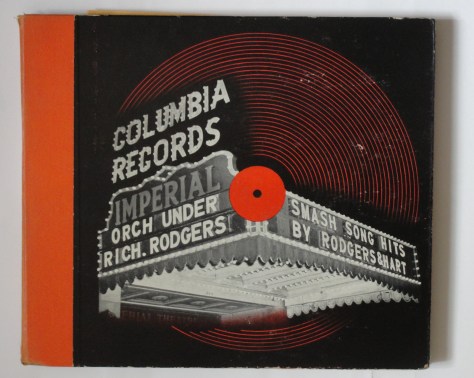
The first cover pictured in the book is Alex Steiweiss’ “Smash Song Hits by Rodgers and Hart“–Steinweiss’ first picture cover for Columbia Records from 1940.
Alex Steinweiss first picture cover for Columbia Records “Smash Song Hits by Rodgers & Hart” from 1940.
The first two chapters in the book, “The Sound I Saw” and “Aural Reappropriation” act as an introduction to the variety of photographs in record cover art and include covers by a multitude of photographers and make up nearly 30% of the book. These include cover photos by Andy Warhol (“This Is John Wallowitch“), Nobuyoshi Araki (Björk’s “Enjoy” and “Possibly Maybe” and Mango Delight’s “Conglomerate of Crazy Souls“), Annie Liebowitz (Cyndi Lauper’s “Change of Heart“, John Lennon’s “Interview Disc” and The Jim Carroll Band’s “Dry Dreams“), Herb Ritts (John Travolta/Olivia Newton-John “Two of a Kind” and Madonna’s “True Blue“). There is even Arthur Doyle’s “No More Crazy Women” with its Cindy Sherman cover photo (see my previous post on Cindy Sherman’s record cover art). Robert Mapplethorpe is represented with the classic Patti Smith cover for “Horses“, Taj Mahal’s “Taj” and Laurie Anderson’s “Strange Angels“.
Following these introductory chapters are sections/chapters devoted to individual photographers. First off are Jean-Paul Goude and Anton Corbijn. Corbijn is, of course, well known for his covers for Depeche Mode and U2. Jean-Paul Goude is best known for his cover photos of Grace Jones and eight of them are pictured in the book. It is a selection of Corbijns photos for U2 that are featured–mainly from the “Joshua Tree” sessions.
Next are eight of Jean-Baptiste Mondino’s covers, including covers of albums by Madonna, Björk, The Eurythmics and Prince.
The chapter after is reserved for Andy Warhol’s photographic covers. “This Is John Wallowitch” appeared in the first section of the book and this section includes the covers for “The Velvet Underground & Nico“, Miguel Bose’ s “Milano/Madrid“, Paul Anka’s “The Painter“, “Silk Electric” by Diana Ross and the cover of the “Muscles” single from the album and finishing with the cover of The Rolling Stones’ “Love You Live” album with a page devoted to the polaroid pictures on which Warhol based the cover design. “Sticky Fingers“, the other Stones album Warhol designed, appears in the section Photo-Copy along with several pastiches.Obviously, in a book on the photography and the art of the album cover, I wouldn’t expect any of Warhol’s graphic covers to be included–and there aren’t any, with the possible exception of “The Velvet Underground & Nico” cover. I’m not sure how much photography was involved. Did Warhol actually photograph the famous banana?
More chapters are devoted to the work of David Bailey (more Rolling Stones covers), Lucien Clergue And Lee Friedlander’s photography for jazz artists on the Atlantic label. The jazz theme is logically continued with a chapter devoted to some of the Blue Note label’s photographic covers with photography by Frank Wolf. And the label theme continues with a chapter on covers from the ECM label photographed by a variety of photographers. Other labels highlighted include Brazil’s Elena Records, ESP-dosc and a chapter devoted to the American Bluesville, Riverside & Yazoo labels before moving on to a chapter of Hipgnosis designs including the usual Pink Floyd covers (but happily, not the “Dark Side of the Moon” cover which I feel has become a cliché).
In the next chapter, aptly titled “Transartistic” there are covers by Robert Rauschenberg (Talking Heads’ “Speaking in Tongues”), Paul Bley (“Paul Bley Quintet“) and Andy Warhol’s “Index” book with the Lou Reed flexidisc. Even Jeff Koons’ cover for Lady Gaga’s “Artpop” and Damien Hirst’s cover for Dave Stewart’s “Greetings From the Gutter” are included.
One of the best chapters is entitled “Propaganda and Slogans” which includes thirty eight covers ranging from the clenched fist on the cover of The BlackVoices album “On the Streets in Watts” to Rage Against the Machines album with the self-imolating buddhist monk on the cover.From this provocative chapter with covers portraying Che Guevara, Charles de Gaulle,Malcolm X and Martin Luther King the book goes “Below the Belt2 with a selection of “racier” covers such as The Jimi Hendrix Experience’s ” Electric Ladyland” (The British cover with the nude models photographed by David Montgomery), Roxy Music’s “County Life” and more Rolling Stones in the form of both versions of the “Beggars Banquet” cover (the originally released version with the white cover which simply stated the group’s name and the record’s title as well as the version The Stones originally wanted with the lavatory interior scene, first released in 1986.
The final three chapters, “A life on Vinyl:David Bowie and Johnny Halliday”, “Word and Image” with many spoken word albums (Allen Ginsberg, Albert Camus, Jack Kerouac, etc.) and “from Grain to Groove”, a homage to the Soundtrack album cover, round off this nice book.
I think this is one of the nicest books on record cover design which I will keep alongside Alex Steinweiss’ “The Inventor of the Modern Record Cover“, Nick de Ville’s “Album: Classic Sleeve Design–Style and Image in Sleeve Design” and Richard Evan’s “The Art of the Album Cover“. I would have been thrilled to see the exhibition and have been able to see the covers full size. But the covers in “Total Records” are beautifully photographed by Romain Riviere and do them justice.
Cindy Sherman and Jeff Koons are two contemporary artists working in totally different media. Cindy Sherman (born 19th January 1954) is a photographer who specialises in self portraits in which she disguises herself in costume and in various situations. She is considered a conceptual artist.
CINDY SHERMAN
I have thus far managed to find six record, video and cassette covers with cover art by Cindy Sherman.The earliest recording I have found that has one of her photographs on its cover was for the television production “Two Moon July” which featured the music of Laurie Anderson, David Byrne (with whom Cindy Sherman had a relationship from 1991 to 2005), Philip Glass and others. The programme was released on VHS in 1986 and on Laserdisk the following year with Cindy‘s photograph of the Empire State Building on the cover.
The cover of the “Two Moon July” Laserdisk.
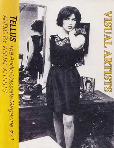
In 1988, one of her self portraits was used as the cover art for a cassette of visual artists talking. The cassette was released as Tellus Magazine #21 entitled “Tellus #21: Audio by Visual Artists“. Tellus was a bi-monthly cassette magazine that was founded in New York in 1983.
Cindy Sherman’s self portrait on the cover of the cassette magazine Tellus from 1988.
Sherman was involved with the female band Babes in Toyland in the 1980s and even appeared in one of their videos. Her photographs appeared on the covers of two of the group’s records “Fontanelle” (1992) and “Painkillers” (1993).
Babes in Toyland’s 1992 LP “Fontanelle” and 12″ “Painkillers” with cover photos by Cindy Sherman.
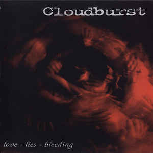
The punk band Cloudburst released two singles. The first, released in France in 1999 was a purple vinyl, three-track 7″ EP entitled “Love-Lies-Bleeding” and had a Cindy Sherman painting as its cover art.
Cloudburst’s 1999 single cover with Cindy Sherman painting.
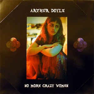
The latest cover i have been able to find is a five-track, single sided, yellow vinyl 12″ EP called “No More Crazy Women” by tenor saxophonist Arthur Doyle. I’ll be returning to Arthur Doyle in my list of Jeff Koon‘s cover art.
The cover of Arthur Doyle’s “No More Crazy Women” 12″ EP-
JEFF KOONS
There only seem to be three record or CD covers with Jeff Koons’ art. Or that is all I have hitherto been able to find.
Eli and Edye Broad have built up a magnificent collection of American postwar art which is housed at The Broad at 221 S. Grand Avenue, Los Angeles and is open to visitors. The Los Angeles County Museum of Art hosted an exhibition of 100 works from the Broad Collection from 7th October 2001 until 6th January 2002. The exhibition was called “Jasper Johns to Jeff Koons: Four Decades of Art from the Broad Collection“. In conjunction with the exhibition a CD was released called “John Cage to David Byrne: Four Decades of Contemporary Music“. The exhibition later transferred to The Corcoran Gallery of Art in Washington DC (16th March-3rd June 2002).
The CD was a compilation of 13 tracks by artists from David Bowie (“Rock ‘n’ Roll Suicide“) to John Cage (“Atlas Eclipticalis”) via The Velvet Underground (“Femme Fatale”), Dizzy Gillespie (“Be Bop”) and Klaus Schulze (“Floating”).
The “John Cage to David Byrne: Four Decades of Contemporary Music” CD cover with a detail of Jasper Johns’ “Flag” and Jeff Koons’ “Rabbit”.
The CD booklet also contains pictures of other artworks from the Broad Collection, including Andy Warhol‘s “Elvis” (1963), Jean-Michel Basquiat‘s “Horn Players” (1983), Sharon Lockhart‘s “Untitled” (1996) and Stephan Balkenhol‘s “Large Woman with Green Pants” (1996). The rear inlay shows Roy Lichtenstein‘s “I… I’m Sorry” (1965-1966).
The second release with Jeff Koons‘ art is another Arthur Doyle record. This time another single-sided, two track 12″ single with cover that shows Koons‘ print “Donkey 1999” from 1999 produced in an edition of 99 copies. The cover, once again, has two corners cut off.
Arthur Doyle Trio’s “Live at the Alterknit” cover.
And the third Jeff Koons cover is the best known. Lady Gaga‘s “ArtPop” from 2013. For this cover Koons acted as photographer.
I will keep looking out for more covers with art by Sherman and Koons and will probably update this post sometime in the future.
Last month I saw an exhibition at the Tel Aviv Museum of Art entitled “Fakes“. The centrepiece of the show was a collection of paintings by the Dutch forger Henricus Antonius “Han“ Van Meergeren, who in the 1940’s painted several “Vermeer” paintings that fooled the experts and even Herman Göring bought one. Van Meegeren was uncovered and tried and to prove he had painted the forgeries, he produced another. His paintings are, however, so good that they are collectors’ items in their own right. The exhibition chose to illustrate the diffuse boundary between a copy, a reproduction and a forgery. There was even a listening station where one could listen and compare George Harrison‘s “My Sweet Lord” with The Chiffon‘s “He’s So Fine“, which Harrison was judged to have plagiarised.
Now I’m not going to suggest I’m in van Meegeren‘s league, but I do like a bit of reproduction… They had to give up trying to make a catalogue of Andy Warhol‘s prints as there were so many reproductions and fakes that judging which should be included and which should not proved impossible. There are many artists who have been “inspired” by Warhol’s art, ranging from Steve Kaufmann, who had worked with Warhol at The Factory to Elaine Sturtevant, who painted Warhol images from memory. As a collector of Warhol‘s record cover art, I realised that there were some rare covers that I was never going to be able to afford (Moondog‘s “The Story of Moondog“, John Wallowitch‘s “The Other Side of John Wallowitch” and a couple of rare bootleg albums). So, if I wanted them in my collection–and the solution seemed easy–just make reproductions!
I started in 2013 when I decided to produce a set of covers of Warhol‘s 1963 “Giant Size $1.57 Each“. The nearest I had come to a real one was when, in 2008, I tipped Guy Minnebach off about one being auctioned in Japan. His has been exhibited in several exhibitions. Warhol had spraypainted record covers in four colours; red, green, orange and yellow and then silkscreened the “Giant Size $1,57 Each” on top. He also silkscreened onto plain white covers. So I bought a batch of record covers and the cans of spraypaint, and set to work. I prepared 50 covers and took a course in silkscreening to finish the job.
There were several other covers I couldn’t afford, including the Lew White “Melodic Magic” and “Waltzes by Johann Strauss, Jr.” So I bought card of about the correct thickness, photocopied the cover art and the rear cover texts and glued them all together. Later I realised that I could get a more accurate reproduction if I took an RCA Camden EP sleeve (luckily all Camden EPs have generic back covers, so I could take just about any Camden EP cover for these projects), removed the front cover image with sticky tape and stuck the photocopied slick over where the original picture had been. Then I had a bit of luck when I bought a copy of the Lew White “Melodic Magic” EP (without a cover) for $3.86 to complete the set. I’m still looking for a copy of the Strauss Waltzes disc.
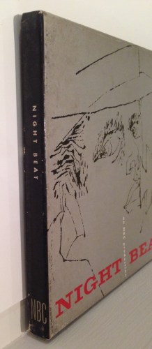
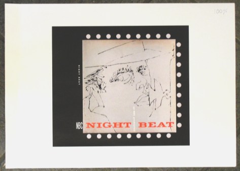
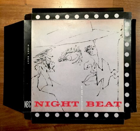
The third rarity that I wanted to make was the incredibly rare (perhaps only one copy exists) “Night Beat” box. There was a picture of in Paul Maréchal‘s book so I set to work. I bought several RCA Victor boxes of EPs and made up a cover slick in Photoshop. I was well pleased with what I thought was a perfect reproduction. However, when the original went on show at the “Warhol on Vinyl” exhibition at the Cranbrook Art Museum I found out that I had not made a true copy. The box’s spine should have the set’s title and the NBC logo rather than the dots I had used.
Back to the drawingboard! Step One: I needed more RCA boxes, and luckily I found a seller in America who had six for sale cheap. Step Two: I needed a photo of the spine of the genuine box to copy. Here fellow WCCC member Niklas Lindberg came to my rescue and mailed over a picture.
Step Three: More photoshopping. Step Four: Off to my local printer. I told him the box’s front cover image had to be 19 cms in height. He duly produced prints with the image 19 cms high. But these were too large (mea culpa!), so he made a second run with 5% smaller images. These turned out to be just too small, so I had to ask him to print a third copy 3% larger than the second printing. Finally the size was dead on.
The print on A3 paper as it came from the printer.
Step Five: Cutting the prints to fit the box required some practice, which I eventually mastered.
The cover print cut and folded ready for gluing.
Step Six: Gluing the slicks to the boxes. Thank heavens for spray glue!
I got home from the printer at 6.10 p.m. and had nine boxes completed by 9.30 p.m.!
Completed “Night Beat” boxes.
During the day I also managed to make mock covers of Moondog‘s “The Story of Moondog” and John Wallowitch‘s “The Other Side of John Wallowitch” as well as a new version of Banksy‘s Capoeira Twins promo cover for “4 x 3“. And I made a cover of Peter Blake‘s “Vintage Blake” print from 2012.
Robert Allen Zimmerman (24th May 1941), better known as Bob Dylan, is a music genius who has caused controversy throughout his career. He was accused of being a sell-out in 1966 when he moved on from his folk-rock roots to more electric rock music with three impressive albums recorded in 14 months: “Bringing It All Back Home“, “Highway 61 Revisited” and “Blonde on Blonde“. These were my introduction to his oeuvre: a fellow student, John Froude, came into the college canteen one day in 1966 in a state of considerable excitement. I was sitting with a couple of friends and John could hardly control himself. He had just heard that his hero Bob Dylan was about to release a new album and he felt we all should look out for it. The album in question turned out to be “Blonde on Blonde“. I bought an import copy as there was always a delay in releasing American albums in the UK at that time. Suffice it to say that I was hooked and immediately bought both “Bringing It All Back Home” and “Highway 61 Revisited“. From then on I bought every Dylan album from “John Wesley Harding” to”Saved“. Then I got bored and stopped buying his albums until 1997’s “Time Out of Mind” and I was on the train again until “Modern Times“, buying all the “Bootleg Series” sets in between. “Tempest” was the last album I bought before selling the major part of my record and CD collection in May 2013. I bought the “Complete Bob Dylan Albums, Volume 1” on USB so I still have ALL his albums up to and including “Tempest“.
I had also bought two books of Dylan‘s lyrics and used them often to check my memory of songs that popped up in my head. I think I bought a paperback copy of “Tarantula” a long time ago, but perhaps my memory serves me wrong. I definitely bought “Chronicles” when it first came out and the six-track CD that went with it. In 2003 I bought Christopher Ricks‘ “Dylan’s Visions of Sin“. An academic’s analysis of Dylan‘s poetry.
I have always seen Dylan as a poet and so, apparently, have many others; including, most recently The Swedish Academy who decided to award the 2016 Nobel prize for literature to Bob Dylan “for having created new poetic expressions within the great American song tradition.”
I should have been elated. But I wasn’t. I couldn’t make up my mind whether or not it was fair to give a rich American musical the literature prize. After all, he had already been awarded The Polar Prize, which honoured his music AND poetry.
So in my uncertainty as to whether I considered that Dylan should–or should not–have been awarded the Nobel Prize, I returned to Christopher Ricks (now Sir Christopher Ricks, for his services to literature). Ricks (born 18th September 1933) as born in Beckenham, studied at Oxford University and, after military service, became a Fellow at Worcester College, Oxford and later became Professor of English at Bristol University. In 1982 Ricks became King Edward VII Professor of English at Cambridge. Four years later he moved to Boston University and in 2011 became Professor at New College of the Humanities in London. He was knighted in 2009.
Christoper Ricks convinces me not only that Bob Dylan considers himself a great poet but that Ricks also joins him in considering him a great poet who can be read from the printed page or heard via concerts or recordings. So, who am I to disagree. Bob Dylan IS a worthy winner of the 2016 Nobel Prize for Literature.
Klaus Voormann has a greater claim to being the fifth Beatle than most. If I had to rank the contenders, I’d put Brian Epstein on the top of my list, followed very closely by George Martin and then, probably, Klaus at number 3. After all, he knew them and became friends with them in Hamburg. He lived for a while with Ringo and George and was the one John phoned when The Beatles needed a cover for their seventh, at the time unnamed, album that became “Revolver“. Later Klaus played on many recordings with individual Beatles (including George Harrison‘s “The Concert for Bangladesh“) and was a founder member of the Plastic Ono Band. So other “contenders” for the title of the fifth Beatle such as Pete Best or Murray the K (Murray Kaufman, born February 14, 1922 – died February 21, 1982) don’t come close.
Quite apart from being an accomplished musician, Klaus Voormann has pursued a successful career as an illustrator. He is a master at portraying TheBeatles as they were in the sixties and has produced posters of Lennon and McCartney in the Abbey Road canteen, John Lennon and Paul McCartney. The latest set of Beatles portraits appeared on the covers of the August/September 2016 German music magazine “Good Times“. This issue had five different covers.
The magazine contained an interview with Klaus on the 50th anniversary of “Revolver” and each magazine included an A2 poster of the cover portrait.
There was even a promotional brochure that pictured all five magazine covers.
While researching Klaus‘ book “The Birth of an Icon-Revolver 50” (see my previous post on this) I stumbled across another of his books that I had previously missed completely. In 2005 he published “Four Track Stories“, an illustrated paperback describing The Beatles‘ time in Hamburg.
This first edition is autographed on the flyleaf:
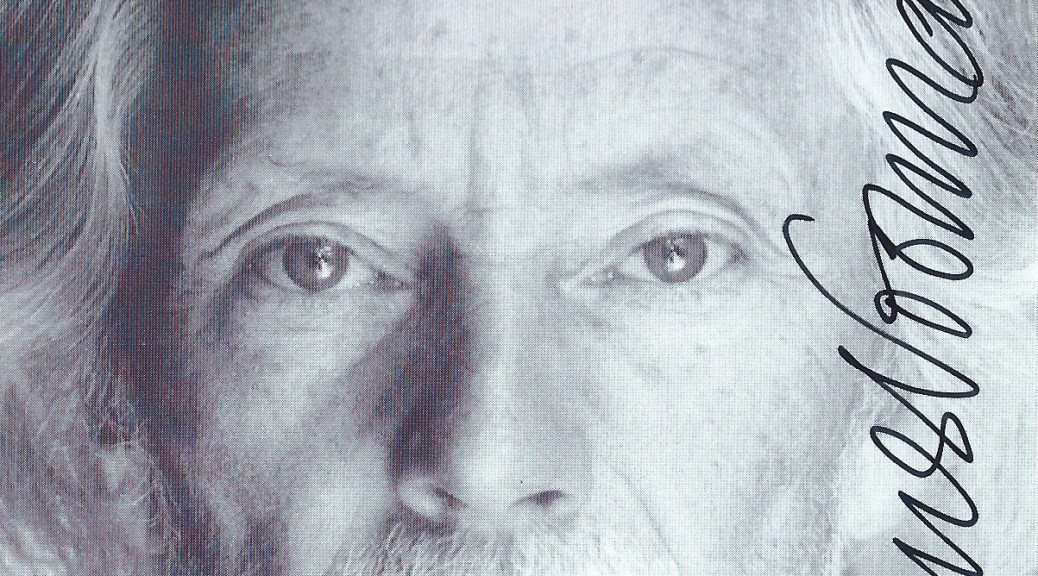
I ordered my copy directly from Klaus‘ website and it arrived in less than a week. There was a discussion about the shipping cost and Klaus refunded the shipping together with an autographed postcard with a personal message:
In our mail exchanges I asked if he knew of any record or CD covers that he had designed that were due for release and he asked which covers I already had. So I mailed him my list of 80 of his of his record covers with an apology that I only had 78 of them. So far he hasn’t replied about any new covers in the pipeline.
As a child, my parents frowned on popular culture – unless it was Sinatra or musicals. Comics were a definite “no-no”. So I had to sneak looks at The Eagle, Beano, Dandy and others. I only caught up on Asterix and Tintin much later. This probably explains why, today, I am fascinated by comics; the parental disapproval as well as the obvious evolution of comics as high art–from Roy Lichtenstein onwards.
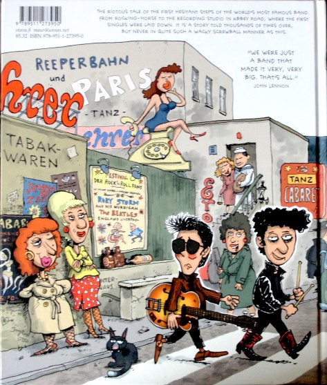
Mauri Kunnas is is a great illustrator and is well-know as the author of many children’s books. His books are usually populated with animals dressed in human clothes and up to all sorts of adventures. Less well-known is the fact that he plays in a cover band and loves 60s and 70s British bands like the Beatles, Stones and Hollies.
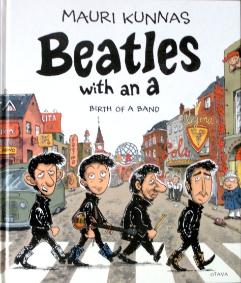
Last year, on a visit to Helsinki, my wife and I went into publishing house Otago’s shop and I saw Mauri Kunnas‘s recently published “Beatles With an A“, in Finnish (original title “Piitles – Tarina erään rockbandin aikutaipaleesta.“). It was a comic strip history of the early life of the Mop Tops up to and including the recording of “Love Me Do“. There was also a version in English Great research and clever drawings–obviously I had to have it!
Kunnas has also written a companion book on the Rolling Stones entited “Mac Moose ja Jagge Migreeni tapaus” which, strangely, only seems to be available in Finnish and Portuguese but not in English!
Mauri Kunnas Finnish book about the The Rolling Stones.
Then for my most recent birthday my daughters, well conversant with my interest in Andy Warhol‘s art, gave me “Where’s Warhol?” by Catherine Ingram & Andrew Rae. This large-format book is made up of a series of twelve scenes each populated by hundreds of people. These range from Studio 54 through places and times before Andy was born (such as Marie Antoinette’s execution and Michelangelo painting the Sistine Chapel) to Basquiat in Washington Square. The clever drawings are by Andrew Rae and many celebrities are recognisable in each double spread picture. The game is to identify all of them and to find Andy among the host of figures. Catherine Ingram has written explanatory essays at the end of the book with a key to let one know which celebrities are included in each scene.
The latest addition to my comic library is Klaus Voormann‘s “Birth of an Icon-Revolver 50“. His history of how the Grammy-winning cover for The Beatles‘ seventh album was created. Klaus calls it a”graphic novel”, obviously a misnomer as it is as near as you can get to a true story. I am an ardent admirer of Voormann‘s draughtsmanship and–as readers of this blog will know by now–have spent endless hours searching for records with cover art by him.
Klaus Voormann’s new book celebrating the fiftieth anniversary of “Revolver”.
The quality of the drawings is amazing. Just imagine (pun intended) how long it must have taken to produce the 32 pages of drawings for the graphic novel–and (if I have counted correctly, a grand total of 166 separate drawings throughout the book! Even with the advantage of digitalising backgrounds so that he only needed to redraw the foregrounds in some pictures, that’s a massive amount of work! Anyway, “Birth of an Icon-Revolver 50” is a genuine treasure.
This has really been a great week for me as a collector of Klaus Voormann‘s record and CD cover art. German musician Volkwin Müller has either read this blog or seen my list of Klaus Voormann‘s record covers on Rate Your Music and informed me of two recent releases of his–both with cover art by Klaus–that weren’t on my list. So, a big thank you to Volkwin. The CDs are Volkwin Müller & Friends “Strawberry Songs” from 2012,
Volkwin Müller’s “Strawberry Songs” CD with Klaus Voormann’s portrait of John Lennon.
and Volkwin‘s “Mit anderen Augen” CD from 2016
The cover of Vokwin Müller’s CD “Mit anderen Augen” with Klaus Voormann’s portrait of him.
But the greatest thing was the arrival of Klaus Voormann‘s new book “Birth of an Icon-Revolver 50“. Well, The Beatles‘ “Revolver” album was released (in the U.K.) on 5th August 1966 and John Lennon asked Klaus Voormann, friend of the Fab Four since their Hamburg days and in 1966 living in London and playing with various bands including the Mike d’Abo fronted Manfred Mann, to design a cover for their new record. This book tells the story in comic strip form of how Klaus Voormann came to design the cover which earned him a Grammy.
Klaus Voormann’s new book celebrating the fiftieth anniversary of “Revolver”.
Two of The Beatles‘ record covers have won Grammys for their design. First was Klaus Voormann‘s cover for “Revolver” and then the album that followed it “Sgt. Pepper’s Lonely Hearts Club Band“, which earned Peter Blake and Jann Haworth Grammys for their joint design. Klaus Voormann has been nominated for a Grammy one further time–for the design of his “A Sideman’s Journey” box set. He was narrowly beaten by Rob Jones‘s and Jack White‘s design for the White Stripes‘ box set “Under the Great Northern Lights“.
The “Birth of an Icon-Revolver 50” book is a beautiful production with many photos and text in English and German. It can be ordered from Klaus Voormann’s site http://www.voormann.com.
While researching the book, I discovered the August/September 2016 number of the German Magazine “Good Times” which has five cover variations of portraits of The Beatles by Klaus Voormann:
Thus Klaus Voormann (born 29th April 1938) is still going strong at the age of 78. May he long continue to produce great record covers.
I have been collecting record cover art since the 1980s. First designers including Vaughan Oliver and his collaborations with Nigel Grierson as 23 Envelope and, later, as V23 with Chris Bigg. Neville Brody ,with his covers (mainly) for the Fetish label, was another designer I collected. Then, when I moved to Sweden, I started collecting covers by Martin Kann, who is responsible for the cover art for Swedish rockers bob hund. Most of the record covers I had by these designers disappeared when I had to sell my record collection and I had to decide which designers’ covers to keep.
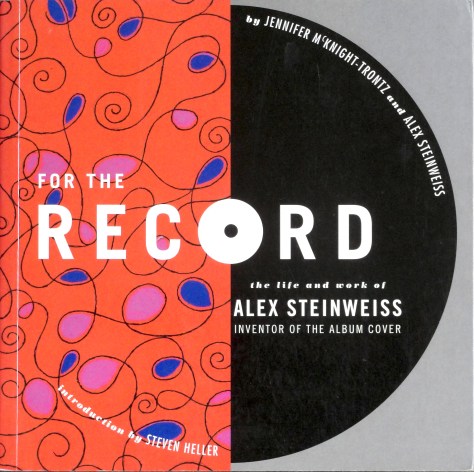
I thought I knew the history of record cover design, but to my eternal shame, I only found out that one individual, Alex Steinweiss (1917-2011), had started the whole field of record cover design in about 2005 when I read Nick de Ville‘s great book on record cover design “Album-Style & Image in Sleeve Design” from 2003.But I HAD for years seen some of Steinweiss‘s work at my parents’ home! They had a condo i Sarasota, Florida, for many years. Sarasota was Steinweiss‘s retirement home and he produced posters for the celebrated Sarasota Jazz Festival and my father had bought three of these posters, which hung on a bedroom wall at home, but I had no idea Steinweiss had designed record covers! Once I had seen de Ville‘s book, I started looking for some Steinweiss covers. They were not easy to find as few Internet sellers recognised Steinweiss‘s work and sold records only by their artist/title. Then, in 2006, I bought Jennifer McKnight-Trontz’s “For the Record: The Life and Work of Alex Steinweiss, Inventor of the Album Cover“. A great place to start researching Steinweiss‘s production of over 2500 record covers.
Jennifer McKnight-Trontz’s “For the Record-The Life and Works of Alex Steinweiss“
Steinweiss may not have been the first to illustrate record covers–here the purists argue–but he was the first to convince a record company that pictures on covers could actually sell records. In 1939, at the tender age of 22, he was hired by Columbia Records as art director for the company’s recorded music division, principally to be responsible for advertising material.
Few dedicated record shops existed in the 1930’s. Music was mainly sold as sheet music and records were usually sold in general stores, electrical appliance stores and i a few record shops. Records were only available as 78 r.p.m shellac discs, ten or twelve inches in diameter. Single discs were generally packaged in brown envelopes with or without a central hole that showed the record label with the title and artist on the record. Longer works, such as classical recordings had to be split onto several discs and were packaged in book-like albums that contained any number of records from two to ten. The front covers were generally plain perhaps with record company, the record’s catalogue number and the record title. They were affectionately known as “tombstone covers”!
A “Tombstone cover” as albums were sold prior to Steinweiss deciding to add pictures to covers.
The album’s spine showed the title and artist and the record’s catalogue number. These albums were generally stored like books in a library, with only the spines visible.
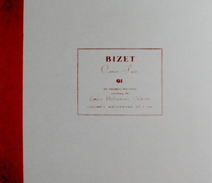
Steinweiss, during his artistic studies, had seen the power of pictures in selling and suggested to his superiors that adding a picture to illustrate the music might actually increase sales of these albums. Despite initial scepsis the directors allowed Steinweiss to produce a limited number of pictorial covers and the first “Smash Song Hits by Rodgers & Hart” appeared in 1940 (Jennifer McKnight-Trontz says 1939).
Alex Steinweiss’s first picture cover for Columbia Records “Smash Song Hits by Rodgers & Hart” from 1940.
I collected about fifty Steinweiss covers and was lucky enough to find a copy of the “Smash Song Hits by Rodgers & Hart” in really good condition early on. This album seems extremely rare as I have been on a fruitless search for a second copy ever since. It seems important for anyone particularly interested in record sleeve design to have this seminal design, so I kept it when my other Steinweiss covers vanished.
Of course, Steinweiss‘s new picture covers increased the sales of Columbia Records’ Albums and he was allowed to continue producing sleeve art. When, in 1948, Columbia introduced the microgroove LP, it fell to Steinweiss to design a suitable packaging and he came up with the LP record sleeve with a design on the front, text on the rear and on the spine. Many of the designs he produced for the 78 r.p.m albums were transferred when a work was reissued in the new format. But Steinweiss‘s burden of designing new covers meant that he couldn’t do them all himself. He enlisted other talented designers to work for Columbia, including Jim Flora and a commercial artist named Andrew Warhola, just arrived in New York from Pittsburgh.
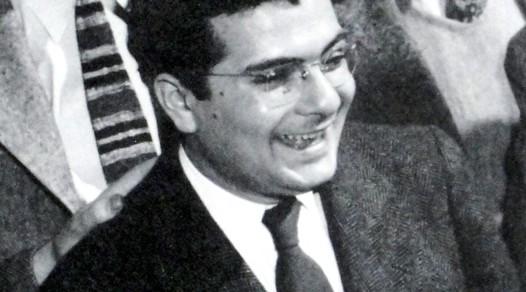
Steinweiss (in dark suit) with other Columbia employees including Jim Flora (With the striped tie standing behind Steinweiss).
Steinweiss left Columbia in 1949 and went freelance. He subsequently designed covers for several other record companies including Everest, Decca and London and RCA.
in 2009, Kevin Reagan and Steven Heller convinced Taschen to publish a luxurious book simply entitled “Steinweiss” with the subtitle “The Inventor of the Modern Record Cover“. I addition to a standard edition Taschen produced an art edition; one hundred copies numbered 1-100 contained a print of Steinweiss‘s design for Decca Records’ recording of Igor Stravinsky‘s “The Firebird“, the second time Steinweiss had designed a cover for that work.
The lithograph of Steinweiss’s design for Decca Records’ recording of Stravinsky’s “The Firebird Suite”.
There were also a further one hundred art copies, numbered 101-200, that did not contain the print. Steinweiss, aged 92, was involved in the production of the book and the art editions were all signed by him as were the prints included in the first one hundred copies. My copy is No. 96.
The book contains full-sized pictures of over two hundred of Steinweiss‘s cover designs as well as pictures of posters and books and ceramics that he made. A worthy tribute to the man without whom I probably wouldn’t be collecting record cover art.




 Again this was based on Banksy‘s “Girl With Balloon” design. Probably less than ten covers had this design. However, I had the “Pokémon” album with the “Sgt Pepper” cover and the “Flower Thrower” cover, so I didn’t think this particularly “Banksy” enough to include in my collection.