Try to imagine a shy twenry-year-old, who is conviced he is ugly (his nose is bulbous and his hair is already thinning) who leaves art college in his home town of Pittsburgh and, in the summer of 1949, moves to New York to seek his fortune. Andy Warhola is determined to find work and hawks his portfolio to the offices of glossy magazines and record companies.
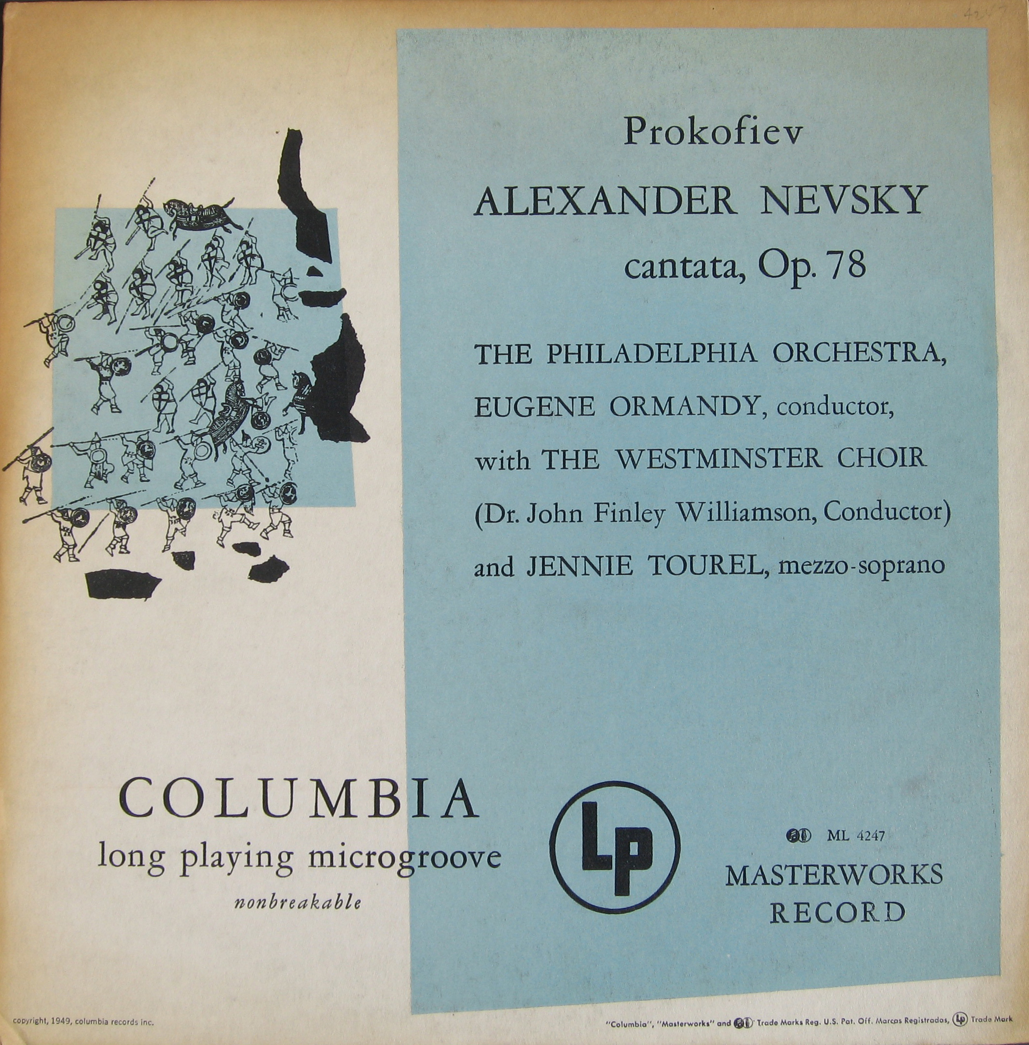
He goes to the offices of Columbia Rrecords, who the previous August, had begun reieasng long playing records and was in the process of reissuing many of their best selling classical albums previously available as 78 rpm sets in the new medium that allowed a whole symphony to fit on one side of a twelve-inch LP.
In 1938, the company hired a 21-year-old Alex Steinweiss as its art director. Steinweiss felt that the company’s record albums with their plain covers were dull and suggested adding pictures to the covers. His superiors were sceptical, but allowed him to make a few trial cover. These were successful, increasing sales. Steinweiss first cover was for an album of Smash Hits by Rodgers and Hart.
The young Warhol was commissioned to illustrate two covers.
Andy Warhol’s first cover for Columbia Records, 1949.
In 1951, Warhol was commissioned to illustrate a newspaper advertisement for radio programmes called The Nation’s Nightmare and Crime on the Waterfront to be broadcast by CBS Radio that autumn. CBS decied to release the programmes the following year on an LP.
Warhol won his first design award for the designs.
In the fifties, Warhol cooperated with Reid Miles, the legendary art director at Blue Note and Prestige Records, producing a numner of classic jazz covers. He also continued to get commissions from Columbia Records subsidiaries and designed several classical covers.
Other Pop artists would later design record covers: Robert Rauchenberg designed the limited edition cover for Talking Heads’ Speaking in Tongues (1983), Robert Indiana’s LOVE image appeared on a recording of Messiaen’s Turangalila Symphony and Ed Ruscha, who has become Paul McCartney’s buddy, has designed several covers for the ex-Beatle as well as the cover for the Beatles’ last single Now and Then.
And England’s Pop artists were also designing record covers. Peter Blake together with his wife at the time, Jann Haworth came up with the famous cover for the Beatles’ Sgt. Pepper’s Lonely Hearts Club Band album and Blake has continued to design record covers — now over forty! Richard Hamilton was invited to design the Beatles next full album The Beatles (the white album) and chose a minimalitic cover to contrast with the Sgt. Pepper design.
Other British artists who have designed record covers include Damien Hirst, David Shrigley, Tracy Emin as well as design groups such as Hipgnosis.
Andy Warhol, announced in 1965 that he was giving up painting to concentrated on his other projects — film and the Exploding Plastic Inevitable, featuring the Velvet Underground and performances and dancers including Gerard Malanga, who would assist Warhol in his printmaking. He took the Velvet Underground to Norman Dolph’s Scepter Studio in New York to record the band’s first album. Warhol insisting that Nico, a German singer, sing on three songs. Warhol offered the record to Columbia Records, who turned it down, suggesting it needed beter production and Warhol let Tom Wilson re-record the album, which Warhol then offered to Verve Records who released it in March 1967. Warhol designed the Banana cover and the front cover just had the banana (with ‘peel me and see’ beside the neck) and Andy Warhol’s name at the bottom.
Warhol was a “mover and shaker” in 60s and 70s New York travelling to parties and discos always with an entourage of beautiful people. He loved being with celbrities. He met Mick Jagger who asjed him to design the cover for the forst Rolling Stones album to be released on the Stones’ own label. Warhol came up with the zip cover for Sticky Fingers (released April 1971).
My signed “Sticky Fingers” LP.
There has been a debate about whose jeans Warhol photographed for the Stocky Fingers cover. It wasn’t Joe d’Allesandro, as many have suggesteds. It may have been Warhol’s parrtner Jed Johnson’s twin brother Jay who was the model.
Warhol was also asked to design the cover for the Stones’ Love You Live album. He had invited the band to hs Long Island home at Montauk wherer he photographed them biting themselves or each other. He selected a picture of Mick Jagger biting his daughter Jade’s hand for the cover. Warhol dis not want any writing on the cover but Mick Jagger added the band name and the record title, which annoyed Warhol. He would normally sign anything he was asked to sign but refused to sign the front cover of the Love You Live album, usually choosing instead to sign the inner spread.
The Front cover of “Love You Live” showing Mick biting a child’s hand (Jade Jagger). .
Later Warhol began a cooperation with Jean-Michel Basquiat, a New York street artist turned fine artist. Basquiat would only outlive Warhol by little over a year, dying in 1968 of a drug overdose, but nor before he had managed to produce a few record covers.
That brings me to other street artists, including the enigmatic artist who calls himself Banksy. Banksy started as a street artist in his native Bristol in the late 90s and produced designs for record covers from then. His first major albel design was for Blur’s Think Tank album in 2003.
Bansky’s art has appeared on over two hundred records and CDs, the majority unofficially.
Other street artists have designed record covers. Mr. Brainwash designed Madonna’s Celebration compilation from 2009.
Hellstrom, a Swedish street artitst, designed a limited edition cover (40 copies) for his namesake Håkan Hellström’s Illusioner album (2019) with a silkscreened portrait of the artist.
Other Swedish designers and artists have designed interesting ecord covers. Martin Kann has designed the covers for bob hund’s records and CDs and — as far as I know — produced on the second cover to give the cover designer’s name on the front of a release: Omslag Martin Kann by bob hund.
The Swedish designer who has sold the most ercords in Swedden is probably Helen Sköld, who has desgne dthe covers for kent, Sweden’s biggest band since ABBA.
Karin Mamma Andersson is a Swedish artist who has made an international career. She has designed covers for the alternative poet and songwriterr Mattias Alkberg as well as providing paintings for three of Beck’s releases.
Cundy Sherman is another worrld renowned photographer who has used her photos on record covers. The latest is for her friend Jenni Muldaur’s (daughter of singer Maria Muldaur) and Teddy Thompson’s (son of Richard Thompson) Teddy & Jenni do George & Tammy EP.
Teddy & Jenni Do George & Tammy
There are other ways of collecting record cover art. Anyone remember bubble gum packaged in small copies of record covers? They are quite collectable. As we are at Spritmuseum, hoem of the Absolut Art Collection, I wold also mention the Absolut Cover adverts that use Bowie’s Aladin Sane image, Miles Davis’s Bitches Brew cover image and others in adverts.
Just recently, I discovered an invitation to an exhibition of the Absolut Vodka record cover adverts in New York in the form of a seven-inch single.
This article is a somewhat expanded version of a lecture given in Swedish on Sunday January 26th 2025 at Spritmuseum, Stockholm, as part of the Money on the Wall– Andy Warhol Exhibition that runs until September 14th 2025.
Band Aid’s single Do They Know It’s Christmas? was concieved on November 2nd 1984 by Bob Geldorf who contacted Midge Ure and together they wrote the song on the following day. The song was recorded at SARM West End studios on Sunday, November 25th by a collection of artists enlisted specially for this recording.
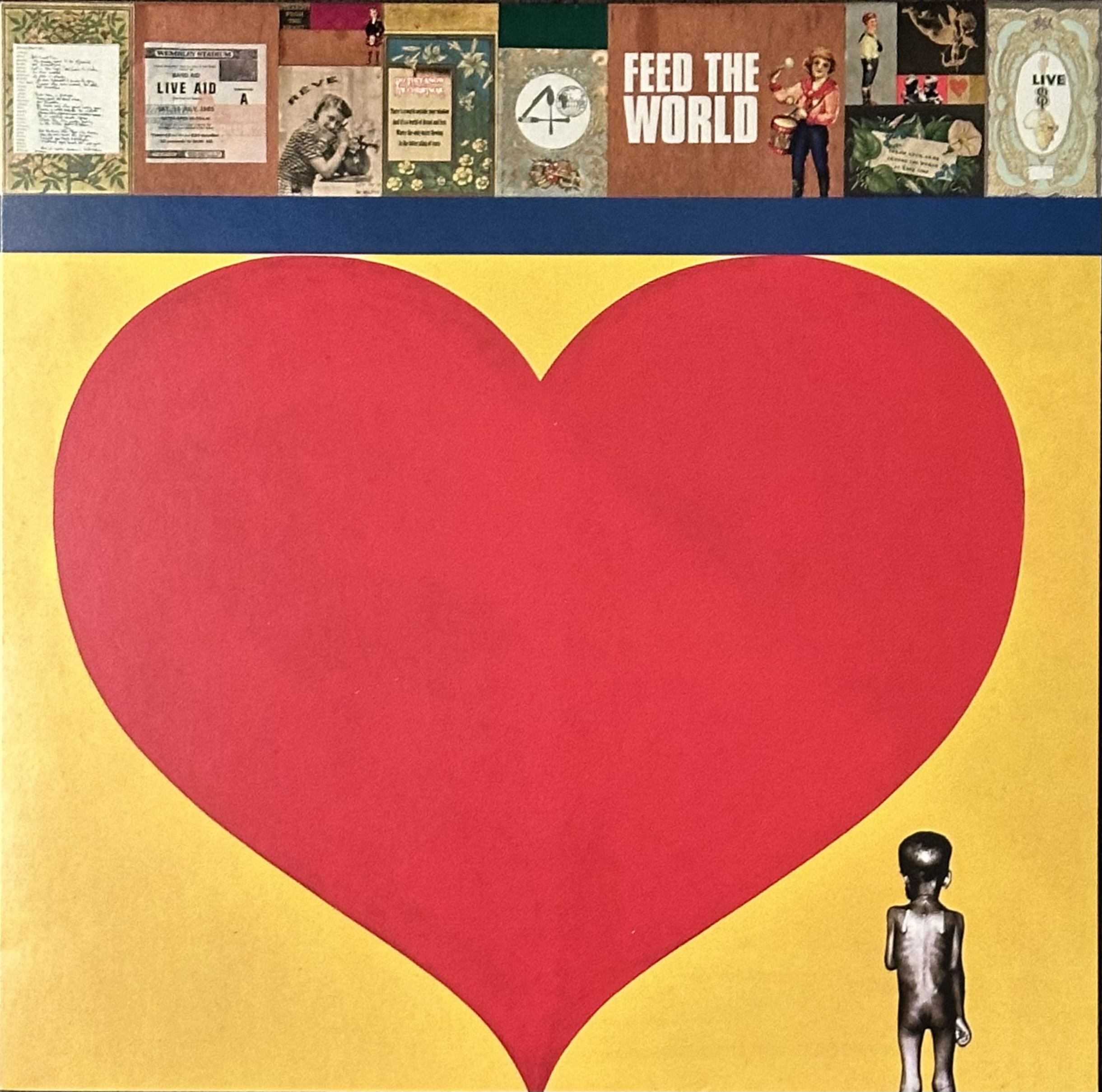
Peter Blake was approached to design the cover and was give one week to come up with the design. A classic Peter Blake collage:
The record was released on 7th December 1984 both on seven-inch and twelve-inch vinyl, and went on to sell millions of copies resulting in GBP 8 million for the charity. I went out and bought several copies to give to friends as Christmas presents.
The record was re-released in November 1985 with a new B-side One Year On (Feed the World), again as a seven-inch and a twelve inch.
Do They Know It’s Christmas? was first released on CD in 1989 together with a cassettee and new seven-inch versions. The cover was a disappointing black or green cover designed by David Howells.
The next release was for the record’s twentieth anniversary in 2004. Released only as CD single, the cover was initially to be designed by Damien Hirst but his design was rejected as being too harrowing and Mat Maitland made the cover image A Disney-ish winter scene with a superimposed image of the back of a starving child.
For the thirtieth anniversary in 2014, Tracy Emin was selected for the cover design and she produced one of her neon signs.
And now it’s 2024–forty years after the original release and Bob Geldorf has once more asked Sir Peter Blake for a new design. It was released on 29th November, this time, only available as a 12″ maxi EP and a CD. Trevor Horn, the producer of the original 1984 version of Do Thy Know It’s Christmas has produced a new remix for this fortieth anniversary release.
Blake has reused his red heart on a yellow background as the main image and selected a range of collagese placed along the top. Front cover design is, however, credited to Mark Cowne with layout and design by Darren Evans. I get a bit muddled by all these designers. All I know is the images on the front cover are by Peter Blake.
This isn’t the first time Blake’s red heart motif has appeared on a record cover. It turned up on the inner spread of Mark Knopfler’s Tracker LP in 2015.
Stay tuned for my report on the fiftieth anniversary version. I hope I’m still around then.
I know nothing about the artist known as Banksy’s art training. He was involved in the street art scene in Bristol from the late nineteen eighties and has admitted that 3D and the Wild Bunch were early influences. Perhaps he had also seen Blec le Rat’s art and borrowed his signature rat images. Monkeys were another early Banksy motifs.
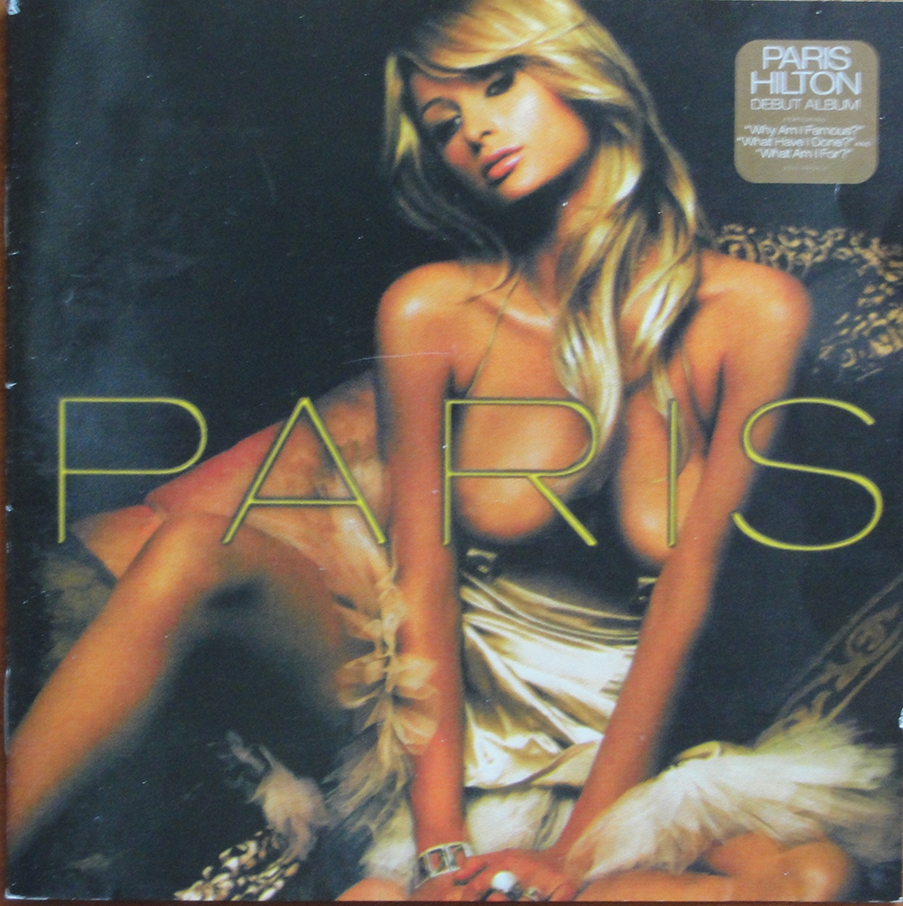
Although he had been active since the mid nineteen nineties, Banksy first came to fame in 2006 when he and associates succeeded in placing 500 spoof CDs satirizing Paris Hilton’s newly released Paris album on the shelves of 48 HMV stores across the United Kingdom. Banksy had reimagined the CD booklet, rendering Paris Hilton topless on the front, and DJ Danger Mouse had created a special album to replace Paris Hilton’s songs. This made frontpage news in several newspapers and started a hunt to try to unmask the artist, led primarily by the Daily Mail.
But Banksy’s career had started at least ten years earlier in his native Bristol, where he followed other street artists in decorating walls in the city. He started painting murals but soon found that stencilling was faster and meant he could better avoid discovery and possible arrest. The story goes that he was in the process of painting a mural when he was spotted and to avoid capture hid under a lorry. On the lorry’s underside was a stencilled message and Banksy realized that stencilling would allow him to work faster.
There is debate about when Banksy first designed a cover for a record. In 1993 and 1994 someone called Robin Gunningham – suggested by the Daily Mail to be Banksy’s real name – designed the covers for two cassettes by the Bristol band Mother Samosa. The first, Oh My God It’s Cheeky Clown (1993) was also released on CDr. The second, The Fairground of Fear (1994) doesn’t seem to have been released in any other format. Printer’s proofs of these cover designs have circulated and been suggested to be the earliest cover art by the artist known as Banksy. However, I have never seen the cassettes.
Printers proofs of Mother Samosa’s two cassettes.
There is no doubt that the covers for One Cut’s records on the Hombré label, and the covers produced by Wall of Sound Records and its offshoots; Ultimate Dilemma and We Love You use Banksy’s images authorised by him, later releases on other labels or on bootlegs are almost certainly unauthorised. Sometimes, as in the case of Benjamin Zephaniah’s Naked CD or Liberation by Talib Kweli and Madlib, it is not certain that the cover images were authorised by Banksy. I won’t separate authorised from unauthorised covers in this list.
I have a nasty feeling that more recent bootleg releases, such as the two Boys in Blue 12” singles and TV-Age’s 12”, seem to have been produced in limited editions, often beautifully made, exclusively to lure collectors to part with large sums. An Israeli group is even producing picture disc singles with Banksy images that are being sold at exorbitant prices. I would not advise serious collectors of Banksy’s record cover art to fall for these.
In the mid-to-late nineties Banksy was an amateur footballer, apparently goalkeeper for the Easton Cowboys and Cowgirls and toured with the team to Chiapas, Mexico in 2001 where he painted a mural and provided images for a very limited cassette by a Mexican band called Revolucion X, titled Canciones electorales, that was probably pressed in the U.S.. There seem to be three colour variations of the cassette, yellow, red and white.
Revolucion X cassette (Thanks to Nick S)
Then there is the story told by Steve Gibbs, a.k.a. Steve Vibronics that an artist called Robin designed the logo for his Vibronics dub band in the latter half of the 1990s, while in Leicester and there is some evidence that Banksy visited at that time. Steve is certain that this Robin was Banksy, but we have no definite confirmation. The Vibronics logo appears on three record covers: The Outernational Dub Convention, Vol 1: Jah Free Greets The Vibronics (1998), Dub Italizer (2000) a sixteen-track double LP that shows part of the logo, and The Return of Vibronics (2015).
The cover of The Outernational Dub Convention, Vol 1: Vibronics Greet Jah Free showing the logo (at right) purportedly designed by Banksy.
The first official cover designed by Banks was for Jamie Eastman’s record label Hombré Records. He designed the cover for hip-hop group One Cut’s Cut Commander 12” EP in 1998 and their remix CD album Hombrémix.
The Cut Commander cover.
One Cut’s Hombremix CD cover art.
He went on to design five more covers for the band in 2000 including their double album Grand Theft Audio, and a 12”, four-track sampler EP, called simply Grand Theft Audio Sampler. There are two versions of the promo 12”, one with a plain white label and the other with Banksy’s Abseiling Thief image together with track titles on each label.
Grand Theft Audio LP cover.
It is said that Banksy had a studio in Bristol in the same building as John Stapleton, who started BlowPop records, and Stapleton asked Banksy to design a cover for the promotional single by his new band the Capoeira Twins. Banksy produced a Matador and Car stencil and spray painted 100 covers for the 4 x 3 / Truth Will Out 12” promotional single.
The Capoeira Twins 4 x 3 / Truth Wiill Out promotional 12″.
There is a rumour that there was also a promotional CD-r for the album entitled Armour Plated, X-rated. This was produced in very limited quantities.
The other covers were for the 12” EPs Mr X / Rhythm Geometry and Underground Terror Tactics. I have a promo version of the Mr X / Rhythm Geometry 12” in a generic black cover but with Banksy’s logo on the record label.
Mr. X / Rhythm Geometry 12″ and Underground Terror Tactics 12″.
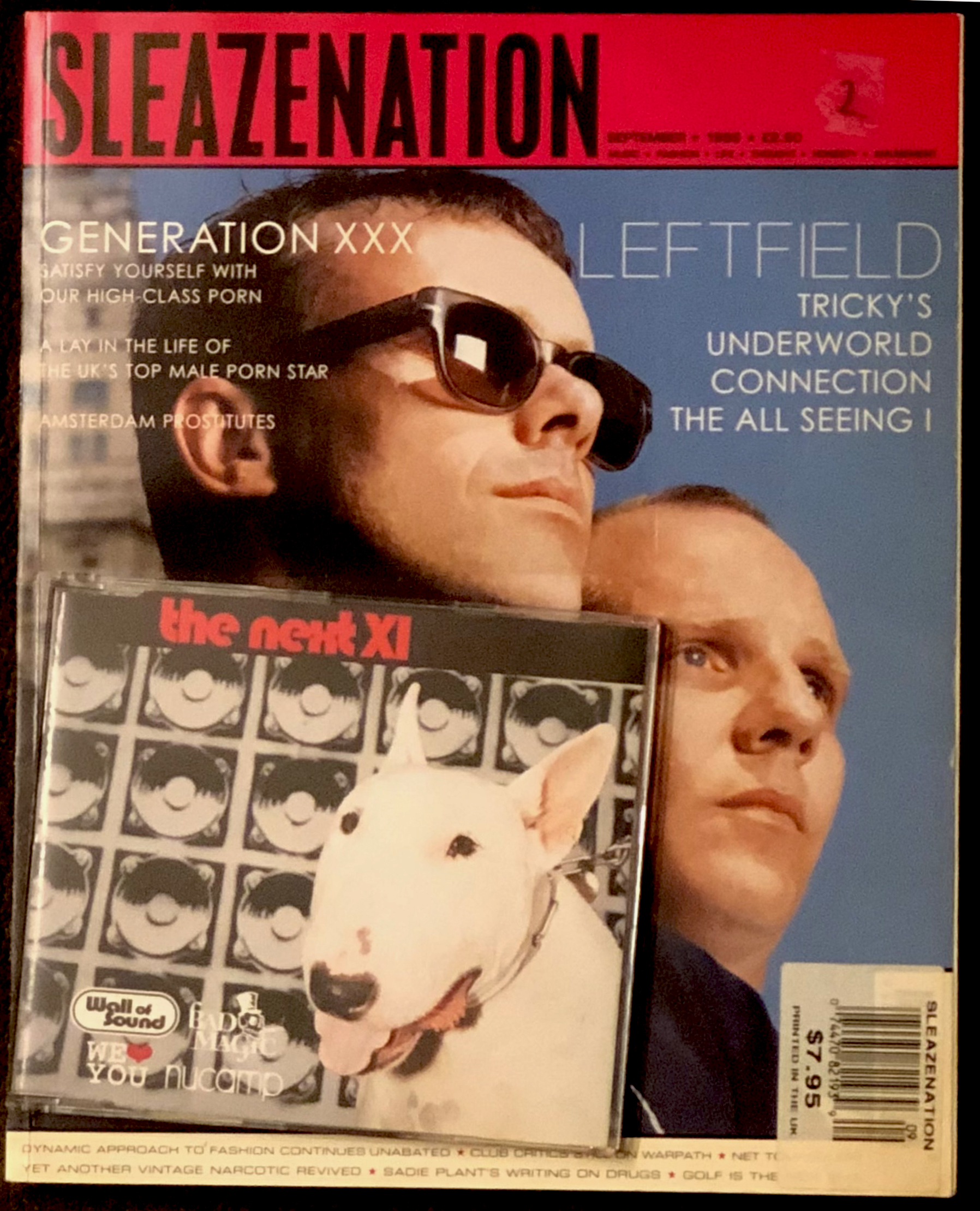
In 1999, Wall of Sound records licensed a compilation CD to Sleazenation magazine. Steve Lazarides photographed Banksy’s image for the cover of The Next XI, a compilation CD that was attached to the September 1999 issue.
Sleazenation magazine with the The Next XI CD.
Banksy collaborated with Insect to design a poster for Monk & Canatella’s Do Community Service CD in 2000 and this was reproduced on the cover of the duo’s CD.
In 2000 Banksy was approached by the newly formed Clown Skateboards to design a logo that would be applied to a limited edition series of skateboards. Banksy came up with his Insane Clown image and Clown Skateboards produced a promotional CDEP called Skateboards, with the Insane Clown image on the cover. And the logo appeared on the label of a split 12” EP Styles by the Dozen by The Dynamic Duo (who are Niall Daily and Bryan Jones) and Nasty P (Paul Rutherford) the same year.
Clown Skateboards CD and Style by the Dozen 12″.
In 2000, Wall of Sound Records launched a subsidiary label called We Love You and released a compilation album called We Love You … So Love Us, with Banksy’s famous Rage – Flower Thrower image on the cover. There are two further We Love You compilations. We Love You … So Love Us Too was released the following year on CD and there is also a four-track 12” that comes in a red generic cover with the same image as on the CD on the record label. The third compilation, imaginatively titled We Love You … So Love Us Three, only available on CD, appeared in 2004. There are copies in jewel cases and promotional copies in card sleeves.
The three We Love You… So Love Us compilation covers.
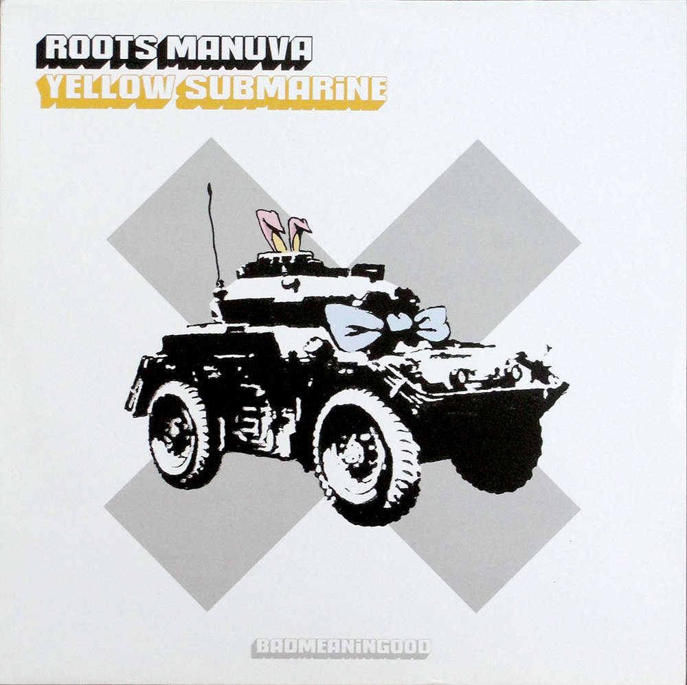
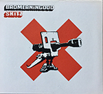
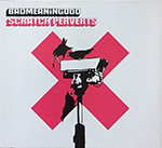
Ultimate Dilemma, another record label associated with Wall of Sound Records released a series of compilation albums and a 12” single between 2001 and 2003 with design by Tijuana Design and incorporating various Banksy images. All were released on vinyl and Digipak CD. Roots Manuva (Rodney Hylton Smith) released a single-sided 12” version of Yellow Submarine (2001). He also remixed tracks for the compilation Badmeaningood, Volume 2 (2002). Skitz (DJ John Cole) remixed the compilation Badmeaningood. Volume 1 (2002). Peanut Butter Wolf (Chris Manak) remixed Badmeaningood, Volume 3, and Scratch Perverts (Prime Cuts and Tony Vegas) remixed Badmeaningood, Volume 4 (both 2003).
Roots Manuva’s Yellow Submarine 12″ and his Badmeaningood compiltion cover. Badmeaningood Volumes 1, 3, 4.
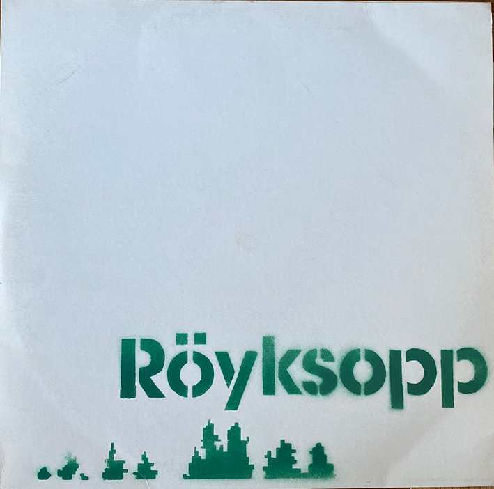
In 2001 the Norwegian duo Röyksopp (Torbjörn Brundtland & Svein Berge) released their first album Melody A.M. on the Wall of Sound label. A promotional double album was released to promote the album in a cover that was hand-sprayed by Banksy. One hundred hand-numbered copies were produced at Wall of Sound’s London office. The first fifty used a dark green paint while the final fifty were sprayed with a paler, olive green, paint.
The two colour variations of the Melody A.M. promo cover.
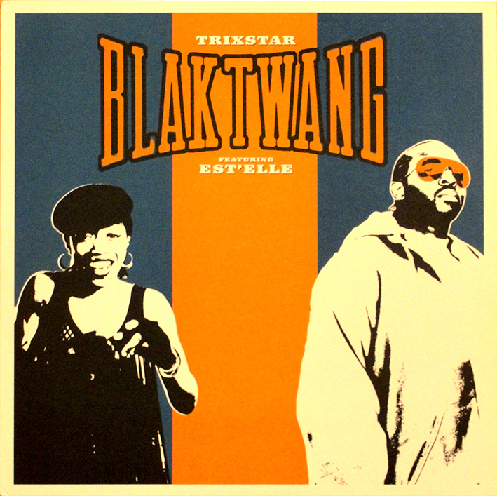
Magic Records was another label associated with Wall of Sound records and Hip-hop artist Blak Twang (Tony Alabode) recorded his Kik Off album for the label in 2002. Three 12” singles were released from the album: Kik Off, Trixstar and So Rotten (Tony Rotten being another of Alabode’s aliases) There was also a remix version of Trixstar featuring Estelle (Estelle Swaray, who wrote the song). All four releases credit design to Mitch Design with art direction by Banksy. Steve Lazarides is credited with the photography.
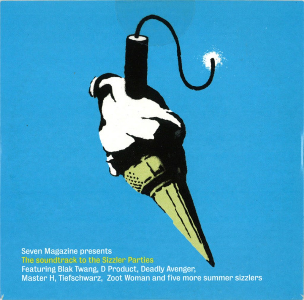
Sometime in 2002 Seven Magazine produced an issue with a compilation CD in a card cover attached called The Soundtrack to the Sizzler Parties that used Banksy’s Dynamite Ice Cream image on the cover. There were even small flyers with the same image but with different coloured backgrounds. I haven’t seen the magazine.
The Soundtrack to the Sizzler Parties CD.
Banksy first showed his painting I Fought the Law at his Peace is Tough show in the Glasgow Arches in 2001 and two editions of screenprints, an unsigned edition of 500 and a signed edition of 100, were released in 2004. There were several colour variations. The original photo from which Banksy made this design came from the video of John Hinckley’s 1981 failed assassination attempt on President Ronald Reagan. Amazingly, the American hardcore band The Promise were quick off the mark and the designer J. Bannon modified the I Fought the Law image for the cover of the band’s Believer album released in November 2002. The album came in two limited editions, 100 copies on clear vinyl and 900 copies on red vinyl, and included a double-sided poster. The album was also released on CD; the U.S. version had a black and silver cover image with the album title in red, while the European CD has a black and grey cover image, with the album title in green. The European version also includes two extra tracks.
The cover of the Believer LP. There are also two CDs with slightly different covers, one with the title in red and another with the title in green.
But 2003 was when Banksy’s art first came to the attention of a broader record-buying public with the release of Blur’s seventh album Think Tank on 5th May. The album release was preceded by a promotional CD in a hand stamped card cover that featured Banksy’s Petrolhead image. As the cover was hand stamped the positioning of the Petrolhead varied from cover to cover, sometimes being stamped upside down and, on a few covers, was missing completely. There is also a very rare variation with Petrolhead being replaced by an infant’s handprint. I have seen two copies of this with the handprint in slightly different placings.
Three promotional CDs for Blur’s Think Tank album.
The release of this Blur album in May 2003 was awaited with almost Beatles-like expectation and four months later, on 21 September, the Observer newspaper produced a five-track CD in a card cover with extracts from the album to accompany their Sunday Magazine again with Banksy’s art on front and rear covers. The image of a child wearing a diver’s helmet also appeared on a page in a Royal Mail stamp booklet issued January 7th, 2010 celebrating ten classic record covers, though the actual cover of the Observer CD wasn’t shown, and the only Blur cover was the Parklife cover, not Think Tank. The Think Tank album was reissued in 2012 on heavyweight (180 g) vinyl.
Three singles with cover art by Banksy were released from the Think Tank album: Out of Time, Good Song, and Crazy Beat, were released as limited edition vinyl singles, with Good Song and Crazy Beat on red vinyl. All were designed by Tijuana Design. Out of Time had Banksy’s Out of Time image; Good Song used his Kids on Guns and Crazy Beat had Insane Clown on Balcony. There was also a collector’s edition in a red book cover with a gold Father Holding Daughter with both wearing divers’ helmets stamped between “Think” and “Tank” on the front.
Three 7-inch singles from Think Tank.
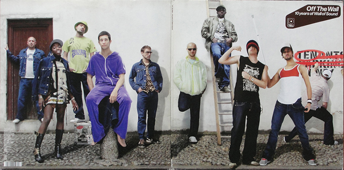
Wall of Sound Records released a compilation album called Off the Wall: 10 Years of Wall of Sound, celebrating its tenth anniversary on 13th September 2003. This was released as a triple LP set and a double CD in a gatefold card cover. The covers had some of the Wall of Sound artists posing in front of a wall and on the cover the figure spraying over the Tenant Parking Only sign on the wall is Banksy.
The cover of the Wall of Sound triple LP.
The label released a follow up to the We Love You … So Love Us Too with the imaginatively-named We Love You … So Love Us Three in 2004. Again, this was only available on CD with booklet art by Banksy. There is also a vinyl 12”, four-track sampler of the We Love You … So Love Us Too.
The February 2004 issue of the magazine The Big Issue included a compilation CD called Peace Not War to celebrate the Peace Not War festival to be held 12-15 February the cover and the CD showed Banksy’s Bomb Hugger Girl. The CD, in a card cover, was Sellotaped to the magazine’s front cover and copies of the CD usually bear marks after the tape. This is the first of several CDs that have used the Bomb Hugger Girl motif.
An album by the German band The Apoplexy Twist Orchestra released a white label, white vinyl LP in 2004 entitled Create the New. This came in a transparent cover with an obi with Banksy’s Bomb Hugger Girl and an insert had a picture of Banksy’s Nipper with Rocket Launcher.
The Create the New white vinyl LP.
Between 2004 and 2005 Bow Wow Records released four 12” singles / EPs; three of which used a modified version of Banksy’s Nipper with Rocket Launcher on the covers, subtly changed to Nipper holding a Tops. The fourth 12”, by Buckfunk 3000 had the same image on the record label.
The label of the Buckfunk 3000 12″ EP
Benjamin Zephaniah, vegan, poet, musician, activist and anarchist recorded a number of albums between 1982 and 2017. His 2005 album Naked was released in a Digibook that contained photos of many of Banksy’s images. It is unclear whether these were published with Banksy’s approval, but considering Zephaniah’s endorsement of Palestinian issues and BDS, similar to Banksy’s, it seems likely.
The same year a Mr Bird released his CD Know Your Rodents with a collage of various Banksy images on its cover and on the disc.
The CD booklet from Mr Bird’s CD Know Your Rodents.
Dirty Funker (Paul Glancy) is a DJ and remix artist who remixed Nirvana’s Smells Like Teen Spirit and Lithium in 2004 and the following year remixed The Knack’s My Sharona on a limited edition 12” single on his own Spirit Records label, calling it Let’s Get Dirty. He used Banksy’s portrait of Kate Moss on front and rear covers. The very limited first pressing used the portrait without any text. While but on the cover of a larger second edition he Dymo strips across Kate’s eyes on the front and over her mouth on the rear. At least two copies of a printer’s proof of the cover art from the first pressing have appeared.
The first and second pressings of the Let’s Get Dirty 12″.
Printers proof of the Let’s Get Dirty cover.
And so to the famous Banksy / Danger Mouse remake of Paris Hilton’s 2006 Paris CD. Five hundred copies of this artwork were produced and Banksy and associates succeeded in placing them in the racks of a number of HMV stores across the United Kingdom and many unsuspecting customers mistook them for the genuine article and must have been mightily surprised when they got to play the CD. The original Banksy / Danger Mouse version was released as a CD-rom with Paris and a heart handwritten on the CD-r in marker pen (purportedly by Banksy.) It came in a jewel case with a booklet that Banksy had reimagined based on Paris Hilton’s original. This prank made national headlines in the United Kingdom and made Banksy a household name.
The original Banksy/Danger Miuse booklet. No label on cover.
Sometime later, a second edition was released in a limited edition of 1000 copies. This time with a properly pressed CD. This edition has been called a fake, but in reality it is a reproduction. It can be distinguished from the first edition by the sticker present at the top left on the outside of the jewel case is printed top right on the booklet’s front cover on the reproduction and the fact that the CD is not a CD-rom.
The reissue of the Banksy / Danger Mouse cersion of Paris Hilton with the “sticker” printed top right on the cover.
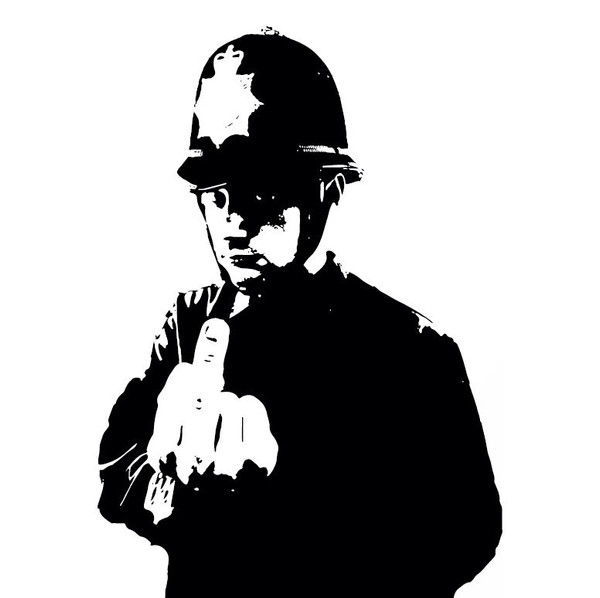
A bootleg white label 12” single I’m Not Your Friend by Hoxton Whores was released in 2006 with Banksy’s Rude Copper image on the record label.
Talib Kweli joined Corey Smith joint founder of Blacksmith Music, to form a production company. In 2006 Blacksmith released the album Liberation, a collaboration between West Coast producer Otis “Madlib” Jackson, Jr. and East Coast rapper Talib Kweli. Banksy’s painting ”Flag” was used on the cover. A coloured vinyl re-issue has been promised for early 2022.
Banksy’s The Flag on the cover of Talib Kweli & Madlib’s LP.
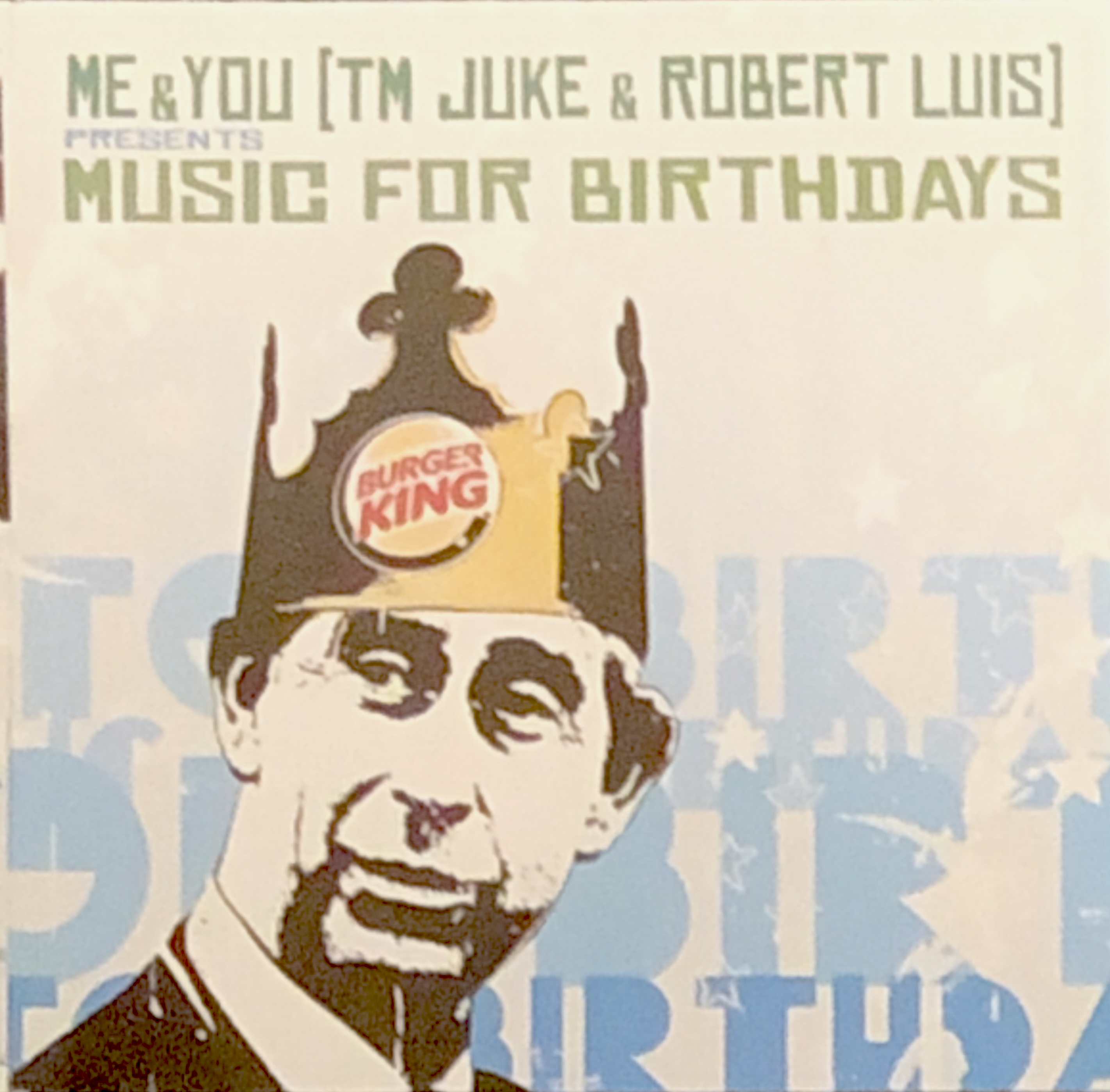
Me&You (T.M. Juke and Robert Luis) released a 12” single called Floating Heavy (Edits) in 2007. This remix single has Banksy’s One Day We’ll Be in Charge on one label and Grannies image on the other. They also released a double CD called Music for Birthdays with a cover image of Prince Charles wearing a paper crown inscribed Burger King that has been suggested to be by Banksy, though it was done by the Norwegian street artist Dolk.
Dolk’s cover for the Music for Borthdays CD.
In 2007 Ashley Beedle remixed Kate Bush’s Running up That Hill and released it on a 12” single that had Banksy’s Kids on Guns image on the record label.
A Canadian band from Saskatoon called One Bad Son (mainly Shane Connery Volk (vocals) and Kurt Dahl (drums)) released its second album Orange City in 2007 and used Banksy’s Bomb Hugger Girl image on the CD.
The Orange City CD has Banksy’s Bomb Hugger giorl on the CD.
DJ Danger Mouse released a double LP the same year with cover art credited to Banksy. The front cover shows a CCTV camera pointing at a wall inscribed with Danger Mouse – From Man to Mouse a modification of Banksy’s What Are You Looking At. The rear cover shows Banksy’s Child with Divers Helmet Holding a Canary; the same image as on the Observer Blur promotional CD from 2003.
A relatively recent discovery is the seven-inch EP by the Belgian band SL-27 called simply SL-27. The fold-out cover has Banksy’s Love Is in the Air: Flower Thrower on the inner spread, Banksy’s Laugh Now, But One Day We’ll Be in Charge on the record label on side A and Banksy’s Children on Weapons Heap on side B. And this also appears on the back cover.
Bristol used to host a poetry festival and one year – probably 2008 – a CD entitled Monkeys With Car Keys was privately produced of the fifteen poets reading forty-two poems. I was first alerted to the existence of this CD in 2010 when I saw an image of the cover on a thread on UrbanArtAssociation’s site. I started to search for it contacting the Bristol main library, the Bristol Museum, and several Bristolian antiquarian booksellers without success. In fact, no one I contacted had ever heard of it. Eventually I sent a picture of the cover art to an ex-Bristolian Banksy collector who recognised the cover painting as one done by Banksy in Bristol in around 1999 but that had disappeared. My friend managed to confirm that the CD did exist and, after a few weeks, also found a copy.
This seems to be last release with cover art authorised by Banksy. All covers and record labels with Banksy’s images released from 2008 are all unauthorised.
The first of these is Dirty Funker’s Future, released on Dirty Funker’s own Spirit label. The 12” single was released in a cover that used Banksy’s Radar Rat. There were five limited editions (each said to be of 1000 unnumbered copies) printed on white, grey or brown card and Radar Rat was in three colours. There was also a 12” test pressing with a black and white cover as well as a promotional CD in a paper cover with the black and white Radar Rat.
Dirty Funker’s Future 12″ single.
The next bootleg was an interview LP called The Banksy Years (2008). Again, this was a limited edition of 1000 copies pressed on orange vinyl.
Another bootleg that used Banksy’s Queen Victoria as a dominatrix was a cover of Queen’s Don’t Stop Me Now by a group calling themselves Queen and Cuntry [sic] (2008).
The next 12” was a split single by Hot Chile and Anarchist, again in a white cover with Banksy’s Love Is in the Air: Flower Thrower on the front cover and Hip-Hop Rat on the reverse.
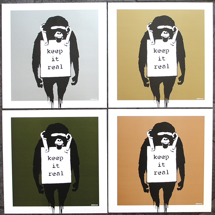
Danger Mouse released a new single called Keep It Real / Laugh Now in four numbered limited editions of 1000 copies each with Banksy’s iconic Monkey design against a coloured background. There are 1000 copies each with gold, silver, brown or dark green backgrounds. Unusually, the numbers are on the record labels rather than on the covers. Apparently, he had planned a seven-inch single release as well and a series of covers with the same design but against a white background were prepared but the single was never issued.
Dirty Funker released a further 4-track 12” single called Flat Beat on his Spirit label in 2009 and appropriated Banksy’s Happy Choppers image for both front and rear covers. The choppers flew against a blue sky on the front cover and against a yellow sky on the rear. I must say that Dirty Funker had the good taste not to add any typography to spoil the artwork.
Dirty Funker’s Flat Beat 12″.
The German band Gottkaiser released a Digipak CD in 2008 called Krieg & Frieden with Banksy’s Bomb Hugger Girl on the cover and CD.
Gottkaiser’s CD Krieg & Frieden.
When the Time Comes, a limited edition five-track CD by a band calling itself The Lonely Kids Club came out in December 2011. I haven’t seen one of these yet.
A band from Hitchin, U.K., called Frog Stupid released their CDEP Love and Amnbition Won’t Get You a Payrise in 2011. This seems to be a private pressing not on any label. The cover shows Banksy’s Girl With Balloon.
Frog Stupid CD cover.
In 2012 a New Orleans brass band called The Hot 8 Brass Band released its third album, called The Life and Times of… The band had approached Banksy for permission to use some of his art on the cover but heard nothing. However, just before the CD was going to press, the band reached out again and this time Banksy agreed to allow the use of his images, though not permitting the band to use his art on the CD cover. The booklet’s inner spread has several Banksy images.
Desy Balmer, an Irish DJ and producer, and co-founder of Nice & Nasty records, released a 15-track compilation as a digital release in 2012 on his own Nasty & Nice label with a cover painting by Banksy modified from an image from the Palestine Wall.
TerranceK (Terrance Kerti) is a Detroit-based DJ who produced a digital EP in 2013 called Hot Line that used a photo of Banksy’s London Phone Box #2 on the cover.
Cover art for digital only relase by TerranceK.
Banksy’s I Fought the Law image appeared for the second time on the cover of a test pressing of Embalming Theatre’s and Tersanjung 13’s split seven-inch EP titled Mommy Died – Mummified / Hellnoise on the Rotten to the Core label in 2013. The test pressing cover was designed by Robert Janis, owner of the label.
Test pressing with I Fought the Law motif.
Warrior Soul released a CD in 2008 called Destroy the War Machines with a modified image of Banksy’s CND Soldiers. The album was reissued in 2013 in a limited edition of 333 numbered, white vinyl LPs. Design is credited on the inner sleeve to Ballsy [sic] and collage by Joachim Ljung. Band photographs by Tim Hodgson & Dajana Winkel.
The LP cover. Only 333 copies were released.
Junichi Masuda is a producer and composer for Pokèmon and produced an LP called Pokèmon in 2015. There doesn’t seem to have been an official release as all editions are listed as test pressings. There are three main cover variations, all released on the Moonscape label. Several coloured vinyl editions came in a cover that was a pastiche of Peter Blake’s and Jann Haworth’s Sgt. Pepper art with the famous Sgt. Pepper drum replaced by a Pokèmon ball. However, there was a further limited edition planned to be 100 copies with a hand-sprayed recreation of Banksy’s Love Is in the Air – Flower Thrower art. The story goes that the stencil used broke after about ninety covers had been sprayed and another stencil with a rabbit and balloon take on Banksy’s Girl with balloon was substituted for most of the remaining ten covers, although there may also be a few with another image instead of the rabbit. Both covers were designed and made by Sean Patrick Dagle. Dagle wasn’t satisfied with the initial run of covers as there was much spray paint outside the actual image and he remade the stencil and produced a further series of 150 numbered covers that he sold without records.
In 2015 a band calling themselves Boys in Blue released Funk da Police, a bootleg 12” single in a cover with Banksy’s Rude Copper design, ostensibly in a limited edition of 100 unnumbered copies. The band released a second bootleg 12” single called Strawberry Donut / Thick as Thieves as a limited edition (250 copies) in 2021.
Boys In Blue – Funk tha Police and Strawberry Donut 12″ singles.
A band calling itself Minraud released a CD in 2016 titled Vox Populi on the Hidden Stone record label. This is probably a bootleg but the cover art uses Banksy’s Radar Rat image.
American DJ Romanowski release a CD called Tracks from the Movie “Saving Banksy” in 2018 with a Banksy rat on the cover.
Another German release arrived in 2016 from a band calling itself TV-Age. This was The Player EP with a beautiful, hand-screened cover of Banksy’s Every Time I Make Love I Think of Someone Else.
TV-Age – The Player EP.
There is also a CD from Belgian band Fist2Fist entitled Hold the Gun with Banksy’s Girl with Rocket Launcher art. There is no information on when it was released.
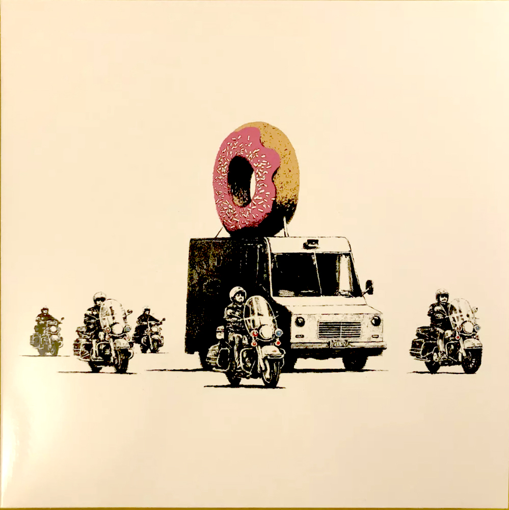
Banksy designed a protective vest for rapper Stormzy (Michael Ebenezer Kwadjo Omari Owuo Jr.) and this was featured on the cover of his December 2019 album Heavy Is the Head. The album was available on CD, a limited edition double vinyl LP, with the vest pictured on one on the inner sleeves, and as a double picture disc. The cover was designed by Hales Curtis design studio. The album was later reissued as a double black vinyl LP.
In 2020, John Brandler bought Banksy’s Port Talbort mural Seasons Greetings and celebrated it with by producing a CD called Seasons Greetings by the Climate Change Sound Project. (Gwyn Griffiths and Frankie Oldfield).
The Climate Change CD cover (rear cover (left) and front cover (right)).
I am certain that more covers appropriating Banksy’s art will appear – both newly discovered records and CDs (and even music cassettes) as well as speculative new productions akin to the Boys in Blue and TV-age releases.
It seems that this blog has become a reference work for information on record and CD covers with cover art by the artist known as Banksy. And I find it very flattering. My aim, way back in the 00s, was to catalogue all record and CD covers with Banksy’s art, irrespective of whether or not the release used an authorised Banksy image. To date I have catalogued about 100 releases.
Banksy’s art has been sold as paintings, stencilled prints or silkscreen prints, the latter being the most commonly available. The prints are commonly limited editions, often in editions of 100 or 250 which may be signed or unsigned. Both are becoming scarce and command very high prices; witness the recent sale of Banksy’s painting Love is in the Bin for GBP 18 million. Signed prints of his more iconic works are currently (October 2021) on offer for GBP 100,000 to 200,000.
I bought Blur’s Think Tank LP when it was released in 2003 and the promotional Parlophone and Observer CDs around the same time. However, I didn’t start seriously collecting Banksy’s record cover art until around 2005. Back then I could buy the records as they were released and they cost no more that other 12″ records, so my set of Dirty Funker’s Future 12″-ers cost GBP 6.99 each; likewise my set of Dirty Funker’s Laugh Now / Keep It Real 12″-ers (there’s a set for sale on Ebay just now for GBP 10,000). The most expensive release I bought was Dirty Funker’s Let’s Get Dirty (the first press without the Dymo strips across Kate Moss’s eyes) from a fellow collector for GBP 100. I added more and more records and CDs as time went on.
Once upon a time, the most expensive Banksy covers were the two he had purportedly stencilled himself: the Capoeira Twins’ promotional 12″ 4 x 3 / Truth Will Out and Röyksopp’s promotional Melody A.M. double LP; each produced in editions of 100 copies, comparable to Banksy’s limited edition prints. However, the records have been selling for about a tenth of what an equivalent print would cost.
So, when I started collecting, the covers were affordable and remained so until about 2015 when prices began to rise. Now, however, many collectors are competing to find Banksy’s record covers and prices have skyrocketed. I am amazed (and shocked) to see someone trying to sell copies of Dirty Funker’s Flat Beat 12″ for between EUR 815 (about GBP 700) and AUD 6,500 (about GBP 3,500), and copies of Queen & Cuntry’s Don’t Stop Me Now are for sale on Ebay for about GBP 4,000! These prices are stimulating the production of forgeries. I am not sure all the copies offered for sale nowadays are 100% genuine.
Apart from the question of forgeries, there are other ways unscrupulous producers are cashing in on the willingness of collectors to fork out large sums for limited edition covers. These seem to be on the increase. Take TV-Age’s beautiful The Player EP (an apparently hand screened cover in an unnumbered edition, said to be 100 copies) or Boys in Blue’s two 12″ singles Funk da Police (unnumbered edition, said to be 100 copies) and Strawberry Doughnut / Thick as Thieves (numbered edition of 250 copies). In my view these have been produced exclusively to lure collectors of Banksy covers to pay large sums for worthless music.
Another group that is cashing in on the widespread interest in collecting record cover art are the Israeli producers of picture discs with art by a variety of artists ranging from Banksy (like this one) to Warhol. They sell via Ebay and generally cost around USD 300 for a single-sided, generally unplayable, 12″ single. I made the mistake of buying a couple of these to test. I hope nobody else will fall for the con.
Thus I have now decided in future to concentrate only on official releases with Banksy’s art. Several CDs and cassettes have recently surfaced that are unoffical and I will not join in the bidding for these, nor will I go for the latest Boys in Blue 12″. Let’s all agree to boycott the speculative releases and just concentrate on the legitimate ones.
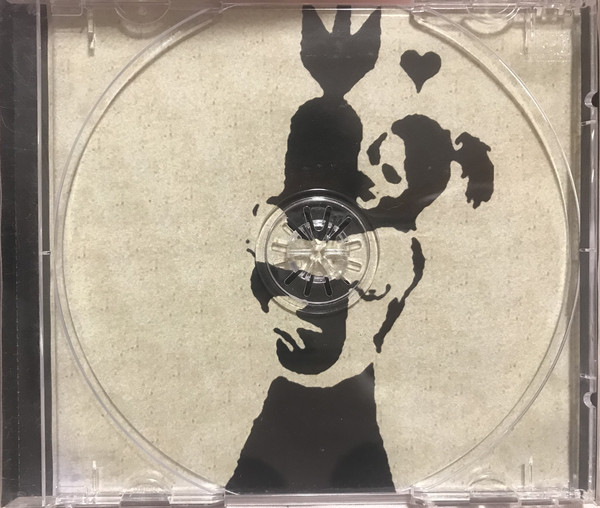
Today was a bit of a special day! I discovered two CDs with Banksy artwork that I had never seen. I was casually surfing the Internet when I came across a picture of a CD cover that I didn’t recognise but that had classic Banksy artwork. The CD in question is an 11-track compilation released by Seven Magazine and called Seven Magazine Presents the Soundtrack to Sizzler Parties, and contains tracks by Blak Twang (Twixstar) and the Röyksopp remix of The Mecons Please Stay. This CD was released in 2002, so I don’t really understand how it has eluded me for so long!
The second CD, Orange City by a Canadian band called One Bad Son, was released in 2007. The front cover didn’t look promising — probably explaining why I had missed this release.
It isn’t until you open the jewel case and see the CD that the Banksy connection appears.
Here the Bomb Hugger girl image appears both on the CD and on the inside of the rear of the jewel case. I suspect that this is an unofficial use of this particular Banksy image that appeared officially on the Peace Not War compilation CD that accompanied the February 2004 number of the Big Issue magazine.
As I write this, my collection of Banksy records and CDs is moving from the Palazzo Ducale in Genoa to the Palazzo dei Diamanti in Ferrara until September 2020 and then from September to December to the Museum of Modern and Contemporary Art of Trento and Rovereto. Perhaps I should add these rare CDs to the exhibit.
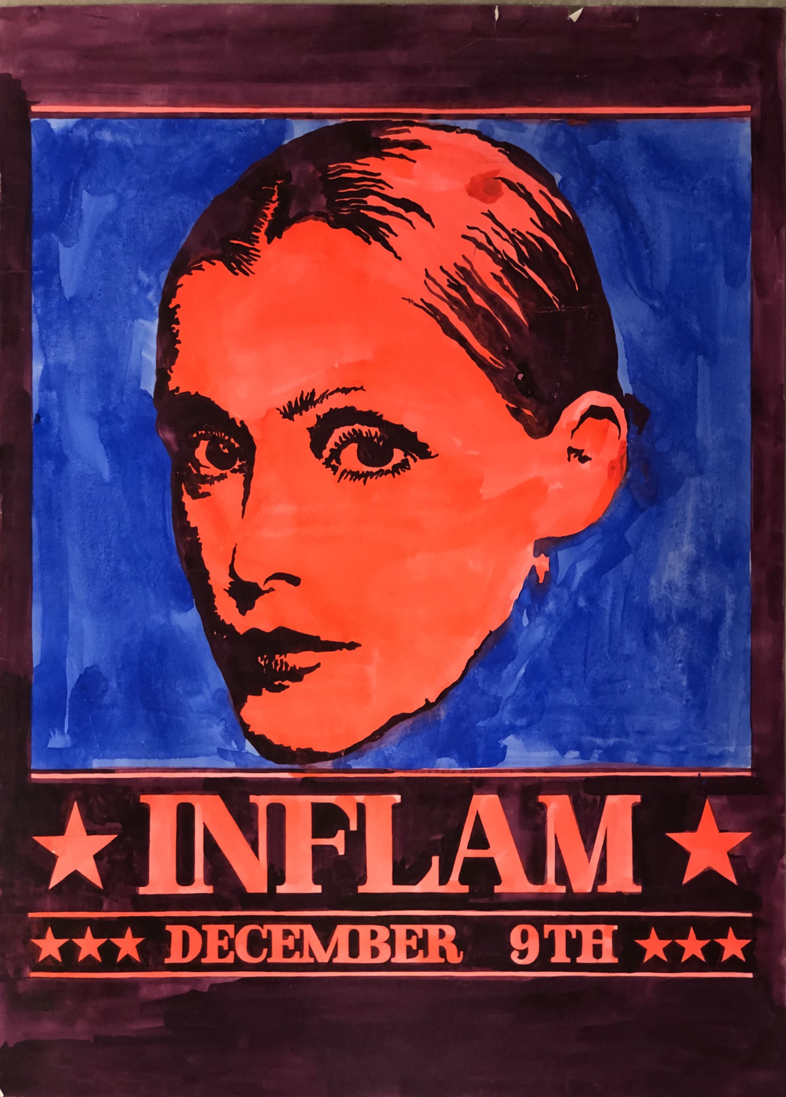
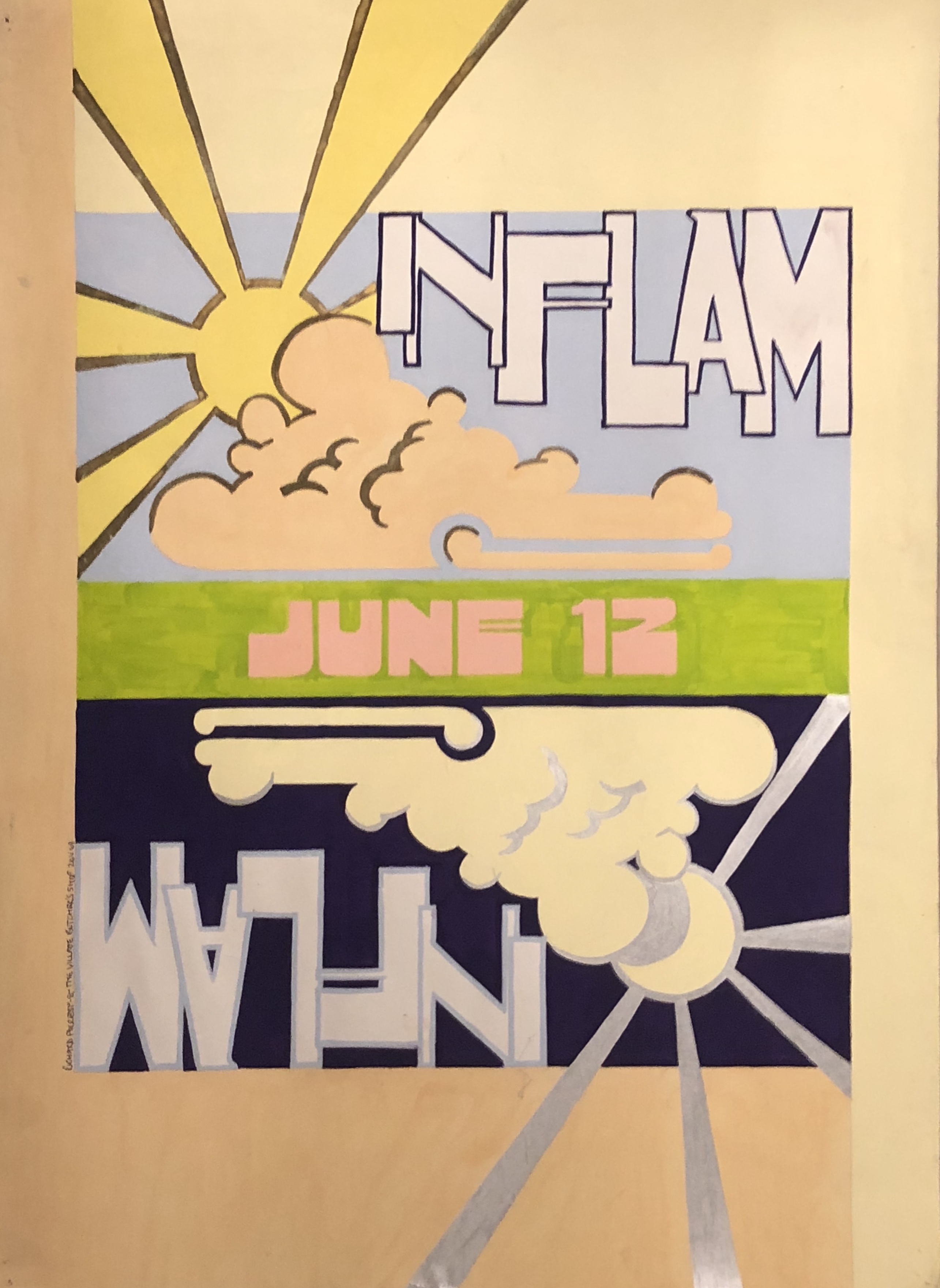
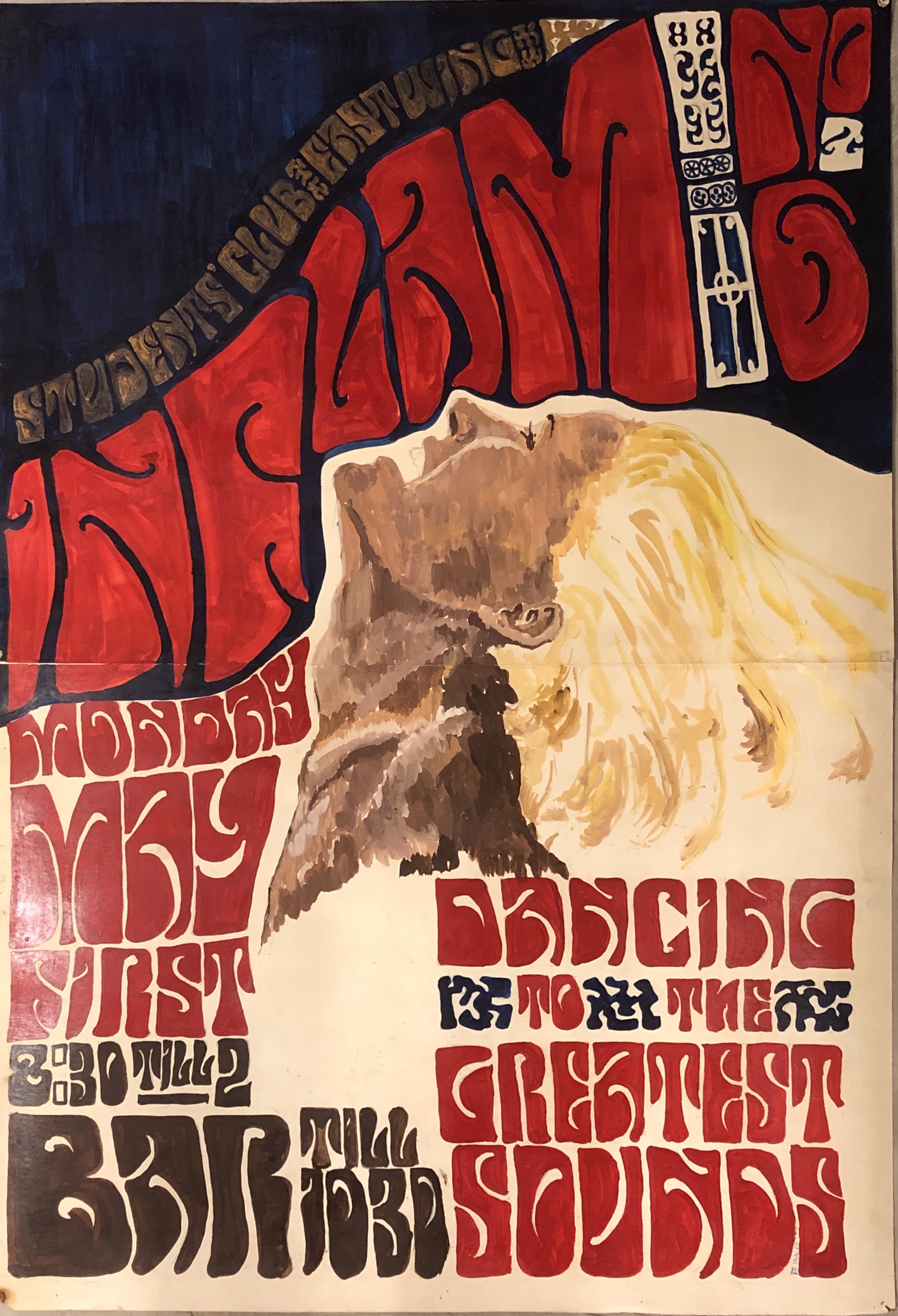
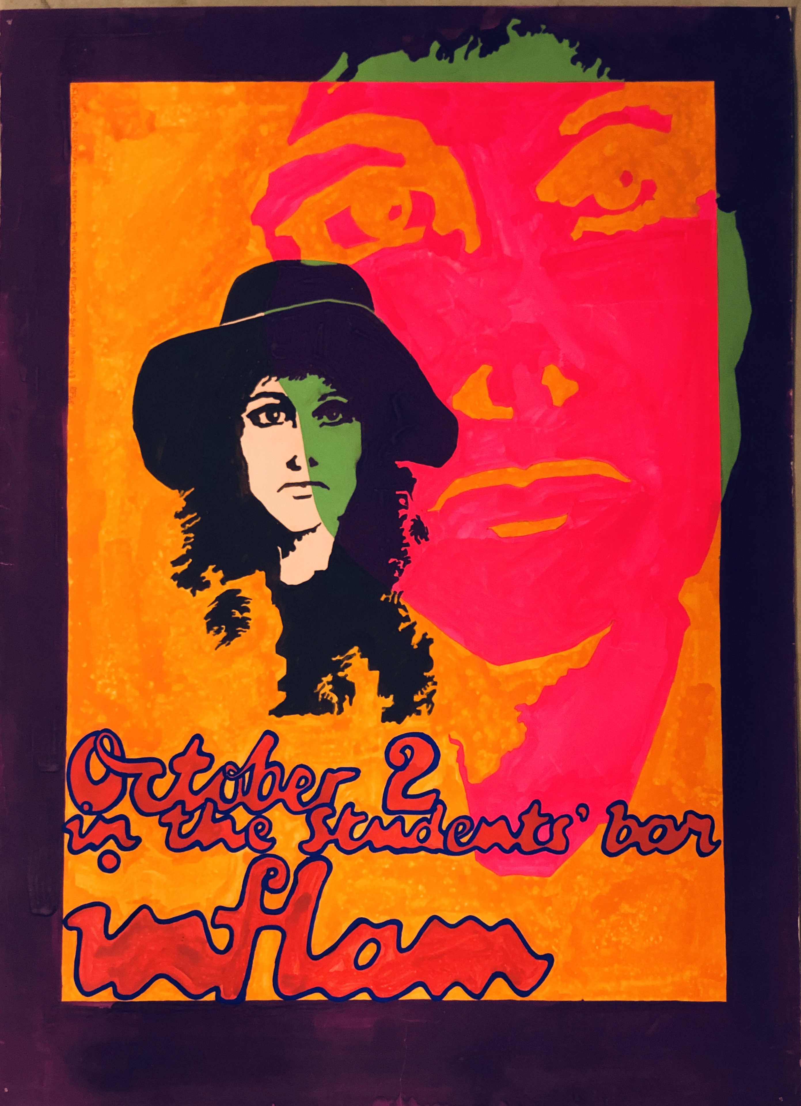
When I was in medical school from 1962 to 1968, I was involved in the Students’ Union and somehow got into a group responsible for organising student dances. These were the heady days of Swinging London, Carnaby Street and all things psychedelic and together with Andrew Batch, I started producing posters for dances, balls and many just for fun. Heavily influenced by American west coast art I painted many posters for dances we called “Inflam” as well as for lectures to be held in the hospital. There were several notice boards around the Guy’s Hospital campus and therefore four posters were required for each event. Many copies disappeared but I managed to save at least one copy of many of the posters, which have followed me around for the last fifty-plus years. For the past seven years they have been languishing in my flat’s cellar storage.
In the past week I have been trying to go through all the detritus that I have collected over the years. Old diaries, out of date credit and membership cards, books and a few records that no longer deserve a place in my collection. However, the most space-consuming articles were my posters and prints, collected over many decades. I started to look through the large folder containing most of the posters I had painted between 1966 and 1968. I was astonished (and a bit proud) of my typography, produced at a time when fonts were not easily found, but had to be copied manually. I have thus far found over forty posters and many friends have been impressed by my handiwork. A couple of fellow students have had memories awakened by seeing them again after such a long time.
Inflam posters:
Party & Dance posters:
Lectures and gatherings:
Plays:
Art Posters:
There are a few more that I might add later. But I was surprised to see that the majority of my artworks had survived more than fifty years of being ignored. There was one unfinished poster that I found and I decided to finish it — four hours of painstaking draftsmanship and it was done:
This poster is called Johanna’s Not Here. Reading the text may give a hint as to why it’s got that title.
I’ve put some of these posters on Facebook and several FB friends have suggest I arrange an exhibition of them. But I’ve no idea how to go about it. So they’ll have to stay exhibited here. Perhaps I’ll get around to painting some more in the near future.
Two record cover and poster designers that have inspired me both in my art and in my collecting have died recently. Vaughan Oliver, famous for his record covers, primarily for 4AD, and posters died on 29th December, 2019 just 62 years old.
Vaughan Oliver 1957-2019.
And less than a month later on 24th January, 2020, Wes Wilson, legendary San Francisco poster artist died aged 82.
Wes Wilson 1937-2020.
Flashback–It’s 1967-8 and I’m a medical student at Guy’s Hospital in London. On Saturdays I would walk along Kings Road in Chelsea visiting hip boutiques and girl watching. Somewhere along there I bought some Fillmore Auditorium and Avalon Ballroom handbills and in a record shop at World’s End bought “The Psychedelic Sounds of the Thirteenth Floor Elevators” and the band’s second album “Easter Everywhere” (with the lyric sheet included). The handbills cost two shillings to half a crown in those days, which was quite a lot of money (10p/15p in modern parlance by with considerably greater buying power). Eventually I had collected more than forty by the likes of Victor Moscoso (ten), Stanley Mouse (four), Rick Griffin (four) and, of course, Wes Wilson (fourteen).
I was on the entertainments committee (not actually a committee, just some students who wanted to organise parties) at the hospital’s Student’s Union and together with fellow medical student Andrew Batch, painted posters for rave-ups that we called Inflam. My posters were heavily influenced by the psychedelic posters I had found on the Kings Road. We painted four copies of each poster to hang on the various notice boards around the Hospital and they attracted quite a lot of attention. I offered one to the shop Gear on Carnaby Street, which they we willing to buy for £25, but I thought that was too cheap, so I (idiot) refused the offer.
I still have my handbills, all 41 of them.
I did actually qualify despite my partying and actually practiced as a doctor doing my various junior posts in London and Norwich, all the while collecting records and posters. many of which I ripped from walls around London. Records with great cover art predominated even if there were many soul records. I had first editions of Sgt. Pepper’s Lonely Hearts Club Band,Their Satanic Majesties Request, Grateful Dead, Jefferson Airplane, Big Brother & The Holding Company, Country Joe & The Fish, Doors and Neil Young records and even bought Velvet Underground & Nico and White Light/White Heat.
Fast forward to the eighties. I discovered Victorialand, a Cocteau Twins album with cover art by 23 Envelope and thereby discovered 4AD records and began an almost obsessional race to collect album covers by Vaughan Oliver and 23 Envelope (Oliver‘s cooperation with Nigel Grierson) and v23 (his collaboration with Chris Bigg and others). I collected posters, calenders, 4AD catalogues and even had a little brass 4AD pin (I wonder what happened to that?) In the end my Vaughan Oliver collection included all the 4AD rarities, including the wooden box version of LonelyIs an Eyesore. My 4AD records went when I had to sell my collection, but I still have the first cover Vaughan designed for the company — the of Modern English‘s Gathering Dust seven-inch single.
Vaughan Oliver’s first cover design for 4AD records. Modern English Gathering Dust.
I bought a folder of fifteen 23 Envelope posters for £9.99 that I still have and also bought the softback This Rimy River (which went with my record collection), however I still have the limited edition of This Rimy River (No 65 of 400) which I took with me to v23‘s office/studio in November 2001 and got Vaughan to autograph it for me. He also signed Rick Poyner‘s book Vaughan Oliver: Visceral Pleasures, and the lid of of my Lonely Is an Eyesore box. I arrived at v23 at around 11 a.m. and introduced myself and started chatting about my collection. Suddenly it was lunchtime and Vaughan and Chris Bigg suddenly remembered they had an appointment at 4AD to re-negotiate their contract. So the suggested I look through their poster archive and then pop round the corner for some lunch and they’d come back after their meeting. Vaughan let me take a selection of posters from the archive as a souvenir of my visit.
Folder of fifteen 23 Envelope posters by Vaughan Oliver and Nigel Grierson.
The cover of the 23 Envelope poster folder.
The limited edition of This Rimy River.
RIck Poyner’s book Vaughan Oliver: Visceral Pleasures.
I am deeply grateful to both these artists for the inspiration their work has given me.
Here I go again! I regularly boast that I have complete collections of Banksy’s, Peter Blake’s and Klaus Voormann’s record covers (well, I usually admit to lacking one Klaus Voormann cover, but still) only to find out that none of these boasts is true.
I recently found the cover to an unreleased 7″ single version of DJ DangerMouse’s “Keep It Real” cover (you can read about it in an earlier blog post). Now it seems there are a couple of other Banksy covers that I had previously never heard of. I’m not going to say more at the moment, but you can be sure that I shall return to this subject in due time.
My blog posts on the latest record cover art by Peter Blake have only mentioned the various vinyl, CD and cassette versions of The Who’s latest album “WHO“. I had bought two limited edition issues of the album: the 45 rpm double LP version with extra single-sided 10” single “Sand” sold via The Who Store and the HMV “Nipper1” double LP. A mate in Liverpool popped in to see Sir Peter while on a recent visit to London and got him to sign both the 45 rpm and HMV covers for me as well as a copy of the reissued “Stanley Road” album (signed previously by Paul Weller himself.)
Then I saw an ad for Dr. John Cooper Clarke’s 2018 book and CD “The Luckiest Guy Alive” whith its cover portrait of Cooper Clarke by Peter Blake and Blake’s classic alphabet tiles for the album title and artist’s name.
The cover of John Cooper Clarke’s CD “The Luckiest Guy Alive”.
So, naturally, I ordered a copy of the book and CD. I wonder if my Peter Blake collection is complete now?
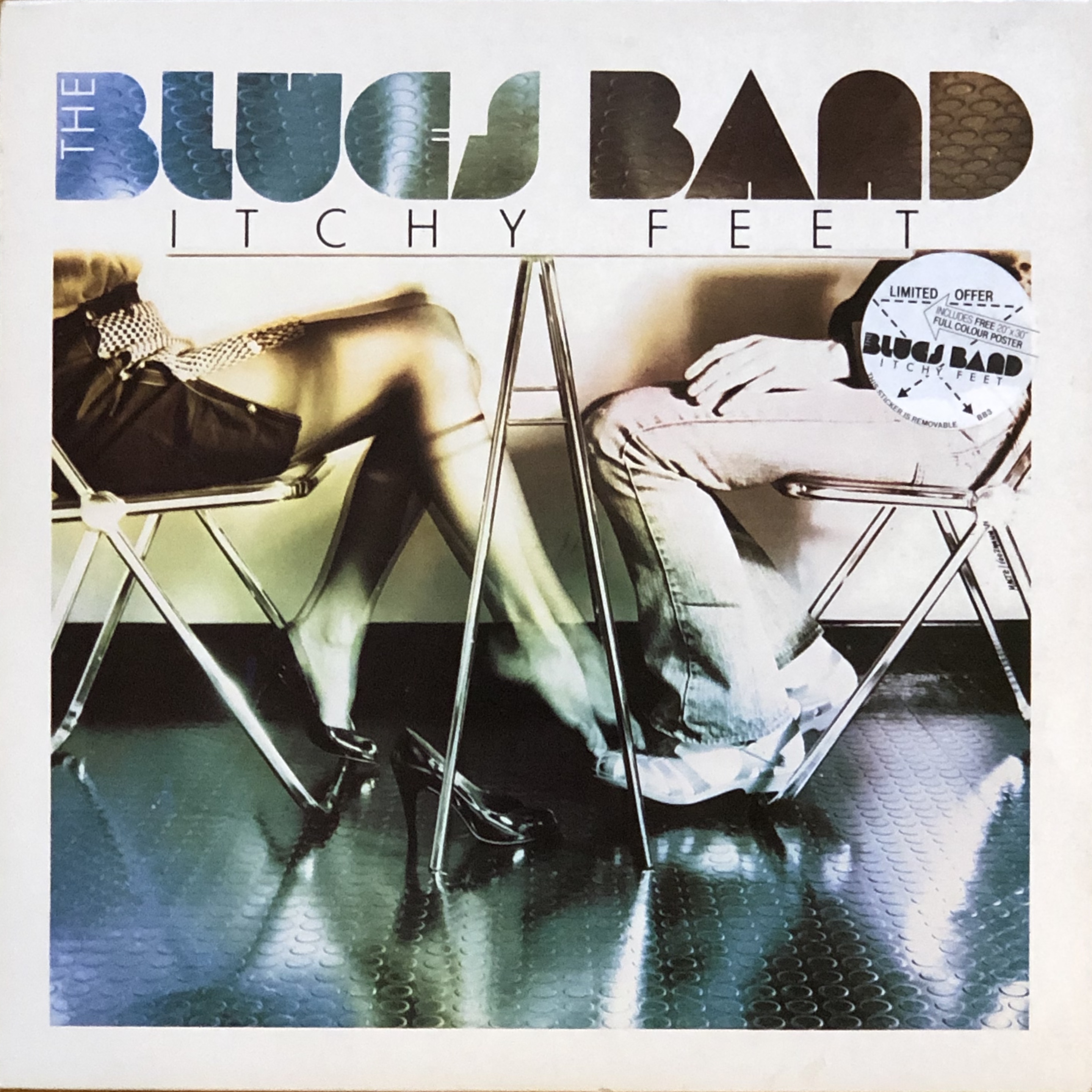
Then I saw an ad for The Blues Band’s album “Itchy Feet” that stated that the cover was designed by Klaus Voormann. I immediately went through my Klaus Voormann collection only to find that I had missed this album (though I had bought the other two Blues Band albums when they came out, and even seen the band live.)
While going through the Voormann albums, I noticed that my copy of Gary Wright’s “Extractions” LP was in less than mint condition. It is a U.S. promo copy with a large cut-out hole through the top right corner of the cover, so I looked on Discogs for a better copy and saw that the U.K. original was released in a six panel poster cover that I had never seen.
The six-panel poster cover for Gary Wright’s “Extractions” LP.
So I ordered both the “Itchy Feet” and the “Extractions” records to “complete” my Klaus Voormann collection even though I’m still missing at least one of his covers. I was lucky that the “Itchy Feet” LP was one of the limited edition pressings that included the large poster of the band in action.
The poster from the “Itchy Feet” album.
I have to say that I feel I’m nearer to having complete collections of these three cover artists. I’ll just have to keep a lookout to see if I find further missing covers.
From March 31st to September 8th, 2019, Moderna Museet in Malmö showed a major part of my collection of Andy Warhol’s record cover art advertised as the first time a complete selection of Warhol’s cover art production was on show. At a forum on record cover art at the Museum on 31st August, 2019, I suggested that we do not actually know if the sixty-eight covers on show are really all the covers produced during Warhol’s lifetime. I noted that new discoveries were still being made–coincidentally, often soon after and exhibition closed. And so it has turned out again!
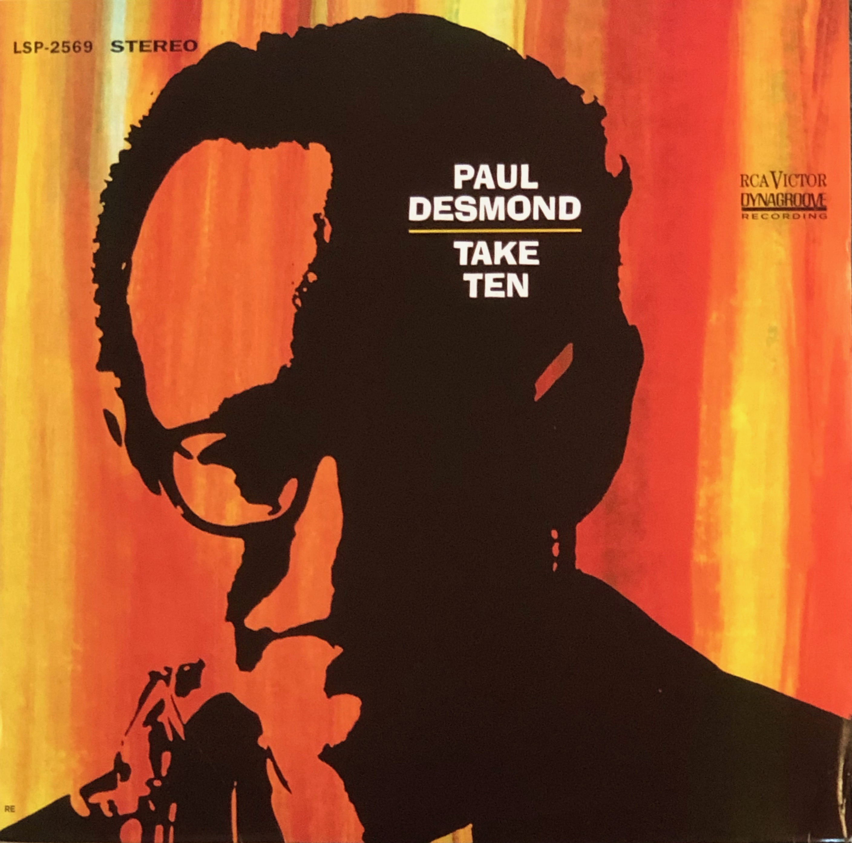
Warhol expert and collector extraordinary, Guy Minnebach, recently visited The Warhol Museum in Pittsburgh and did some further research through Warhol’s letters and invoices collected at the Museum [https://warholcoverart.com/2019/10/13/the-bossa-nova-cover-no-one-knew-was-a-warhol-paul-desmonds-take-ten/]. he turned up an order from RCA Records dated May 1st, 1962 for cover art for an album with catalogue number LPM/LSP 2598. An invoice with the same date had a July 6th written on it, suggesting that that was when it was paid.
Guy didn’t recognise this catalogue number among currently identified Warhol covers and quickly discovered that the number belonged to Paul Desmond’s 1963 album “Take Ten”.
The cover of Paul Desmond’s 1963 album “Take Ten”.
In the nineteen fifties Andy Warhol designed or illustrated about twenty-eight record covers. By the mid- to late fifties he was one of the highest paid commercial artists in New York, but, surprisingly, only three record sleeves were known to have been produced during the sixties; the “Giant Size $1.57 Each”, the “John Wallowitch” covers, and–of course–the famous “banana” cover for the “Velvet Underground & Nico” album. So the discovery of a further cover released in the sixties is sensational.
This appears to be a silkscreen portrait of Desmond against a coloured background. This possibly could be Warhol’s first silkscreen portrait. He only began making silkscreens in August 1962, so he probably had no idea for the cover when the order arrived. There is a sweet story as to how Warhol hit upon the idea of using silkscreens to “mechanise” his art. In 1961, he met a couple of English teenagers, David and Sarah Dalton, at party and invited them to see his art at his home. The Daltons were regular visitors to The Factory and David would in 1966 co-produce the Aspen Magazine box set together with Warhol.
The pop art edition of Aspen Magazine produced by David Dalton and Andy Warhol in December 1966.
David Dalton went on to a successful career as a writer. But I digress, When Warhol met the Daltons, David was 16 and his sister Sarah 14. In early 1962 Warhol was experimenting with ways to speed up the process of producing multiple images on a canvas. He tried using stampers made from various materials but found that he could only produce small images by this method. According to one story, Sarah Dalton was visiting the Factory in early 1962 and saw Andy at work and he complained about the problems of reproducing many images quickly. Sarah was attending art classes at the time and suggested to Andy that he should try silkscreening as she had tried the method in her classes. Sarah would be a regular visitor and When Andy had filmed his first major film “Sleep”, he asked Sarah to edit it. Sarah had no previous experience of film editing but took on the challenge. It was the start of her career as a film editor.
Warhol usually used photographs from which to make his drawings and silkscreens. Thus he used a publicity still from Marilyn Monroe’s film “Niagara” for his “Marilyn” portraits, and a photo of hibiscus flowers, taken by photographer Patricia Caulfield as the basis for his “Flowers” paintings and prints. I therefore suspect that he found a photo of Paul Desmond on which to base his cover portrait. I have been searching for the photo, but without success.
Warhol’s cover design was also used by RCA Italy for a slightly different Paul Desmond album called “The Artistry of Paul Desmond” also released in 1963 and containing six of the original eight tracks from “Take Ten” but substituted “The Night Has a Thouand Eyes” and “O Gato” for “El Prince” and “Samba de Orfeu” on the original US release.
The cover of “The Artistry of Paul Desmond” album.
So, my collection of Andy Warhol covers on show at Moderna Museet in Malmö during the summer of 2019 was incorrectly advertised as being “complete”. The finding of the Paul Desmond album barely one month after the show closed proves the collection to have been incomplete. I wonder how many more Warhol covers will turn up in the future?
Street art has become mainstream. Street artists are increasingly in demand as commercial artists and recording artists are turning to these readily identifiable painters for cover art for their recordings. In America, Jean-Michel Basquiat, Keith Haring and designed record covers in the eighties, and Shepard Fairey, Robert del Naja (aka 3D) and Banksy (the latter two in the UK) produced covers mainly from the nineties onwards.
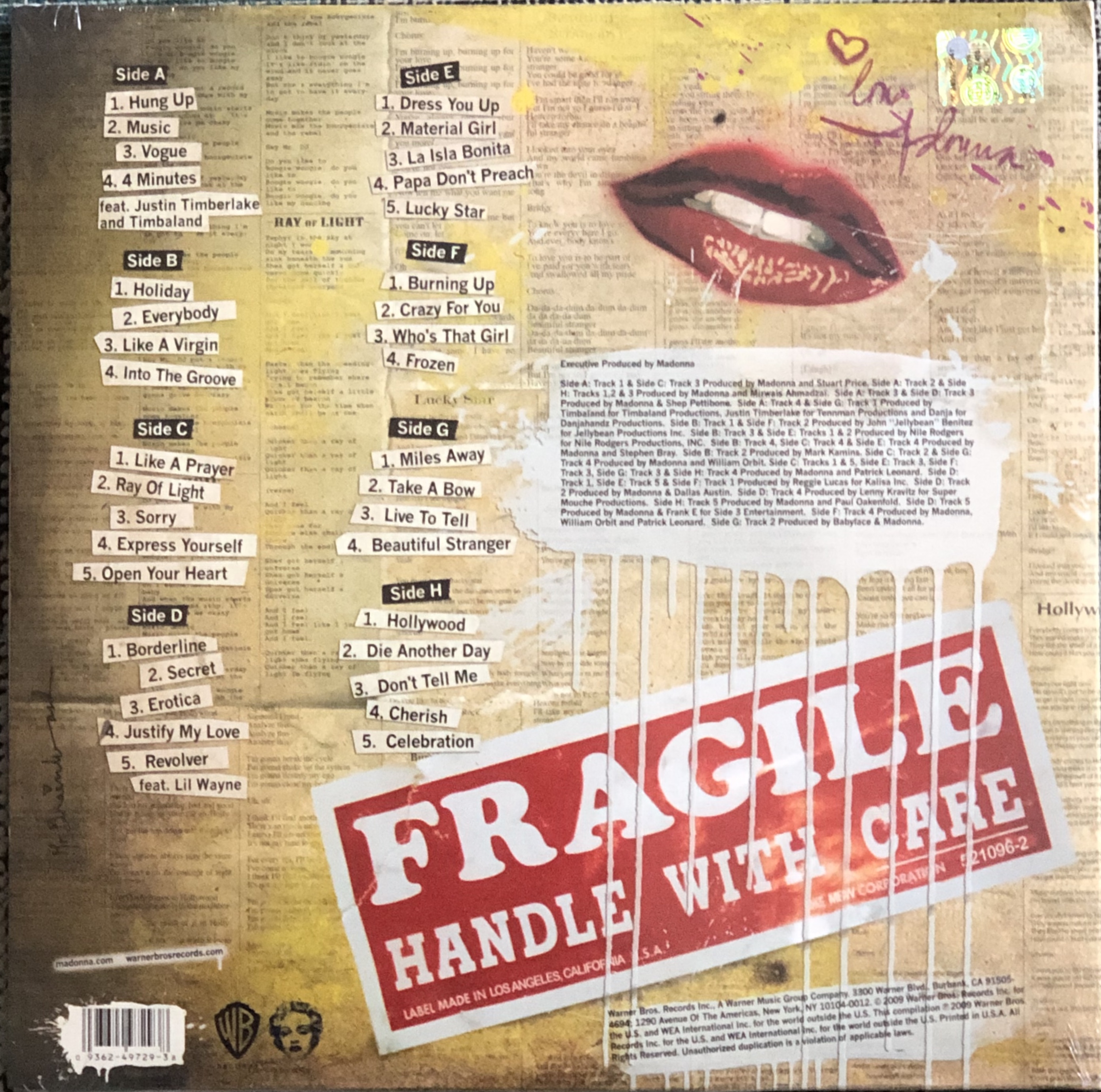
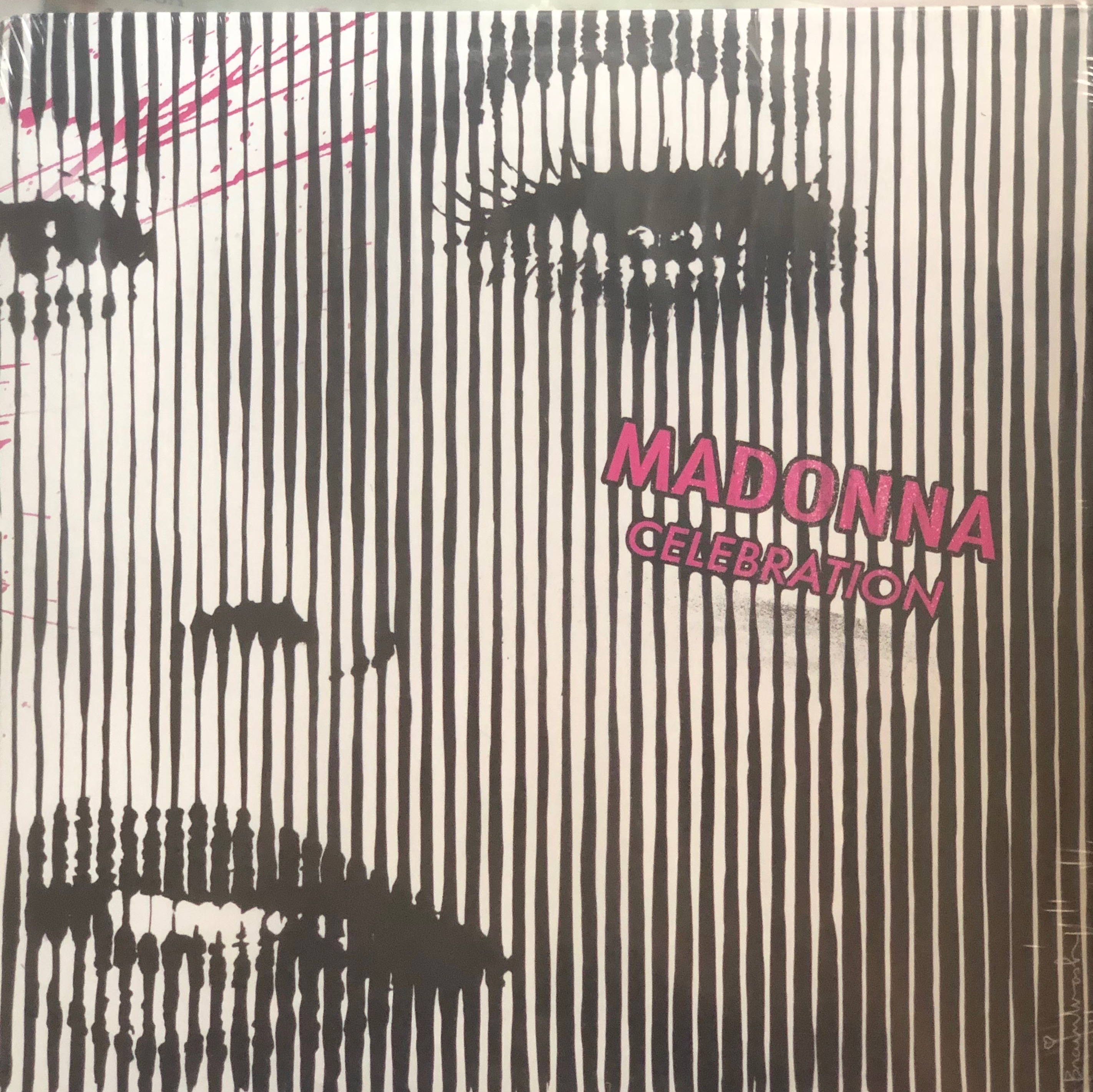
Covers by Basquiat and Fairey‘s art covers are very collectible and many are currently very expensive as they were produced in limited editions. Vinyl covers with Banksy designs are also rare and command high prices. I was lucky enough to start collecting Banksy’s record cover art relatively early and have managed to collect what I consider to be a complete collection of his record cover art. Thierry Guetta–better known as Mr. Brainwash–is a more recent street artist to design record sleeves. So far I have only been able to identify three such covers; all for Madonna. He designed the cover for her 2009 compilation “Celebration” which was released on vinyl as a 4 LP set in a gatefold cover.
“Celebration” 4LP cover.
Rear cover of “Celebration” 4 LP set.
Record Label Side 1.
Record Label Side 2.
Record Label Side 3.
Record Label Side 4.
Record Label Side 5.
Record Label Side 6.
Record Label Side 7.
Record Label Side 8.
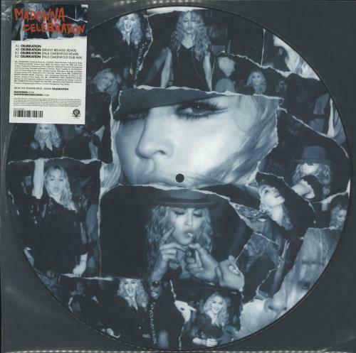
There is also a 12″ EP of “Celebration” remixes.
The cover of the 12″ EP with remixes.
Then there are a variety of CD releases. The standard double CD uses the same Mr. Brainwash image as the LP set, but there is a slightly different (more anemic) variation also.
Alternative CD cover art.
And the 12″ picture disc and CD singles hare the same artwork:
12″ picture disc with Celebration remixes.
The CD single of “Celebration”
A couple of other records turned up when I searched http://www.discogs.com for other cover art by Mr. Brainwash and I fell for one that I thought probably was by him–Travis Barker‘s “Give the Drummer Some“:
Travis Barker’s “Give the Drummer Some” LP cover front.
Travis Barker’s “Give the Drummer Some” LP cover rear.
Unfortunately, this cover is NOT by Mr. Brainwash but is by Pushead (aka Brian Schroeder, who, according to Wikipedia, is a graphic designer and record label owner.) More of his designs may be seen here. Skulls seem to be his speciality!


 While going through the Voormann albums, I noticed that my copy of Gary Wright’s “Extractions” LP was in less than mint condition. It is a U.S. promo copy with a large cut-out hole through the top right corner of the cover, so I looked on Discogs for a better copy and saw that the U.K. original was released in a six panel poster cover that I had never seen.