
I like graphic design and for me minimalism in expression and great typography make a record cover appeal to me. I regularly get asked which is my favourite record cover design. The question is really impossible to answer–could it be “Sgt. Pepper’s Lonely Hearts Club Band”? “Revolver”? “Sticky Fingers”? Something by Vaughan Oliver or Peter Saville? Nope!
Despite collecting cover art by some great designers, there are a couple of covers that always excite me. The first is the late Tony Lane’s design for Toto’s 1981 album “Turn Back”. In my book, a contender for the greatest record cover design of all time!
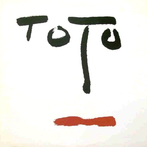
Tony Lane (May 2, 1944–January 1, 2016) is one of record design’s masters, though generally unrecognised. Lane was responsible for revamping the graphic style of Rolling Stone magazine in the 1970s. He was recruited by Bob Cato and John Berg at Columbia Records and designed covers for a wide range of artists including Michael Jackson (“Bad”), Simon & Garfunkel (“Bridge Over Troubled Waters”), Barbra Streisand (“Greatest Hits, Volume 2”), among a host of others. But for me, his greatest moment was this Toto cover!
He even managed to convince Columbia records to move their Walking Eye logo from the top left corner of the cover (where it appeared on every Columbia LP that I have seen since the early sixties), banishing it to the bottom of the reverse.
What more can I say other than the calligraphic design in all its simplicity really rocks!
Close to this, and almost equally exciting, is Chris Bigg’s cover for Pieter Nooten’s & Michael Brook’s “Sleeps With the Fishes” released by 4AD in 1987. For many years Chris Bigg was Vaughan Oliver’s partner in 4AD’s design team v23. His calligraphy was featured on several 4AD covers including the promotional double CD/book “Lilliput”. The “Sleeps With the Fishes” cover stimulates my fantasy and I see all sorts of figures in the calligraphy. I’ll also admit to having a particular liking for covers that use black/red/white colour combinations. They are always dramatic as these two examples show.

I used to have the poster for this cover on my office wall, so I could see it every day.
