Like most collectors of Andy Warhol’s record cover art, I follow the covers advertised on Ebay. All too often sellers call their object “the rarest Warhol cover”. Niklas L challenged me to make a list of what I considered to be rarest covers. I thought I’d list the Top 20 rare covers. It is, of course impossible to rank them exactly, but here is my first attempt, keeping official releases and bootlegs apart. I hope publishing this list will stimulate readers to criticise and comment.
a. Official releases
|
No. |
Artist |
Title |
Comment |
|
1 |
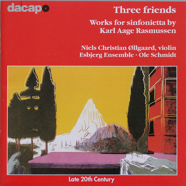
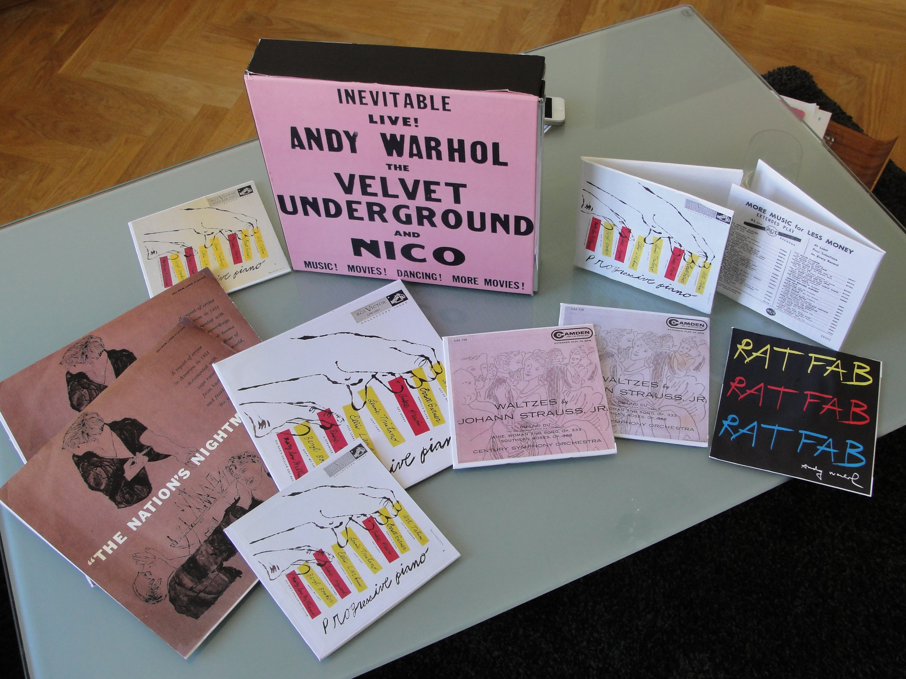
Various Artists
|
Progressive Piano |
Rare because it was probably never released. Lithographs of the cover design exist, however. |
|
2 |
Frank Lovejoy
|
Night Beat |
Probably only 1 known copy |
|
3 |
Andy Warhol |
Giant Size $1.57 Each |
Available in four colour variations. Black on white background (edition of 75 signed and numbered), black on yellow (edition of 75 unsigned, unnumbered), Black on green (edition of 75 unsigned, unnumbered) and black on red (edition of 75 unsigned, unnumbered) |
|
4 |
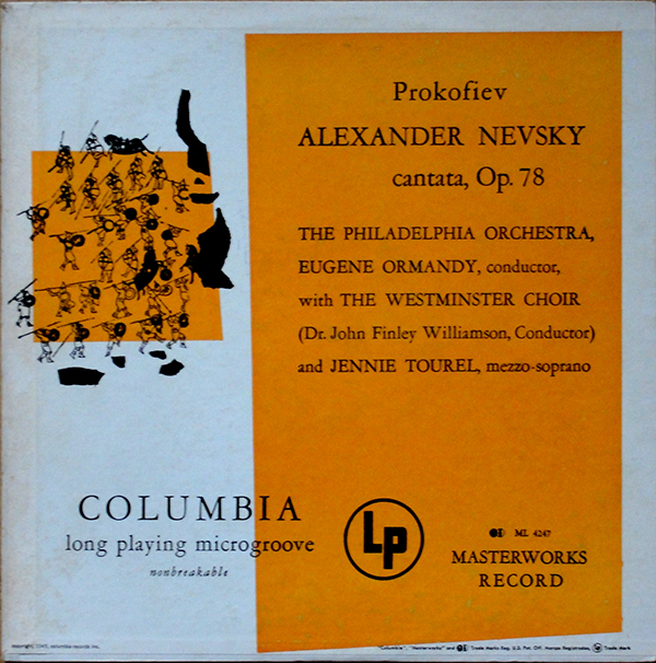
Century Symphony Orchestra |
Waltzes by Johann Strauss, Jr. |
|
|
5 |
Ultra Violet
|
Ultra Violet |
Most copies seem to be cut-outs |
|
6 |
CBS Radio show
|
The Nation’s Nightmare |
Possibly 2 colour variants, one brown and one more grey. |
|
7 |
Arthur Fiedler & Boston Pops |
Boston Pops Latin Rhythm |
|
|
8 |
Johnny Griffin |
The Congregation |
Original Blue Note LP |
|
9 |
Jan Smeterlin |
Chopin Nocturnes (Complete) |
2 LP set in slip case |
|
9a |
Jan Smeterlin |
Chopin Nocturnes (vol 1) |
Single LP |
|
9b |
Jan Smeterlin |
Chopin Nocturnes (vol 2) |
Single LP |
|
10 |
Wolfgang Amadeus Mozart |
4 Divertimenti |
|
|
11 |
RATFAB
|
Det brinner en eld / Mörka ögon |
Sweden only single |
|
12 |
John Wallowitch
|
Another Side of John Wallowitch |
His first album is easier to find |
|
13 |
Walter Steding & The Dragon People |
The Joke / Chase the Dragon |
|
|
14 |
Cool Gabriels
|
Cool Gabriels |
|
|
15 |
Moondog
|
Story of Moondog |
Original on Blue Note |
|
16 |
J. J. Johnson, Kai Winding & Bennie Green |
Trombone by Three |
16 RPM version on Prestige |
|
17 |
Margarita Madrigal |
Madrigal’s Magic Key to Spanish |
More valuable with the book |
|
18 |
Various Artists |
MTV – High Prority |
The version with yellow shading to the MTV logo |
|
19 |
Velvet Underground & Nico |
Velvet Underground & Nico |
Original ”Torso” back cover |
|
19a |
Velvet Underground & Nico |
Velvet Underground & Nico |
”Torso” cover with black sticker |
|
20 |
Art Gallery of Toronto |
Cronenberg on Warhol |
Limited edition CD – 2 copies have surfaced to date. |
|
21 |
Jeanne Moreau & Günther Kaufmann |
Each Man Kills the One He Loves / Young and Joyful Bandit |
7” single |
Bootlegs
|
No |
Artist |
Title |
Comment |
|
1 |
Rolling Stones |
Emotional Tattoo |
Some copies have orange vinyl |
|
2 |
Velvet Underground |
Screen Test: Falling in Love With the Falling Spikes |
There are three colour variants of this release: one with a blue flower, one with a black and white cover and a re-release with a red cover |
|
3 |
Velvet Underground |
Orange Disaster |
|