As a child, my parents frowned on popular culture – unless it was Sinatra or musicals. Comics were a definite “no-no”. So I had to sneak looks at The Eagle, Beano, Dandy and others. I only caught up on Asterix and Tintin much later. This probably explains why, today, I am fascinated by comics; the parental disapproval as well as the obvious evolution of comics as high art–from Roy Lichtenstein onwards.
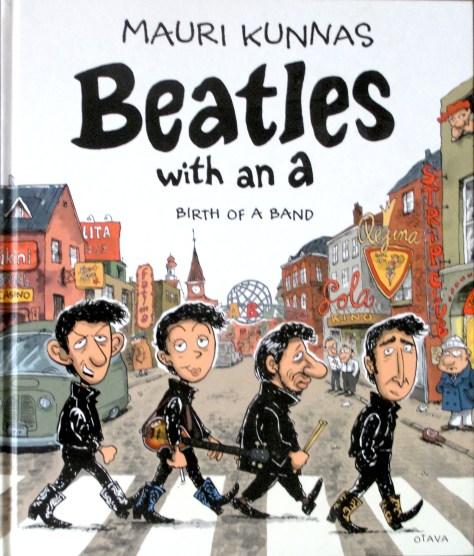
Mauri Kunnas is is a great illustrator and is well-know as the author of many children’s books. His books are usually populated with animals dressed in human clothes and up to all sorts of adventures. Less well-known is the fact that he plays in a cover band and loves 60s and 70s British bands like the Beatles, Stones and Hollies.
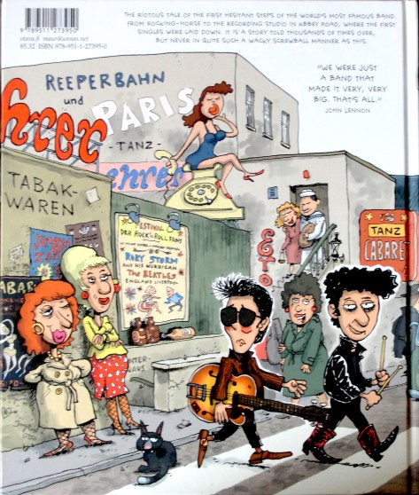
Last year, on a visit to Helsinki, my wife and I went into publishing house Otago’s shop and I saw Mauri Kunnas‘s recently published “Beatles With an A“, in Finnish (original title “Piitles – Tarina erään rockbandin aikutaipaleesta.“). It was a comic strip history of the early life of the Mop Tops up to and including the recording of “Love Me Do“. There was also a version in English Great research and clever drawings–obviously I had to have it!
Kunnas has also written a companion book on the Rolling Stones entited “Mac Moose ja Jagge Migreeni tapaus” which, strangely, only seems to be available in Finnish and Portuguese but not in English!
Mauri Kunnas Finnish book about the The Rolling Stones.
Then for my most recent birthday my daughters, well conversant with my interest in Andy Warhol‘s art, gave me “Where’s Warhol?” by Catherine Ingram & Andrew Rae. This large-format book is made up of a series of twelve scenes each populated by hundreds of people. These range from Studio 54 through places and times before Andy was born (such as Marie Antoinette’s execution and Michelangelo painting the Sistine Chapel) to Basquiat in Washington Square. The clever drawings are by Andrew Rae and many celebrities are recognisable in each double spread picture. The game is to identify all of them and to find Andy among the host of figures. Catherine Ingram has written explanatory essays at the end of the book with a key to let one know which celebrities are included in each scene.
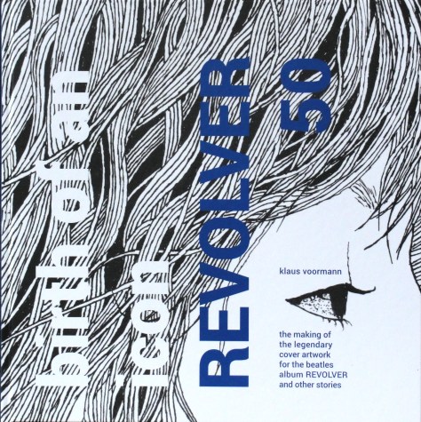
The latest addition to my comic library is Klaus Voormann‘s “Birth of an Icon-Revolver 50“. His history of how the Grammy-winning cover for The Beatles‘ seventh album was created. Klaus calls it a”graphic novel”, obviously a misnomer as it is as near as you can get to a true story. I am an ardent admirer of Voormann‘s draughtsmanship and–as readers of this blog will know by now–have spent endless hours searching for records with cover art by him.
Klaus Voormann’s new book celebrating the fiftieth anniversary of “Revolver”.
The quality of the drawings is amazing. Just imagine (pun intended) how long it must have taken to produce the 32 pages of drawings for the graphic novel–and (if I have counted correctly, a grand total of 166 separate drawings throughout the book! Even with the advantage of digitalising backgrounds so that he only needed to redraw the foregrounds in some pictures, that’s a massive amount of work! Anyway, “Birth of an Icon-Revolver 50” is a genuine treasure.
This has really been a great week for me as a collector of Klaus Voormann‘s record and CD cover art. German musician Volkwin Müller has either read this blog or seen my list of Klaus Voormann‘s record covers on Rate Your Music and informed me of two recent releases of his–both with cover art by Klaus–that weren’t on my list. So, a big thank you to Volkwin. The CDs are Volkwin Müller & Friends “Strawberry Songs” from 2012,
Volkwin Müller’s “Strawberry Songs” CD with Klaus Voormann’s portrait of John Lennon.
and Volkwin‘s “Mit anderen Augen” CD from 2016
The cover of Vokwin Müller’s CD “Mit anderen Augen” with Klaus Voormann’s portrait of him.
But the greatest thing was the arrival of Klaus Voormann‘s new book “Birth of an Icon-Revolver 50“. Well, The Beatles‘ “Revolver” album was released (in the U.K.) on 5th August 1966 and John Lennon asked Klaus Voormann, friend of the Fab Four since their Hamburg days and in 1966 living in London and playing with various bands including the Mike d’Abo fronted Manfred Mann, to design a cover for their new record. This book tells the story in comic strip form of how Klaus Voormann came to design the cover which earned him a Grammy.
Klaus Voormann’s new book celebrating the fiftieth anniversary of “Revolver”.
Two of The Beatles‘ record covers have won Grammys for their design. First was Klaus Voormann‘s cover for “Revolver” and then the album that followed it “Sgt. Pepper’s Lonely Hearts Club Band“, which earned Peter Blake and Jann Haworth Grammys for their joint design. Klaus Voormann has been nominated for a Grammy one further time–for the design of his “A Sideman’s Journey” box set. He was narrowly beaten by Rob Jones‘s and Jack White‘s design for the White Stripes‘ box set “Under the Great Northern Lights“.
The “Birth of an Icon-Revolver 50” book is a beautiful production with many photos and text in English and German. It can be ordered from Klaus Voormann’s site http://www.voormann.com.
While researching the book, I discovered the August/September 2016 number of the German Magazine “Good Times” which has five cover variations of portraits of The Beatles by Klaus Voormann:
Thus Klaus Voormann (born 29th April 1938) is still going strong at the age of 78. May he long continue to produce great record covers.
I have been collecting record cover art since the 1980s. First designers including Vaughan Oliver and his collaborations with Nigel Grierson as 23 Envelope and, later, as V23 with Chris Bigg. Neville Brody ,with his covers (mainly) for the Fetish label, was another designer I collected. Then, when I moved to Sweden, I started collecting covers by Martin Kann, who is responsible for the cover art for Swedish rockers bob hund. Most of the record covers I had by these designers disappeared when I had to sell my record collection and I had to decide which designers’ covers to keep.
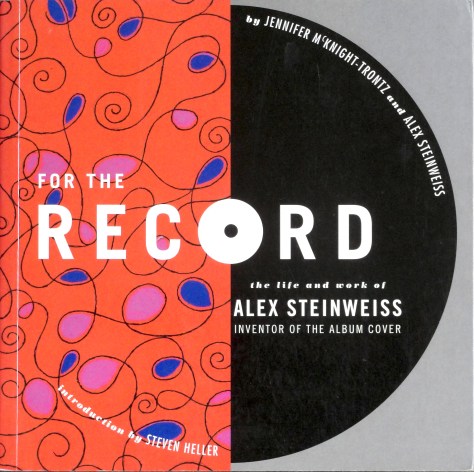
I thought I knew the history of record cover design, but to my eternal shame, I only found out that one individual, Alex Steinweiss (1917-2011), had started the whole field of record cover design in about 2005 when I read Nick de Ville‘s great book on record cover design “Album-Style & Image in Sleeve Design” from 2003.But I HAD for years seen some of Steinweiss‘s work at my parents’ home! They had a condo i Sarasota, Florida, for many years. Sarasota was Steinweiss‘s retirement home and he produced posters for the celebrated Sarasota Jazz Festival and my father had bought three of these posters, which hung on a bedroom wall at home, but I had no idea Steinweiss had designed record covers! Once I had seen de Ville‘s book, I started looking for some Steinweiss covers. They were not easy to find as few Internet sellers recognised Steinweiss‘s work and sold records only by their artist/title. Then, in 2006, I bought Jennifer McKnight-Trontz’s “For the Record: The Life and Work of Alex Steinweiss, Inventor of the Album Cover“. A great place to start researching Steinweiss‘s production of over 2500 record covers.
Jennifer McKnight-Trontz’s “For the Record-The Life and Works of Alex Steinweiss“
Steinweiss may not have been the first to illustrate record covers–here the purists argue–but he was the first to convince a record company that pictures on covers could actually sell records. In 1939, at the tender age of 22, he was hired by Columbia Records as art director for the company’s recorded music division, principally to be responsible for advertising material.
Few dedicated record shops existed in the 1930’s. Music was mainly sold as sheet music and records were usually sold in general stores, electrical appliance stores and i a few record shops. Records were only available as 78 r.p.m shellac discs, ten or twelve inches in diameter. Single discs were generally packaged in brown envelopes with or without a central hole that showed the record label with the title and artist on the record. Longer works, such as classical recordings had to be split onto several discs and were packaged in book-like albums that contained any number of records from two to ten. The front covers were generally plain perhaps with record company, the record’s catalogue number and the record title. They were affectionately known as “tombstone covers”!
A “Tombstone cover” as albums were sold prior to Steinweiss deciding to add pictures to covers.
The album’s spine showed the title and artist and the record’s catalogue number. These albums were generally stored like books in a library, with only the spines visible.
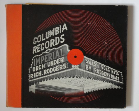
Steinweiss, during his artistic studies, had seen the power of pictures in selling and suggested to his superiors that adding a picture to illustrate the music might actually increase sales of these albums. Despite initial scepsis the directors allowed Steinweiss to produce a limited number of pictorial covers and the first “Smash Song Hits by Rodgers & Hart” appeared in 1940 (Jennifer McKnight-Trontz says 1939).
Alex Steinweiss’s first picture cover for Columbia Records “Smash Song Hits by Rodgers & Hart” from 1940.
I collected about fifty Steinweiss covers and was lucky enough to find a copy of the “Smash Song Hits by Rodgers & Hart” in really good condition early on. This album seems extremely rare as I have been on a fruitless search for a second copy ever since. It seems important for anyone particularly interested in record sleeve design to have this seminal design, so I kept it when my other Steinweiss covers vanished.
Of course, Steinweiss‘s new picture covers increased the sales of Columbia Records’ Albums and he was allowed to continue producing sleeve art. When, in 1948, Columbia introduced the microgroove LP, it fell to Steinweiss to design a suitable packaging and he came up with the LP record sleeve with a design on the front, text on the rear and on the spine. Many of the designs he produced for the 78 r.p.m albums were transferred when a work was reissued in the new format. But Steinweiss‘s burden of designing new covers meant that he couldn’t do them all himself. He enlisted other talented designers to work for Columbia, including Jim Flora and a commercial artist named Andrew Warhola, just arrived in New York from Pittsburgh.
Steinweiss (in dark suit) with other Columbia employees including Jim Flora (With the striped tie standing behind Steinweiss).
Steinweiss left Columbia in 1949 and went freelance. He subsequently designed covers for several other record companies including Everest, Decca and London and RCA.
in 2009, Kevin Reagan and Steven Heller convinced Taschen to publish a luxurious book simply entitled “Steinweiss” with the subtitle “The Inventor of the Modern Record Cover“. I addition to a standard edition Taschen produced an art edition; one hundred copies numbered 1-100 contained a print of Steinweiss‘s design for Decca Records’ recording of Igor Stravinsky‘s “The Firebird“, the second time Steinweiss had designed a cover for that work.
The lithograph of Steinweiss’s design for Decca Records’ recording of Stravinsky’s “The Firebird Suite”.
There were also a further one hundred art copies, numbered 101-200, that did not contain the print. Steinweiss, aged 92, was involved in the production of the book and the art editions were all signed by him as were the prints included in the first one hundred copies. My copy is No. 96.
The book contains full-sized pictures of over two hundred of Steinweiss‘s cover designs as well as pictures of posters and books and ceramics that he made. A worthy tribute to the man without whom I probably wouldn’t be collecting record cover art.
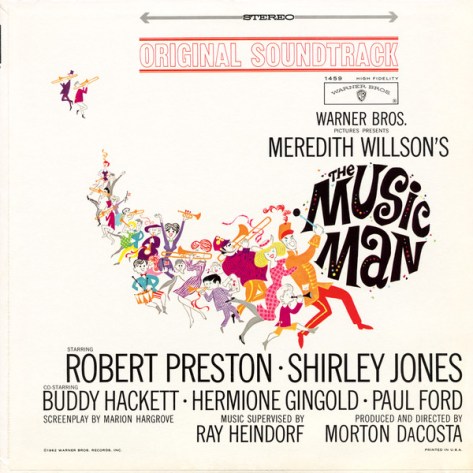
I was brought up on musicals–pre Andrew Lloyd-Webber musicals–like South Pacific, Oklahoma, Annie Get Your Gun and West Side Story. My father’s favourite was Show Boat. I think my favourite has turned out to be Meredith Willson‘s “The Music Man“, a story of a trickster and fraud who sells boys’ bands and is himself tricked by falling in love with a town’s librarian. The show had its American premiere in 1957 and several of the songs became hits, not least “‘Til There Was You“, which was covered by many artists, including Peggy Lee. The Beatles heard Peggy Lee‘s version and it became a standard in their Hamburg days and was one of the songs they sang in their audition for Decca records in 1962. The song even appeared on the “With the Beatles” album. Paul McCartney has been quoted as saying that he didn’t know the song came from “The Music Man” until much later.
The cover of the 1962 original soundtrack recording of “The Music Man”.
Several times a week I trudge off to the recycling depot with detritus resulting from the shopping done in the previous days. I cannot get my head round the amazing amount of plastic, paper, metal and glass that two people can generate in such a short time. And just thinking about the environmental consequences of
a. producing all that material, and
b. recycling it all
makes my mind boggle!
I almost long for the “good old days” when one could go into the grocery store and pick biscuits out of a tin (the broken ones were cheaper), have your ham sliced in front of you knowing that it was home cooked and not delivered to the shop in a plastic pack. Meredith Willson‘s and Franklin Lacey‘s characterised this type of highstreet shop in the “Rock Island” introduction/overture to “The Music Man” as “a little 2 by 4 kinda store“.
So, what’s “The Music Man” got to do with recycling? Well, the opening scene/overture is set on a train with a crowd of travelling salesmen on their way to River City, Iowa. They get into a discussion on the conditions for notions salesmen (itinerant salesmen who went from town to town knocking on doors to sell their wares). The discussion is orchestrated to sound like the noise of a train. One of the salesmen suggests that the decline in sales is due to the arrival of the Model-T Ford, which allowed people to travel to town to buy their goods. Another suggests that it wasn’t the Model-T at all, but the establishment of department stores (“modern, departmentalised grocery stores”, in the words of the song). However, a third salesman chimes in with the REAL reason why travelling salesmen have hit on harder times. He blames packaging of goods:
“Why, it’s the U-needa biscuit
Made the trouble
U-needa, U-needa,
Put the crackers in a package, in a package,
The U-needa biscuit
In an air-tight sanitary package
Made the cracker barrel obsolete, obsolete.”
Yet another salesman confirms that the cracker barrel indeed disappeared like a list of other things:
“Cracker barrel went out the window
with the Mail Pouch cut plug chawin’ by the stove
Changed the approach of a travelin’ salesman
Made it pretty hard.”
And the first salesman bemoans the loss of other things:
“Gone with the hogshead, cask and demijohn. Gone with the sugar barrel, pickle barrel, milk pan,
gone with the tub and the pail and the till.”
And there you have it–the link between “The Music Man” and recycling! If the Nabisco Company hadn’t put its Uneeda biscuit in “an airtight sanitary package”, packaging of groceries might never have become the problem it is now and I wouldn’t have to visit the recycling centre several times a week!
I can’t help it but I’ve sort of become obsessed with this recording and its many versions. I must apologise to Eric Clapton‘s myriad of fans, but my interest is not in the music but in Peter Blake‘s cover art. I have described this in a previous post.
Eric Clapton performed a total of 42 shows at London’s Royal Albert Hall in 1990 and 1991. All were recorded but Clapton was not satisfied with the 1990 concerts and “24 Nights” included recordings from various nights between 5th February and 9th March (the 24 nights in the record’s title). Its primary release form was a double CD, released on 8th October 1991, just seven months after Eric Clapton concluded the 24 shows. The album was simultaneously released on double LP and double cassette–both these being pressed in Germany.Warner Brothers Records also produced a 73 x 31 cm promotional lithograph with Peter Blake’s drawings from the “24 Nights” sessions.
Perhaps it is important to add that while Peter Blake did the drawings used on the cover of the album, the design group Wherefore Art (David Costa) were responsible for the final design/layout of the cover art.
I also posted a description of Genesis Publication’s boxed set “24 Nights – The Limited Edition: The Music of Eric Clapton-The Drawings of Peter Blake” published in 1991 and mentioned how this project led to a long-term friendship between musician and artist that has resulted in several more record covers. I have also just found out that DavidCosta‘s Wherefore Art design bureau assisted Genesis Publications in the design of the limited edition box set of “24 Nights“.
My collection includes the double LP and a couple of singles from the album as well as the Genesis Publications’ Limited Edition. In 2009 I curated an exhibition of Peter Blake‘s record cover art at Piteå Museum, produced in association with Jan Wimander and Piteå Dansar och Ler festival. Sometime in the months preceding the opening of the exhibition I came across thirteen prints of drawings by Peter Blake that were obviously related to the “24 Nights” release, but I had no idea how, or where they came from.
Having only bought the Genesis Publications’ version in February 2016, I could check the prints against the pages in the Scrapbook of Peter Blake‘s drawings and photographs (by Peter Blake, Graham Salter and Brian Roylance) in the set. My thirteen prints were single-sided and were copies of pages in the “Scrapbook“. Even the paper quality resembled that in the book. However, all the Scrapbook‘s pages were printed on both sides, so my prints could not have been cut out of one of the books.
I have not been able to find out any more about the prints, or where they came from, but they make an interesting addition to my Peter Blake collection.
The Genesis Publications limited edition box also contained another book “Commentary” by Derek Taylor, a pack of memorabilia (plectra, guitar strings , badge, backstage pass etc.) and a folder with two CDs of the “24 Nights” recordings including three extra tracks– ‘No Alibis‘, ‘I Shot the Sheriff‘, ‘Layla’ – orchestra introduction’— purported not to be available elsewhere.
In my search for more record covers with Peter Blake‘s art I discovered that Reprise Records, to whom Clapton was under contract, had released a two-track 7″single from the “24 Nights” album (“Wonderful Tonight/Edge of Darkness“) with cover art by Peter Blake. A few months ago I stumbled across a six-track, “collectors edition” CD EP “Wonderful Tonight” that I had not heard of previously that had the same cover art as the 7″ single. The remaining tracks on the CD were: “No Alibis”, “I Shot the Sheriff”, “‘Layla’ – orchestra introduction” and “Cocaine” and a second version of “Wonderful Tonight”— all from the “24 Nights” sessions! Thus it was possible for collectors to obtain the three, so called “exclusive” tracks from the Box set for a considerably more modest price.
The cover of the Collectors Edition CD EP of “Wonderful Tonight”.
Just as another piece of information, Clapton had released a version of “No Alibis” recorded on his “Journeyman” tour on a single in March 1990–before his first series of Albert Hall concerts.
And, then there were two bootleg CDs of recordings from the “24 Nights” sessions. Beano records released a CD of the 5th February 1991 concert entitled “24 Nights-First Night, 5th February 1991” and another CD was issued of the fourth night’s concert at which George Harrison had been guest artist. This was a CD-ROM with no record company identified.
I think this just about exhausts what I have been able to find out about the recordings of the “24 Nights” album. I think I can now move on.
The War, Capitalism & Liberty exhibition of works by the artist known as Banksy has been on show at the Palazzo Cipolla in Rome since 24th May 2016 and ends today. Here’s a nice video of the exhibition as a reminder of what was on show.
It’s a nice reminder of the show for those who managed to get to see it and a teaser for those who didn’t. I have heard some rumours that the exhibition, or parts of it, might travel, but nothing definite. Watch this space for future developments.