Tom Waits in Concert, 1999.

There are artists who don’t tour very often and some of my favourites seem only to tour once in blue moon. Such artists are Randy Newman, Joni Mitchell — and Tom Waits.

I remember his concerts at Stockholm’s Cirkus on July 13th and 14th, 1999, very well. We were living in Luleå then and had to travel down to Stockholm to our little Stockholm flat for the concerts. And I’ve lately been clearing out my storage room and came across a whole lot of memorabilia, including the tickets for Tom Waits’s concerts promoting his Mule Variations album. Well, in addition to the tickets, I found that I had gone to the trouble of making set lists of both nights’ concerts.

These concerts were really very expensive — costing SEK 600 per person (about GBP 50 or USD 80), so for two people for two nights it meant an outlay of SEK 2400! Unheard of in 1999. But Cirkus is a great concert venue, with great acoustics and we had seats quite high up and to the right of the stage. On the first night, Tom sauntered into the theatre entering though a door just above us and walked down the stairs past our seats and on down to take his place on the stage. The first nights’ concert went on for over three hours. For the second night it seemed that he had had instructions not to go on for so long, so the show only lasted a bit over two and a half hours. The first night was magical and the second felt a bit like a disappointment after the previous evening. Perhaps we should have been satisfied with one night.

Tom Waits Set list
Te set lists for both concerts and our tickets.

It looks from te set list as though the second night should have been longer — but I can guarantee that it wasn’t.

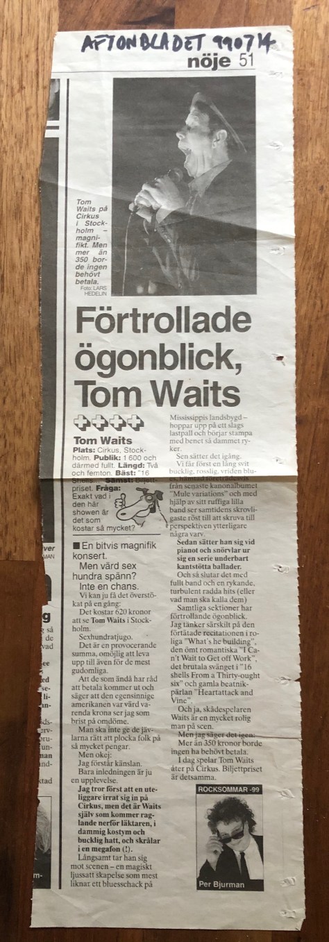
Per Bjurman, reviewing the concerts said Waits was great but thst the ticket price was extortionate!
Tom Waits review

Anyway, the first night was magical! I would pay the same to see Tom Waits again — should he ever decide to come over.

My Poster Production.

When I was in medical school from 1962 to 1968, I was involved in the Students’ Union and somehow got into a group responsible for organising student dances. These were the heady days of Swinging London, Carnaby Street and all things psychedelic and together with Andrew Batch, I started producing posters for dances, balls and many just for fun. Heavily influenced by American west coast art I painted many posters for dances we called “Inflam” as well as for lectures to be held in the hospital. There were several notice boards around the Guy’s Hospital campus and therefore four posters were required for each event. Many copies disappeared but I managed to save at least one copy of many of the posters, which have followed me around for the last fifty-plus years. For the past seven years they have been languishing in my flat’s cellar storage.

In the past week I have been trying to go through all the detritus that I have collected over the years. Old diaries, out of date credit and membership cards, books and a few records that no longer deserve a place in my collection. However, the most space-consuming articles were my posters and prints, collected over many decades. I started to look through the large folder containing most of the posters I had painted between 1966 and 1968. I was astonished (and a bit proud) of my typography, produced at a time when fonts were not easily found, but had to be copied manually. I have thus far found over forty posters and many friends have been impressed by my handiwork. A couple of fellow students have had memories awakened by seeing them again after such a long time.

Inflam posters:
fullsizeoutput_6956fullsizeoutput_692dfullsizeoutput_6940fullsizeoutput_6924fullsizeoutput_692cfullsizeoutput_6942

Party & Dance posters:

Lectures and gatherings:

Plays:

Art Posters:

There are a few more that I might add later. But I was surprised to see that the majority of my artworks had survived more than fifty years of being ignored. There was one unfinished poster that I found and I decided to finish it — four hours of painstaking draftsmanship and it was done:

This poster is called Johanna’s Not Here. Reading the text may give a hint as to why it’s got that title.

I’ve put some of these posters on Facebook and several FB friends have suggest I arrange an exhibition of them. But I’ve no idea how to go about it. So they’ll have to stay exhibited here. Perhaps I’ll get around to painting some more in the near future.

Miguel Bosé — More on His Warhol Covers.

I am lucky to count Guy Minnebach as a  friend as he is the source of much of my knowledge about Andy Warhol’s record cover art. I first got to know Guy sometime around 2005 when we shared information about Warhol covers and Guy tipped me off about covers I didn’t have. Then when I was about to curate the Happy Birthday, Andy Warhol exhibition at Piteå Museum in 2008, Guy lent me several extremely rare covers to include in the show and then arrived to co-curate and help hang the show. We have remained in contact ever since and Guy was a founder member of the Warhol Cover Collectors Club.

His knowledge of Andy Warhol’s art is impressive and he has identified a number of record covers and designs previously not known to be by Andy Warhol. He also writes about Warhol covers on his Andy Earhole blog, which I heartily recommend to anyone interested in Warhol’s record cover art.

In a blog post in November 2016, Guy described the June 1983 edition of the Spanish music magazine El Gran Musical, which published an interview with Miguel Bosé about his new album Made in Spain that described how the cover art came about. It has taken me almost four years to find my own copy of the magazine.

El Gran Musical-cover
The June 1983 edition of El Gran Musical.

In 1983 Latino star Miguel Bosé’s manager contacted Andy Warhol in the hope that he would design the cover for Bosé’s as yet untitled album planned for that year. He contacted Warhol expecting the cold shoulder but was surprised that Warhol immediately agreed to providing a portrait for the cover and Bosé first spent two days in New York (presumably for the photo session with Warhol) and later a further two weeks while Warhol made the video for Bosé’s Fuego single.

As can be seen in the article, Warhol photographed a bare-chested Bosé in front of a white screen. Warhol then produced a unique series of five portraits from the Polaroids taken at that session. It seems highly likely (as Guy Minnebach suggests) that Warhol also came up with the title Made in Spain for the album, having been involved in Loredana Berté’s Made in Italy album in 1981. Made in Spain must have seemed a logical title after Made in Italy. Guy also speculated that Warhol had also done the typography for the album but Bosé has said that he did it himself although it does seem quite Warholian.
A double-sided poster of Warhol’s artwork for the album was included in the El Gran Musical magazine.

El Gran Musical-poster1
One side of the poster.

The reverse showed The Police.

El Gran Musical-poster2
The reverse of the poster.

Bosé’s record label CBS released a limited promotional folder for the Made in Spain album. This contained the full 12 inch LP as well as 7 inch and 12 inch copies of the Fuego single and a presentation folder that included a fold out poster of the cover artwork.
Made_in_Spain poster-800

Bosé was obviously so pleased with Andy Warhol’s design that he used it on his 1983 Italian album Milano – Madrid and on the covers of the Fuego and Non Siamo Soli singles as well as on the Made in Spain album.

I have both the Made in Spain (both the standard LP and the CBS promo folder) and Milano – Madrid albums along with the standard seven inch Fuego and Non Siamo Soli singles completing my collection of Miguel Bosé’s records with Warhol’s cover art.

Kraftwerk and Me.

The recent death of Kraftwerk’s co-founder Florian Schneider reminded me of the band’s concerts I have been lucky enough to see.

My introduction to German electronic music was via Tangerine Dream’s album Phaedra that I bought in 1974. I also owned several other of their albums and a single Can LP. I was aware of Kraftwerk at the time but didn’t have any of their albums until 1998 when I first saw them live.

I was one of the Medical Crew at the year’s Roskilde Festival and Kraftwerk were appearing there in (I think) the Green Tent. I only have dim memories of seeing the band members playing standing on a sort of balcony in the tent and no memory at all of what songs they played. I just remember being excited to see this mythical band live.

I bought the albums Man Machine, Radio-Activity and Trans-Europe Express thereafter and, sometime later, probably around 2010, bough a fantastic Mensch Maskine knitted sweater.

kraftwerk sweater
My Kraftwerk sweater.

I have been an on-and-off member of the Tate Museums and in 2013 saw that Kraftwerk were going to play live in the Machine Hall at the Tate Modern. They were going to play  eight concerts one after the other on separate nights from 6th February through to the 15th (having a night off on the Sunday.) By the time I found I would be in London on some of those dates tickets were, of course, sold out. So I succumbed to temptation and searched Ebay for tickets and bought a pair for Thursday 7th February at an extortionate rate. So donning my Kraftwerk sweater I went to the show.

Kraftwerk Tate Modern
Before the show at the Tate Modern.

We received our 3-D glasses and a souvenir booklet as our armbands were checked.

The concert was due to start at 21.00 h and went on for over two hours. Everyone sat on the concrete floor of the Turbine Hall as the swirling sounds enveloped us and the 3-D projections leaped out of the screen. This was Radio-Activity evening but they played a selection of songs including The Robots, Computer-World, Trans-Europa Express, Autobahn, Die Mench-Maschine and others. A wonderful experience! The Wallpaper folder contained a short introduction by Ralf Hütter and two-page spreads of pictures from Kraftwerk’s slides.

I was also a member of Stockholm’s Moderna Museet and was really happy when the museum announced that there would be an exhibition Dansmaskiner – från Léger till Kraftwerk that opened on 22nd January 2014, which Ralf Hütter had been involved in planning. In addition Kraftwerk would play two concerts at Cirkus on 21st and 22nd January. I was lucky to get tickets for the 21st January.

fullsizeoutput_68a2
My Kraftwerk ticket.

As far as I remember, the set was substantially identical to that at the previous year’s show at the Tate Modern. But we didn’t get to keep our 3-D glasses this time.

Now I can simply play the music and reimagine the 3-D films that accompany them.


More on Andy Warhol and the History of His Silkscreens and the New Warhol Biography by Blake Gopnik.

In February 2018 I wrote a potted history of Andy Warhol’s silkscreens (you can read it here). Much new information had emerged since thanks to Blake Gopnik’s new biography Warhol — A Life as Art.

Gopnik Warhol-fr cropped
Blake Gopnik’s 2020 biography Warhol — A Life as Art.

The story as I understood it back when I wrote that post was that Warhol had been searching for a way to mechanise his art, enabling him to produce many similar images with a minimum of effort. He had developed his characteristic dot-and-blot technique that allowed him to produce a third degree copy of an original drawing or photograph. Fist he would trace the image to be reproduced and then he would tape another paper so that it folded over the traced image and then he would ink the tracing an inch or so at a time and blot the the ink with the paper he had taped to transfer the image in reverse onto the second sheet. This was a time consuming method and produced only a single copy. He later tried making stamps to print recurring images, but was limited to relatively small images. He produced his S & H Green Stamps print by this tedious method. According to several authors, Warhol got the idea of silkscreening from the teenaged Sarah Dalton, who, together with her brother David, Warhol had taken under his wing in around 1961.

However, Gopnik has researched the subject in greater detail. Warhol certainly had experience of silkscreening during his years  (1945-1949) at Carnegie Tech and often visited the avant guard Outlines Gallery in Pittsburgh where gallery owner Betty Rockwell put on a show of silkscreened works that Warhol would have seen. Thus there is no doubt that Warhol was aware of the silkscreen technique and had probably had some experience of using it in his studies.

So, why didn’t he take up the technique until 1962? Could the young Sarah have jogged his memory? Gopnik makes no mention of her in this capacity, though she turns up later in his book as the editor of Warhol’s first film Sleep.

I had previously dated Warhol’s first silkscreen prints to the Autumn of 1962. But Gopnik, who spent much time in the archives of The Warhol Museum, ahs found that Warhol’s first silkscreen was for a record cover in April 1962. That cover was the Take Ten album by Paul Desmond, recently “discovered” by Guy Minnebach.

Pauk Desmond-Take Ten-fr
The cover of Paul Desmond’s 1963 album “Take Ten”.

Not only was this therefore Warhol’s first commercial silkscreen, it was his first silkscreened portrait. According to Gopnik, Warhol made the front cover of Time magazine in May 1962 photographed standing in front of his silkscreened Two Hundred One-dollar Bills, but I haven’t been able to find this cover. This suggests that Warhol was already using the silkscreen medium to produce art as early as this. Gopnik also suggests that Warhol was experimenting with portraits of Marilyn Monroe during the summer of 1962 — before her death in August of that year and that he, as a shrewd businessman, realised he could capitalise on her demise with his silkscreened portraits. Warhol probably also made his Elvis canvases during the late summer or early autumn of 1962 shown a year later in Warhol’s second show at the Ferus Gallery in Los Angeles.