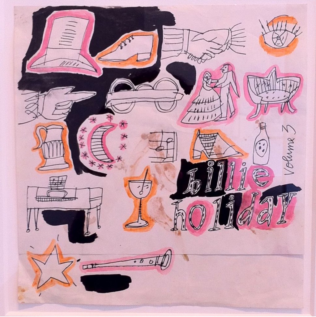
Last October, I posted an article about Andy Warhol’s unreleased cover art and described my attempts to reproduce the Billie Holiday, Volume 3 covers. Warhol made four designs for a possible Billie Holiday EP or LP entitled Volume 3.
To celebrate the 100th anniversary of Billie Holiday’s birth, Guy Minnebach published his research on the four covers. The first he found from a sale catalogue, it seems that two are in the Warhol Museum’s collection and the fourth was shown at the Robert Miller Gallery (New York) in 2011 according to Olivia Feal‘s blog.
The four Warhol designs for a possible Billie Holiday record cover.
A careful look at these covers shows that they are really collages — various bits of paper stauck together to make the finished design and then painted. Song titles are written in Warhol’s hand style. So, when were they made? Guy Minnebach, in his 2015 blog post, suggests that they were made in the early fifties, about the time he illustrated Margarita Madrigal’s book Magic Key to Spanish (published in 1953.) He points out that all the titles, were recorded in the 1930s for Columbia Records or its subsidiaries. I speculate that the covers may have been made later, towards the end of the fifties when Billie Holiday had left Columbia Records. Perhaps we will never know for sure.
I realize that these designs are unlikely ever to grace a real record and so I decided to try to make reproductions of Warhol’s designs. I’m in good company here. Many artists have reproduced Warhol’s art, starting early in the late sixties with Elaine Sturtevant’s copies of well-known Warhol works and continuing up to the present with Richard Pettibone’s miniature reproductions and Gavin Turk’s reinvention of Warhol’s Fright Wig Self Portrait.
So here are the results:
These are my renditions of Warhol’s originals.
My printer has managed to print up a limited edition of ten copies of each cover as ten-inch covers.
I am very happy with the results and to be able to add these to my other reproductions, such as the Progressive Piano ten-inch LP and seven-inch that I made several years ago. Wouldn’t it be nice if Columbia Records actually issued these records?
I am lucky to count Guy Minnebach as a friend as he is the source of much of my knowledge about Andy Warhol’s record cover art. I first got to know Guy sometime around 2005 when we shared information about Warhol covers and Guy tipped me off about covers I didn’t have. Then when I was about to curate the Happy Birthday, Andy Warhol exhibition at Piteå Museum in 2008, Guy lent me several extremely rare covers to include in the show and then arrived to co-curate and help hang the show. We have remained in contact ever since and Guy was a founder member of the Warhol Cover Collectors Club.
His knowledge of Andy Warhol’s art is impressive and he has identified a number of record covers and designs previously not known to be by Andy Warhol. He also writes about Warhol covers on his Andy Earhole blog, which I heartily recommend to anyone interested in Warhol’s record cover art.
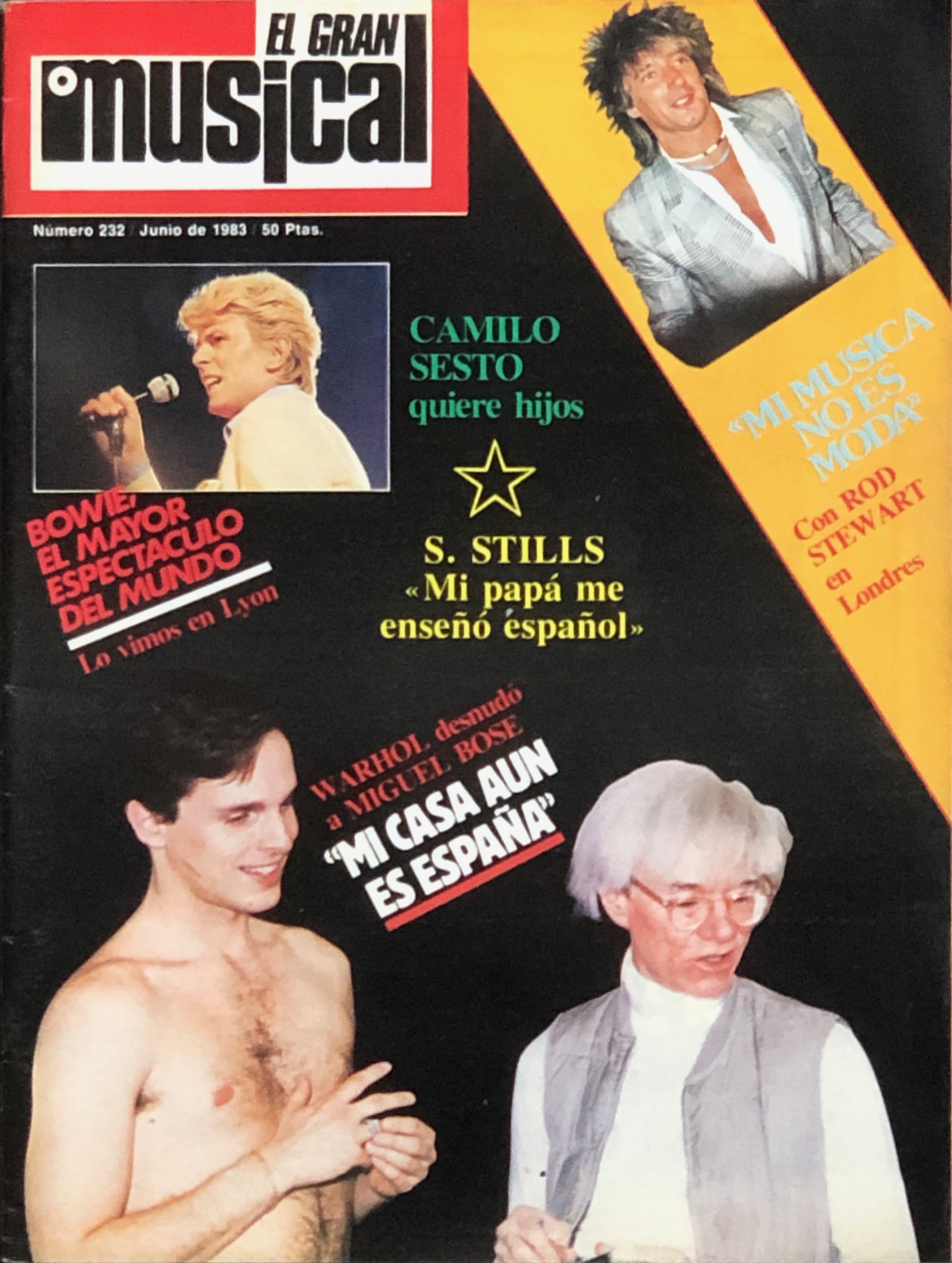
In a blog post in November 2016, Guy described the June 1983 edition of the Spanish music magazine El Gran Musical, which published an interview with Miguel Bosé about his new album Made in Spain that described how the cover art came about. It has taken me almost four years to find my own copy of the magazine.
The June 1983 edition of El Gran Musical.
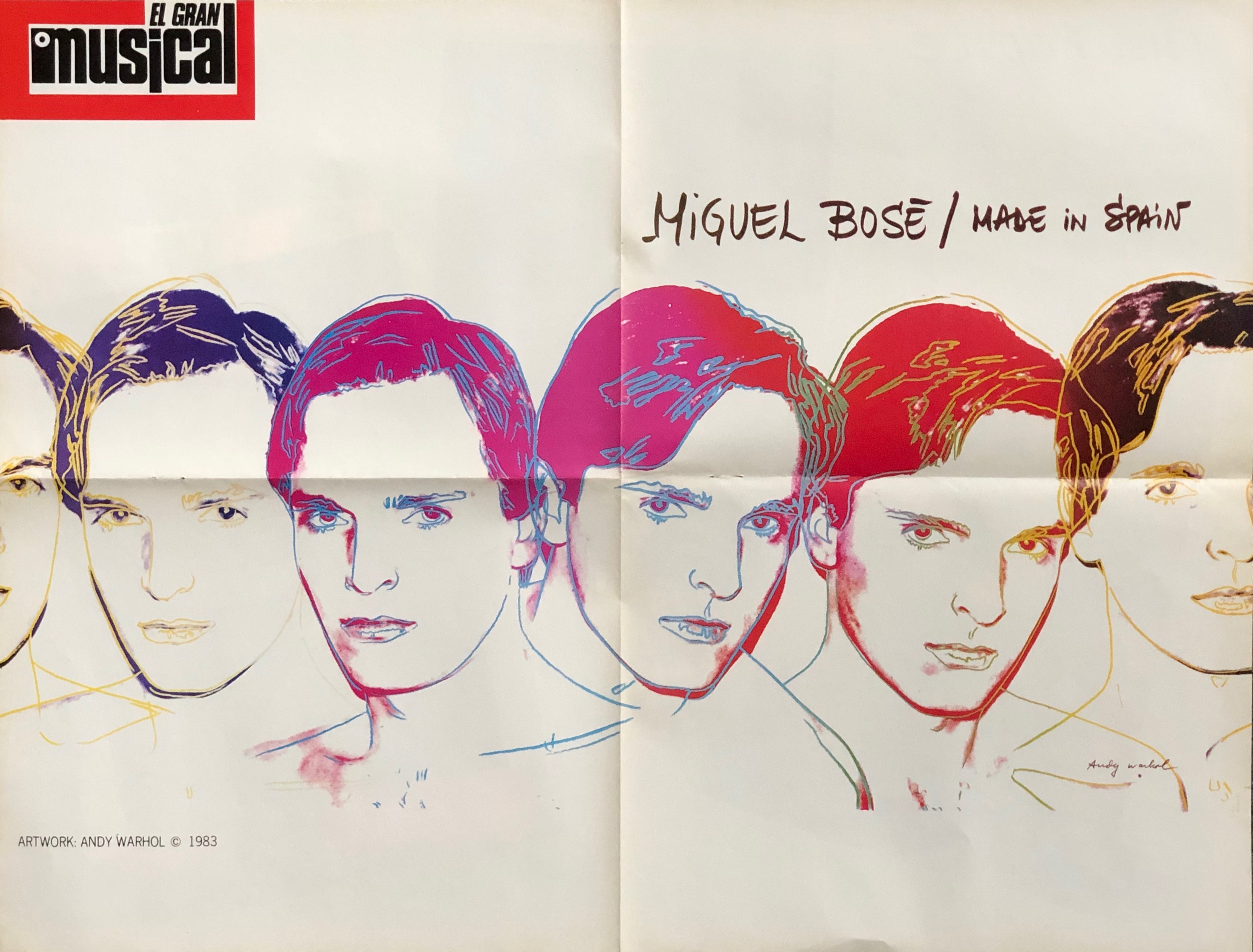
In 1983 Latino star Miguel Bosé’s manager contacted Andy Warhol in the hope that he would design the cover for Bosé’s as yet untitled album planned for that year. He contacted Warhol expecting the cold shoulder but was surprised that Warhol immediately agreed to providing a portrait for the cover and Bosé first spent two days in New York (presumably for the photo session with Warhol) and later a further two weeks while Warhol made the video for Bosé’s Fuego single.
As can be seen in the article, Warhol photographed a bare-chested Bosé in front of a white screen. Warhol then produced a unique series of five portraits from the Polaroids taken at that session. It seems highly likely (as Guy Minnebach suggests) that Warhol also came up with the title Made in Spain for the album, having been involved in Loredana Berté’s Made in Italy album in 1981. Made in Spain must have seemed a logical title after Made in Italy. Guy also speculated that Warhol had also done the typography for the album but Bosé has said that he did it himself although it does seem quite Warholian.
A double-sided poster of Warhol’s artwork for the album was included in the El Gran Musical magazine.
One side of the poster.
The reverse showed The Police.
The reverse of the poster.
Bosé’s record label CBS released a limited promotional folder for the Made in Spain album. This contained the full 12 inch LP as well as 7 inch and 12 inch copies of the Fuego single and a presentation folder that included a fold out poster of the cover artwork.
The “Made In Spain” promotional folder.
The complete set, including the booklet, which contains a fold-out poster of Warhol’s Bosé portraits.
The “Made In Spain” promotional folder showing the “Made In Spain” LP, the white label 12″ and 7″ Fuego singles.”
Bosé was obviously so pleased with Andy Warhol’s design that he used it on his 1983 Italian album Milano – Madrid and on the covers of the Fuego and Non Siamo Soli singles as well as on the Made in Spain album.
I have both the Made in Spain (both the standard LP and the CBS promo folder) and Milano – Madrid albums along with the standard seven inch Fuego and Non Siamo Soli singles completing my collection of Miguel Bosé’s records with Warhol’s cover art.
In February 2018 I wrote a potted history of Andy Warhol’s silkscreens (you can read it here). Much new information had emerged since thanks to Blake Gopnik’s new biography Warhol — A Life as Art.
Blake Gopnik’s 2020 biography Warhol — A Life as Art.
The story as I understood it back when I wrote that post was that Warhol had been searching for a way to mechanise his art, enabling him to produce many similar images with a minimum of effort. He had developed his characteristic dot-and-blot technique that allowed him to produce a third degree copy of an original drawing or photograph. Fist he would trace the image to be reproduced and then he would tape another paper so that it folded over the traced image and then he would ink the tracing an inch or so at a time and blot the the ink with the paper he had taped to transfer the image in reverse onto the second sheet. This was a time consuming method and produced only a single copy. He later tried making stamps to print recurring images, but was limited to relatively small images. He produced his S & H Green Stamps print by this tedious method. According to several authors, Warhol got the idea of silkscreening from the teenaged Sarah Dalton, who, together with her brother David, Warhol had taken under his wing in around 1961.
However, Gopnik has researched the subject in greater detail. Warhol certainly had experience of silkscreening during his years (1945-1949) at Carnegie Tech and often visited the avant guard Outlines Gallery in Pittsburgh where gallery owner Betty Rockwell put on a show of silkscreened works that Warhol would have seen. Thus there is no doubt that Warhol was aware of the silkscreen technique and had probably had some experience of using it in his studies.
So, why didn’t he take up the technique until 1962? Could the young Sarah have jogged his memory? Gopnik makes no mention of her in this capacity, though she turns up later in his book as the editor of Warhol’s first film Sleep.
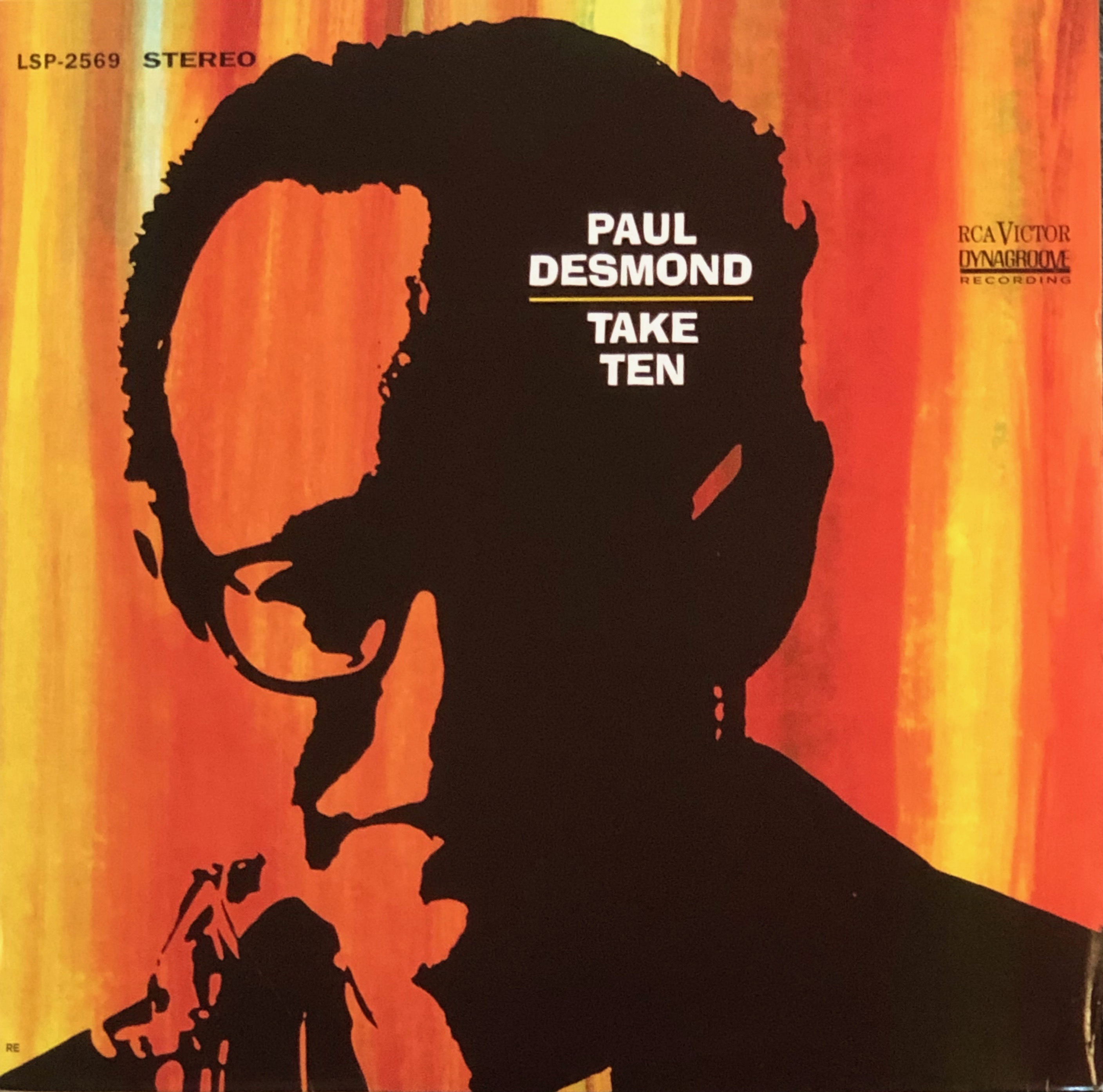
I had previously dated Warhol’s first silkscreen prints to the Autumn of 1962. But Gopnik, who spent much time in the archives of The Warhol Museum, ahs found that Warhol’s first silkscreen was for a record cover in April 1962. That cover was the Take Ten album by Paul Desmond, recently “discovered” by Guy Minnebach.
The cover of Paul Desmond’s 1963 album “Take Ten”.
Not only was this therefore Warhol’s first commercial silkscreen, it was his first silkscreened portrait. According to Gopnik, Warhol made the front cover of Time magazine in May 1962 photographed standing in front of his silkscreened Two Hundred One-dollar Bills, but I haven’t been able to find this cover. This suggests that Warhol was already using the silkscreen medium to produce art as early as this. Gopnik also suggests that Warhol was experimenting with portraits of Marilyn Monroe during the summer of 1962 — before her death in August of that year and that he, as a shrewd businessman, realised he could capitalise on her demise with his silkscreened portraits. Warhol probably also made his Elvis canvases during the late summer or early autumn of 1962 shown a year later in Warhol’s second show at the Ferus Gallery in Los Angeles.
I was first made aware of two of Andy Warhol’s seminal publications the Aspen Magazine Pop Art issue of December 1966 (#3, “FAB”) and “Andy Warhol’s Index (Book)” late in 2008, when I first saw Paul Maréchal’s “Andy Warhol – The Record Covers 1949–1987. Catalogue Raisonné“, which listed both as record covers. Both do contain records; the former a double sided flexidisc and the latter a single-sided 7” single, but I wouldn’t consider either package to be a record cover in the true sense of the words.
The pop art edition of Aspen Magazine produced by David Dalton and Andy Warhol in December 1966.
The hardcover version of Andy Warhol’s Index (Book) with is lenticular cover.
Andy Warhol was a polymath–commercial artist, “fine” artist, Photographer, film m,aker, diarist, would be sculptor and, not least,Author, illustrator and publisher. An exhibition at the Museum Brandhorst in Munich from September 2013 to January 2014 showed Warhol’s publications, ranging from one-off illustrated books to his popular mass produced publications. The exhibition was called “Reading Andy Warhol” and included over eighty books and the hard cover catalogue (with the same title) opened with a series of erudite essays on Warhol’s literary career as a publisher of his own books (such as “25 Carts Name[d] Sam and One Blue Pussy“, written together with George Lisanby) or one-offs like “Play Book of You S Bruce From 2:30 to 4:00“. There is a short section on “Andy Warhol’s Index (Book)” in a chapter entitled “Trash, Gossip, and Porn–Warhol’s Transgressions in Photography” written by a professor Burcu Dogramaci, There doesn’t seem to be too much written about the December 1966 Pop Art issue of the Aspen Magazine (#3) titled “FAB“, edited by David Dalton and Andy Warhol. However, the catalogue of the current Warhol retrospective at New York’s Whitney Museum, called “Andy Warhol – from A to B and Back Again” goes some way to rectifying this in an essay by Brandon W. Joseph called “White Light / White Heat“.
Aspen Magazine #3
The Aspen Magazine was produced by Phyllis Johnson between 1965 and 1971. It was billed as the first 3D magazine as it was produced as a box containing various printed items and ephemera. Ten issues were published and the third was the Pop Art issue edited by David Dalton and Andy Warhol and published in December 1966. I think it is significant that a publication on Pop Art in 1966 would be entrusted to Warhol as there were numerous other pop artists who could have been invited to compile a box to illustrate Pop Art.
David McCabe & David Dalton “A Year in the Life of Andy Warhol”.
But who was David Dalton? I have had to do some considerable research to find out about him despite him being a much published author of rock-related biographies.
Dalton (born 15th January 1945) was a founding editor of Rolling Stone magazine. He is the son of a British physician, Dr John Dalton, and elder brother to sister Sarah. When Sarah was 13 years old (and I suppose David was a couple of years older), the family moved to New York and–according to Sarah began visiting art galleries, in particular Leo Castelli Gallery where they met Ivan Karp
In a The Guardian review (on Sunday 5th October 2003) of “A Year in the Life of Andy Warhol English author and, according to Peter Conrad, writing in , was co-author of “A Year in the Life of Andy Warhol” together with photographer David McCabe. Dalton, according to Conrad, had been taken to New York from boarding school by his sister Sarah. In fact, as David, himself, writes in the book, he is Sarah’s older brother, and the family arrived in New York together. Both David and Sarah and their father, Dr John Dalton, appear in McCabe’s photos in the book. Exactly how David became one of Andy Warhol’s first assistants is not clear. He stayed at The Factory for over a year. Dalton, by his own admission was besotted with Bob Dylan and managed to get at least six mentions of his hero in the Aspen package. Also included were ten “trip” tickets, A newspaper entitled “Plastic Exploding Inevitable”, 12 pop art picture cards and a 7.-inch flexidisc with Peter Walker’s “White Wind” on the “A” side and “Loop” by the Velvet Underground on the “B” side (more correctly is was John Cale playing the noise).
The “A” side of the Aspen Magazine flexidisc. Peter Walker’s “White Wind”.
The “b” side of the Aspen Magazine flexidisc. The Velvet Undergrund’s “Loop”..
Andy Warhol’s Index (Book) Published in December 1967 “Andy Warhol’s Index (Book)” is primarily a book of photographs by Billy Name (Billy Linich 1940-2016), Nat Finkelstein, Steven Shore and others.It is decorated with several pop-up figures: a castle, a biplane, a can of Hunt’s Tomato Paste and includes the single-sided 7″ picture disc with a portrait of Lou reed on one side. The record plays an interview with Nico while the Velvet Underground play in the background.
The 7″ picture disc in “Andy Warhol’s Index (Book)”.
“Andy Warhol’s Index (Book)” was published in three editions. A hardback edition of (I think( 2000 copies), a Limited edition of the Hardback book signed by Warhol (365 copies) and a soft cover book. The hardcover book cost $12.95 and the soft cover $4.95.
I decided that I should include these seminal Warhol publications in my collection of Andy Warhol’s record cover art, though I do not consider the box or the book to be true record covers. And in January 2019 they arrived.
Yesterday I went to a couple of art exhibitions. First I went to Sven-Harry’s to see the excellent Jenny Nyström exhibition and then went on to Bonnier’s gallery to see what was on there. But it’s not the exhibitions that I want to talk about here. To get to the exhibition rooms at the Bonnier’s gallery one has to go through the shop. They usually have loads of interesting books for sale there and yesterday was no exception. I saw Rock Graphics Originals by Peter Golding & Barry Miles with great poster and record cover art and a book Emigre Fonts 1986-2016 cataloguing Emigre Magazines typefaces. I still have two or three copies of Emigre with David Carson’s often confusing fonts.
Peter Golding & Barry Miles “Rock Graphic Originals”
Ginko Press – “Emigre Fonts 1986-2016”
The third book to catch my eye was Imagine — John Yoko with the famous Imagine album’s cover image on the front. I had not seen the book, published in October 2018, before, so I started rummaging through it to see if Yoko discussed the album’s cover art.
Yoko Ono’s book “Imagine John Yoko”.
And, on page 190, she goes into explicit detail. There John’s quote is published:
“My album front and back is taken by Yoko as a Polaroid. It’s a new one called a Polaroid close up. It’s fantastic. She took a photo of me, and then we had this painting off a guy called Geoff Hendricks who only paints sky. And I was standing in front of it, in the hotel room and she superimposed the picture of it on me after, so I was in the cloud with my head. And then I lay down on the window sill to get a lying down picture for the back side, which she wanted with the cloud above my head. And I’m sort of ‘imagining.‘”
However, collectors of Andy Warhol’s record cover art noticed that a couple of Andy Warhol’s Polaroid pictures of John, sold at Christie’s in 2013, looked suspiciously like the photo used on the Imagine album cover and were advertised as “Two unused and previously unseen photographic proofs of artwork for the front cover of John Lennon’s 1971 album Imagine“. However, it doesn’t specifically state that these Polaroids were taken by Andy Warhol, so they could be Yoko Ono’s.
Yoko Ono’s Polaroids of John for the “Imagine” cover.
After reading this book I have removed Lennon’s “Imagine” album (and the various singles that use the same picture) from my list of Andy Warhol’s record covers and I credit the cover design to Yoko Ono.
I’ve now read three Warhol biographies–well actually four: The first was the 1989 version of Victor Bockris’s Warhol biography entitled “The Life and Death of Andy Warhol”. Next I borrowed Bob Colacello’s “Holy Terror – Andy Warhol Close Up” (1990) from my local library and soon realised I needed my own reference copy. The third was Wayne Koestenbaum’s 2003 “Andy Warhol”. But then I read a review somewhere that told me that Bockris had updated and expanded his 1989 bio in 2003 for the 75th anniversary of Warhol’s birth and simply called it “Warhol”. So I invested in a copy and reread Bockris’s account.
Victor Bockris’s 1989 biography
Colacello’s 1990 biography.
Koestenbaum’s 2003 biography.
Bockris’s 75th anniversary biography.
There is no doubt that Bockris’s biography is the most detailed story of Warhol’s life and artistic development and I recommend the 2003 edition as the most detailed. Colacello’s book also tries to describe Warhol’s background and early years but its main interest is in the period from 1970 to 1981 when Colacello was Andy’s employee and confidante and hustler–constantly being nagged to convince potential customers to order Warhol to paint their portrait. Koestenbaum’s, is the shortest of the biographies, and includes a description of Warhol’s early life, but I get the impression that he’s read Bockris. Koestenbaum is a fan of Warhol’s films and most of his book extols the virtues of sitting for hours watching them or re-watching them until one is hypnotised.
Bockris tells how Andy Warhol was introduced to silkscreening. Coincidentally, the day before I read Bockris’s account, I saw a BBC documentary on Robert Rauchenberg. I knew next to nothing about this other founding member of American Pop Art and realised I have really missed out on seeing his art. The only Rauchenberg work I know is “Monogram”–the stuffed goat with a tyre round its middle standing on a collage floor. I had no idea he was working with silkscreens before Warhol got the idea. I didn’t know either that he was gay and had had a relationship with Jasper Johns…
Warhol moved house many times in New York; first living in cockroach-infested, cold-water flats in various locations. In 1952 he rented a fourth floor flat at 242 Lexington Avenue and in the spring his mother, Julia, moved in with him as his housekeeper. They slept on mattresses on the floor of the single bedroom. then Andy rented the flat on the second floor of the building, above Shirley’s Pin-Up Bar night club, leaving Julia in the fourth floor flat. Andy was using his living room as his studio with the TV on and his stereo blaring the day’s pop record on repeat. He had hired his first assistant, Vito Giallo in 1954, introduced by Nathan Gluck, who the following year, would take over as Andy’s assistant.
Well, back to Warhol and silkscreens. Warhol always wanted to be accepted as a proper artist, but was generally regarded as a commercial artist and was having difficulty getting his art shown in galleries. He had approached Leo Castelli , who represented both Rauchenberg and Johns but had been rejected. Fast forward to 1962. Andy’s Cambell’s Soup Can paintings had aroused a lot of media attention, even before they had been shown in a gallery (in fact they were first shown in Los Angeles in July 1962).
Elinor Ward, owner of the Stable Gallery, who represented, among others, Cy Twombly and Robert Indiana, wanted to meet Andy. She was taken to his apartment by the art critic Emile de Antonio. Ward offered Andy a show in her gallery on one condition–according to Bockris, she took out her lucky two dollar bill, and waving it in Andy’s face, said that she’d give him a show if he painted the bill. All Andy replied was “Wow!”
Andy had painted Coke bottles and Campbell’s soup cans and was looking for a way to be able to reproduce images faster than painting them. So in July, as Andy was trying to find a way to reproduce a hundred dollar bills, Nathan Gluck suggested he use silkscreens. He immediately revisited some of his earlier subjects, Elvis, Troy Donahue, Warren Beatty and Natalie Wood and made silkscreens with several images of his idols on each. Then, on 4th August 1962, the same day his Soup Can show closed in Los Angeles, Marilyn Monroe died. Andy immediately decided to paint a series of portraits of her, using Gene Korman’s photo of her from the film Niagara as his subject and over the following months he produced 23 portraits in various colour combinations. First he painted a coloured background, then he sketched an outline by projecting the image onto the background and painted in eye shadow and lipstick and then he silkscreened the black and white image onto the prepared canvas.
Thus was born Warhol’s modus operandi for the rest of his career. In the future, he would take a photograph (or he would find a stock photo) of the subject to be portraited. He would take the photo to a printer who would blow the photo up to the required size (usually 40 x 40 inches) and make an acetate from which a silkscreen was prepared and Andy–or rather some assistant, with or without his help–would make the final painting or print. In effect, Andy’s only contribution to the process was either taking or choosing the photograph used in the work.
Then–just as Rauchenberg, did–he would store the screens so that they could be re-used later. Andy did this in the eighties when he made a series of “reversal” paintings, re-using the Marilyn screens to make a series of negative portraits. Now, the fact that Andy kept old screens may shed light on another series of artworks, namely his 1963 “Giant Size $1.57 Each” record covers. He collaborated with Billy Klüver on producing the original edition of 75 signed an numbered copies on white record cover stock. There are four further series, each of 75 copies on spray painted record sleeves. The covers were sprayed in red, green, orange and yellow paint and then silkscreened with the “Giant Size” image. These were released for sale in 1971. It is my guess that it was probably Klüver’s idea to remake the series as he seems to have been responsible for selling at least some of them. It is thus completely possible that he–or Andy, or one of Andy’s assistants–made the second batch of covers using the original screen, particularly as these were often unsigned and unnumbered.
The five colour variations of the “Giant Size $1.57 Each” covers.
Warhol cover collectors are constantly on the look out for previously unrecognised records with Andy Warhol’s art on the cover. Warhol Cover Collector Club (WCCC) member Kevin Kinney seems to have an eye for them. He recently reported an 1985 Australian single by a band (improbably) called I’m Talking that reproduced Warhol’s print from around 1962 titled “Marilyn’s Lips”
Andy Warhol’s “Marilyn’s Lips” print.
I’m Talking was formed in Melbourne, Australia in 1983 and had top ten hit singles in Australia with “Trust Me”, “Do You Wanna Be?” and “Holy Word” Their 1986 album, “Bear Witness” made the top 15 in the Australian album charts. The band released ten singles between 1984 and 1986 and the “Bear Witness” LP in 1986 (there was also a compilation album “Dancing”, released in 1988). “Lead the Way”, the band’s third single was released in 1985 as a two-track seven inch and a limited edition three-track twelve inch maxi single, both with the same cover.
I’m Talking’s “Lead the Way” 7″ single cover.
While each panel of Warhol’s original has 84 (12 x 7) images, the I’m Talking cover only shows 77 (11 x 7) images, but the cover art is unmistakably based on the left-hand panel of Warhol’s original(note the two sets of lips at bottom right on the cover, that match the botton two lips on the left-hand panel of Warhol’s original.) There is, however, no credit anywhere on the cover or record. I suppose that as the record was only released in Australia and New Zealand, Andy Warhol would not have heard about the use of his image on the cover.
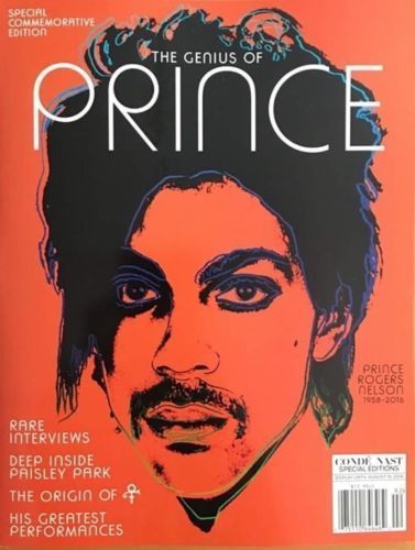
Andy Warhol painted his portrait of Prince Rogers Nelson (June 7, 1958 – April 21, 2016) in 1984 and it appeared in the November issue of Vanity Fair that same year and was used for the cover of Conde Nast’s 2016 memorial magazine “The Genius of Prince”.
The cover of Condé Nast’s Prince commemorative magazine.
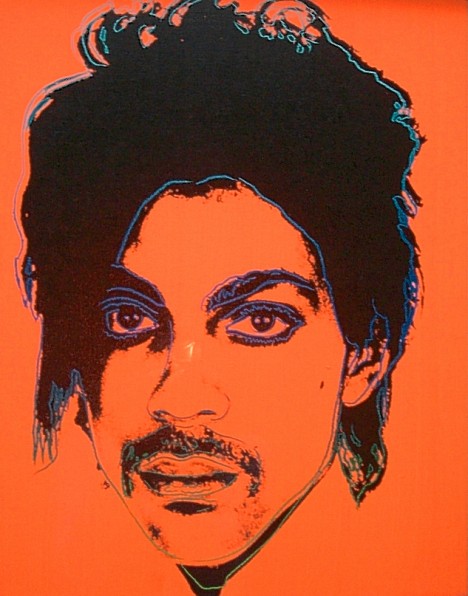
Warhol always worked from photographs, usually, though with some famous exceptions, using ones he had taken himself–most commonly with his Polaroid camera.
Andy Warhol’s portrait of Prince.
However, Prince was less than pleased with it, reportedly saying that Warhol’s portrait of MJ (Michael Jackson) was much better!
One photograph that Warhol did not take, however, was the basis for his Flower silkscreens in 1964. He found Patricia Caulfield’s photo of hibiscus flowers in a 1964 issue of the magazine Modern Photography and appropriated it.
Patricia Caulfield’s hibiscus flower photograph.
Two years later Caulfield sued Warhol for infringement of copyright and in a settlement, Warhol offered her two sets of the Flowers prints; an offer Caulfield refused preferring a cash settlement.
Lynn Goldsmith (2013).
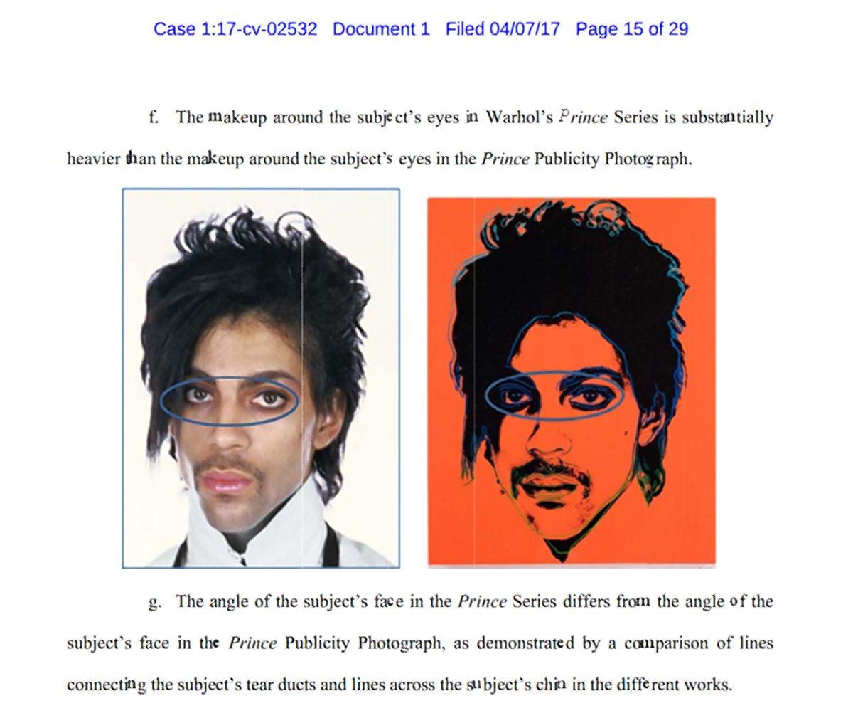
In 1981, photographer Lynn Goldsmith had taken a publicity photo of Prince. Warhol’s portrait image looks suspiciously like it is copied from Goldsmith’s photograph and Goldsmith tried to achieve a settlement with the Warhol Foundation for the use of the image. However, the Warhol Foundation, in a preemptive move, decided to sue Goldmith to prevent her from taking legal action against it.
Court comparison of Goldsmith’s photo (left) with Warhol’s portrait (right).
It seems that fair use laws in the U.S. mean that an artist may use other artists work as the basis for their own work and that Warhol’s art is protected under these laws. It seems that Lynn Goldsmith will not benefit from Warhol’s possible use of her original photograph.
It has been an intensive few months on my Warhol front. I have added almost a dozen titles to my collection.
It started in July, when I finally managed to find an original copy of Aretha Franklin’s 1986 CD “Aretha”. This was the only CD with Andy Warhol’s art released in his lifetime, The CD was reissued with extra tracks as a double CD in 2014, but I wanted an original 1986 copy. They seem to be quite rare and it has taken me a long time to find one though it didn’t turn out to be too expensive.
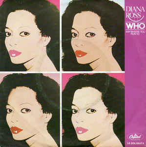
“Aretha” CD booklet.The next records I found were by Diana Ross. First a rather battered copy of her 1983 single “Who / Anywhere You Run to” and a poster cover copy of “So Close / Fool for Your Love”, which was way more expensive than I really wanted to pay.
Diana Ross “Who” 7″ single cover.
Diana Ross “So Close” poster sleeve cover.
Then I found a copy of Arthur Fiedler & The Boston Pops’ “Latin Rhythms by the Boston Pops”, which I got reasonably cheap. I already had a nice copy that with the “A High Fidelity Recording” text below the RCA logo at top right. The copy I now got hold of didn’t have that text, but instead a gold sticker with the same text. My guess is that this was an earlier printing.
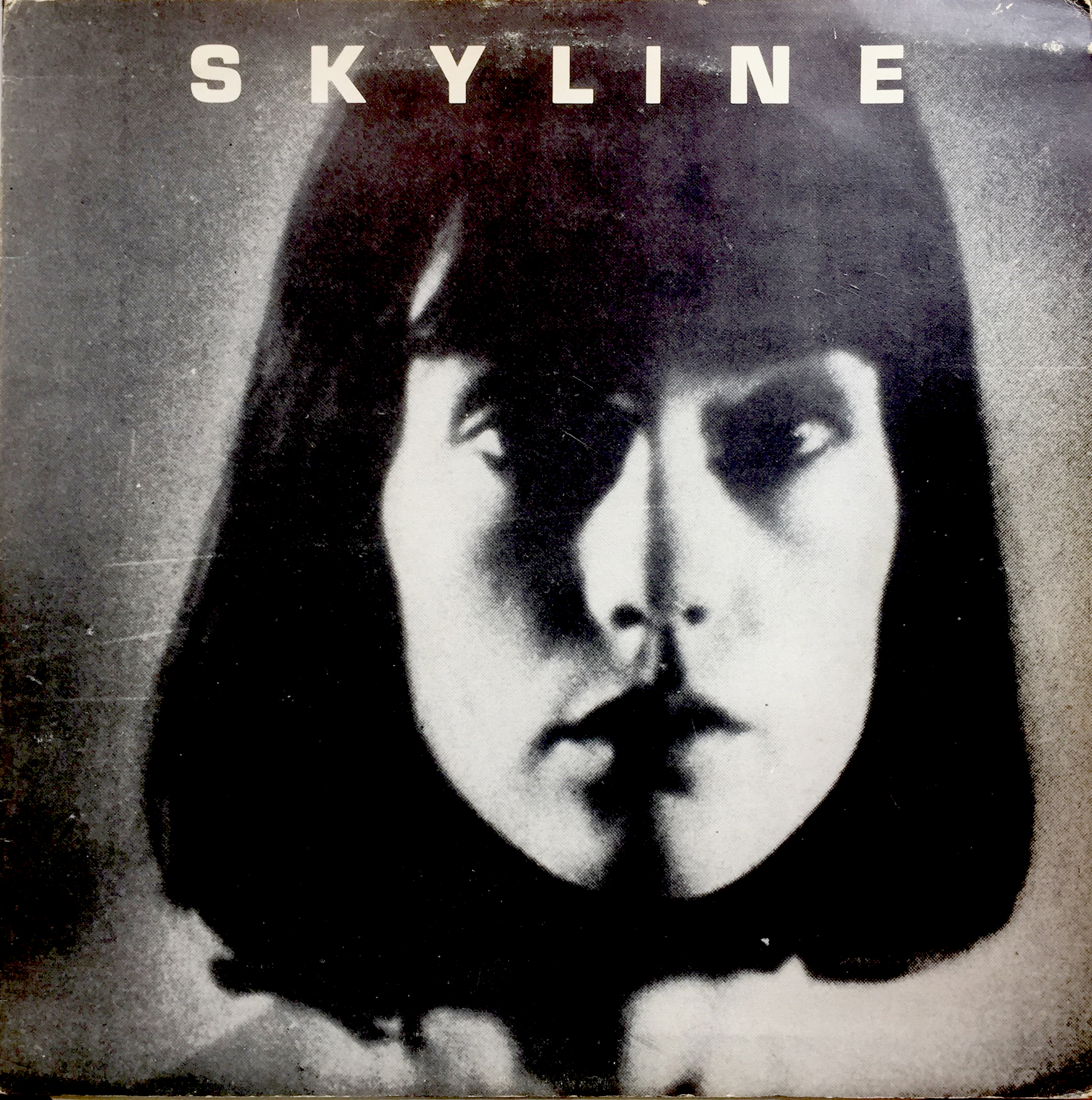
Both versions of the “Latin Rhythms” EP. On the left with the gold sticker and on the right with “A HIFI Recording just visible below the RCA Victor logo at top right.Then I was pleased to find a reasonably priced copy of the original Skyline bootleg album on the Four Stars label that I wrote about in a previous blog post.
The original 1978 Skyline cover.Next up was an Austrian bootleg of The Rolling Stones “Sticky Fingers” album with alternate takes and that used the photo of the Stones that had previously been used on the 1971 “Brown Sugar / Bitch / Let It Rock” EP and again on the numbered RSD reissue in 2011.
The front cover of the Austrian bootleg of outtakes from the “Sticky Fingers” recording sessions.I was in London for a few days in August and popped into HMV on Oxford Street where I found two copies of “The Velvet Underground & Nico” 50th anniversary edition, with a large black label on the shrink wrapper on the rear of the cover covering Eric Emerson’s “torso” emulating the sticker used to cover his photo on the original 1967 release. I bought two copies in the hope that they might be the limited pink vinyl edition. Needless to say, they weren’t! However, I did manage to find a pink vinyl copy not long after. Apparently these were made in America in a limited edition of 1000 copies. The copies I bought at HMV were both pressed in Europe.
“Velvet Underground & Nico” 50th anniversary version with sticker over Eric Emerson’s “torso”.
There are loads of interesting bootlegs with Andy Warhol art. I have been looking for a couple for quite some time. I have already mentioned the Skyline album with Warhol’s photo of Suzanne de Maria on the cover, another was another The Rolling Stones bootleg called “Live in Laxington” [sic] — a live recording from the Rupp Arena in Lexington, Kentucky, recorded on 29th June 1978. The front cover is a typical bootleg cover picture, but the rear cover shows one of Warhol’s “biting” photos from 1975. This version has a green spatter vinyl. There is another black vinyl version with a plain cover á la Beggars Banquet.
The front cover of “Live in Laxington”.
The much more interesting rear cover of “Live in Laxington”.
The purchase that has given me the greatest thrill arrived at the end of September. I knew that there was a limited edition promotional folder of Miguel Bosé’s 1983 album “Made in Spain”. I had never seen one for sale until a copy appeared on Ebay in mid September. I put in a bid was was outbid. “Oh, Well…” I thought. It wasn’t meant to be. However, the following day I received a “second chance” as the high bidder couldn’t afford his final bid. So I got the set. The folder should contain white label versions of the full “Made in Spain” LP, a promo 12″ single “Fuego / Panama Connection” and a single-sided, white label 7″ single “Fuego” and an A4 booklet with a fold-out version of Warhol’s Bosé portraits. When the folder arrived, the singles were missing. The seller had another copy that also lacked the singles and couldn’t help provide them. But Discogs had a single copy of the white label 12″, which I snapped up and several copies of the single-sided, white label 7″ single, so that was easy to get and a little over a week later my foleder was complete with the LP, 12″ and 7″ and the booklet. What a great (and rare) addition to my collection. I laid out my /several) copies of “Made in Spain”, the Fuego 12″ and made a composite of Warhol’s Bosé portraits!
The “Made In Spain” promotional folder.
The “Made In Spain” promotional folder showing the “Made In Spain” LP, the white label 12″ and 7″ Fuego singles.”
The complete set, including the booklet, which contains a fold-out poster of Warhol’s Bosé portraits.
Another cover appeared on Ebay that was a pastiche of the “Velvet Underground & Nico” cover with a banana-shaped chocolate ice cream with “Peel Slowly and See” beside it. Peel the chocolate off to reveal the naked banana. The record is a 12″, three-track single “Family” by the Cru-el Grand Orchestra — a 1999 Japanese recording, whose cover was designed by Ukawa Naohiro (Mom’n’DaD Productions 222). Even the rear cover had a photo that I recognise from a record cover, but can’t place — perhaps a reader can help identify it.
The Cru-el Grand Orchestra’s 12″ single “Family” with its obviously Warhol-inspired banana ice lolly.
The rear cover of the Cru-el Grand Orchestra’s 12″ single “Family”. Another cover pastiche?
There are several other coloured vinyl versions of “The Velvet Underground & Nico”, yellow, red and blue vinyl plus the Newbury Comics yellow/black vinyl. Now that I have the pink copy, do I have to get hold of the other colours too?
It has been my ambition to collect all record covers with Andy Warhol‘s art. Most of the seventies and eighties covers are relatively easy to find and shouldn’t cost the earth (an exception is Ultra Violet‘s eponymous LP from 1973), but the earlier ones, particularly the fifties covers have become increasingly expensive. And the original “Velvet Underground & Nico” (1967) along with many of it’s reissues are becoming increasingly expensive.
I have long searched for decent copies of Moondog‘s “The Story of Moondog“. While copies of the Moondog album do pop up relatively frequently on Ebay, most are in pretty poor condition with severely discoloured covers, but I had the great good fortune to find a near mint copy on Discogs which I bought as a Christmas present to myself.
The other major hole in my collection was John Wallowitch‘s second album for Serenus Records called “This Is (The Other Side of) John Wallowitch“. This album doesn’t come up for sale very often and bidding goes crazy on good copies. A reasonable copy popped up on Ebay in late January and despite having depleted my funds the previous month for the Moondog album, I managed to win it with a not too outrageous bid.
Front and rear covers of “This Is (The Other Side of) John Wallowitch”, 1965.
As can be seen, Wallowitch chose as the rear cover picture to reuse the “photo booth” photos taken by Warhol that were on the front cover of his previous Serenus Records release “This Is John Wallowitch“. It’s sort of ironic that the “Man of a Thousand Faces”, as stated on the front cover, is portrayed on the rear from the chin downwards, so one cannot see any of the thousand faces (actually, there are only 56 photos, or parts of photos on the cover, not thousands).
So now there are two of Warhol’s original covers and one bootleg that I need to complete my collection of Warhol’s record covers. These are the pink version of Prokofiev’s “Alexander Nevsky, Cantata Op 78” and the unobtainable “Night Beat” promotional box set that Guy Minnebach wrote about in his Andy Earhole blog (https://warholcoverart.com/2017/03/25/night-beat-rarest-of-the-rare/). Though I do have the facsimile box of the latter.
The remaining bootleg I am still looking for is the limited edition of Keith Richards‘ “Unknown Dreams” (Outsider Bird Records, OBR 93009).
Keith Richards’ bootleg “Unknown Dreams” with Warhol’s car drawing cover.