Peter Blake Signed Album Covers and Unsolved Mysteries.

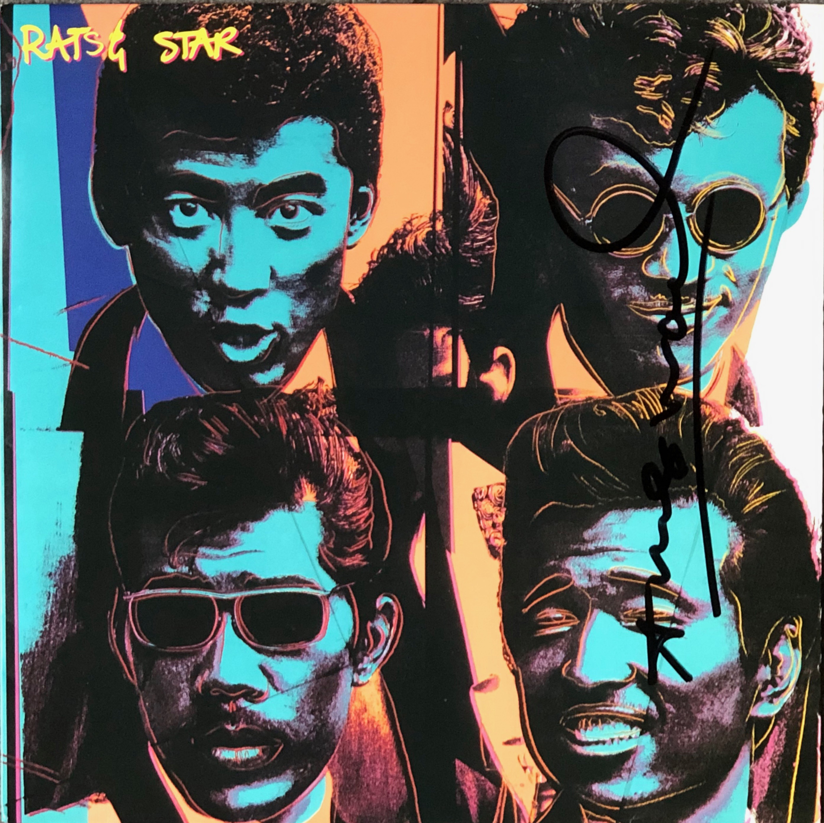
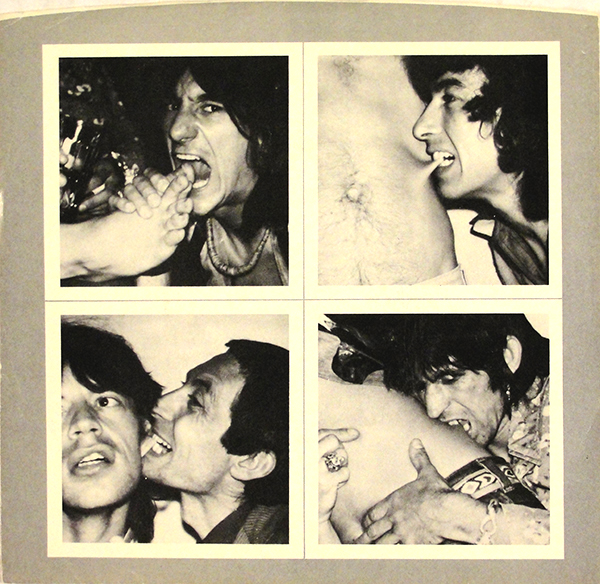
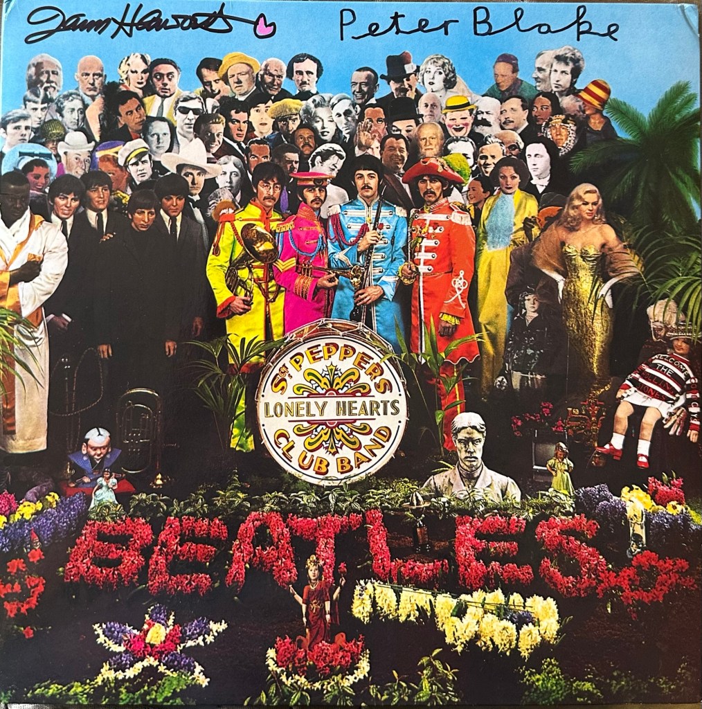
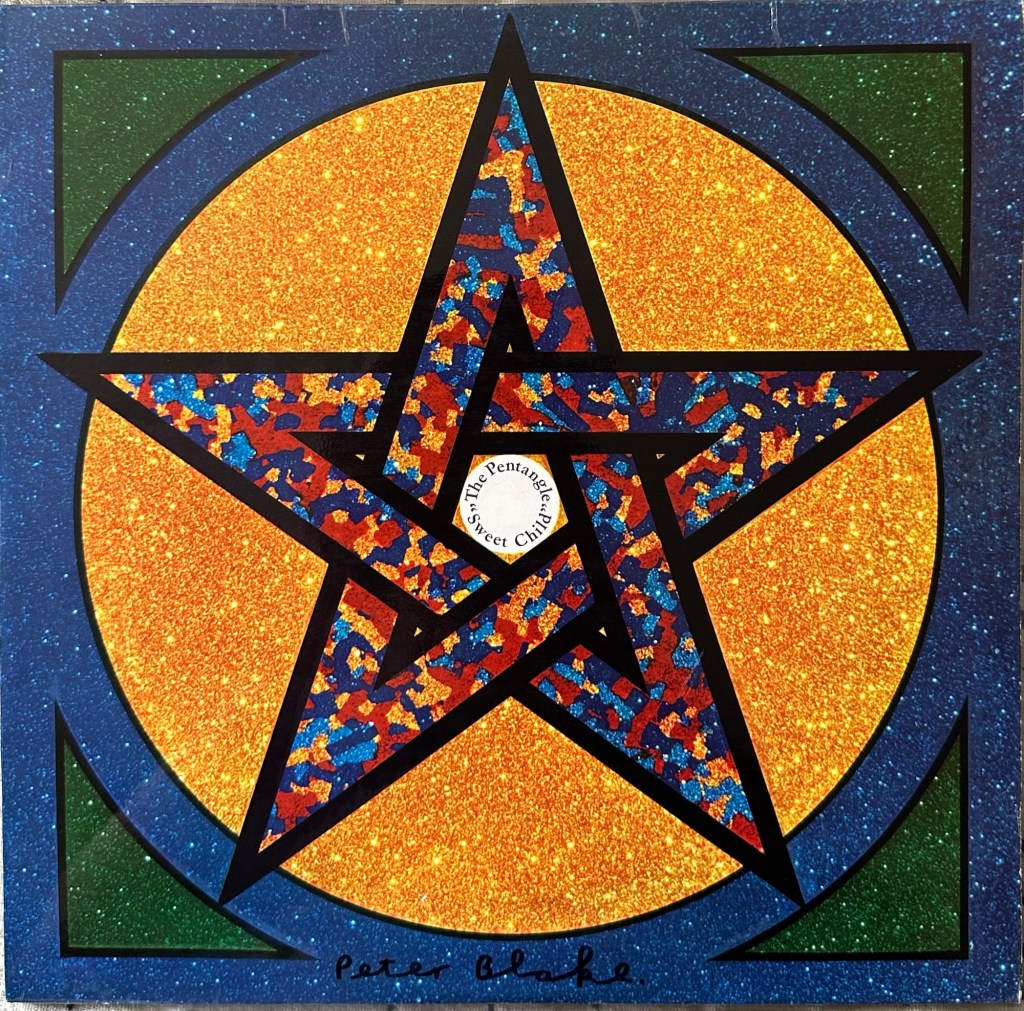
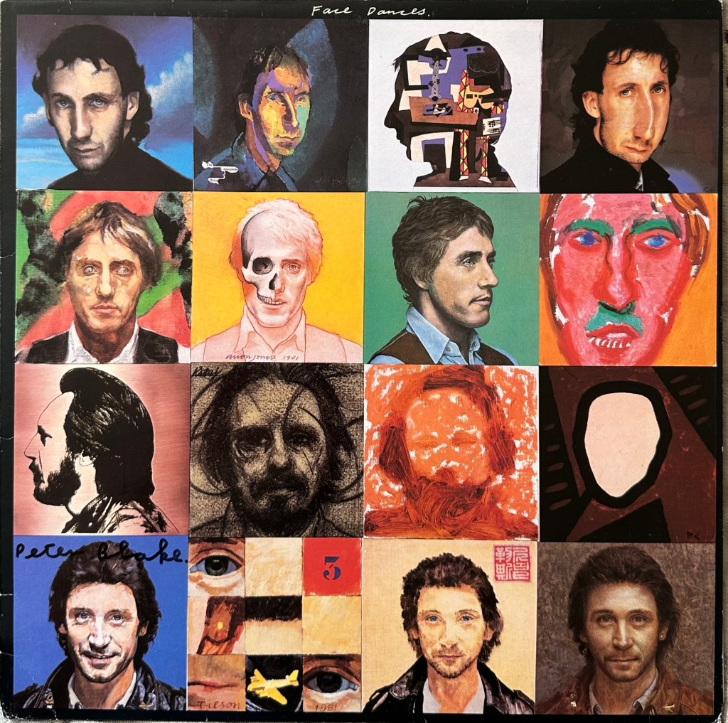
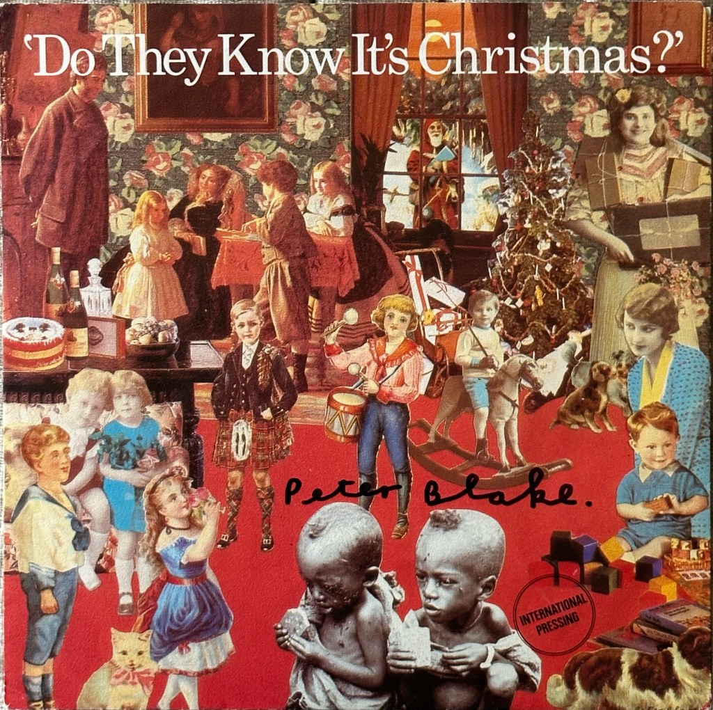
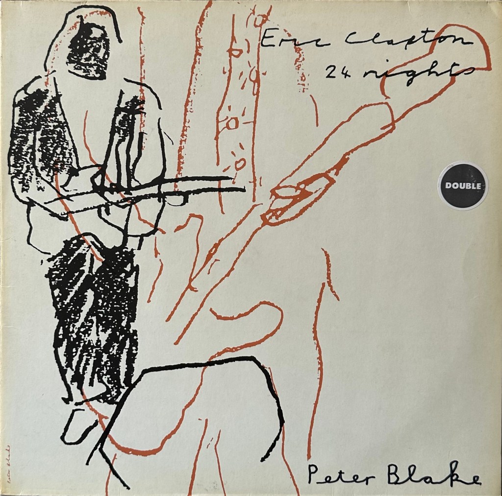
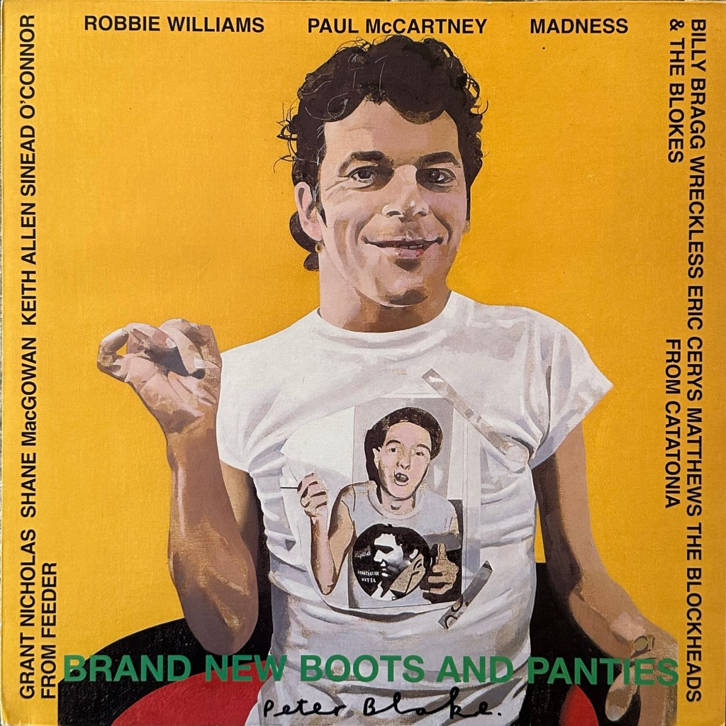
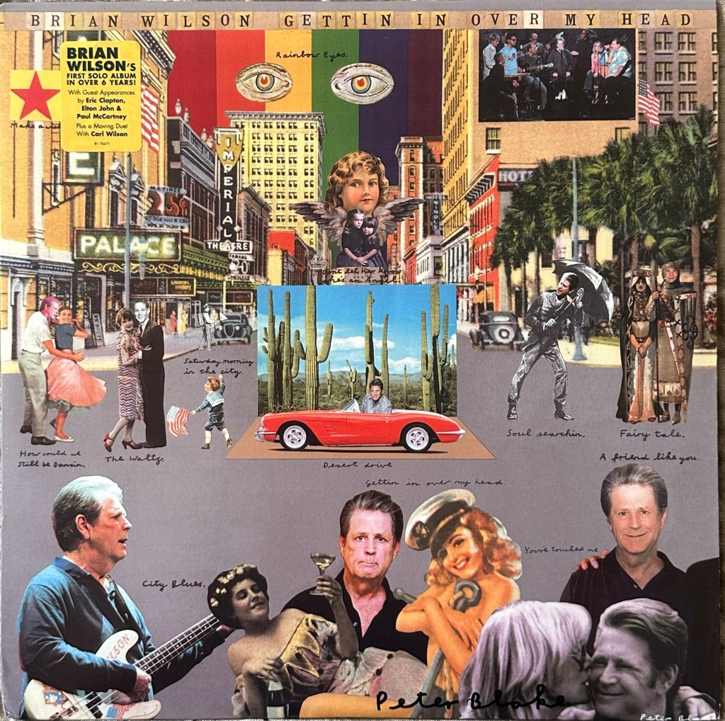
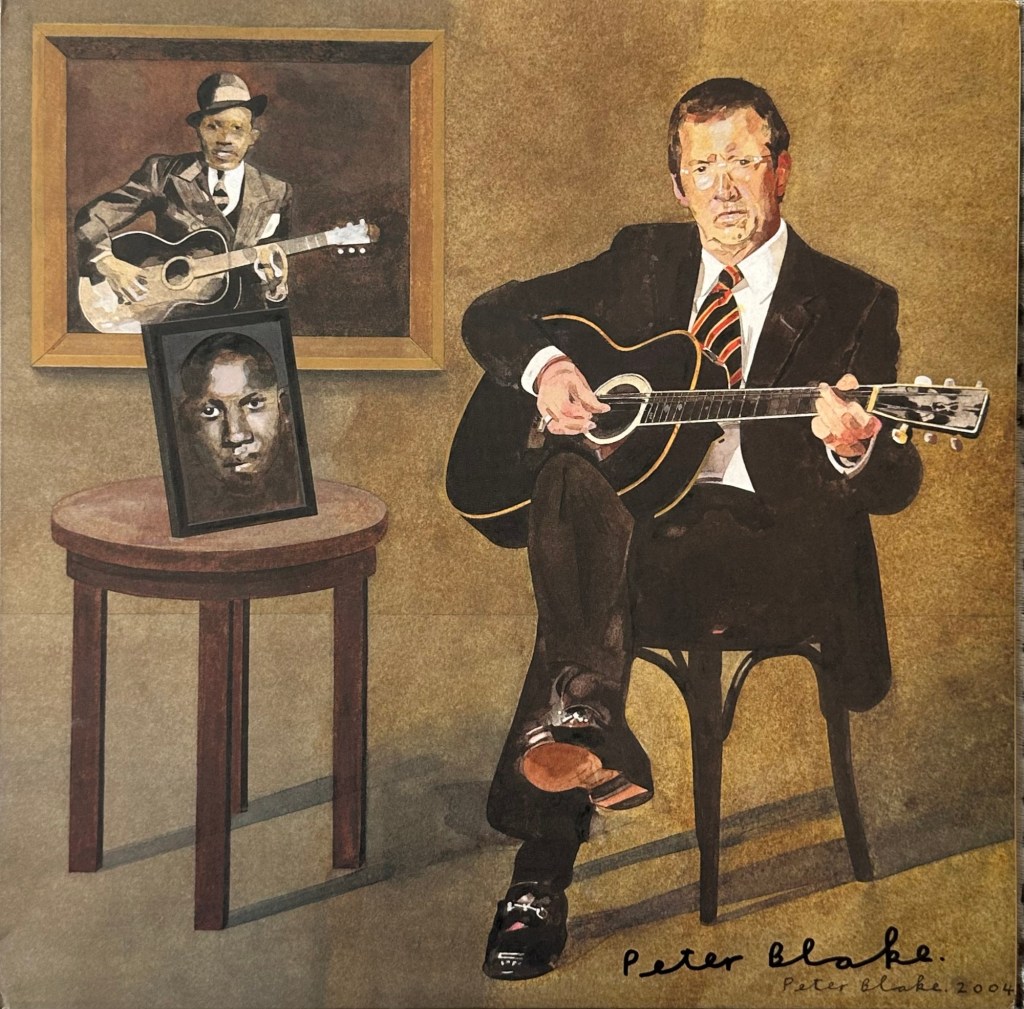
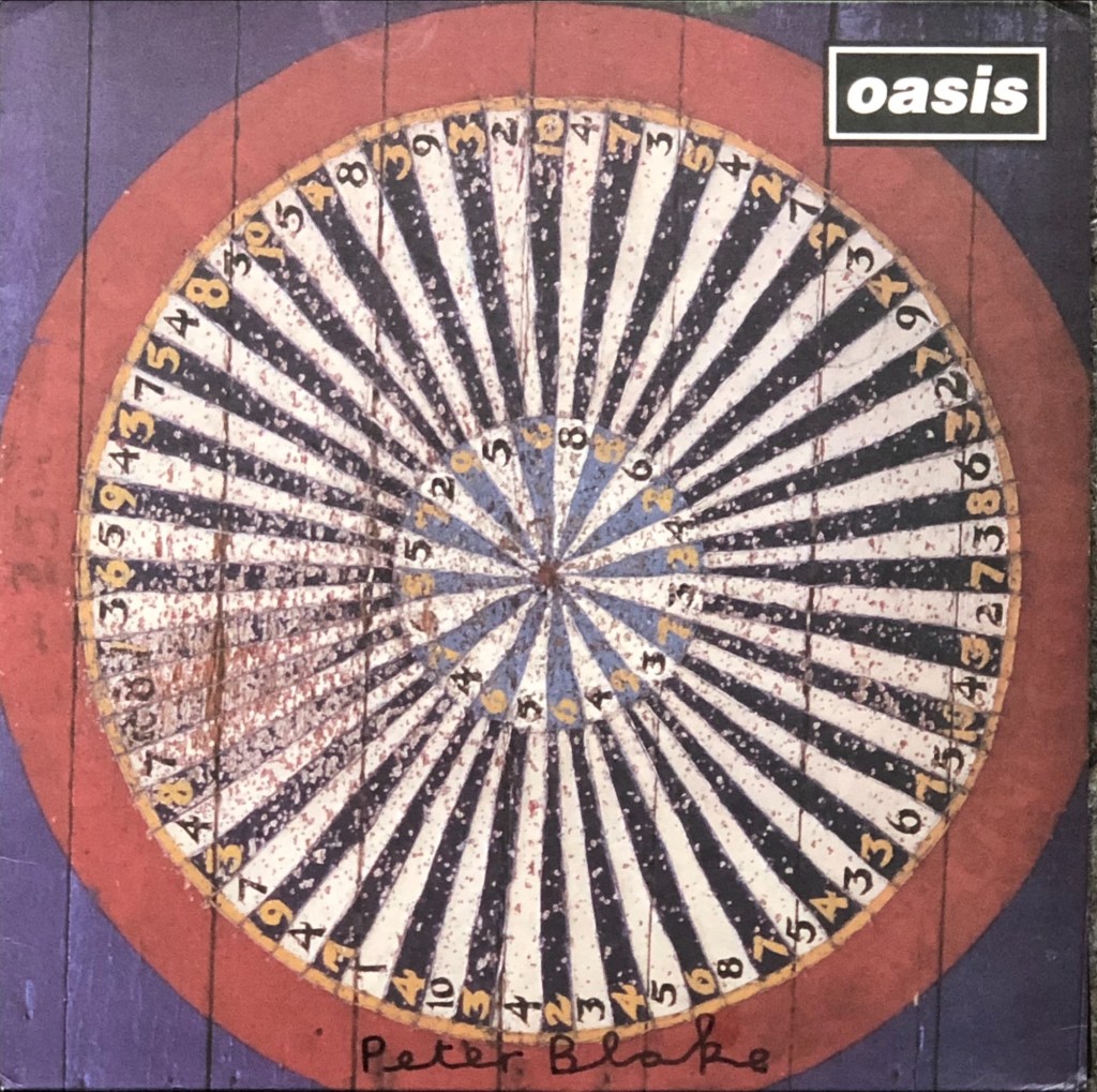
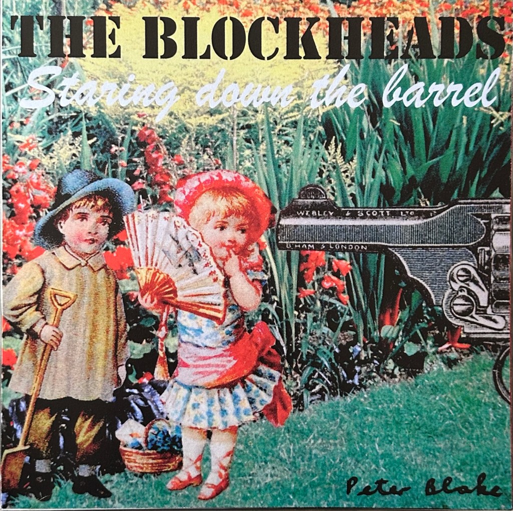
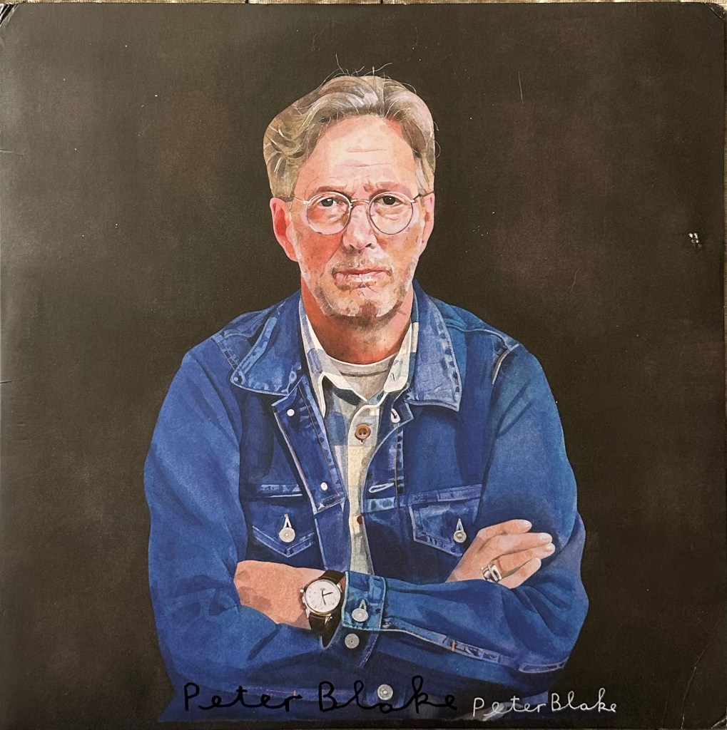
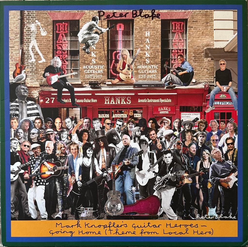
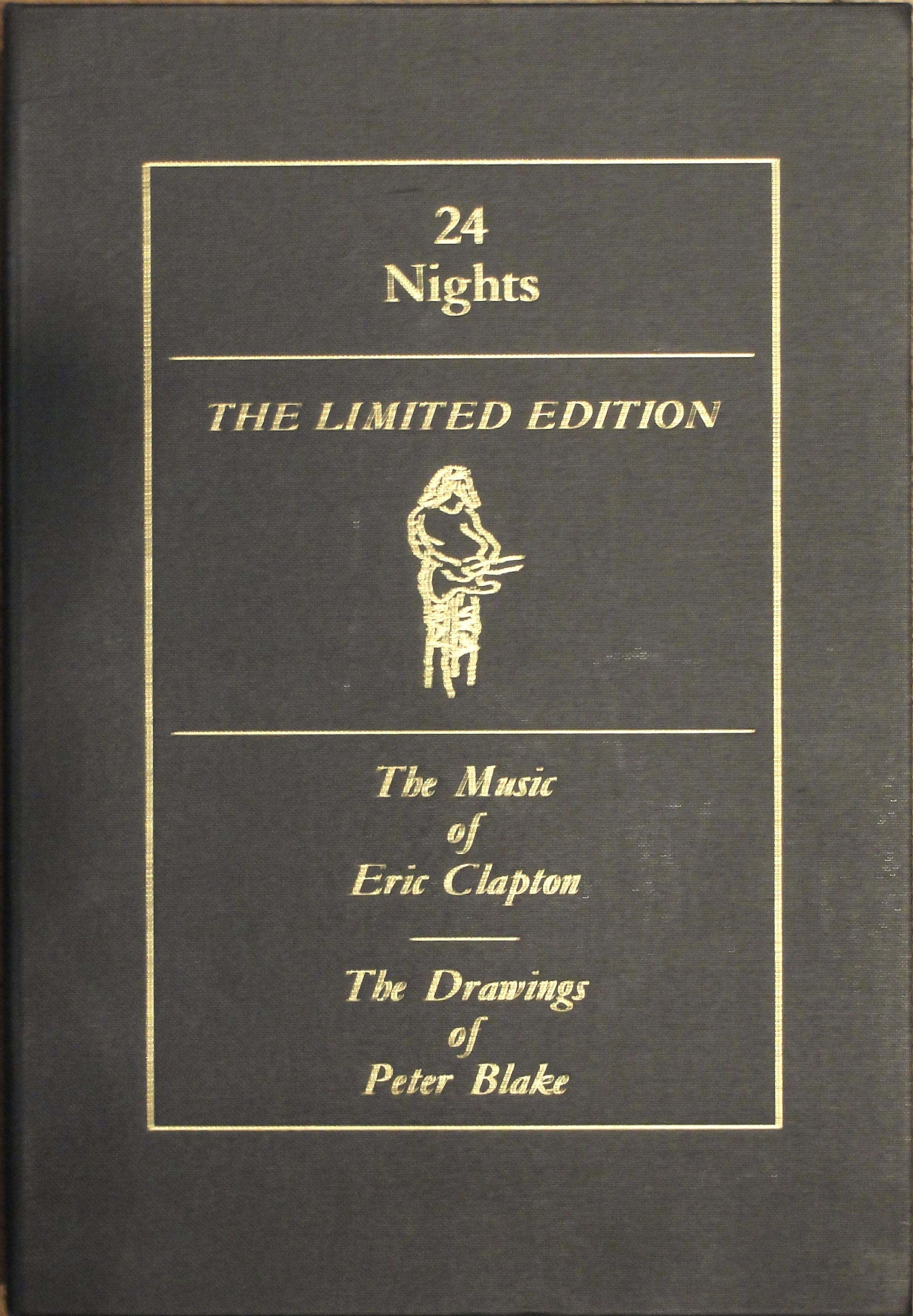
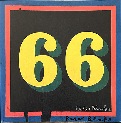
You all know I collect Peter Blake album cover art and I’ve been lucky, over the years, to get many covers signed by Sir Peter. However, as I live in Sweden, it has not been easy to get covers signed.

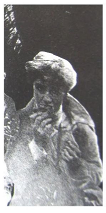
Some time in March 2024, my friend — and Beatles expert — Ken Orth wondered if I cuold help him try to solve a mystery. There is a shadowy figure from the Sgt. Pepper photo shoot that has not been identified and Ken has asked just about everybody, including Jann Haworth, if they could identify the person.

Peter Blake – Mystery figure

The only person Ken hadn’t asked was Peter Blake and so Ken asked mwe if I could pass the picture on to him to see if he knew who the person was. I wondered how this would work and decided to ask Sir Peter to sign some album covers for me and I would enclose the picture of the mystery person in the hope that he mighty remember.

So — at the end of March I assembled a package of six record covers and one CD booklet and printed a large copy of the mystery person. I wrote a long letter asking several questions about the covers and posted the package by registered mail. I received notice that the package had been delivered on April 4th and the waiting started.

One month went by. And then another… And I began to give up hope. I reckoned that I had lost the covers and managed to find replacements. Then, at the beginning of July I received and email from Blake’s gallery saying that Chrissy Blake had delivered a parcel addressed to me for the gallery to forward. I confirmed my address and the gallery sent the package off only for it to be returned after a couple of days as being “undeliverable”. The gallery director emailed my telling me the package was once again at the gallery but for some reason this email didn’t arrive until the 26th July. So I arranged a new shipment where Royal Mail would collect the package and send it registered to me. They tried to collect the parcel on August 1st but the person on the gallery’s front desk didn’t know about the collection, so had to reshedule collection for the following day. That worked and the package was on its way.

It arrived at the Swedish customs on August 12th and I collected it yesterday. In the parcel were my six record covers, on CD booklet and the poster of the Mystery person, now with an inskription by Peter Blake.

So the Mystery person is still a mystery.

Sir Peter had signed all four album covers and the CD booklet but had not commented on my questions.

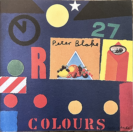
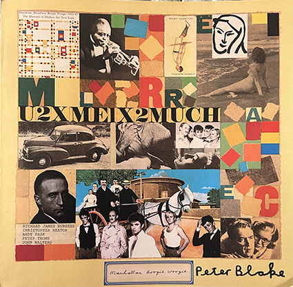
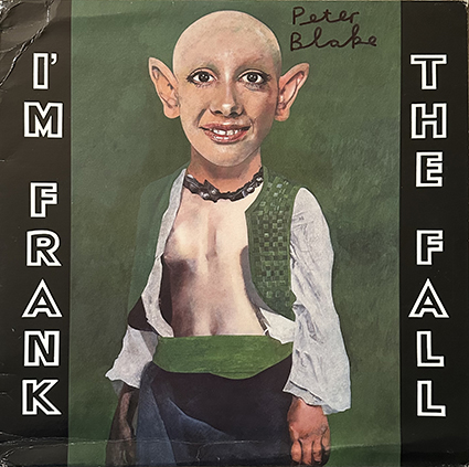
I would still like to know how The Fall came to use Peter Blake’s Nadia painting on the cover of their promotional EP, and I still wonder where the original painting for the Gershwin cover is now? And how did A Stranger Shadow get their Colours CD cover designed by Peter Blake? The final mystery is why Landscape (or their record company) rejected Peter Blake’s cover for their Manhattan Boogie Woogie album?
These mysteries, too, remain unsolved.

Blur’s Think Tank — UK Editions and Promos

I lost my original copy of Blur’s Think Tank poster in 2010 when it got lost after an exhibition of Banksy’s record covers in Stockholm. At last I’ve found a replacement — though it was considerably more expensive than the one I lost. This new acquisition made me review my collection of Think Tank albums, promos and such.

I saw Blur at Hultsfreds Festival in Sweden in 1996 and got a couple of album covers signed. So it was quite logical that I also bought Think Tank on vinyl when it first came out, and I suppose this was the first Banksy designed cover in my collection. I also bought the Observer five-track promo soon after. I soon found the large Think Tank poster to add to the collection.

My collection of Banksy covers started in 2005-6 after I missed seeing a streeet art exhibiiton at which several Banksy prints were on sale. I found most early covers at standard issue prices with only a couple costing more than that — the Laugh Now / Keep It Real twelve-inchers cost £6.99 each back then! My next buys were the Think Tank promo CD with the petrolhead stamp and the promo twelve-inch white label.

In addition to the double vinyl, I bought the ‘limited edition’ CD in the red book cover so I didn’t buy a standard Think Tank CD until the reissue box set with bonus CD and the four prints when it came out in 2012.

ThinkTank 2012 box set.

I had seen that a number of the Think Tank promo CDs had been found without the Petrolhead stamp and a good friend sold me a second copy of the CD with the stamp and one without. I had also read about a version with a pink baby’s hand stamped instead of the Petrolhead figure and when one came up on Ebay I nabbed it! So my collection of promo CDs has grown.

Three promotional CDs for Blur’s Think Tank album.

I wondered why no one had come up with one of these promos with a foot instead of the baby’s hand. So I went to Photoshop and created my own, though I haven’t printed it yet.

I ‘m a sucker and gave in to temptation and bought the reissue Think Tank double LP in 2023.

More recently, I read about the Blur stencil that appeared on adverts for the Think Tank album when it was released and found a nice mint stencil as well as a magazine ad for the album showing the stencil.

I know there are interesting versions of Think Tank available from other countries but I’m limiting my collection to U.K./Europe issues. I wonder what other additions may turn up in future.

New Album Covers by Klaus Voormann.

Klaus Voormann will be 86 on April 29th, 2024, but he hasn’t retired from record cover design. My current list of Voormann covers has just reached its centenary — 100 covers listed! The list includes magazine and book covers in addition to the 90-odd record covers he has designed.

The latest two to turn up are Wolfgang Bernreuther’s Still a Fool, a CD or a limited edtion double LP, released on 21st April 2023.

Classic Voormann drawing.

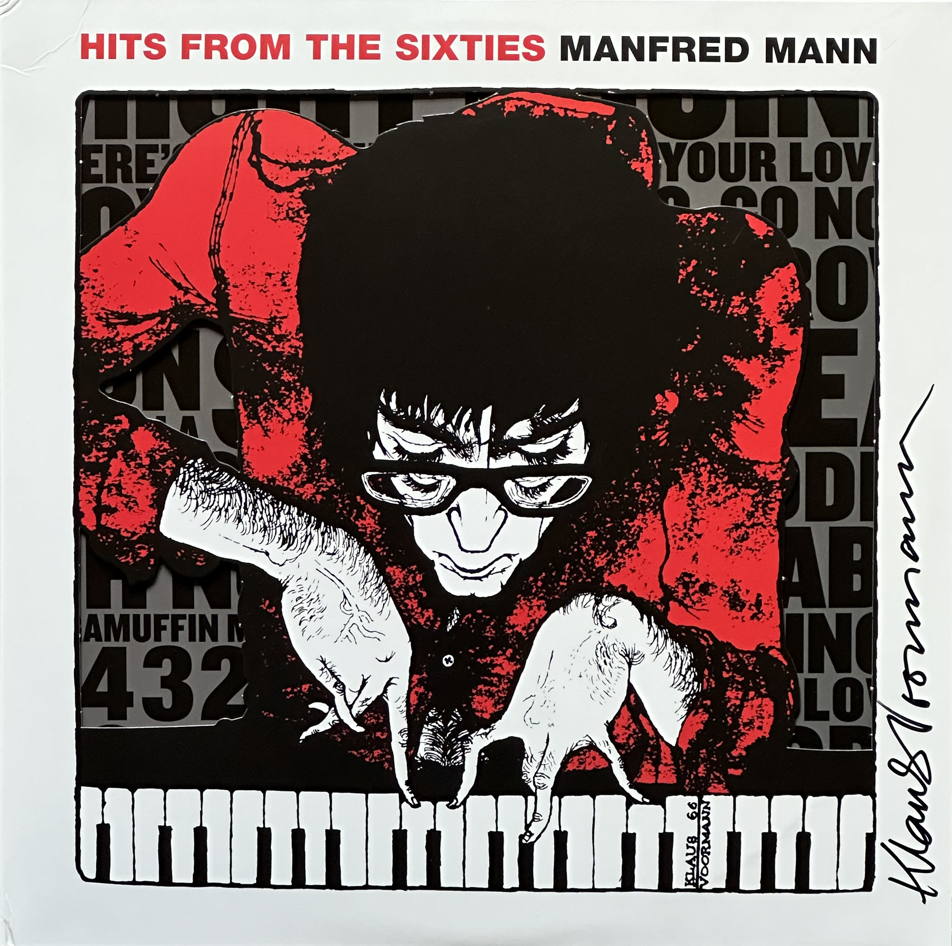
And, as mentioned in my recent post on Voormann’s early covers, the latest Manfred Mann greatest hits package called Hits From the Sixties, was released in April 2024. Thanks to Stefan Thull, a Voormann collector, I was able to get a signed copy to add to my collection.

Klaus drew this portrait of Manfred Mann in 1966 — as written on the piano keys while he was a member of Manfred Mann. He also designed the cover for the Manfred’s 1966 album As Is.

Madonna’s “Celebration” Album

Madonna originally released her 36-track greatest hits album “Celebration” in 2009 as a double CD , BlueRay set and a limited edition 4LP set in a gatefold cover. The vinyl version soon became a collectors’ item with copies selling for up to $850. I imagine that a vinyl reissue to coincide with Madonna’s 2024 world tour must be an irritation for collectors who have the original version. Released on March 1st, 2024, the vinyl reissue is difficult to differentiate from the 2009 original, The covers, with the classic Mr. Brainwash portrait of Madonna, appear identical.

The original 2009 sticker on the left, compared with the re-issue sticker on the right.

But once the shrink wrap had been removed together with the sticker collectors will have to look at the record’s spine to be able to decide which version they have .

The original release is on the Warner Bros. label while the reissue is credited to Warner Music, or just plain “Warner” on the spine, and the catalogue number is given both with the spine number and the full barcode number on the reissue.

It’s impossible to tell if the reissue will also become a collectors’ item as I haven’t been able to find out if it is a limited edtion. I popped into one of Stockholm’s biggest record shops yesterday (8th June, 2024) and they didn’t have a copy, so perhaps it is fairly limited. Anyway, I’ll keep both my versions. But there is a limited edition od the reissue — 500 copies include a lithograph of Mr. Brainwash’s cover portrait of Madonna.

Some Unpublished Rock Photos in My Collection.

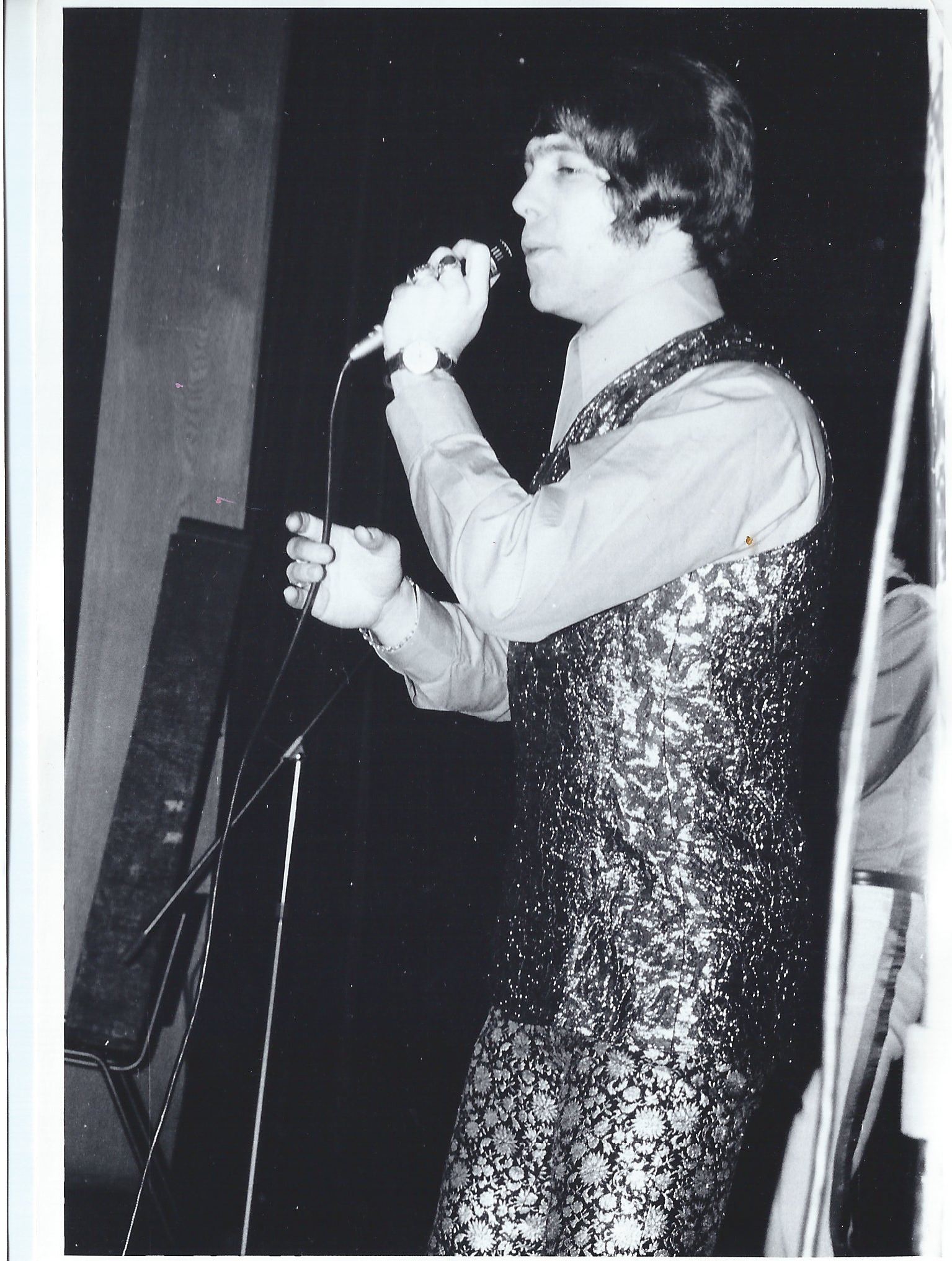
I’ve been rummaging around in one of my cupboards and found a photo album that’s been lying their for more than ten years. The album contains about twenty photos of rock acts thast visited Stockholm, Sweden, in 1966 and 1967 taken by my friend and colleague Sten Sundberg and a mate of his whom he would not name. Sten gave me these photos some twenty plus years ago together with a paper bearing the autographs of the Jimi Hendrix Experience.

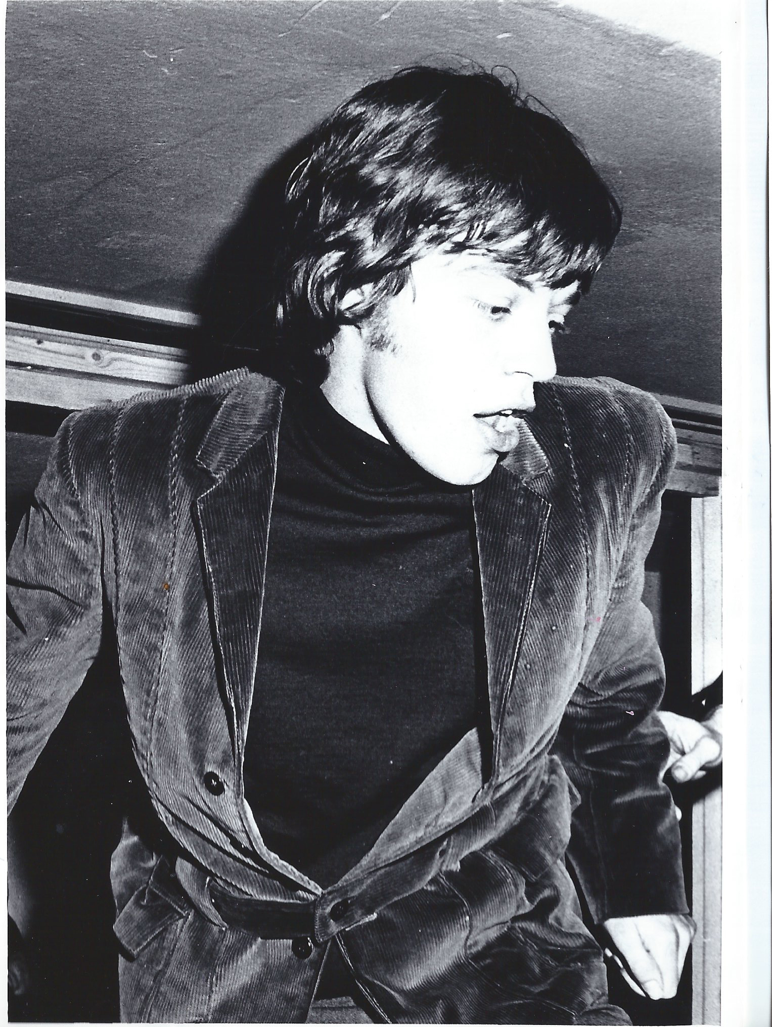
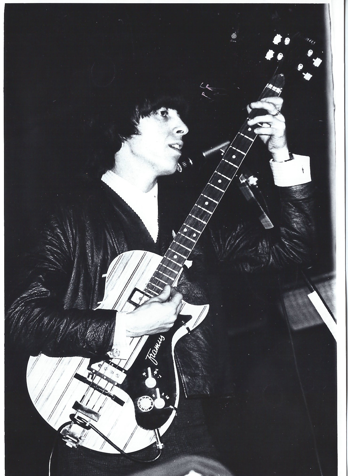
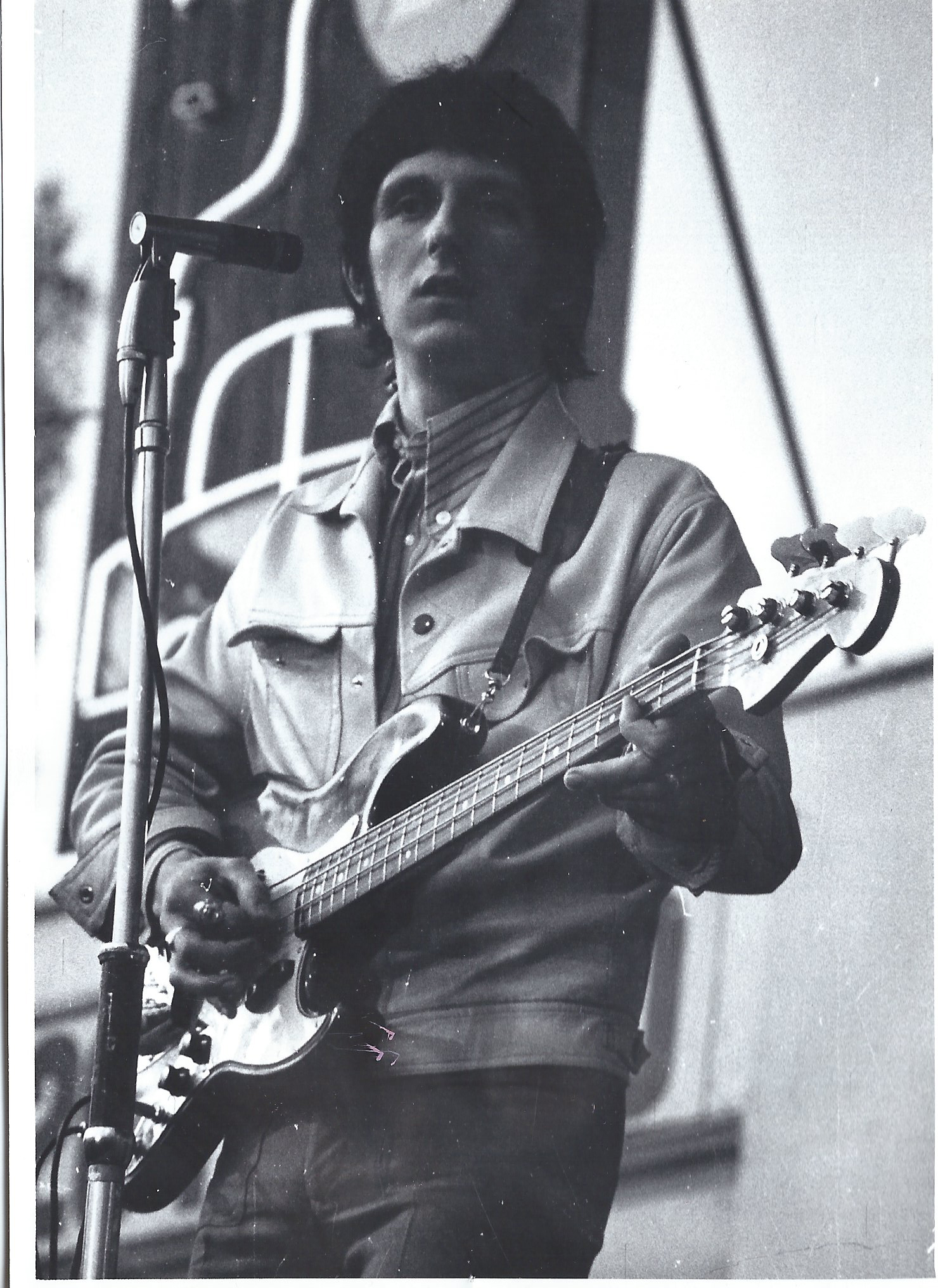
What I’ve found going through these pictures are some fascinating, but rather amateurish, pictures of some of rock music greats. There’s Otis Redding on stage at Stockholm’s Konserthus in June 1967, together with Donald “Duck” Dunn and Steve Cropper. There’s a nice profile portrait of Manfred Mann and another of the Manfred’s singer Paul Jones from a consert at Stockholm’s Nalen on 29th December 1966, Mick Jagger wearing a velvet jacket and holding his maraccas and Charlie Watts at his drums from one of the two shows at Kungliga Tennishallen on April 3rd 1966. Then there’s The Who’s Keith Moon bashing away and John Entwistle playing bass also from the Kungliga Tennishallen but on May 6th 1967.

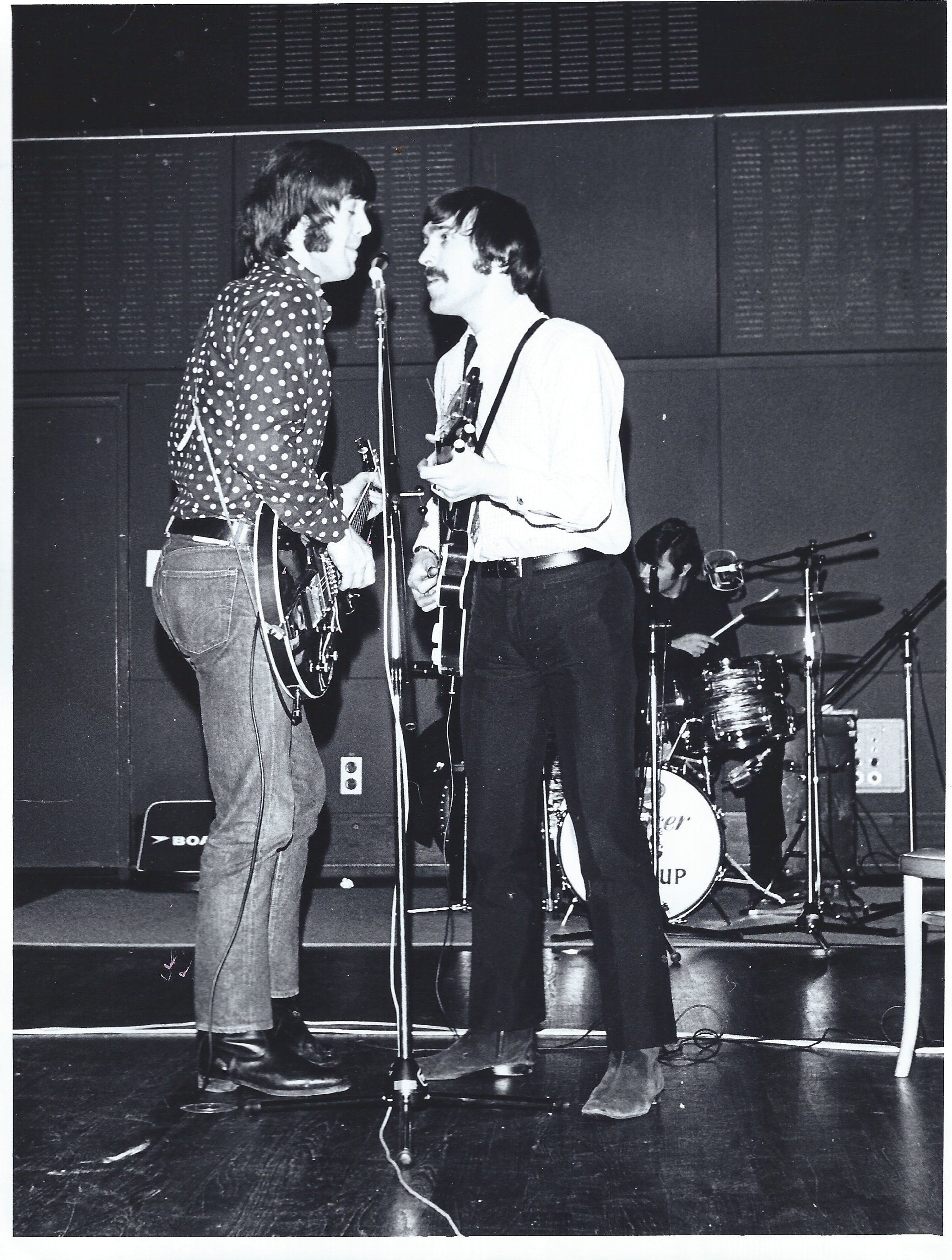
Sten managed to follow the Spencer Davis Group around after their concert at Gröna Lund in February 1967 and even followed them to Arlanda Airport to see then fly back to England.

The Jimi Hendrix Experience played many gigs in Sweden. Sten and his mate were at Gröna Lund on May 24th 1967 when the Experience played there and managed to get on the tour bus with the band as they were whisked awat to Swedish Radio for a late night recording. Once there, they had to wait for the studion to be ready and they sat in reception and drank a bottle of Johnny Walker whisky. The band signed the back of one of Swedish Radio’s studio play sheets for Sten.
Otis Redding, Duck Dunn & Steve Cropper on Stage in Stockholm.

Three Rolling Stones in Stockholm on 3rd April 1966.

One half of The Who at Kungliga Tennishallen, 1967.

Manfred Mann and Paul Jones, Nalen, December 1966.

The Spencer Davis Group in action, February 1967.

Klaus Voormann’s Early Record Covers.

There can be few artists or graphic designers who have designed record covers for more than half a century. Offhand, I can think of three: the late great Alex Steinweiss (1917-2011), who designed over 2,500 covers in his career, Sir Peter Blake, who is till going strong at the age of 91 and Klaus Voormann, who designed his first cover in 1960 and his most recent to be released in April 2024. His most famous cover, of course, is the one he did in 1966 for the Beatles Revolver, that he revisited in his book The Birth of an Icon. Revolver 50 on the fiftieth anniversary of Revolver’s release.

Voormann has designed over eighty record covers since the first that was released in 1960, when Klaus was only 22 years old. I am indebted to Thorsten Knublauch for much of the information on release dates for Klaus’s early covers. He is a mine of knowledge about matrix numbers and had tipped me off about several Voormann covers that I otherwise wouldnt have been able to collect. So, thank you, Thorsten!

Voormann’s first cover was for the Walk Don’t Run / Parisian Heiress 7″ single by a band called the Typhoons released on the Heliodor label, a subsidiary of Deutsche Grammophon that was released in autumn 1960. According to Thorsten, the Typhoons were a group of New York session musicians — but how they came to release this lone single in Germany remains a mystery.

In late October 1960, according to Klaus’s own accounts in his books, he Klaus was walking in Hamburg’s Reeperbahn district after a row with Astrid Kirchherr, when he heard music coming from the Kaiserkellar bar, on Grosse Freihet Strasse, and went in to investigate. There he was fascinated by the young Beatles and returned several times and befriended the band members. And at about the same time, he showed John Lennon the cover of the Typhoons Walk Don’t Run single.

Voormann’s first publsihed record cover.

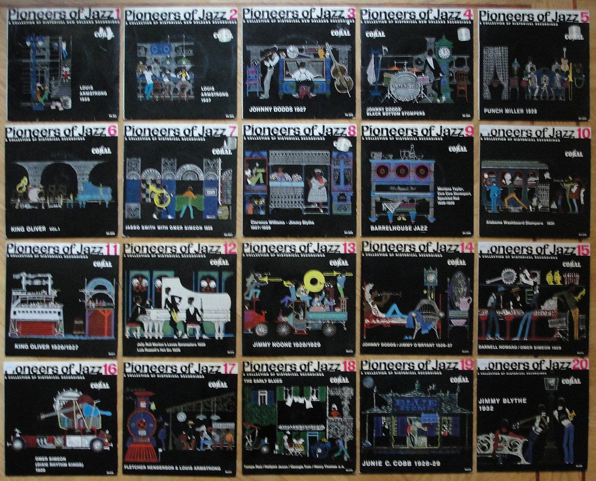
Klaus got another cover commision from Reinhart Wolf in 1960/1 to illustrate the covers for a series of jazz reeissue EPs called Pioneers of Jazz. These archival recordings were released on the German Coral label, another Deutsche Grammophon imprint at the time. Klaus illustrated all twenty covers

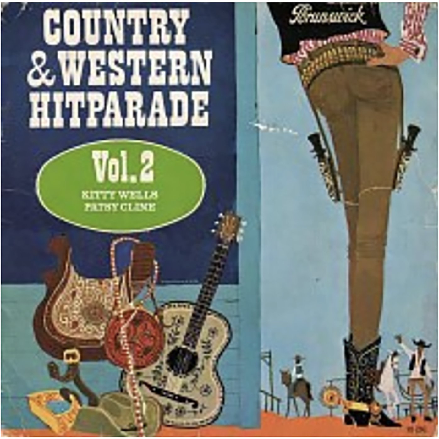
Soon after, Klaus illustrated the covers for another reissue series, this time eight seven-inch EPs each called Country & Western Hitparade, Vols 1 to 8. This time, though, all eight covers bore the same Voormann illustration. The series was released in January 1962 (my copies have a sticker on the front of each dated 2.62, implying they were availabe as early as February 1962). It’s tempting to wonder if the cowboy boot on the cover was a wink to the Beatles, who bought cowboy boots and wore them on stage while playing in Hamburg.

Voormann’s cover for the Country & Western Hitparade EPs.

Then in late 1962, probably as a Christmas gift for employees at Deutsche Grammophon, Klaus was commissioned to design the cover for the LP album Wer nie im Bett Programm gemacht.

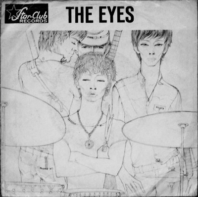
Klaus Voormann is a musician as well as a graphic designer, record producer and author and has played in a number of bands, the first of which was the Eyes, together with Gibson Kemp and Patrik Chambers. The Eyes released a single called She / Peanut Butter in 1965 with cover illustration by Klaus.

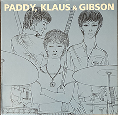
Paddy, Klaus and Gibson were three of the four members of the Eyes and they released three singles on the Pye label in 1965/6 as Paddy, Klaus & Gibson. The six tracks from these singles were reissued on a ten-inch EP in 2014 and the cover illustration was an editied version of the Eyes’cover with only Paddy, Klaus and Gibson. The limited edition EP was available on black, red and clear vinyl.

Revolver, Voormann‘s most famous cover design, was released on 5th August 1966 when Klaus was back in London as the basist in Manfred Mann’s reformed band after Paul Jones had left Manfred Mann released their latest album As Is on 21st October 1966, with cover design by Klaus Voormann. And in the following decade, Voormann went on to design covers for the Bee Gees, Gary Wright, Harry Nilsson, Edwards Hand, Ringo Starr, Jimmy Smith and Jackie Lomax.In April 2024 his 1966 portrait of Manfred Mann appeared on a double LP greatest hists package entitled Manfred Mann — Hits from the Sixties.

Voormann’s 1966 portrait of Manfred Mann on the cover of the 2024 Hits album.

Lou Reed — Words and Music May 1965.

Design: Masaki Koike.

I don’t usually succumb to the temptation to buy a record designed by someone other than one of the designers I already collect. However, I’m a fan of Lou Reed and when I read that his latest release, designed by the Japanese-American Masaki Koike, based in Los Angeles, had been nominated for a Grammy in the package design category that I thought I would ignore my own collection rule and invest. Sadly, Koike didn’t win the Grammy but his design won my approval.

This album has been proiduced by Reed’s widow Laurie Anderson and associates. Anderson found a reel-to-reel tape of Lou Reed’s early music in a sealed envelope among Reed’s possesions.

I am not alone as a vinyl collector in that I try to buy two copies of each release for my collection — one I keep sealed while the second copy is my display copy. So I had to buy two copies of the Lou Reed album. Of course I wanted the limited edition — a double album with a limited edition seven-inch EP and a CD. Most copies of this version available online or in my local record shops cost $100 or more. I was lucky to find copies for $60..

The outer and inner spreads of the cover. The seven-inch EP is visible on the left and the CD on the right, overlying the booklet with lyrics.

The twoblack vinyl LPs are mastered at 45 rpm and housed in printed inner sleeves.

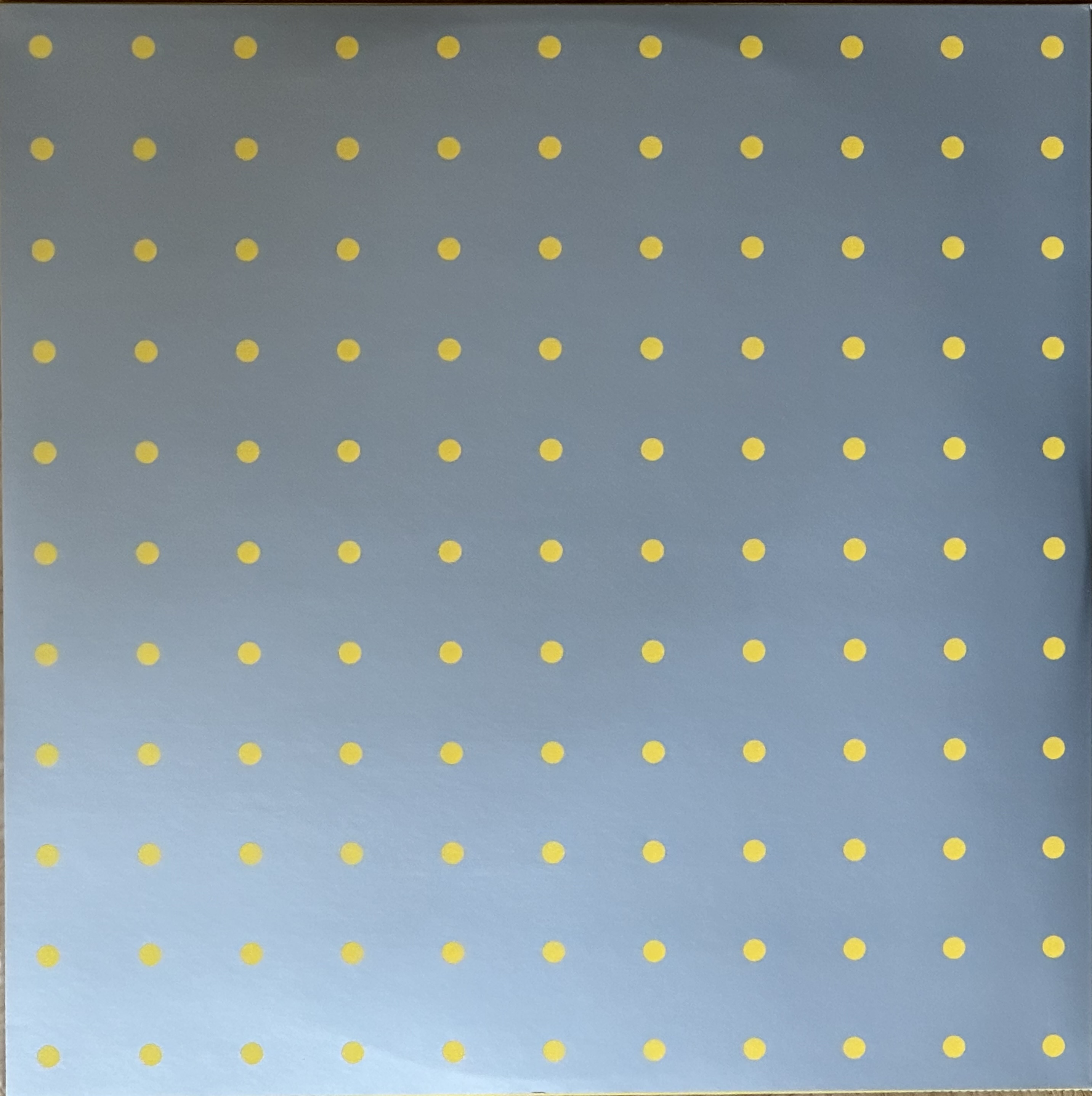
The outer cover is diecut with a series of 6 mm holes — 110 holes on the front cover. Even the seven-inch and CD covers are diecut with similar holes.

I am really pleased to have added this beautifully designed album to my collection. My congratulations to Masaki Koike for the great design. I noticed that the band round the album calls this album “No. 1”. Hopefully there will be at least one follow-up collection.

More on Richard Prince’s Record Cover Art.

It’s amazing what one can come up with after a little bit of research.

I have the exhibition catalogues from Richard Prince’s exhibitions Super Group (shown at the Gallerie Max Hetzler in Berlin, from 16th September to 28th October 2017) and High Times (Gagosian, New York, 1st November to 19th December 2018.) These include essays by Prince that explain some aspects of his record cover-related works. He obviously has a record collection and decided to make artworks of covers, starting with the nine Sonic Youth covers he happened to have in his collection. He fixed thm in a 3 x 3 format on canvas using paint as glue. Then he moved on to Kinks albums. He wanted to make a collage of sixteen Kinks albums but only had six so he went out and bought ten more! Next he collected eighty-seven Beatles albums, includung seventeen copies of Revolver! However, he doesn’t say how he used all these.

Prince got fascinated by records’ inner sleeves and betweewn 2015 and 2017 created a series of large format paintings/collages using record sleeves, black and white stuck to canvas and with group names and song tiotles as well as some “hippie” figures from his earlier series of Hippie paintings that had been noticed by High Times magazine that had used two on the covers of its September 2016 special trippy issue.

In 2016 A Tribe Called Quest were planning to release their first album since 2003 and the band’s lead rapper, Q-Tip (Kamaal Ibn John Fareed) approached Richard Prince to ask if he would design the cover. Q-Tip had obviously seen Prince’s Hippie paintings and wanted something in that style. However, at that time Prince was painting his Super Group paintings/collages using blank black or white recoird sleeves.

Prince visited the band in NewJersey and painted portraits of the four members, rendered in his Hippie painting style. The final cover design for the CD/double LP combined one of his Super Group collages with a Hippie-style portrait of one of the band.

A tribe Called Quest’s 2016 album We Got It From Here … Thank You 4 Your Service.

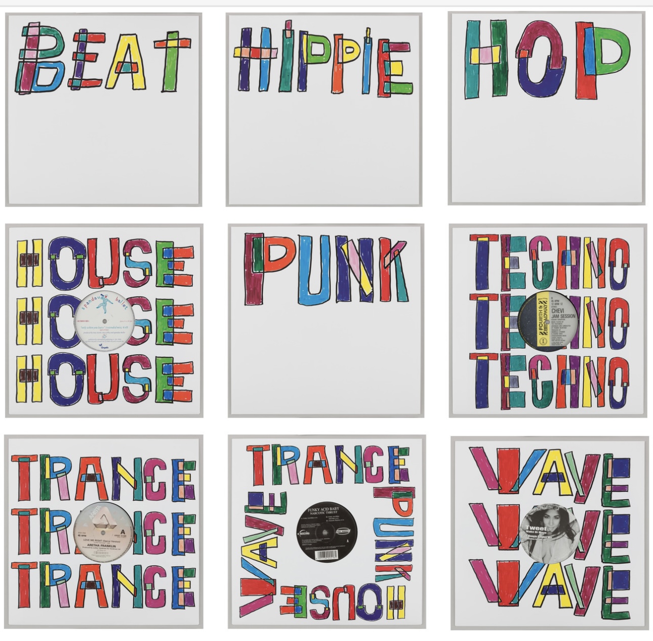
You may remeber the set of nine “Pop” covers that Prince exhibited in 2022.

Richard Prince’s 2022 set of nine “Pop” covers.

All the words on these covers seemed to relate to a particular music genre, with one exceprtion: Hippie. I wondered why Prince had chosen that and, having now read about his series of Hippie paintings, I realise where the Hippie probably came from as the style of these paintings is similar to the style of the Hippie works. I couldn’t get hold of the original covers, so–in true Richard Prince style–I made reproductions for my Richard Prince cover collection.

Appropriational Art — To Copy or Not to Copy?

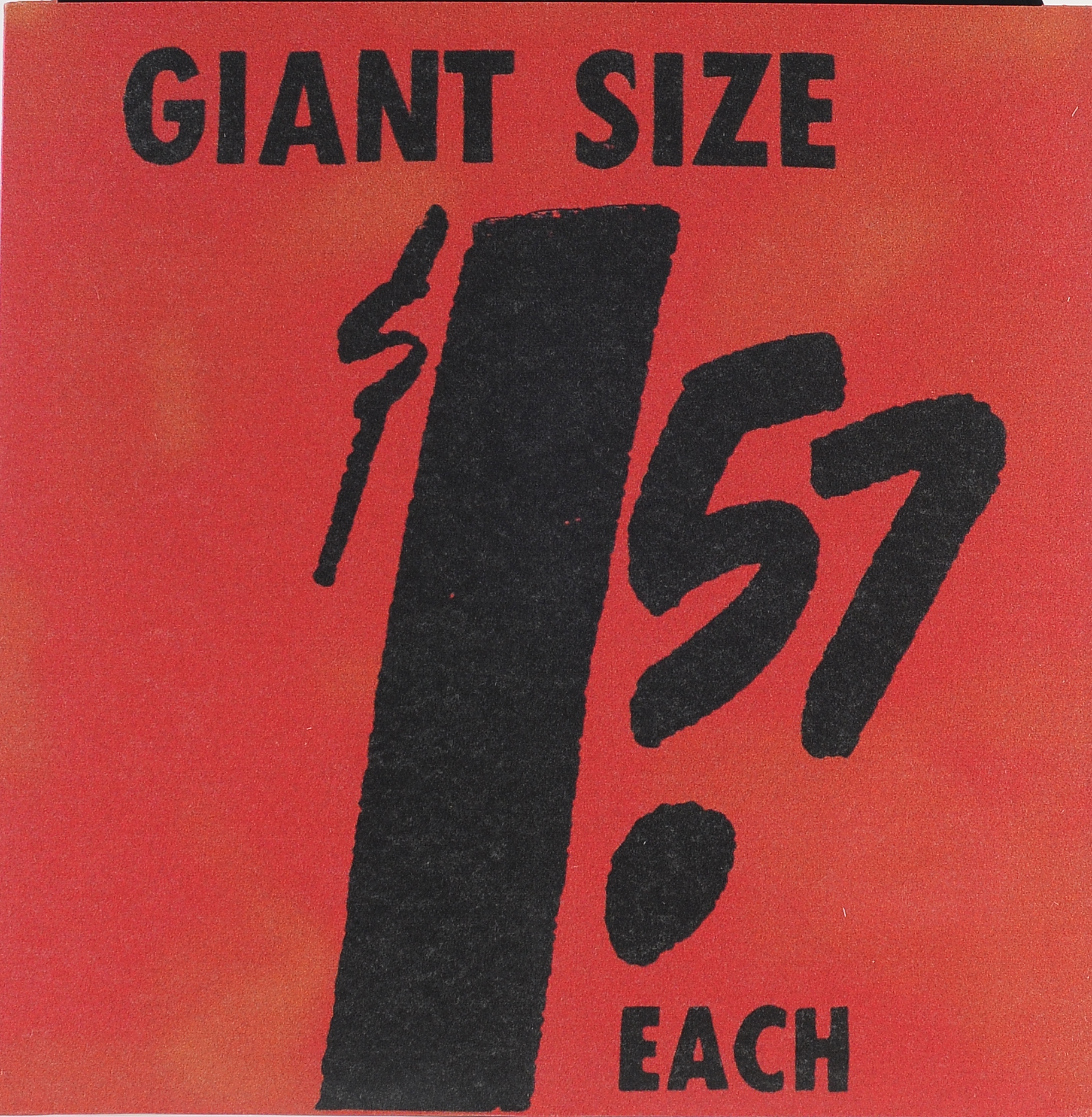
I consider myself to be a graphic designer as opposed to an artist. And as a collector of record cover art I quite often remake a rare cover or create covers for records that never existed, but for which cover art exists. Examples are my creation of covers for a proposed RCA Victor jazz album entitled Progressive Piano that was scheduled for release some time in the 1950s but, despite being allocated a catalogue number, was never actually released. The Warhol Museum has lithographs of Andy Warhol’s proposed designs for the covers of a 10-inch and a 7-inch version of the record. I created full-sized covers from photos of these lithographs and even made record labels to look like fifites RCA Victor labels.

Warhol also made collages for a projected Billie Holiday album to be called Volume 3. He made four versions and pictures have circulated on the Internet , so I decided to make actual covers and include records suggesting that the album would have been released by Columbia Records, though Warhol’s designs do not include a record label or catalogue number.

I consider these to be appropriations of Warhol’s art not dissimilar to those made by Elaine Sturtevant (1924-2014) who painted versions of Warhol’s Flower paintings — and was even given a silkscreen by Warhol to make further prints!

And then there are my paintings of posters and record sleeves.

There is a fine line between appropriation and copyright infringement. Warhol, or the Andy Warhol Foundation, was sued on at least three occasions. The first was in 1966. when Patricia Caulfield (1932-2023) sued Andy Warho for his use of her photograph of hibiscus flowers photographed in a Barbados restaurant as the basis for his series of Flowers paintings and prints. The case was settled out of court with Warhol paying Caulfield $6000 (from the sale of two Flowers paintings plus 25% of the royalties from the sale of the Flowers prints.) Warhol had, apparently, offered to licence the use of the photogeaph from the Modern Photography magazine, but was unwilling to pay the price quoted.

In 2011 the Andy Warhol Foundation intended to licence the use of Warhol’s Banana design for use for ipod and iPad ancillary products. However, the Velvet Underground threatened to sue as the band considered the design “to represent a symbol, truly an icon of the Velvet Undergound”. The matter was settled out of court with the Foundation publishing a letter stating that the matter had been resolved by a confidential settlement.

In 2021 photographer Lynn Goldsmith sued the Andy Warhol Foundation for licencing Warhol’s portrait of Prince to Condé Nast Publishers without credit to Goldsmith. She eventually won in the Supreme Court which decided that the Warhol version of her photograph was not sufficiently “transformative” to justify “fair use”, a legal term used to exempt use of copyright materal without having to pay the creator. Such use could be in reviews, criticisms or similar situations.

Other artists, ranging from the above-mentioned Sturtevant, to Jeff Koons, Richard Prince (who also lost a suit over his appropriation of five of Patrik Cariou’s photos of Rastafarians that Prince used in his 2008 exhibition Canal Zone at the Gagosian Gallery), and most recently, Eric Doeringer who makes “bootlegs” of other artists works, including Richard Prince’s! Apparently Prince has given Doeringer his blessing but Takashi Murakami was not so impressed with Doeringer’s work and issued a “stop and desist” order to prevent him from using Murakami’s work.

I have three examples of Richard Prince’s work in my collection: his 12-inch, limited edition, single sided vinyl Loud Song (with cover art by Sonic Youth’s Kim Gordon), a 7-inch flexidisc of Loud Song that is included in his High Times! monograph published by Gagosian, and the limited edition, picture disc It’s a Free Concert Now. I recently saw that Eric Doeringer has made a 7-inch version of Loud Song with two of his own songs (Catherine and My Way) and made a new version of Kim Gordon’s cover art. This EP has been pressed in a limited edition of just twenty-six copies, numbered from A to Z. I got number J.

Doeringer (born 1974) has achieved serious acceptance for his art by being awarded gallery exhibitions and thus a degree of fame. I find his story encouraging and a stimulus for my own continuing appropriation of other artists’/designers’ work. Hopefully my works will be suffiently “transformative” to be considered “fair use”.

There is a lot more to be said about appropriation art. There are several artists reproducing record covers commercially that could possible fall foul of copyright law. So far, though, they do not appear to have been challenged.

Barney Bubbles – the Anonymous Record Cover Designer.

One of the first things I look for when I see a record cover I like — or have just bought — is to check the liner notes, back cover or possibly the printed inner sleeve to find out who was responsible for the cover artwork/design. I never knew I had a collection of Barney Bubbles’ record covers despite having (at least) thirteen in my record collection. If he did allow a designer credit he would, as often as not, use a pseudonym.

I suppose I knew that Barney Bubbles (born Colin Fulcher on 30th July 1942, died 14th November 1983) had designed the logos for Stiff and F-beat record labels but none of my Elvis Costello albums or my Wreckless Eric records mentioned a designer. I did like a couple of Hawkwind’s covers, but I never bought any. No mention of a designer on those anyway. Other artists include Nick Lowe, Ian Dury, Quintessence and Billy Bremner. Barney Bubbles even released his own album, Ersatz, credited to The Imperial Pompadours

I recently starteed reading Kenneth FitzGerald’s Process Music: Songs, Stories and Studies in Graphic Design. FitzGerald writes beautifully — the book is a collection of his writings on graphic design with focus on a number of designers, one of whom is Barney Bubbles. There I read descriptions of many covers but there aren’t any pictures, so I was constantly searching Discogs to see what FitzGerald was describing. Then I found Discogs list of seventy-two Barney Bubbles cover designs, though incomplete, it is a good way to see images of most of his covers.

Here are a couple of other Barney Bubbles covers not included in the Discogs list:

These eclectic designs show that Barney Bubbles knew his design history. The Art of Roger Bechirian cover referencing Alex Steinweiss’ early designs for Columbia Records in the 1940s and fifties.

FitzGerald is impressed by the sheer amount of work Barney Bubbles produced between 1977 and his death at the age of forty-one in 1983. In addition to record covers he designed advertising material, posters and was an accomplished draughtsman and painter. He was suppported by Stiff Records, and later Radar Records, founder Jake Riviera.

Paul Gorman, who manages Barney Bubbles’ estate, has written a book, about Barney Bubbles’ art. Reason to Be Cheerful: The Life and Work of Barney Bubbles that was originally published in 2010 and an updated version came out in 2022. There is also a 500 copy, limited edition, box set of Barney Bubbles’ work called A Box of Bubbles.

Record sleeve art by artists I collect