Tag Archives: Andy Warhol

Is Appropriated Art Fair? — Cecilia Edefalk — A Modern Case History.

Banksy’s sculpture ”Bad Artists Imitate…” An appropriation.

In September 2023 I wrote about the implications of photographer Lynn Goldsmith’s successful legal action against the Andy Warhol Foundation and Condé Nast over Warhol’s appropriation of her portrait of Prince. The Supreme Court ruling established a notably stricter interpretation of “transformative use” than many in the art world had anticipated. You can read that post [here].

A recent Swedish television documentary has prompted me to revisit the subject.

Jag är inte här, jag drömmer (I’m not here, I’m dreaming), broadcast on SVT on 26 April 2026, profiles Cecilia Edefalk (born 1954), one of Sweden’s most celebrated contemporary artists. It is a sympathetic portrait, following her career from when she left art school to the present day. Distinguished critics including Daniel Birnbaum — former director of Moderna Museet and one of the most respected voices in the international art world — speak warmly about the importance of her work, noting that she borrows from mass media and advertising, adding or subtracting to make something new.

Nobody asks the obvious question.

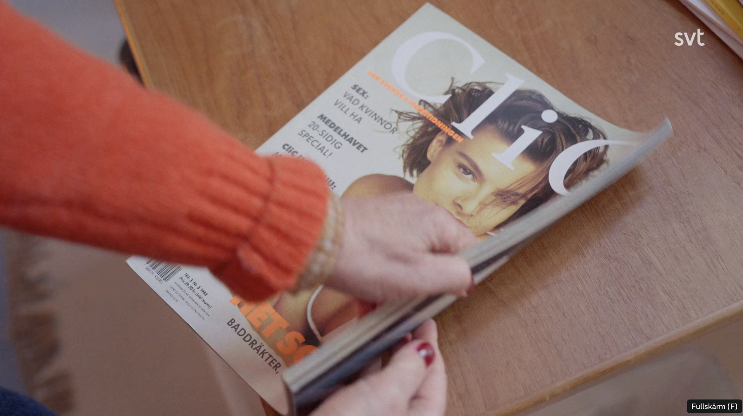
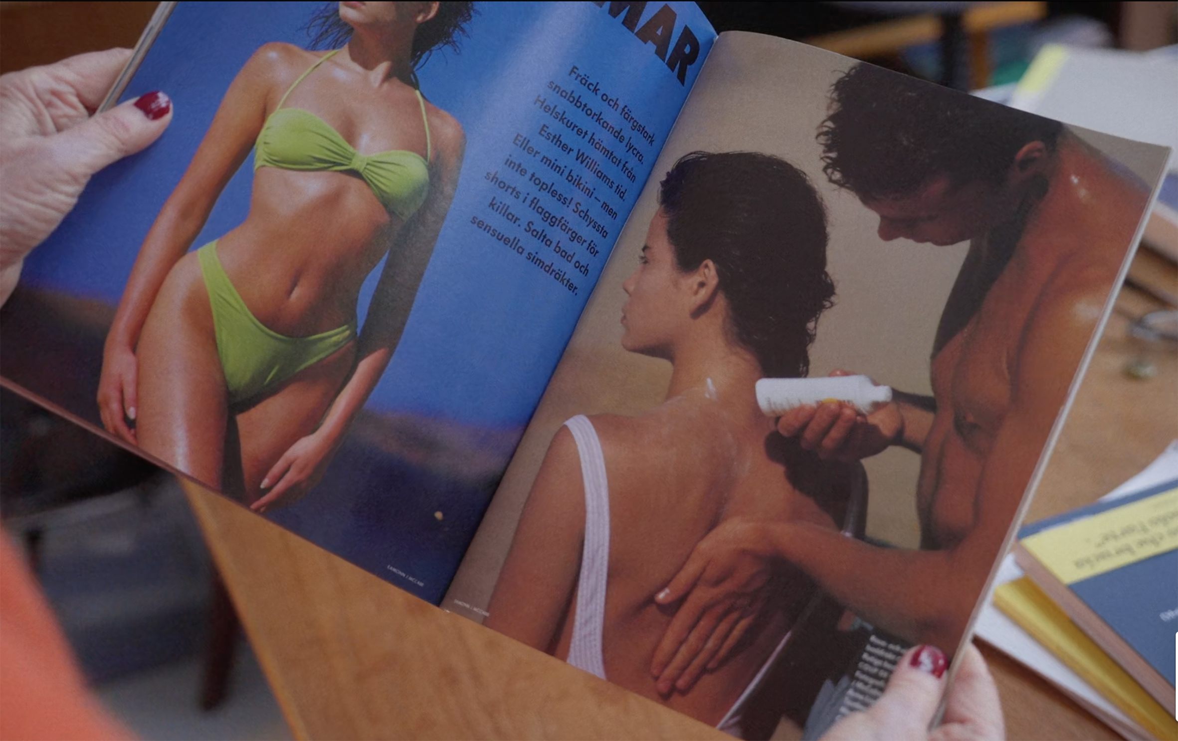
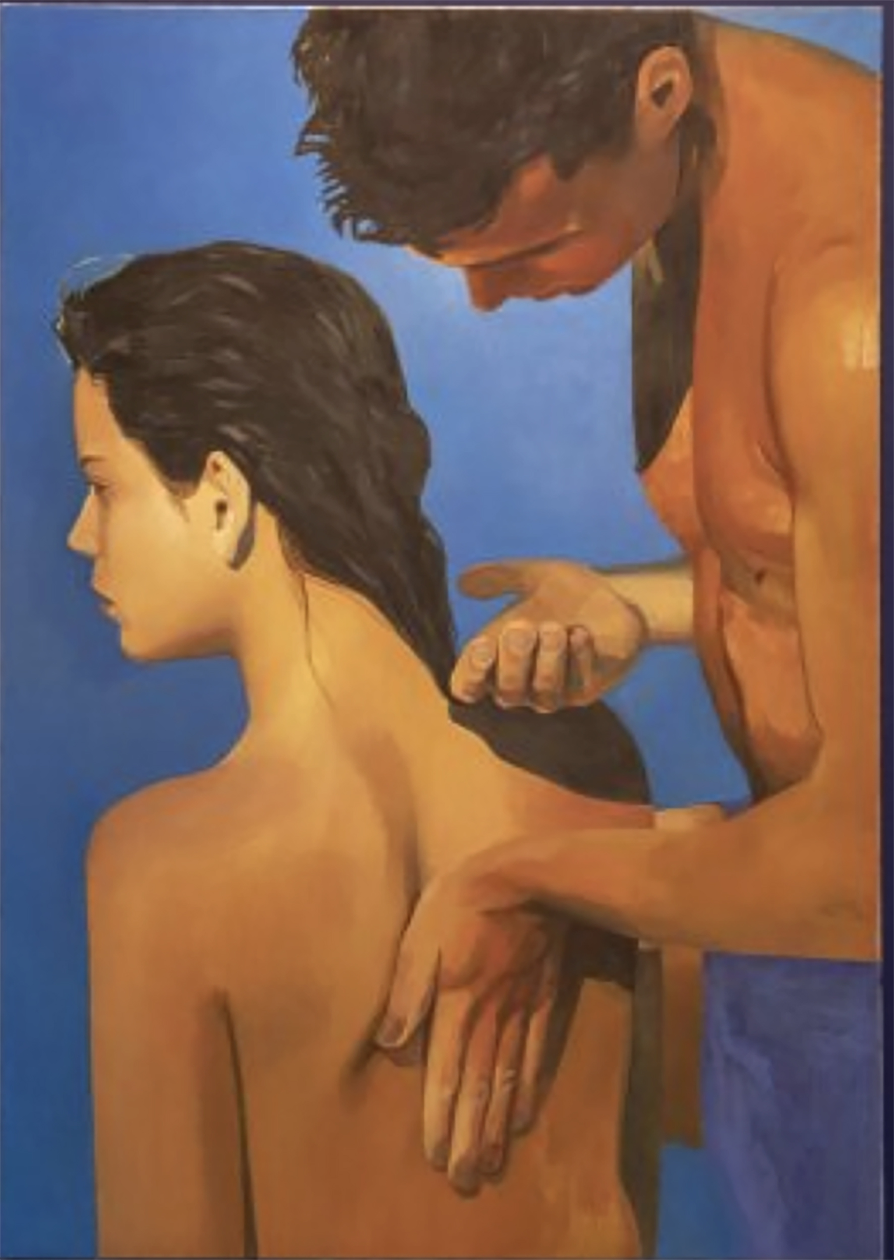
In one remarkable sequence, Edefalk holds up her source material for one of her better known paintings— a double page spread from Clic magazine, issue 3, 1988. Clic was founded by Cay Bond in 1981 as a forum for Swedish fashion design, using Swedish photographers throughout its run. The photograph shows a man applying suntan lotion to a woman’s back. Edefalk explains her modifications: she removed the suntan lotion bottle, painted the woman nude by removing her bathing costume, and changed the background colour from grey-brown to blue. The result, rendered at monumental scale in oil, which she painted in at least seven versions of varying sizes, has been exhibited internationally and commands serious prices.

The final painting with the suntan oil bottle, the woman’s bathing costume removed and the backgrund colour changed.

The photographer — almost certainly a Swedish professional working on commission for a Swedish publication — is not mentioned. Neither is the question of credit, compensation or consent. The model, painted nude without her apparent knowledge or agreement, is similarly absent from the conversation.

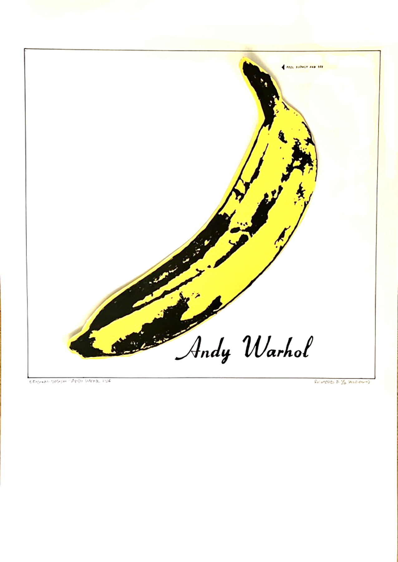
Edefalk has produced this and similar works in multiple identical versions of various sizes — a strategy echoing Warhol’s silkscreen series. But where Warhol’s multiples worked through the silkscreen process itself, introducing colour variations and surface irregularities that were intrinsic to the meaning, identical painted versions in different sizes raises a different question: if the work is genuinely transformative, why does it need to be reproduced identically, many times, at different scales? One might argue that the source photograph is doing most of the artistic heavy lifting.

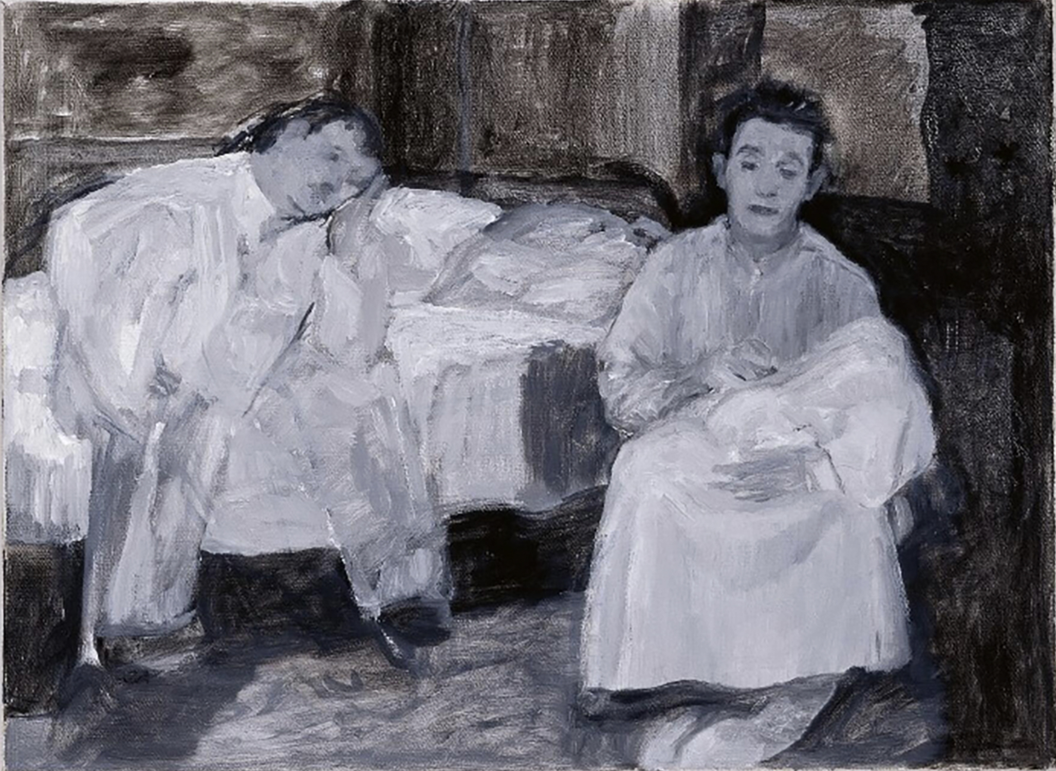
Edefalk has also painted a series of works based on Laurel and Hardy film stills — among them “Family” (1999), now in the collection of the Museum für Moderne Kunst in Frankfurt. The source is a bedroom scene from a 1932 film, reproduced in monochrome — which, it should be noted, is also the tonality of the original black and white film still, making the nature of the “transformation” somewhat difficult to identify. In fairness to Edefalk, a 1932 film still was almost certainly in the public domain in 1999, and the legal landscape around appropriation at that time was considerably more permissive than it is today. The post-Goldsmith world asks harder questions than the art world of 1999 was inclined to. Whether MMK Frankfurt — acquiring the work in full knowledge of its source — would approach the matter differently today is an interesting question that nobody appears to be asking.

However, Edefalk’s use of copyrighted material has not been entirely unchallenged. Swedish photographers raised objections and there was press coverage of the copyright implications. She and her supporters have their answer — Birnbaum’s formulation of “borrowing to make something new” is the standard defence of appropriation art, and it is not without merit. The question is whether removing a suntan lotion bottle, undressing a model and changing a background colour constitutes making something sufficiently “new” — particularly in the light of the post-Goldsmith legal landscape.

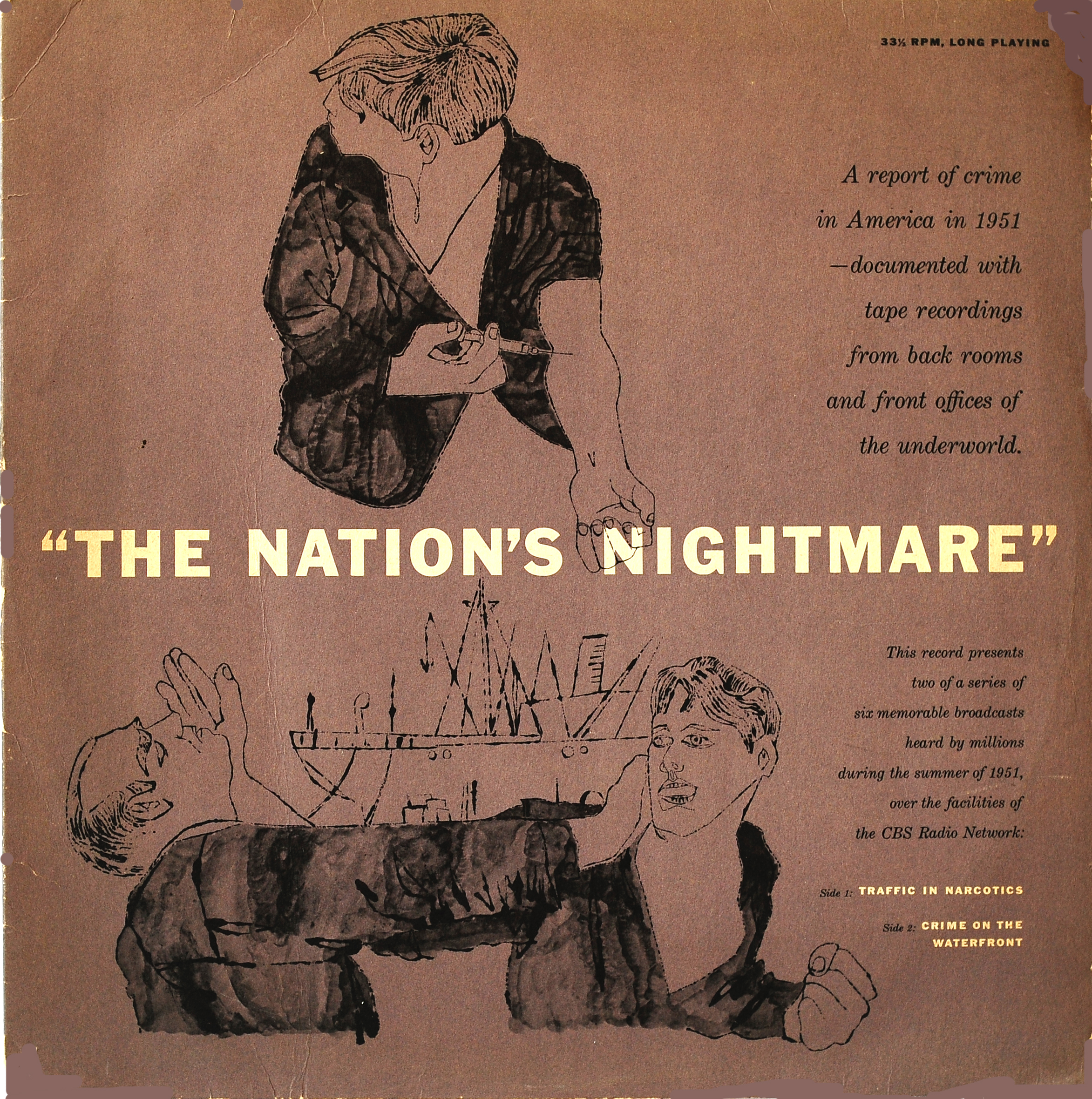
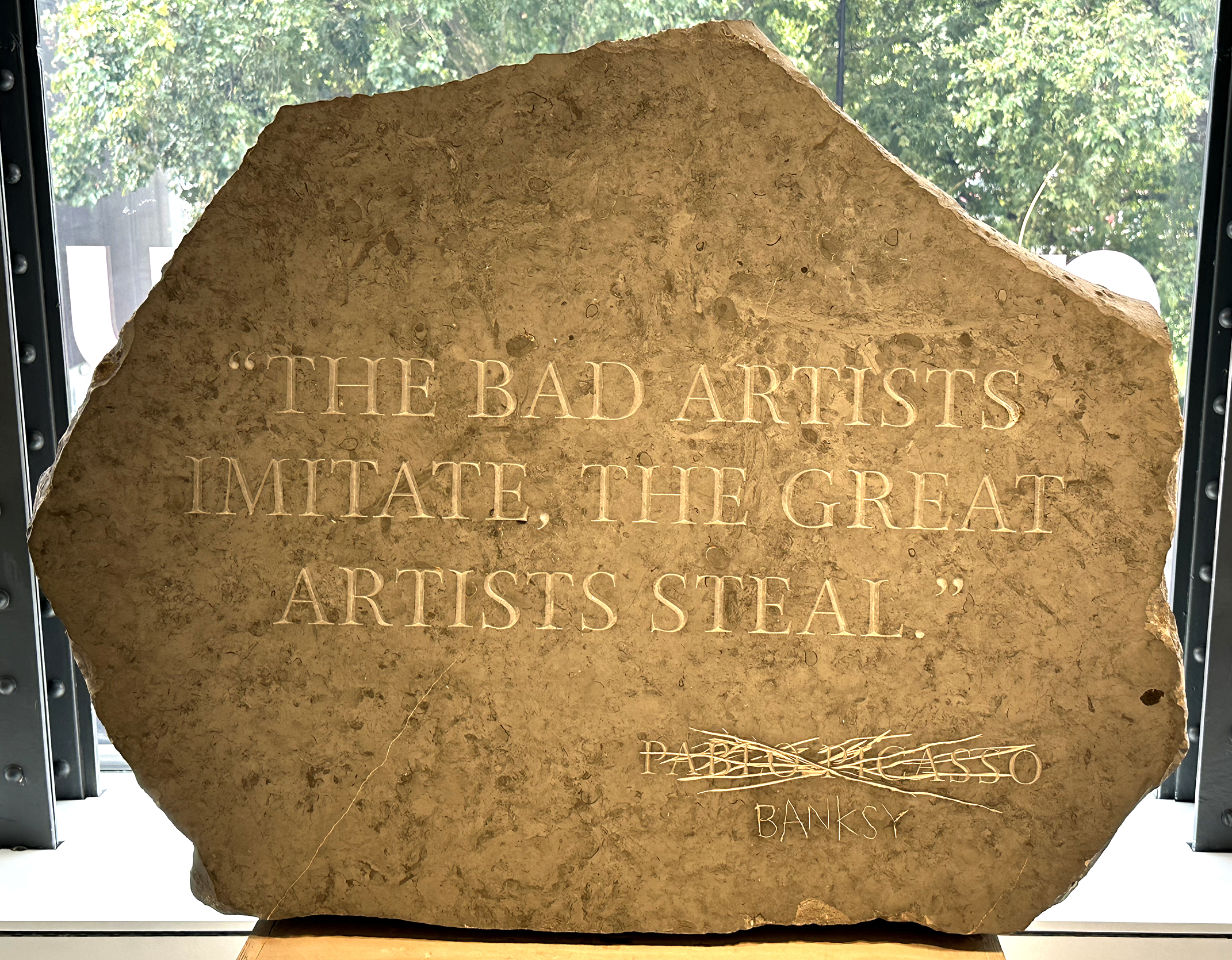
The precedents are not encouraging for appropriation artists. Patricia Caulfield successfully sued Warhol for using her photograph of hibiscus flowers as the basis for his celebrated Flowers series. Richard Prince has faced multiple legal challenges over his appropriation of other photographers’ work, with largely unfavourable results. And the Supreme Court’s Goldsmith ruling confirmed that even an image unmistakably bearing an artist’s signature style may not clear the transformative use bar if it serves a similar commercial purpose to the original.

Against this backdrop, Elaine Sturtevant’s practice stands out as the most philosophically rigorous position in the appropriation canon. Sturtevant copied works by Warhol, Duchamp, Beuys and others — but from memory rather than directly from the originals. The inevitable drift introduced by memory made her copies meditations on the nature of the original rather than reproductions of it. She was also admirably transparent about her method. That combination of philosophical intent and acknowledged practice is rather different from simply painting from a magazine spread.

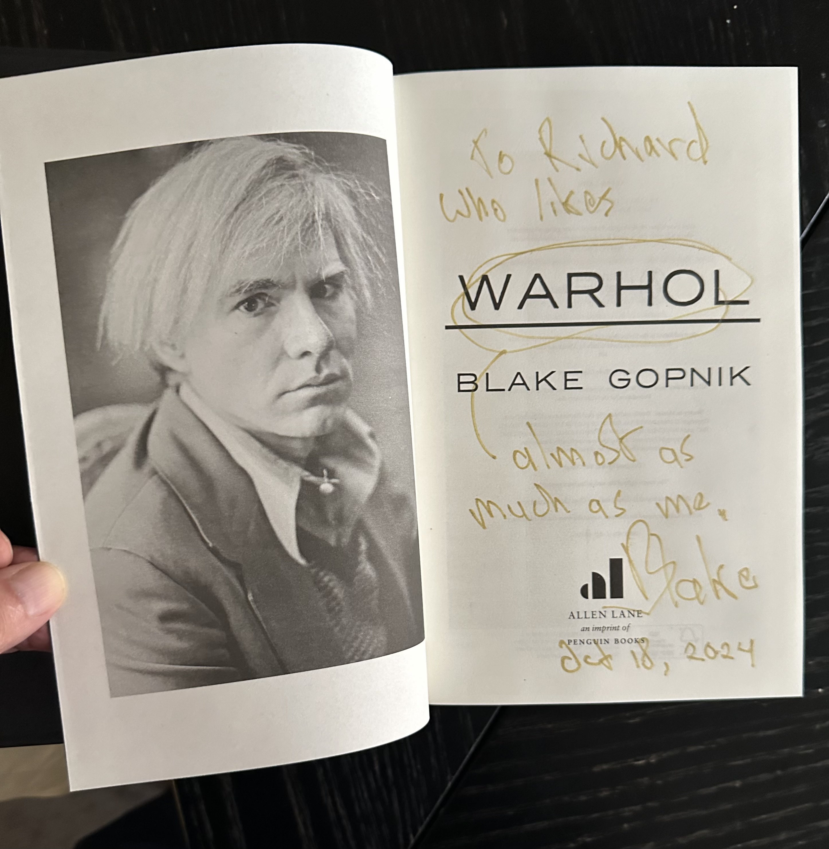
I should, in the spirit of full disclosure, acknowledge my own position in this conversation. I have made hand-painted reconstructions of unissued Warhol cover designs for a proposed Billie Holiday album — designs Warhol created in the 1950s, possibly on commission, possibly simply for his own amusement and a 50th anniversary series of his Giant Size $1.57 Each, as well as his Progressive Piano covers (ten-inch and seven-inch versions) . The immediate inspiration for the Billie Holiday cover creations was seeing one of Warhol’s original collages displayed on the wall of a Swedish museum exhibition, apparently sourced from the internet and included among genuine Warhol cover designs. My reconstructions, complete with period Columbia Records labels and liner notes signed with my Internet moniker “Rockdoc,” are explicitly labelled as such. I am also the author of forthcoming books on Banksy’s and Peter Blake’s record cover art — artists whose own relationships with appropriation, quotation and borrowed imagery are central to their practices. Thus I am not a disinterested observer.

The appropriation debate is genuinely complex and I have no wish to reduce it to simple condemnation. Borrowing, quoting, referencing and transforming are as old as art itself. But the critical establishment’s apparent incuriosity about the specifics — an unnamed Swedish photographer’s uncredited and uncompensated work, a model painted nude without apparent consent, a legal landscape that has shifted considerably since these works were made — is harder to excuse, particularly from critics who know perfectly well where these questions lead.

The suntan lotion bottle and the bathing costume, at least, had been removed. Whether what remains constitutes transformation or merely tidying up — and undressing — is left as an exercise for the reader.

Andy Warhol and the Velvet Underground & Nico.

My series of paintings of records covers continues. I’ve now done seven: The Ramones, UFO’s Strangers in the Night, Kraftwerks’s Die Mench Maschine, Ian Dury’s Juke Box Dury, Led Zeppelin I, The Clash, and most recently the Sex Pistol’s Never Mind the Bollocks and the Velvet Underground & Nico with its removeable banana.

While I was busy painting these, I was reading Andy Warhol’s & Pat Hackett’s Popism: The Warhol ’60s and I came to 1966 when Warhol describes his first meeting the Velvet Underground in late 1965 and his interest in “getting into the music scene”. Warhol and Paul Morrissey had planned a Velvet Underground concert in early 1965, but the locale turned out to have been previously booked, and desperate, Paul and Andy overheard a conversation that the Polish Dance Hall, the Dom, on St Mark’s Place, was free during April and so Warhol rented it to put on what he intitially called the Erupting Plastic Inevitable—it wouldn’t be called the Exploding Plastic Inevitable until later.

Warhol put a half-page ad in the Village Voice:


Come blow your Mind
The Silver Dream Factory Present
ERUPTING PLASTIC INEVITABLE
with
Andy Warhol
The Velvet Underground
and
Nico

It was at the Dom, at one of the Plastic Inevitables, that Warhol met Eric Emerson who would later come to influence the Velvet Underground & Nico’s album release. At the end of April ’65, the Velvets along with other bands played at the opening of The Cheetah Club on Broadway and 53rd Street.

Warhol describes how he put up the money to rent a couple of days’ studio time at “one of those little recording studios on Broadway”. He was, of course, referring to the Scepter Studio run by Norman Dolph. According to Popism, Warhol, Paul Morrissey, Tom Wilson and Little Joey (whom Warhol describes as “The Factory gofer) were the only people in the control room (though I would guess Dolph was there, too.)

I think “put up the money” is something of a euphemism. Rumour has it that he paid Dolph with a Campbell’s Soup Can painting! Another of Warhol’s ways of settling accounts without having to dip into his pockets. According to Blake Gopnik, author of the definitive Warhol biography, Warhol “paid ” Giuseppe Rossi, the surgeon whon saved his life after he was shot by Valerie Solanas in June 1968, with seven Soup Can prints—apparently Rossi wasn’t worth the full set of ten prints!

Warhol says that the Velvets hadn’t included Nico originally as they didn’t want to be seen as a “back-up band for a chanteuse.” Warhol says “ironically, Lou had written the greatest songs for her to sing. Her voice, the words, and the sounds the Velvets made all were so magical together.”

When the lease on the Dom lapsed at the end of April, Warhol says they “only had time to record half the album in that Broadway studio” — “All Tomorrow’s Parties, There She Goes Again and I’m Waiting for the Man“. However, thanks to the discovery of the Scepter acetate, we now know that almost the full album was recorded. Dolph, in aaddition to owning the studio, was a sales executive at Columbia Records and sent the tape to Columbia but they declined, as did Atlantic Records (objecting to the drug references) and Elektra Records.

In May ’65, Warhol & the Velvets went to Los Angeles where Tom Wilson rerecorded I’m Waiting for the man, Venus in Furs and Heroin. The final track, Sunday Morning was recorded in Mayfair Recording Studios in Manhatten, in November 1966. MGM’s subsidiary company Verve Records agreed to release the album.

In Popism, Warhol describes his initial ideas for the cover design were a series of plastic surgery images, and Warhol had “sent Little Joey (the gofer) and his friend Dennis to medical supply houses for photographs and illustrations of nose jobs, breast jobs, ass jobs etc.—they brought me back hundreds!” Luckily, Warhol ditched that idea in favour of the now famous banana.

Warhol goes on to tell how he watched “a tall guy with dark curly hair step out of the elevator carrying a big manila envelope under his arm. … The guy didn’t know who to talk to and he just started wandering around, looking at the canvases, the screens, the vunyl, the plastic, the crumbling walls. If anybody “received” people at the Factory, it was Gerard (Malanga), but he’d just gone out to mail invitations to one of his poetry readings. The guy walked three-quarters of the way through the Factory till he saw me sitting in my corner and almost jumped—it was so hot, I hadn’t moved for an hour. He handed me the envelope. It was the from the artwork department at M-G-M records.

Warhol doesn’t say any more about the contents of that envelope. Did it have the famous rear cover picture with Eric Emerson’s head? When the album was eventually released in March 1967, Emerson demanded payment for the use of his picure, forcing Verve Records to recall as many albums as they could and sticking a black label over the back cover photo. They re-released the album with Emerson airbrushed out of the frame.

The rear cover with the sticker covering Emerson’s face.

From Warhol to Banksy — A Trip Through Record Covers.

Try to imagine a shy twenry-year-old, who is conviced he is ugly (his nose is bulbous and his hair is already thinning) who leaves art college in his home town of Pittsburgh and, in the summer of 1949, moves to New York to seek his fortune. Andy Warhola is determined to find work and hawks his portfolio to the offices of glossy magazines and record companies.

He goes to the offices of Columbia Rrecords, who the previous August, had begun reieasng long playing records and was in the process of reissuing many of their best selling classical albums previously available as 78 rpm sets in the new medium that allowed a whole symphony to fit on one side of a twelve-inch LP.

In 1938, the company hired a 21-year-old Alex Steinweiss as its art director. Steinweiss felt that the company’s record albums with their plain covers were dull and suggested adding pictures to the covers. His superiors were sceptical, but allowed him to make a few trial cover. These were successful, increasing sales. Steinweiss first cover was for an album of Smash Hits by Rodgers and Hart.

The young Warhol was commissioned to illustrate two covers.

Andy Warhol’s first cover for Columbia Records, 1949.

In 1951, Warhol was commissioned to illustrate a newspaper advertisement for radio programmes called The Nation’s Nightmare and Crime on the Waterfront to be broadcast by CBS Radio that autumn. CBS decied to release the programmes the following year on an LP.

Warhol won his first design award for the designs.

In the fifties, Warhol cooperated with Reid Miles, the legendary art director at Blue Note and Prestige Records, producing a numner of classic jazz covers. He also continued to get commissions from Columbia Records subsidiaries and designed several classical covers.

Other Pop artists would later design record covers: Robert Rauchenberg designed the limited edition cover for Talking Heads’ Speaking in Tongues (1983), Robert Indiana’s LOVE image appeared on a recording of Messiaen’s Turangalila Symphony and Ed Ruscha, who has become Paul McCartney’s buddy, has designed several covers for the ex-Beatle as well as the cover for the Beatles’ last single Now and Then.

And England’s Pop artists were also designing record covers. Peter Blake together with his wife at the time, Jann Haworth came up with the famous cover for the Beatles’ Sgt. Pepper’s Lonely Hearts Club Band album and Blake has continued to design record covers — now over forty! Richard Hamilton was invited to design the Beatles next full album The Beatles (the white album) and chose a minimalitic cover to contrast with the Sgt. Pepper design.

Other British artists who have designed record covers include Damien Hirst, David Shrigley, Tracy Emin as well as design groups such as Hipgnosis.

Andy Warhol, announced in 1965 that he was giving up painting to concentrated on his other projects — film and the Exploding Plastic Inevitable, featuring the Velvet Underground and performances and dancers including Gerard Malanga, who would assist Warhol in his printmaking. He took the Velvet Underground to Norman Dolph’s Scepter Studio in New York to record the band’s first album. Warhol insisting that Nico, a German singer, sing on three songs. Warhol offered the record to Columbia Records, who turned it down, suggesting it needed beter production and Warhol let Tom Wilson re-record the album, which Warhol then offered to Verve Records who released it in March 1967. Warhol designed the Banana cover and the front cover just had the banana (with ‘peel me and see’ beside the neck) and Andy Warhol’s name at the bottom.

Warhol was a “mover and shaker” in 60s and 70s New York travelling to parties and discos always with an entourage of beautiful people. He loved being with celbrities. He met Mick Jagger who asjed him to design the cover for the forst Rolling Stones album to be released on the Stones’ own label. Warhol came up with the zip cover for Sticky Fingers (released April 1971).

My signed “Sticky Fingers” LP.

There has been a debate about whose jeans Warhol photographed for the Stocky Fingers cover. It wasn’t Joe d’Allesandro, as many have suggesteds. It may have been Warhol’s parrtner Jed Johnson’s twin brother Jay who was the model.

Warhol was also asked to design the cover for the Stones’ Love You Live album. He had invited the band to hs Long Island home at Montauk wherer he photographed them biting themselves or each other. He selected a picture of Mick Jagger biting his daughter Jade’s hand for the cover. Warhol dis not want any writing on the cover but Mick Jagger added the band name and the record title, which annoyed Warhol. He would normally sign anything he was asked to sign but refused to sign the front cover of the Love You Live album, usually choosing instead to sign the inner spread.

The Front cover of “Love You Live” showing Mick biting a child’s hand (Jade Jagger). .

Later Warhol began a cooperation with Jean-Michel Basquiat, a New York street artist turned fine artist. Basquiat would only outlive Warhol by little over a year, dying in 1968 of a drug overdose, but nor before he had managed to produce a few record covers.

That brings me to other street artists, including the enigmatic artist who calls himself Banksy. Banksy started as a street artist in his native Bristol in the late 90s and produced designs for record covers from then. His first major albel design was for Blur’s Think Tank album in 2003.

Bansky’s art has appeared on over two hundred records and CDs, the majority unofficially.

Other street artists have designed record covers. Mr. Brainwash designed Madonna’s Celebration compilation from 2009.

Hellstrom, a Swedish street artitst, designed a limited edition cover (40 copies) for his namesake Håkan Hellström’s Illusioner album (2019) with a silkscreened portrait of the artist.

Other Swedish designers and artists have designed interesting ecord covers. Martin Kann has designed the covers for bob hund’s records and CDs and — as far as I know — produced on the second cover to give the cover designer’s name on the front of a release: Omslag Martin Kann by bob hund.

The Swedish designer who has sold the most ercords in Swedden is probably Helen Sköld, who has desgne dthe covers for kent, Sweden’s biggest band since ABBA.

Karin Mamma Andersson is a Swedish artist who has made an international career. She has designed covers for the alternative poet and songwriterr Mattias Alkberg as well as providing paintings for three of Beck’s releases.

Cundy Sherman is another worrld renowned photographer who has used her photos on record covers. The latest is for her friend Jenni Muldaur’s (daughter of singer Maria Muldaur) and Teddy Thompson’s (son of Richard Thompson) Teddy & Jenni do George & Tammy EP.

Teddy & Jenni Do George & Tammy

There are other ways of collecting record cover art. Anyone remember bubble gum packaged in small copies of record covers? They are quite collectable. As we are at Spritmuseum, hoem of the Absolut Art Collection, I wold also mention the Absolut Cover adverts that use Bowie’s Aladin Sane image, Miles Davis’s Bitches Brew cover image and others in adverts.

Just recently, I discovered an invitation to an exhibition of the Absolut Vodka record cover adverts in New York in the form of a seven-inch single.

This article is a somewhat expanded version of a lecture given in Swedish on Sunday January 26th 2025 at Spritmuseum, Stockholm, as part of the Money on the Wall– Andy Warhol Exhibition that runs until September 14th 2025.

A New David Shrigley Cover and Some Thoughts About Collecting Record Cover Art.

I’m in a contemplative mood. I collect, I make lists, and recently people have been asking for copies. I try to help and get compliments. How unusual. I’m not really used to those.

DB wants a list of Cindy Sherman and David Shrigley covers, Felix wants a list of Damien Hirst covers and I send them with explanations. A friend casually asks “how many Banksy covers are there?” And I answer “Well, I have about two hundred.” I check my curent list, that doesn’t have them all.

DB gets back to me and wonders if I’ve missed one Shrigley cover and sends me a picture of the Velvet Undergrund & Nico album released by Castle Face Records with its Shrigley rendition of Warhol’s Banana on the cover and his portrait of Andy on the rear. I check my list and note number 37–listed as a Various Artists compilation. It’s the Castle Face album. I remember that I asked David Shrigley to sign it when he visited Spritmuseum in Stockholm a few years ago.

Then, in late November 2024, Paul emails that there is a new record being released with a cover designed by David Shrigley. Another to
a. add to my collection, and
b. add to my Shrigley list.
Paul says it’s a limited edition and I better hurry. By the time I get his mail I’ve already ordered it. Then the following week he emails me again about what I assume is the same release, only it isn’t. It’s a second version of the record, this time pressed on red vinyl. The first version came on yellow vinyl. I rush to order a copy but find it has already sold out. Ouch! I check Ebay. There’s a copy for sale there and I manage to grab it.

So now my Shrigley list has sixty-six titles, although that includes a few doubles.

And, another little compliment–Spritmuseum, in Stockholm, where their current exhibition Money on the Wall: Andy Warhol is a critically lauded success has eighteen of my Andy Warhol designed record sleeves on display, want me to give a talk about record cover art at the end of January 2025.

I’ve called it Record Cover Art from Warhol to Banksy. Now all I need to do is put it all together. I’m making a new list of important covers.

Money on the Wall–Andy Warhol. Exhibition at Spritmuseum, Stockholm, Sweden.

What a week last week turned out to be! The impressive Money on the Wall–Andy Warhol exhibition opened on Friday, 18th October at Stockholm’s Spritmuseum. The official opening was preceded by a preview and dinner for those involved in the production on the Tuesday and a massive party for fans of the museum on the Thursday before the opening.

Let me tell you something about Spritmuseum. Absolut Vodka was a Swedish vodka product owned by the Swedish Vin & Sprit company until it was bought by the Pernod Ricard Group in 2008. Absolut Vodka had since 1985 engaged artists to make artworks “celebrating” Absolut Vodka. The first artist to do this was none other than Andy Warhol, who painted two large canvasses featuring the classic Absolut bottle (more about these later.) Warhol suggested that Keith Haring do the following year’s work and the Absolut Art Collection was born. It now includes 850 works.

The Art Collection was not included in the sale of Absolut Vodka to the Pernod Ricard Group and a home was needed for it and the building on Djurgården, between the famous Vasa Museum and what has become the Viking Museum was chosen as the new Spritmuseum, not only housing the Absolut Art Collection but also a permanent exhibition of the hustory of alcohol drinking in Sweden.Spritmuseum’s artostoc director is Mia Sundberg, who has curated many exciting shows and I have been a regular visitor to exhibitions at Sprituseum that she has curated or organised. The Andy Warhol “portrait” of the Absolut Vodka bottle has been a regular feature in many of these exhibitions.

A couple of years ago Mia Sundberg and an associate found the second, “lost” Warhol version of the Absolut bottle in a garage. This find prompted the idea of a major exhibition of Andy Warhol’s art at Spritmuseum to show the new, blue version for the first time.

Mia Sundberg suggested that Blake Gopnik, author of the 2020 definitive Warhol biography curate the exhibition. He suggested “art as business” as a theme for the exhibition starting from Warhol’s expressed interest in money both as a subject for his art and as a business.

Mia Sundberg contaced me a few months ago and asked if the museum could borrow twelve of my Warhol record covers and I provided her with a list of possible covers to choose from. I promised to deliver the selected covers when the time came and three weeks before the opening I took the tram ot to Djurgården and delivered them.

A week or so later, I got an email from Mia asking for six more covers. That caused a problem–all my other Warhol covers are in Linköping, a town two hour’s drive from Stockholm, being stored before travelling to a new Warhol exhibition in Borås next year. So, I had to get on a train and collect the six covers and deliver them ASAP. Here are all the covers I have lent to Spritmuseum:

In the end, the Rolling Stones promotional seve-inch and the RATFAB seven-inch were not included in the exhibiiton.

I had the honour/great good fortune to be seated beside Blake Gopnik at the preview dinner and we had a fascinating discussion. He kindly offfered to sign my copy of his Warhol biography.

I also asked him to sign the exhibition poster together with Mia Sundberg. Her signature, unfortunately, is difficult to see..

Money on the Wall is an impressive exhibition that runs until 27th April 2025. It’s really one of the better Warhol shows I’ve seen.

What’s in a Name? My Latest Art Attempts.

I spent three intensive days last week on a silkscreening course. I’ve been on several over the years but this time I had some ideas — a couple of friends are getting married later this month and I thought I could produce a portrait of them as a wedding present. In addition I had some unfinished paintings that I thought I could finish.

It turned out that I could do both in the fifteen hours that the course lasted.

First the wedding present. I had downloaded the couple’s portrait from one of their Facebook posts and edited the background out to leave just the couple seated together holding hands. I made two screens, one with the photo as originally taken with M seated on the left and a second with the picture reversed. I had previously prepared backgrounds on 300 g watercolour paper and simply screened the image onto the prepared backgrounds.

While I had the screen ready I decided to make a separate portrait for myself:
I screened a silver background and then screened the portrait on top.

Silver wedding

Then I had six portraits of Andy Warhol that I had painted some time ago and wanted to finish. Two were only in the early stages of production and had to be finished.

Then the series was complete:

And, I added diamond dust to make them sparkle!

We were four participants on the course and we had a discussion as to whether or not we should sign our work. The general consensus was “if one accepts ownership of the work, then it should be signed”.

Okay, then. But I don’t really think my name rings really ‘artistic’. I mean, not like Picasso or Cezanne or something catchy — even if my wife jokingly calls me the family Picasso! So I just put “Richard F ’20” on each picture.

Edie Sedgwick on Record Covers.

The original Poor Little Rich Girl film (not the 1987 film of the same title) featured Andy Warhol’s 1965 muse Edie Sedgwick (April 20, 1943 – November 16, 1971). she would star in eighteen of Warhol’s films in just one year before they fell out.

Her story is real tragedy. She was born into a rich aristocratic American family, whose roots could be traced back to the Pilgrim Fathers. Her father was mentally unstable married to her shy retiring mother. Edie was the next youngest of eight siblings. Edie lost her virginity when she was twenty and got pregnant and had an abortion. She received a trust fund of $80,000 from her grandmother and moved in with her in New York, moving to her own apartment a few months later. In 1964 two of her brothers died. Minty committed suicide aged 25 and Bobby, aged 31, killed himself by crashing his motorcycle into a bus. Edie was experimenting with drugs and alcohol.

Andy Warhol’s superstar “Baby Jane” Holzer had been 1964’s Girl of the Year and on March 25th, 1965 film producer Lester Persky hosted a party for Tennessee William’s birthday and, knowing that Andy was looking for 1965’s Girl of the Year introduced him to Edie. As Lili Anolik writes in the December 2017 edition of Vanity Fair (the whole article is beautifully written and worth reading:

“They were one of the great romances of the 1960s. Pop art’s golden couple, even if silver was their signature color. Romeo and Juliet with kink. Andy Warhol and Edie Sedgwick. The two were opposites. Were, in fact, radically, diametrically, almost violently opposed. So how could the attraction between them have been other than irresistible? She was the beauty to his beast, the princess to his pauper, the exhibitionist to his voyeur. They were also, of course, opposite sexes, which should have made their pairing all the more inevitable, only it did, well, the opposite since he preferred the same. As impediments to heterosexual unions go, homosexual impulse is a biggie. Edie got around it, though, no problem because she intuited that Andy’s gayness was incidental. Fundamental was Andy’s narcissism. No, fundamental was Andy’s frustrated narcissism. He was the boy who didn’t like what he saw when he gazed into the pool, and thus was doomed, in a permanent state of unfulfilled desire. Edie’s method of seduction was to take her shoulder-length dark hair, chop it off, bleach it a metallic shade of blond so that it matched his wig, and dress herself in the striped boatnecked shirts that had become his uniform. In other words, to turn herself into the reflection of his dreams. At long last—oh, rapture! oh, ecstasy!—his self-love was requited.”

Edie and Andy had begun to fall out towards the end of 1965. She had met Bob Dylan in the autumn and they had a brief relationship which Edie thought was serious and believed that Dylan was going to get his manager Alan Grossman to sign her for a professional film career. When Edie told Andy that she was leaving the Factory to sign with Grossman (and hopefully continue the relationship with Dylan), Andy coldly told her that Dylan had just got married–which Edie hadn’t heard. She was devastated!

In 1967 Edie started filming her story with producer David Weisman but the filming broke down. Weisman made a second attempt in early 1971 with Edie recounting her life story and the film was finally released in 1972, just weeks after Edie had died of a barbiturate overdose.

The soundtrack of the film was released as a limited edition (3000 copies) coloured vinyl LP for 2017’s Record Store Day with Weisman’s portrait of Edie on the front cover.

Ciao Manhattan
Soundtrack LP “Edie Sedgwick: Ciao! Manhattan”.

I didn’t recognise this photo but assumed it was taken at the Factory from one of Warhol’s screen tests or from a still from one of Warhol’s films. I should have looked at Edie’s hair in this picture, which is dark with strands hanging over her forehead. In her Factory days Edie had died her hair blond and had it combed back off her forehead. So this photo obviously wasn’t a Factory image.

The LP cover photo was the same one as The Cult had used on their 1989 single “Edie! Ciao Baby”, sort of Warholised with a coloured aura round her head. You can listen to it here.
Cult_Edie_7"_Fr

There was also a 12″ version with a more “artistic” version of the cover image.

Cult_SunKing_fr
The cover of the limited edition 12″ with the hologram slip case.

Some Ebay sellers try to sell the “Edie! Ciao Baby” singles as Warhol covers, but now I know they definitely are not Warhol portraits at all but photos from the “Ciao! Manhattan” sessions.

The “Ciao! Manhattan” LP, pressed on red/white vinyl, comes in a gatefold sleeve and includes a 20-page booklet with more photos of Edie from the film sessions.
fullsizeoutput_4e34.jpeg

fullsizeoutput_4e52fullsizeoutput_4e50fullsizeoutput_4e4efullsizeoutput_4e4cfullsizeoutput_4e4afullsizeoutput_4e48fullsizeoutput_4e46fullsizeoutput_4e44fullsizeoutput_4e42fullsizeoutput_4e41

The gatefold’s inner spread has yet another alluring photo of Sedgwick.

fullsizeoutput_4e75
The gatefold album’s inner spread.

The French music magazine “Les Inrockuptibles” issued a compilation CD together with their January 2017 magazine with DAvid McCabe’s famous photo of Warhol and Sedgwick on the cover.

NewYork-d'AndyW
Les Inrockuptibles CD “Le New York d’Andy Warhol”.

My Collection of Andy Warhol’s Record Cover Art — Is This as Far as I Can Go?

I have been collecting Andy Warhol’s record cover art more seriously since about 1982. Once Ebay started I found research into Warhol’s 1950s cover art easier and in the early part of the 2000s could collect some rare covers quite reasonably. But, I suppose it was in about 2006 or 2007 that I got to know Warhol collector Guy Minnebach, who gave me amazing help to boost my collection.

In around 2007, I had the (not too original) idea of putting on an exhibition of ALL of Andy Warhol’s record covers and it came about in time for what would have been Warhol’s 80th Birthday in 2008. The exhibition, at Piteå Museum, in northern Sweden, wouldn’t have been possible without the help of Jan Wimander and, of course, Guy Minnebach–who lent me several extremely rare covers to photograph for the exhibition and who helped hang the covers. Little did I know at the time that the Montreal Museum of Fine Arts was planning a major Warhol retrospective entitled “Warhol Live!” that concentrated on his connection to music and film and included what would have been the first properly curated exhibition of Warhol’s record cover art had we not pipped the Montreal Museum at the post, by opening a couple of months earlier!

Our exhibition included sixty-five covers. The Montreal exhibition showed Paul Maréchal’s wonderful cover collection that included the “Night Beat” box, that neither Guy nor I had seen. In addition, the Montreal Museum of Fine Arts launched Paul Maréchal’s book “Andy Warhol – The Record Covers, 1949-1987. Catalogue Raisonné”, the first serious attempt to document Warhol’s record cover art.

The discovery of the “Night Beat” box, together with Guy Minnebach’s earlier discovery of the “Waltzes by Johann Strauss, Jr.” EP showed that there were probably more previously unrecognised Warhol covers out there, and, only a month after our exhibition in Piteå closed, I was tipped off about a cover by the Swedish band RATFAB (Roland and the Flying Albatross Band) that Warhol had drawn in 1984. Since then more covers have been found and motivated an updated version of Paul Maréchal’s catalogue raisonné, this time renamed “Andy Warhol–The Complete Commissioned Record Covers, 1949-1987”.

I have several times in blog posts warned against saying a collection is “complete”–as  new items usually turn up immediately one says a collection is complete. So, even with Paul Maréchal’s book!

My list of Warhol covers includes bootlegs and records and CDs released after Warhol’s death in 1987 and today has 248 separate items. 228 of them are currently in my collection, with only five of the twenty omissions that I would call “essential”–the pink version of Prokofiev’s “Alexander Nevsky” (from 1949), the “Night Beat” box (1949 or 1950), the Japanese EP of Mendelsson’s “Scherzo” (with the “Cool Gabriels artwork) , an original “Giant Size $1.57 Each” cover (1963) and the limited edition Keith Richards bootleg LP “Unknown Dreams” (1977).

I have made facsimile editions of the “Night Beat” box, the five versions of the “Giant Size $1.57 Each” cover (with white, red, yellow, green & orange backgrounds) as well as a version of the unreleased “Progressive Piano” EP and 10″ LP and the recently “discovered” “Voices and Events” box. I’m toying with the idea of making a facsimile of the pink “Alexander Nevsky”, which shouldn’t be too difficult, but I don’t have a decent high resolution image for the “Unknown Dreams” album cover to be able to make one of those. So, is this as near completion as I can get?

Collecting Andy Warhol’s Record Cover Art. How to Credit Previously Unrecognised covers?

I curated what I thought would be the first exhibition of Andy Warhol’s record covers in Piteå, Sweden, in July 2008 I enlisted the help of fellow collector Guy Minnebach to assemble as complete a collection of record Warhol’s record covers as possible. Only later did I find out that Warhol’s record covers had been shown before-usually as part of other exhibitions of his art, and then only exhibiting a few covers. My intention with the 2008 exhibition was to try to gather together all the covers he designed or illustrated.

Just two months after the exhibition in Piteå closed, the Museum of Art in Montreal, Canada, put on a major exhibition entitled “Warhol Live!” which showed the link between Warhol’s art and music. Many of the record covers shown came from the collection of Paul Maréchal and his book “Andy Warhol – The Record Covers 1949-1987: Catalogue Raisonné” was published to coincide with the “Warhol Live!” exhibition.

Just before the Piteå exhibition, Guy Minnebach had discovered the “Waltzes by Johann Strauss Jr.” EP and the “Warhol Live!” exhibition showed Paul Maréchal’s newly discovered “Night Beat” box set. Less than a month after the exhibition in Piteå closed, in September 2008, a friend of mine read an interview in a magazine with Tomas Alfredsson, a Swedish musician turned actor, who had been a member of a band called Roland and the Flying Albatros Band (known as RATFAB for short). In the interview he said that the cover of the Band’s second single had been designed by Andy Warhol. Thus started my search for this cover, and I quickly found three copies. The RATFAB single “Det brinner en eld / Mörka ögon” became the first Warhol cover NOT to be included in Maréchal’s 2008 book!

Since then, a number of covers, unrecognised in 2008, illustrated or designed by Andy Warhol have been identified.
1. Margarita Madrigal’s Magic Key to Spanish, Volume 2 (LP),
2. Vladimir Horowitz – Piano Music of Mendelssohn and Lizst (LP),
3. Mendelssohn – Wedding March / Scherzo (45 RPM EP)
4. Lew White – Melodic Magic (EP),
5. Erika Morini – Tchaikovsky–Violin Concerto
6. George Gershwin / Edvard Grieg – Porgy & Bess / Symphonic Dances (LP and EP box),
7. Curiosity Killed the Cat – Misfit / Man (7″ single).

And this list doesn’t include bootlegs or records and CDs that simply appropriated Warhol’s art for their covers. Nor does it include covers after 1987 that simply use or reuse Warhol’s art, such as Paul Anka’s “Amigos” or Skyline’s “Skyline” or even The Silver Apples’ “Fractal Flow / Lovefingers“.

There has been a problem in having new covers suggested to be by Warhol verified. An example is the rear cover drawing on Keely Smith’s 1957 Capitol Records LP “I Wish You Love“. By this date, Warhol was an acclaimed commercial artist and his “dot and blot” technique was being used by other illustrators. Warhol is not known to have worked with Capitol Records on any other projects, so this drawing cannot certainly be accredited to Warhol. There are similar discussions about the Tchaikovsky (No. 5 in the above list) and the Gershwin / Grieg (No. 6 in the list) designs also released in 1957, but these were at least released on the RCA Victor Bluebird label, and Warhol did many designs for RCA and its other subsidiary Camden Records. Maréchal has included the Tchaikovsky, but not the Gershwin / Grieg in the second edition of his book.

There are variations in some of the covers that Maréchal has described. There are various colour variants of the covers illustrated, starting with the first cover in the book, “A Program of Mexican Music” (Columbia Records – ML 2080). Maréchal includes the green cover variant but doesn’t mention the rarer pale blue coloured version. Similarly, there are five colour variations of the “Alexander Nevsky” (Columbia Records – ML 4247)–pale blue and a deeper, almost turquoise, blue that contained the original LP with dark blue labels. The album was re-released in the late fifties with the cover in green, orange and pink. These copies have records with Columbia 6-eye labels. Maréchal includes the green reissue cover, but not the original blue covers. Then there are minor variations such as the various printings of the “Latin Rhythms by the Boston Pops” EP. Friend and Warhol expert Guy Minnebach noticed that some copies had the text “A High Fidelity Recording” just beneath the RCA logo in the upper right of the cover. Some had this text in silver and some in green. There is a minor variation in the cover of the “Waltzes by Johann Strauss, Jr.” EP. Some copies have “Printed in U.S.A.” at bottom right while others do not (probably due to the way the slick was cut before being affixed to the cover.)

There are probably more cover designs by Andy Warhol waiting to be identified. A recent case in point is the sister box to NBC’s “Night Beat” entitled “Voices and Events“. As with the designs for the “Progressive Piano” EP set and 10″ LP a lithograph of the “Voices and Events” cover design exists in The Warhol Museum and was shown at the “Adman-Warhol Before Pop” exhibition in Australia early in 2017. It isn’t clear whether The Warhol Museum recognised this to be the design for an EP box set, but when I saw it I immediately saw the similarity to the “Night Beat” design with the dots on three sides. No one knows if the “Voices and Events” box was ever released. I suppose, like the “Night Beat” set, it was intended as a promotional teaser but the radio show it was intended to promote only lasted three episodes… so probably not.

By my reckoning, there are some 55 individual covers that can be attributed to Andy Warhol (I do not count different formats that use the same, or similar, designs), but there is no way that a newly identified cover can be given accreditation, other than being recognised by Paul Maréchal and included in future editions of his “Complete Commissioned Record Covers“.


“Voices and Events” – A Previously Unrecognised Andy Warhol Record Cover.”

Occasionally serendipity strikes. A week ago I went to Stockholm’s Moderna Museet to see the retrospective exhibition of Marie-Louise Ekman’s art. In true Banksy style I left thru’ the gift shop and while there I noticed a new book about Andy Warhol’s early career–“Adman-Warhol Before Pop“, published b the Art Gallery of New South Wales, Australia, to coincide with their exhibition of the same name, which ran from February to 28th May 2017.

IMG_0265
Nicholas Chamber’s exhibition book published by the Art Gallery of New South Wales.

I couldn’t resist a quick flick through just to see if there were any record covers featured. I was excited to see quite a few of Warhol’s earliest covers, including “A Program of Mexican Music“, “The Story of Moondog“, with Julia Warhola’s beautifully querky calligraphy, Johnny Griffin’s “The Congregation” and sketches for the Tennessee Williams LP, Billie Holiday EPs and one of the “Progressive Piano” designs. There was also a picture of one of Julia Warhola’s early attempts to write the cover for “The Story of Moondog” album.

Adman-Spread5
Julia Warhola’s trial version of the cover text for “The Story of Moondog”.

But what I wasn’t prepared for was:

Adman-Spread3
Page 97 in “Adman-Warhol Before Pop” with a picture of the cover slick for an recording of an NBC radio programme called “Voices and Events“.

Voices&Events-slick
The cover slick for “Voices and Events” box set.

Having made reproductions of the “Night Beat” box set, I immediately recognised that this was the design for a similar box. While there exists a physical example of the “Night Beat” set, discovered by famous Warhol collector and author, Paul Maréchal, that has a record company catalogue number, as far as I know no physical example of the “Voices and Events” box exists and so I cannot know if it was actually released. I don’t even know if it was intended for a box of seven-inch EPs or for LPs, but I suspect the former.

So–all you Warhol cover collectors out there please start searching! Meanwhile I’m gonna try to make me a copy.