Here’s another artist whose record cover art I don’t really collect. But as you probably know by now I do have a penchant for Pop Art and I put Ed Ruscha in that class. However… I did pick up the Beatles’ Now and Then / Love Me Do single on seven- and twelve-inch vinyl, so I have the beginnings of an Ed Ruscha collection.
Yesterday (18th May, 2025), I went to Stockholm’s Wetterling Gallery to see the Ed Ruscha exhibiton Figure It there and was honoured to be given a guided tour by Björn Wetterling himself. He also dug around for a copy of the exhibiiton catalogue which is housed in a twelve-inch record sleeve. Thus I have two Ed Ruscha record covers, so I decided to see what other covers he has made.
First off, there’s Paul McCartney‘s 2020 album McCartney III, which wasn’t designed by Ruscha but he provided the typography on the front cover. Photography was by Mary McCartney, so Paul kept that in the family.

- The first cover Ruscha painted was for Mason Williams ‘1969 album Music.

2. Ruscha did the title on the cover of Talking Heads‘ 1992 compilation album Sand in the Vaseline. The cover art, however, is credited to Frank Olinsky and Manhattan Design.

3. Van Dyke Parks released a seven-inch single in 2011 called Dreaming of Paris / Wedding in Madagascar (Faranaina) and used a photo of Ruscha’s Paris print on the cover.

4. The two remaining memebers of the Beatles, with the help of AI reworked John Lennon‘s demo of Now and Then and in 2020 released it as a single on seven-, ten-, and twelve-inch vinyl coupled with a Giles Martin remastered version of the Beatles‘ first single Love Me Do. This time Ruscha designed the cover.

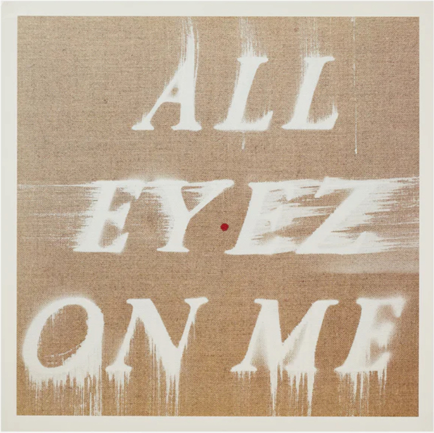
5. In 2023, Interscope Records celebrated its thirtieth anniversary and invited several “fine” artists to reimagine the cover art of many of the label’s back catalogue. Damien Hirst reimagined twelve of Eminem‘s covers and Richard Prince reimagined Nine Inch Nails‘ The Downward Spiral cover. Ed Ruscha reimagined 2Pac‘s All Eyez on Me album from 1996. There were two versions; a picture disc version in a ‘limited’ edition of 500 copies and a black vinyl edition of 100 copies that included a giclee print of the cover art signed by Ruscha. The picture disc edition sold for USD 100 and the 100 copy edition for USD 2,500!

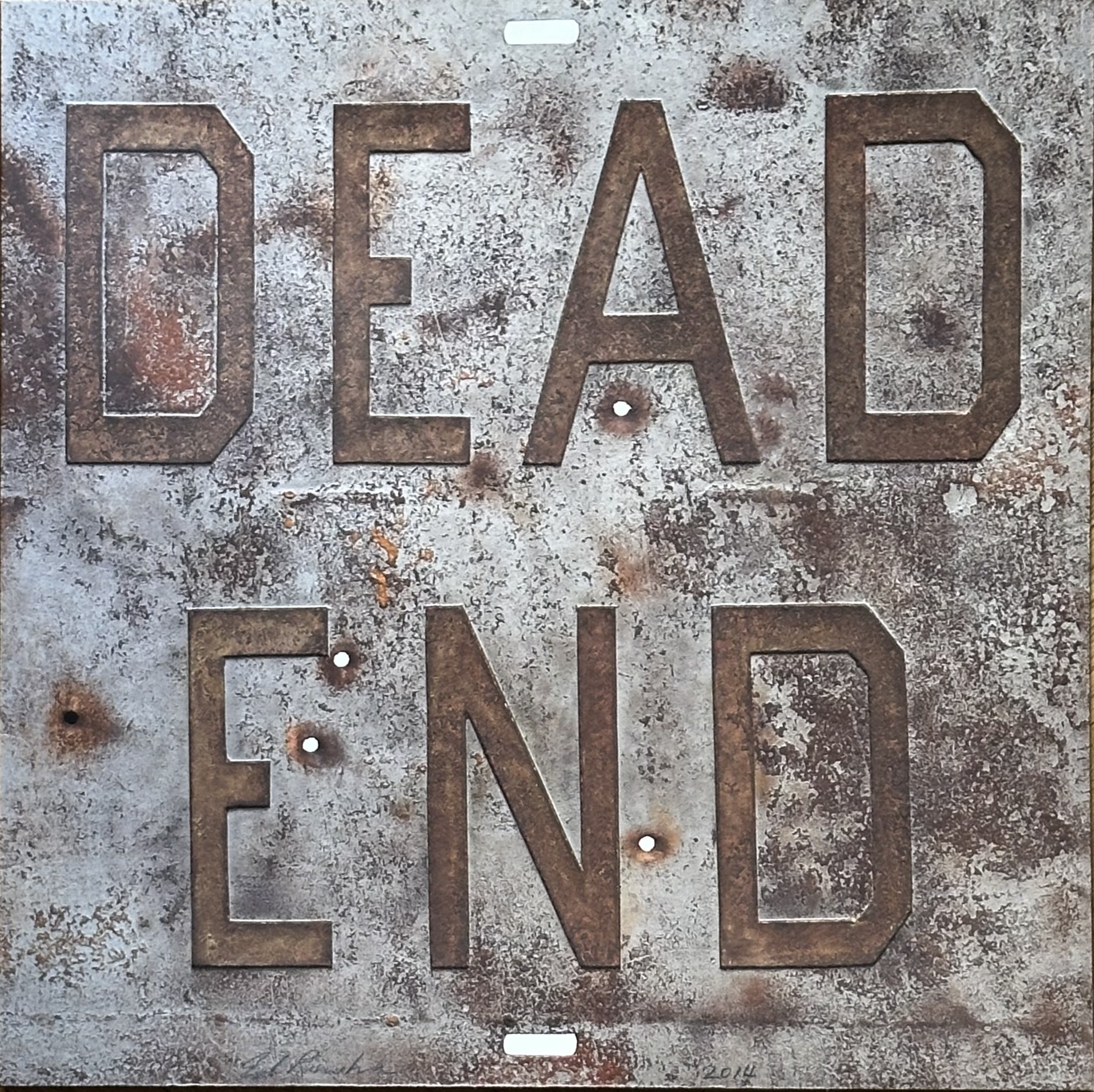
6. Dead End. This is the cover from the Wetterling Gallery‘s recent Ed Ruscha exhibition. The Dead End print looks like it’s made of metal but it is actually a multi-layered print on hand-made paper. The typeface is Ruscha‘s typical Boy Scout Utility Modern with its squared off, geometric letter forms. Insted of a record, there is a card insert along with the actual catalogue.

I haven’t been able to find any more Ed Ruscha covers so I might be tempted to try to collect the few that I don’t actually have.