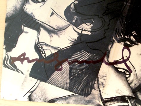
I enjoy visiting the A & D Gallery in Chiltern Street, London, on my regular visits to spend time with my aged mother. I enjoyed the banter with my friends, the late Daniel Brant and Helen Clarkson (who now runs the gallery). I learnt a whole lot about pop art, and in particular about Andy Warhol’s art, from these experts. Daniel had sold a couple of signed copies of the Rolling Stones’ “Love You Live” album in previous years and I had told him hat I would be interested in a copy should he ever find another. Three or four years ago he mailed me that he had included copies of “Sticky Fingers” and “Love You Live” in an auction and I was lucky to be able to buy them.
My signed “Sticky Fingers” LP.
Late in 2018, I met John Peter Nilsson, from Moderna Museet, in Stockholm during the Warhol 1968 exhibition at the museum in Stockholm. I pointed out that one of the eight Andy Warhol designed record covers on display (by The East Village Other) was NOT designed or illustrated by Warhol. And I mentioned that I had a complete set of Warhol covers. John Peter suggested that, when the exhibition moves to Moderna in Malmö in March 2019, my collection would look great in the Malmö exhibition space so I agreed to lend my records to the exhibition.
Just prior to collecting the records I came across an autographed copy of Paul Anka’s 1976 album “The Painter” signed by both Andy Warhol and Paul Anka. Apparently, Warhol signed the cover outside The Factory in December 1986, just two moths before he died, and Paul Anka signed it later.
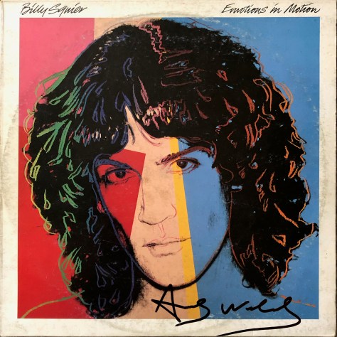
Most recently I found a copy of Billy Squier’s “Emotions in Motion” album signed by Andy Warhol. Unusually, this is an Italian pressing. The provenance is from a gallery in Rome that bought the album from Anita Pallenberg.
Billy Squier’s “Emotions in Motion” signed by Andy Warhol.
Apparently, this was signed in for Anita at The Factory in 1985. I’m a little suspicious, however.The signature soesn’t look 100% and I wonder how Anita Pallenberg happened to have her Italian copy of the album with her in New York… Perhaps I’m being too suspicious, though.
But the signed album any Warhol collector really wants is, of course, a copy of The Velvet Underground & Nico!
“The Velvet Underground & Nico” signed by the band and Andy Warhol.
My friend and fellow collector of record cover art, Stefan Thull, decided in October to sell part of his amazing collection and among the records he was prepared to part with was his signed copy of Rats and Star’s “Soul Vacation” album that he sold to me.
“Soul Vacation” by Rats and Star signed in 1983 in Japan when Andy Warhol met the band.
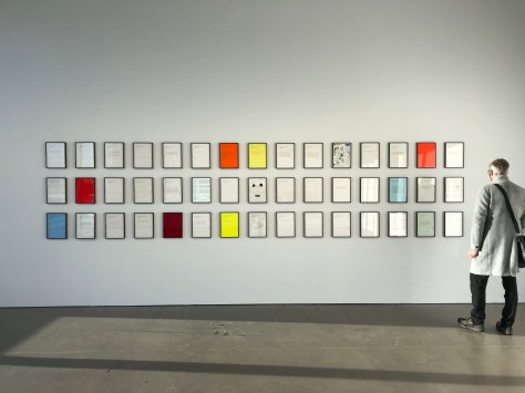
In a previous post I reported on British artist Peter Liversidge’s record cover art. Liversidge’s art is quite fascinating. in 2013 he arranged for children in an east London school to suggest and mount a protest on any subject–that they themselves, independently of adult suggestions–wanted to protest about. They made placards and chants to go with their protest and in 2015 staged it at Lonson’s Whitechapel Gallery. Otherwise Liversidge is known for his concept art, producing proposals for galleries to carry out. In his recent exhibition at Bonniers konsthall in Stockholm, entitled “Working Title II” he had produced 45 “Proposals”, each neatly typed on a separate A4 sheet of paper and framed on one wall of the exhibition space.
Peter Liversidge’s 45 proposals.
Bonniers konsthall had also published the proposals in a book:
In addition the gallery had produced Liversidge’s book “Notes on Protesting” describing his projects.
Another aspect of Liversidge’s art is his passion for collecting objects that resemble faces. One room in the gallery was devoted to this aspect of his art with carpets, rocks and masks.
Peter Leversidge’s face replicas.
Peter is a music lover (as I have found many artists to be) and friends with members of various bands for whom he has provided cover art. I had managed to find four LPs with Liversidge designs:
– Low–Ones and Sixes (2015)
– The High Plains–Cinderland (2017)
– Allred & Broderik –Find the Ways (2017)
– Low– Double Negative (2018)
On the Liversidge’s exhibitions penultimate day (February 16th, 2019), the artist attended the galley to do a book signing and I went along with my records to try to get them signed, too.
Peter was surprised (and apparently quote pleased) to see his record covers in these surroundings and was very happy to sign them. But he didn’t want to sign the front covers, preferring either to sign the inner sleeves or the backs. However, I managed to persuade him to sign the front of Low’s “Double Negative” cover–and he agreed it looked great that way.
Low’s “Double Negative” cover and inner sleeve signed by Peter Liversidge.
He also signed the other three covers:
Peter told be a couple of stories about how the album art evolved. Theinner spread of the “Ones and Sixes” album has pictures of an owl taken in British Columbia. Originally, a bald eagle was suggested as the bird to be shown, but as this is the U.S.’s national bird the suggestion was shelved and the owl substituted. On Low’s other album “Double Negative” Peter had suggested using a different mask on the cover:
The mask Peter Liversidge had originally intended to use on the cover of “Double Negative”.
Peter also told me about a record cover he had designed that I had not managed to find. This was Wires Under Tension’s 2012 album “Replicant”.
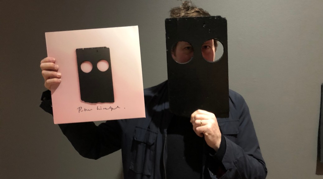
Before leaving I managed to get Peter to pose for a photo with one of his masks–and the cover of “Double Negative”.
Peter with the mask featured on the cover of “Double Negative”.
I’ve been quite confident that I had all of Klaus Voormann’s record and CD covers bar one (the LP “Wer nie im Bett Programm Gemacht“), but a fellow rateyourmusic.com member (Warpkernbruch) showed my that there were several CD covers that I had missed by a musician named Achim Schultz and his band Achim Schultz Over Twenty. I had never heard of Achim Schultz. A Google search reveals little. He is a music producer with his own studio and record label (imaginatively called Achim Schultz) in Munich and has recorded several CDs. He must be on good terms with Klaus Voormann as Klaus has provided cover art for three CDs by Schultz and one for a German group called The Pleasure. I know nothing of them except that they have released two albums: “The Pleasure” in 2006 and “Travel Inside” in November 2008, Klaus drew the cover for the latter album.
Klaus Voormann’s cover for The Pleasure’s CD album “Travel Inside”.
Achim Schultz’s CDs include “Bye Bye George Harrison“, released on Achim’s own label in 2006, which includes the tribute track with the same title, a CD single “Give Peace a Chance” from 2008 and “Welcome“, from 2009 the latter two credited to Achim Schultz Over Twenty.
All four covers show Klaus Voormann’s incomparable draughtsmanship.
Klaus Voormann in his recently published book “It Started in Hamburg” provides pictures of several recent covers that I haven’t been able to trace. Klaus says some of the records for which he has designed the covers may, or may not, be released. These are Gaby Moreno’s & Van Dyke Parks’ “Spangled!“, Wukong & The Grim Shadows same titled album, and Stephen Dale Petit’s “2020 Vision“. I’ll keep an eye out for these to see if they ever surface.
I was first made aware of two of Andy Warhol’s seminal publications the Aspen Magazine Pop Art issue of December 1966 (#3, “FAB”) and “Andy Warhol’s Index (Book)” late in 2008, when I first saw Paul Maréchal’s “Andy Warhol – The Record Covers 1949–1987. Catalogue Raisonné“, which listed both as record covers. Both do contain records; the former a double sided flexidisc and the latter a single-sided 7” single, but I wouldn’t consider either package to be a record cover in the true sense of the words.
The pop art edition of Aspen Magazine produced by David Dalton and Andy Warhol in December 1966.
The hardcover version of Andy Warhol’s Index (Book) with is lenticular cover.
Andy Warhol was a polymath–commercial artist, “fine” artist, Photographer, film m,aker, diarist, would be sculptor and, not least,Author, illustrator and publisher. An exhibition at the Museum Brandhorst in Munich from September 2013 to January 2014 showed Warhol’s publications, ranging from one-off illustrated books to his popular mass produced publications. The exhibition was called “Reading Andy Warhol” and included over eighty books and the hard cover catalogue (with the same title) opened with a series of erudite essays on Warhol’s literary career as a publisher of his own books (such as “25 Carts Name[d] Sam and One Blue Pussy“, written together with George Lisanby) or one-offs like “Play Book of You S Bruce From 2:30 to 4:00“. There is a short section on “Andy Warhol’s Index (Book)” in a chapter entitled “Trash, Gossip, and Porn–Warhol’s Transgressions in Photography” written by a professor Burcu Dogramaci, There doesn’t seem to be too much written about the December 1966 Pop Art issue of the Aspen Magazine (#3) titled “FAB“, edited by David Dalton and Andy Warhol. However, the catalogue of the current Warhol retrospective at New York’s Whitney Museum, called “Andy Warhol – from A to B and Back Again” goes some way to rectifying this in an essay by Brandon W. Joseph called “White Light / White Heat“.
Aspen Magazine #3
The Aspen Magazine was produced by Phyllis Johnson between 1965 and 1971. It was billed as the first 3D magazine as it was produced as a box containing various printed items and ephemera. Ten issues were published and the third was the Pop Art issue edited by David Dalton and Andy Warhol and published in December 1966. I think it is significant that a publication on Pop Art in 1966 would be entrusted to Warhol as there were numerous other pop artists who could have been invited to compile a box to illustrate Pop Art.
David McCabe & David Dalton “A Year in the Life of Andy Warhol”.
But who was David Dalton? I have had to do some considerable research to find out about him despite him being a much published author of rock-related biographies.
Dalton (born 15th January 1945) was a founding editor of Rolling Stone magazine. He is the son of a British physician, Dr John Dalton, and elder brother to sister Sarah. When Sarah was 13 years old (and I suppose David was a couple of years older), the family moved to New York and–according to Sarah began visiting art galleries, in particular Leo Castelli Gallery where they met Ivan Karp
In a The Guardian review (on Sunday 5th October 2003) of “A Year in the Life of Andy Warhol English author and, according to Peter Conrad, writing in , was co-author of “A Year in the Life of Andy Warhol” together with photographer David McCabe. Dalton, according to Conrad, had been taken to New York from boarding school by his sister Sarah. In fact, as David, himself, writes in the book, he is Sarah’s older brother, and the family arrived in New York together. Both David and Sarah and their father, Dr John Dalton, appear in McCabe’s photos in the book. Exactly how David became one of Andy Warhol’s first assistants is not clear. He stayed at The Factory for over a year. Dalton, by his own admission was besotted with Bob Dylan and managed to get at least six mentions of his hero in the Aspen package. Also included were ten “trip” tickets, A newspaper entitled “Plastic Exploding Inevitable”, 12 pop art picture cards and a 7.-inch flexidisc with Peter Walker’s “White Wind” on the “A” side and “Loop” by the Velvet Underground on the “B” side (more correctly is was John Cale playing the noise).
The “A” side of the Aspen Magazine flexidisc. Peter Walker’s “White Wind”.
The “b” side of the Aspen Magazine flexidisc. The Velvet Undergrund’s “Loop”..
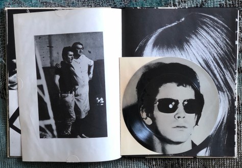
Andy Warhol’s Index (Book) Published in December 1967 “Andy Warhol’s Index (Book)” is primarily a book of photographs by Billy Name (Billy Linich 1940-2016), Nat Finkelstein, Steven Shore and others.It is decorated with several pop-up figures: a castle, a biplane, a can of Hunt’s Tomato Paste and includes the single-sided 7″ picture disc with a portrait of Lou reed on one side. The record plays an interview with Nico while the Velvet Underground play in the background.
The 7″ picture disc in “Andy Warhol’s Index (Book)”.
“Andy Warhol’s Index (Book)” was published in three editions. A hardback edition of (I think( 2000 copies), a Limited edition of the Hardback book signed by Warhol (365 copies) and a soft cover book. The hardcover book cost $12.95 and the soft cover $4.95.
I decided that I should include these seminal Warhol publications in my collection of Andy Warhol’s record cover art, though I do not consider the box or the book to be true record covers. And in January 2019 they arrived.
Bonniers Konsthall in Stockholm shows a wide variety of art exhibitions. I saw Turner Prize winner Susan Phillipz “Lost in Space” exhibition there a couple of years ago and I went to see the gallery’s latest exhibition by British artist Peter Liversidge. I hadn’t heard of him before seeing the exhibition. Liversidge’s preferred medium is providing “proposals”–he types suggestions for art happenings on A4 paper on his Olivetti portable typewriter. The proposals range from simple orders to suggestions that are complex and possibly impossible to realise. The exhibition at Bonniers konsthall has 45 of Liversidge’s “proposals” as its starting point. These 45 proposals are neatly framed A4 papers with his suggestions for projects arranged on one wall in three rows of fifteen frames.
Peter Liversidge’s 45 proposals.
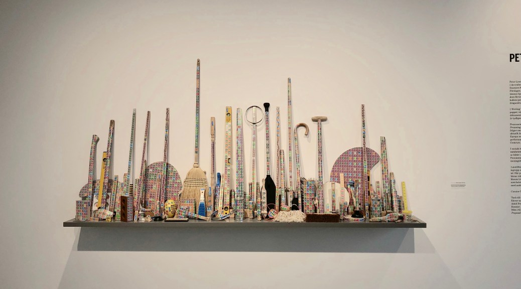
On the floor in front of the frames is a pile of A2 papers each printed with “Let’s take a walk together”. Visitors to the exhibition are invited to take one or more of these posters home. There is a shelf on the wall opposite the framed proposals with various implements standing on it, each covered in postage stamps. Apparently Liversidge often uses the postal service to send articles to his exhibitions. Bonniers konsthall allows the postman/postwoman to arrange the item that is being delivered on the shelf. Thus the postal service acts as a sort of exhibition curator.
Peter Liversidge’s posted objects.
Peter Liversidge’s posted objects.
Close-up showing the stamps on each object.
One suspects that some objects might possibly get lost in the post. Nobody knows which, if any, don’t make to their destination, adding mystery to the exhibition.The idea of sending repeated missives through the post reminded me immediately of Japanese -American artist On Kawara (1932-2014), who throughout his career sent postcards to friends and institutions with stamped messages. One series stated “I got up at—-o’clock”, and another simply stated “I am still alive”.
One of On Kawara’s postcards from the “I got up at…” series.
The gallery shows a film of another of Liversidge’s projects. He asked a class at an east London school to make a protest about any subject they felt strongly about. It had to be the children’s project–not one suggested by teachers of adults. The film I saw was a protest about dogs fouling pavements with placards saying things like “clean up after your dog”. This protest was stages at the Whitechapel Gallery in 2014.
Another of Liversidge’s ongoing projects is collecting artifacts that look like faces and one room of the exhibition is devoted to found objects that resemble faces and masks that Liversidge has produced from such objects.
A day or two after I seen the Liversidge exhibition, I got an email about the best record cover designs of 2018 and was surprised when I saw a cover bearing one of Liversidge’s masks among the nominated covers. The album is “Double Negative” by the American band Low (released in September 2018). Liversidge has also designed the cover for the band’s 2015 album “Ones and Sixes”, and it transpires that he has designed at least two other record sleeves: one for High Plains’ album “Cinderland” (2017) and another “Find the Ways” (2017) by Allred & Broderick.
Low’s “Double Negative” with cover art by Peter Liversidge.
I always find it interesting when “fine” artists design record covers. There’s a long list of them ranging from Sir Peter Blake to Damien Hirst via Andy Warhol. I’m looking forward to seeing all Peter Liversidge’s record covers. I currently have two other covers (in addition to the “Double Negative” cover); Allred & Broderick’s “Find The Ways” and High Plains “Cinderland”.
Allred & Broderick’s LP “Find the Ways”. Cover by Peter Liversidge.
High Plains “Cinderland” LP. Cover by Peter Liversidge.
Yesterday I went to a couple of art exhibitions. First I went to Sven-Harry’s to see the excellent Jenny Nyström exhibition and then went on to Bonnier’s gallery to see what was on there. But it’s not the exhibitions that I want to talk about here. To get to the exhibition rooms at the Bonnier’s gallery one has to go through the shop. They usually have loads of interesting books for sale there and yesterday was no exception. I saw Rock Graphics Originals by Peter Golding & Barry Miles with great poster and record cover art and a book Emigre Fonts 1986-2016 cataloguing Emigre Magazines typefaces. I still have two or three copies of Emigre with David Carson’s often confusing fonts.
Peter Golding & Barry Miles “Rock Graphic Originals”
Ginko Press – “Emigre Fonts 1986-2016”
The third book to catch my eye was Imagine — John Yoko with the famous Imagine album’s cover image on the front. I had not seen the book, published in October 2018, before, so I started rummaging through it to see if Yoko discussed the album’s cover art.
Yoko Ono’s book “Imagine John Yoko”.
And, on page 190, she goes into explicit detail. There John’s quote is published:
“My album front and back is taken by Yoko as a Polaroid. It’s a new one called a Polaroid close up. It’s fantastic. She took a photo of me, and then we had this painting off a guy called Geoff Hendricks who only paints sky. And I was standing in front of it, in the hotel room and she superimposed the picture of it on me after, so I was in the cloud with my head. And then I lay down on the window sill to get a lying down picture for the back side, which she wanted with the cloud above my head. And I’m sort of ‘imagining.‘”
However, collectors of Andy Warhol’s record cover art noticed that a couple of Andy Warhol’s Polaroid pictures of John, sold at Christie’s in 2013, looked suspiciously like the photo used on the Imagine album cover and were advertised as “Two unused and previously unseen photographic proofs of artwork for the front cover of John Lennon’s 1971 album Imagine“. However, it doesn’t specifically state that these Polaroids were taken by Andy Warhol, so they could be Yoko Ono’s.
Yoko Ono’s Polaroids of John for the “Imagine” cover.
After reading this book I have removed Lennon’s “Imagine” album (and the various singles that use the same picture) from my list of Andy Warhol’s record covers and I credit the cover design to Yoko Ono.
I had heard of Robert del Naja in my research into the roots of Banksy‘s art and learnt that del Naja–alias 3D–was a leading figure in Bristolian street art long before Banksy started decorating Bristol’s streets. Banksy has acknowledged 3D as a major influence. I knew also that del Naja was a member of Massive Attack. Del Naja has even been suspected of actually being Banksy. despite Banksy‘s ex-agent Steve Lazarides stating that he had seen Banksy at a Massive Attack gig.
I got hold of Robert del Naja‘s book “3D and the Art of Massive Attack” last autumn and wrote a post about it last October. A couple of months ago I bought a copy of Massive Attack‘s “Heligoland”–the limited edition version from The Vinyl Factory, with its spangly cover.
Massive Attack’s “Heligoland package with 2 LPs, CD & booklet.
I then saw a copy of The Vinyl Factory’s limited edition (1000 copies) of Massive Attack‘s “Atlas Air” 12″ offered together with a copy of Very Nearly Almost (VNA) magazine No. 26 which featured an article on 3D for the amazing sum of £300! And the VNA magazine was the regular version, not the limited edition one. I picked up a copy of VNA no. 26 for the princely sum of £15!
The standard shop version of VNA Magazine No. 26.
and decided that I would try to get the “Atlas Air” and “Splitting the Atom” 12″-ers too. I was lucky enough to find a seller in Germany who could supply both! They arrived a couple of days ago and I’m really pleased I got them. The cover art is magnificent.
The limited edition of “Atlas Air”. My copy is No. 085/1000.
The limited edition of “Splitting the Atom”. My copy is No. 576/1000.
I decided that I would buy the limited edition of “3D and the Art of Massive Attack“, too. Said and done! My copy was number 149/350 and includes a print by 3D (from a run of 1325 copies, an expanded version of the ordinary book called “Protection” and, not least a single sided 12″ entitled “Vermona“–which is only available in this box set.
The box set of “3D and the Art of Massive Attack”.
The cover of the book of 3D‘s art and the print (on hardboard) and the “Vermona” single sided 12″ with 3D‘s etching on the reverse.
The standard version of the book (left) and the limited edition, numbered version (right).
I’m waiting for the remastered reissue of “Mezzanine“, Massive Attack‘s magnificent 1998 album. A special 3 LP version with coloured vinyl will be released in late January 2019 to celebrate its 20th anniversary. The stag beetle cover photo is by Nick Knight and the remastered vinyl package will come in a heat-sensitive box with more photos by Knight and 3D.
Andy Warhol’s first ever retrospective exhibition opened on 15th January 1968 and ran until 17th February. This year, to mark the 50th anniversary of that groundbreaking show, Moderna Museet in Stockholm has created a new show, called “Warhol 1968” as a sort of rememberance of the earlier exhibition. This exhibition runs from 15th September 2018–17th February 2019. The exhibition will transfer to Moderna Museet’s Malmö site, opening on 30th March and running until 8th September.
The current exhibition in Stockholm includes eight record covers bearing Andy Warhol’s art. The exhibition’s curator John Peter Nilsson has decided to try to include all Warhol’s record covers produced during his lifetime in this new exhibition and has asked me if I would lend my record covers to the exhibition along with some other related pieces of Warhol art.
It will be a wonderful opportunity to show a total of seventy-seven record sleeves, LPs, EP boxes, 12″ and a few 7″ singles, some of which have never been shown in public before.
My friend, Lars Magnell, CEO of Wag the Wall has promised to lend his company’s fantastic Magic Vinyl Display frames in which to hang the covers to show them at their best .
As anyone knows who has been following my blog, I’ve been collecting record covers by Sir Peter Blake for a long time. I’ve also been to numerous gallery shows and museum exhibition of Peter Blake’s art. I also have a number of exhibition catalogues from a various Peter Blake exhibitions. In addition I have several books on record cover art and one by graphic designer Richard Evans–who I guess is a Peter Blake fan too.
Richard Evans (born 30th March 1945 (as he states on his web page the same day as Eric Clapton) is a graphic designer, artist and photographer who has designed record covers for a great many artists including Robert Plant, Van Morrison, World Party, Pete Townsend and has been “official” designer to The Who since the mid 1970s.
Richard Evans published his book “The Art of the Record Cover” in 2010 and it is a chronological guide to record cover design and includes, at the end, a section on how to design one’s own record cover.
Richard Evans – The Art of the Record Cover–A History and How to.
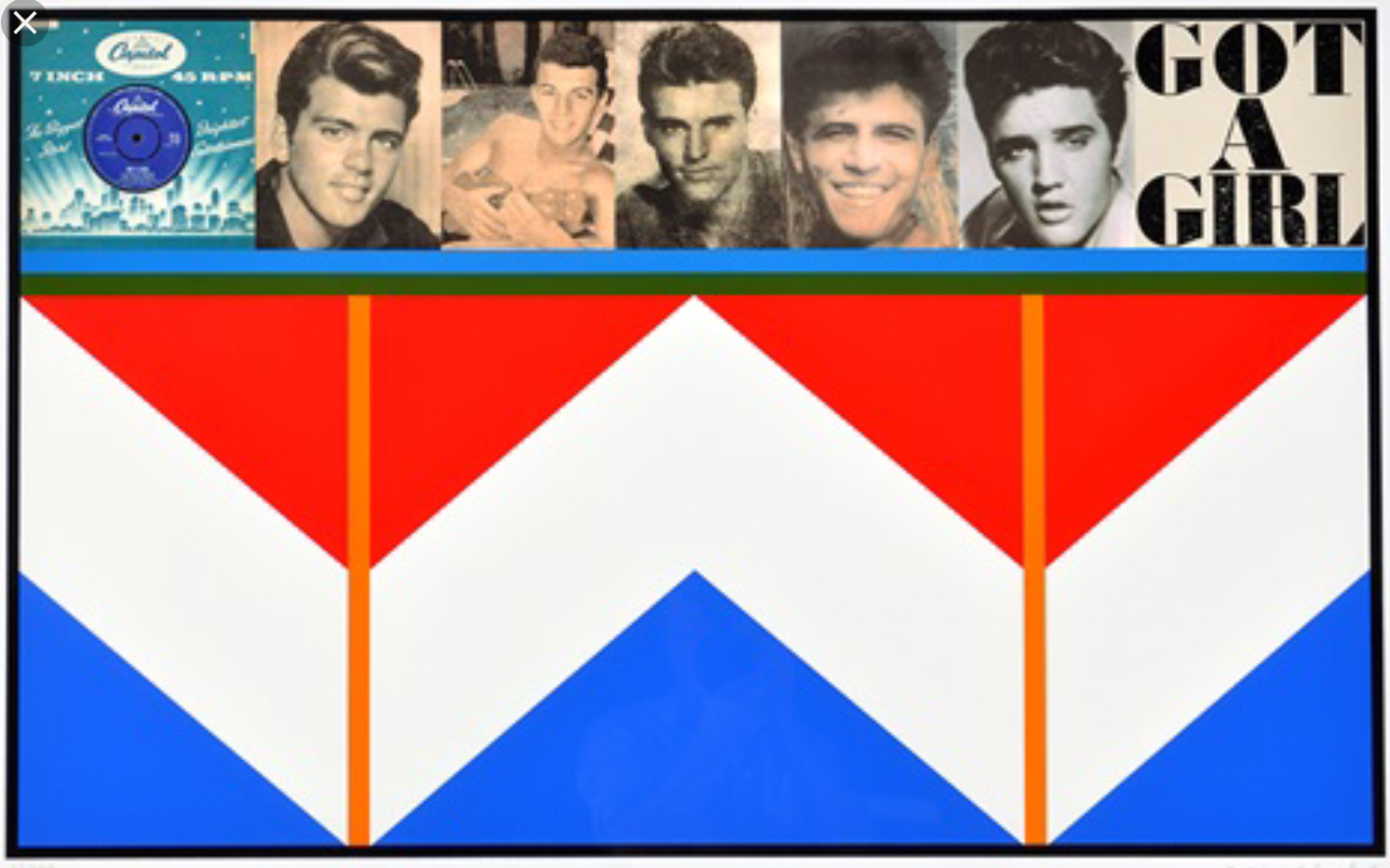
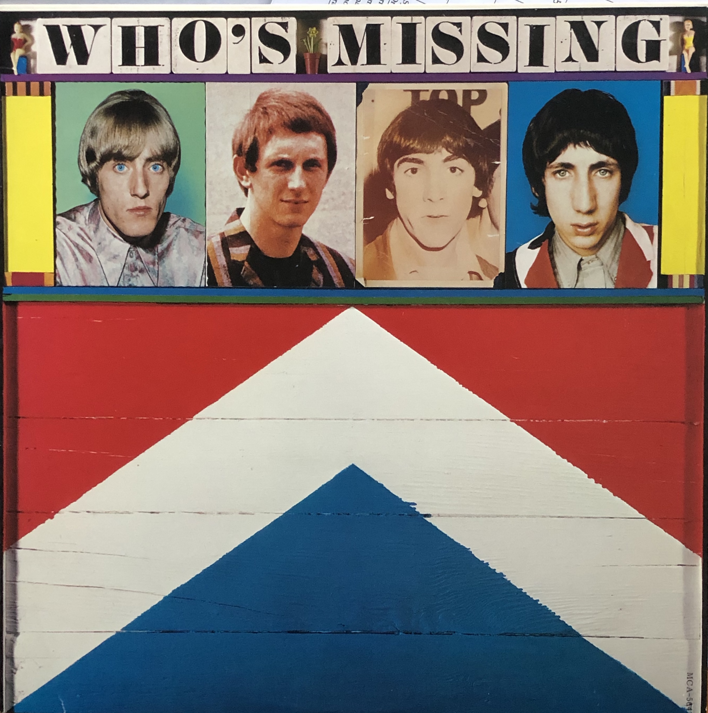
One of Richard Evans’s covers for a 1985 compilation album by The Who called “Who’s Missing” features tracks not previously available on LP and the cover–to another fan of Peter Blake’s art–seems inspired by Blake’s 1960-1 painting/collage “Got a Girl” (the title comes from a 1960 single by The Four Preps (Capitol 4362)).
Peter Blake — “Got a Girl” 1960-61.
Richard Evans’s cover for The Who’s “Who’s Missing”.
This album was only released in America and I have been looking for a copy to keep beside my Peter Blake covers for several years, and I finally found one in my favourite Stockholm record emporium.
You already know that I am inordinately proud of my collection of records and CDs with cover art by the artist known as Banksy. Many of the vinyl releases with Banksy‘s cover art, particularly the “unofficial” ones, were released as limited editions. Dirty Funker (just one of DJ Paul Glancy‘s aliases) released two remixes as 12-inch singles with cover art by Banksy: “Let’s Get Dirty“, from 2006, appropriated Banksy‘s famous Kate Moss portrait, and “Future“, released in 2008, featured Banksy‘s “Radar Rat” design (in five different limited edition covers, probably each of 1000 copies).
a. Front of first pressing of Dirty Funker’s “Let’s Get Dirty” 12-inch single.
b. Back of first pressing of Dirty Funker’s “Let’s Get Dirty” 12-inch single.
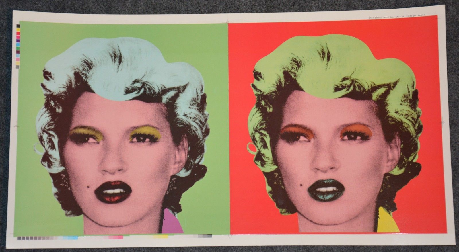
There were two editions of the “Let’s Get Dirty” 12-incher, both limited–the first edition, which showed only Banksy‘s Kate Moss portrait with no artist, title or tracklisting, or even a barcode. The front image showed Kate‘s head against a red background, while on the rear cover she had a pale green background. This edition must have been significantly more limited than the second edition which showed Kate‘s portrait with a Dymo strip over her eyes on the front cover giving the artist and record’s title. On the rear the strip was placed over Kate‘s mouth giving the tracklisting.
Second pressing with “Dymo” band
b. back of second pressing of Dirty Funker’s “Let’s Get Dirty” 12-inch single.
This week a printer’s proof of the first edition “Let’s Get Dirty” cover was advertised on Ebay. The seller had bought it in 2007 and now was sadly selling it. He thought there might have been about ten copies printed in 2006 (the print is dated 18th January 2006) and makes an interesting addition to both my Banksy and my collection of record and CD covers featuring Kate Moss.
Printer’s proof sheet for the “Let’s Get Dirty” cover.