The seven RCA EP boxes Kevin sent arrived yeserday and I collected them from the Post Office at 5.15 pm. By 9.00 pm they had been transformed into –
So, the project moves closer to completion!
The seven RCA EP boxes Kevin sent arrived yeserday and I collected them from the Post Office at 5.15 pm. By 9.00 pm they had been transformed into –
So, the project moves closer to completion!

The Warhol Cover Collectors Club members are still waiting for their “Night Beat”, “Giant Size $1.57 Each” boxes and covers. Kevin has mailed that at least seven RCA 45 RPM EP boxes are on their way, but they have thus far not arrived.
I started my second silkscreen course last evening (5th November) by silkscreening T-shirts with the “Giant Size $1.57 Each” motif for all five members in sizes from S to XXL. I also plan to provide all with black T-shirts with the RATFAB cover image, but have run into difficulty in finding the right colours to use. As I will be screening on to black T-shirts I need inks with good covering ability. Most, however, are “transparent”, which means that the black of the t-shirt will show through the colour. There are, apparently, two ways to approach this problem. One is to pre-print the image in white and then print in transparent ink exactly over the previously screened white image. This is going to be almost impossible given the thin outlines of the design. The second way is to scour the market and try to find inks that are not transparent. And that is the solution I’m working on. Our next silkscreen meeting is on 12th November, so I have a week to find the new inks.
I hope the RCA boxes will have arrived by then, so that I will be able to dispatch all the packages in good time before the Christmas rush begins.
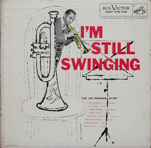
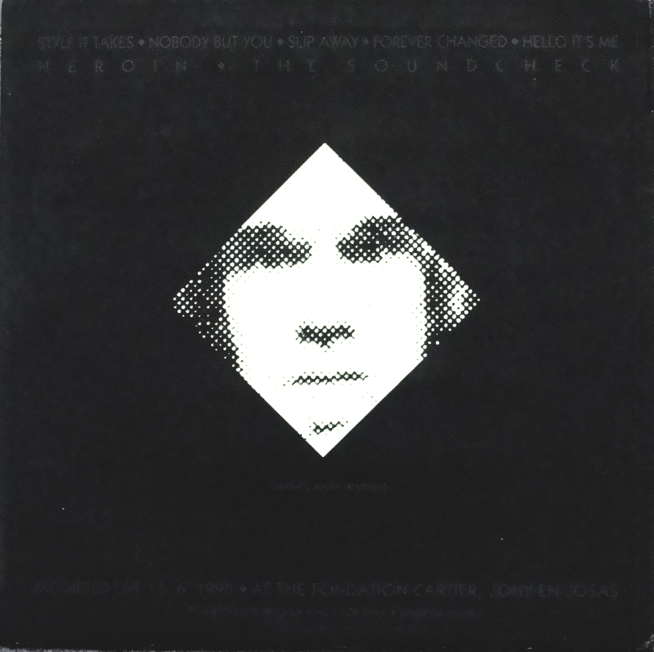
It feels like Christmas when four additional Andy Warhol covers can be added to my collection. Two are releases I had not been aware of until very recently. The four covers are:
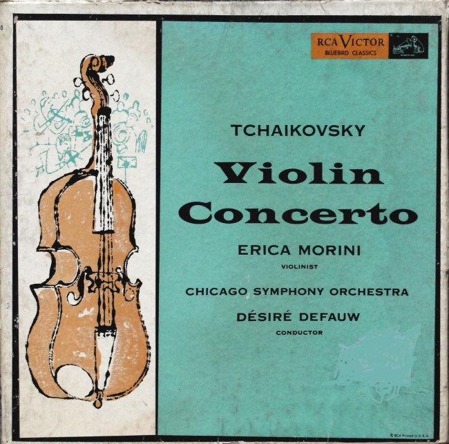
1. Tchaikovsky – Violin Concerto played by Erica Morini and the Chicago Symphony Orchestra, conducted by Desiré Defauw.
2. The Joe Newman Octet – I’m Still Swinging, double gatefold EP – 45 EPB-1198.
3. Velvet Underground – Paris 1990 – Bootleg “promotional” LP.
4. The Falling Spikes (Velvet Underground) – Screen Test: Falling in Love With the Falling Spikes (1987 re-issue):
1. The Byron Janis recording of Gershwin’s “Rhapsody in Blue” coupled with Grofé’s “Grand Canyon Suite” on the RCA Victor Bluebird label has an illustration of a piano and orchestra generally accepted as being by Andy Warhol. This recoeding was released both as a 12″ LP and a three 7″ EP box. Its sister release, the recording of Tchaikovsky’s Violin Concerto by Erica Morini and the Chicago Symphony Orchestra, conducted by Desiré Defauw, on the same label has an illustration of a double base done in the same style and probably by Andy Warhol. I have a copy of the 12″ LP, generously given me by Frank Edwards. Until recently, I had not been aware of a three EP box similar to the Byron Janis recording, then one came up on Ebay and found its way into my collection.
2. The Joe Newman Octet’s “I’m Still Swinging” has been released as a 12-tract LP and an 8-track double EP and single EPs. I have one of the single EPs and recently acquired the German pressing of the single EP. Now I succeeded in finding the double EP version.
3. A short while ago, Guy Minnebach told members of the Warhol Cover Collectors Club about a Velvet Underground bootleg of a live show recorded in Paris on 11th June 1990, cleverly entitled “Paris 1990”. I was lucky to find a mint copy from a seller in Texas. This cover has a reproduction of an early Warhol flower on the front cover and a portrait of Warhol on the reverse. The images fluoresce in the dark! So cool!
4. Frank Edwards discovered the re-issue version of the bootleg album by the Falling Spikes, later to metamorphose into The Velvet Underground. The re-issue “Screen Test: Falling in Love With the Falling Spikes” LP has the same detail from Warhol’s “Flowers” painting as the original 1985 release, but has a red card cover and includes two postcards. I found this one on Discogs and made a good deal with the seller. So now I have all three versions; one with the black and white cover, one with the blue flower and now even the red cover.
It seems a stranghe coincidence that I should receive the two Velvet Underground albums just days after founder member, Lou Reed, died. Anyway, four interesting and unusual additions to my collection.
Like most collectors of Andy Warhol’s record cover art, I follow the covers advertised on Ebay. All too often sellers call their object “the rarest Warhol cover”. Niklas L challenged me to make a list of what I considered to be rarest covers. I thought I’d list the Top 20 rare covers. It is, of course impossible to rank them exactly, but here is my first attempt, keeping official releases and bootlegs apart. I hope publishing this list will stimulate readers to criticise and comment.
a. Official releases
|
No. |
Artist |
Title |
Comment |
|
1 |
Various Artists
|
Progressive Piano |
Rare because it was probably never released. Lithographs of the cover design exist, however. |
|
2 |
Frank Lovejoy
|
Night Beat |
Probably only 1 known copy |
|
3 |
Andy Warhol |
Giant Size $1.57 Each |
Available in four colour variations. Black on white background (edition of 75 signed and numbered), black on yellow (edition of 75 unsigned, unnumbered), Black on green (edition of 75 unsigned, unnumbered) and black on red (edition of 75 unsigned, unnumbered) |
|
4 |
Century Symphony Orchestra |
Waltzes by Johann Strauss, Jr. |
|
|
5 |
Ultra Violet
|
Ultra Violet |
Most copies seem to be cut-outs |
|
6 |
CBS Radio show
|
The Nation’s Nightmare |
Possibly 2 colour variants, one brown and one more grey. |
|
7 |
Arthur Fiedler & Boston Pops |
Boston Pops Latin Rhythm |
|
|
8 |
Johnny Griffin |
The Congregation |
Original Blue Note LP |
|
9 |
Jan Smeterlin |
Chopin Nocturnes (Complete) |
2 LP set in slip case |
|
9a |
Jan Smeterlin |
Chopin Nocturnes (vol 1) |
Single LP |
|
9b |
Jan Smeterlin |
Chopin Nocturnes (vol 2) |
Single LP |
|
10 |
Wolfgang Amadeus Mozart |
4 Divertimenti |
|
|
11 |
RATFAB
|
Det brinner en eld / Mörka ögon |
Sweden only single |
|
12 |
John Wallowitch
|
Another Side of John Wallowitch |
His first album is easier to find |
|
13 |
Walter Steding & The Dragon People |
The Joke / Chase the Dragon |
|
|
14 |
Cool Gabriels
|
Cool Gabriels |
|
|
15 |
Moondog
|
Story of Moondog |
Original on Blue Note |
|
16 |
J. J. Johnson, Kai Winding & Bennie Green |
Trombone by Three |
16 RPM version on Prestige |
|
17 |
Margarita Madrigal |
Madrigal’s Magic Key to Spanish |
More valuable with the book |
|
18 |
Various Artists |
MTV – High Prority |
The version with yellow shading to the MTV logo |
|
19 |
Velvet Underground & Nico |
Original ”Torso” back cover |
|
19a |
Velvet Underground & Nico |
”Torso” cover with black sticker |
|
20 |
Art Gallery of Toronto |
Cronenberg on Warhol |
Limited edition CD – 2 copies have surfaced to date. |
|
21 |
Jeanne Moreau & Günther Kaufmann |
Each Man Kills the One He Loves / Young and Joyful Bandit |
7” single |
Bootlegs
|
No |
Artist |
Title |
Comment |
|
1 |
Rolling Stones |
Emotional Tattoo |
Some copies have orange vinyl |
|
2 |
Velvet Underground |
Screen Test: Falling in Love With the Falling Spikes |
There are three colour variants of this release: one with a blue flower, one with a black and white cover and a re-release with a red cover |
|
3 |
Velvet Underground |
Orange Disaster |
|
It has been a great week for my collection of Warhol covers. Forst I received the two CDs that Frank Edwards told me about. First, the Tobias Picker / Marc Bliztstein CD “Keys to the City / Piano Concerto”. This CD uses Warhol’s poster design for the Brooklyn Bridge centenary in 1983 as its cover image. Tobias Picker pianist and composer apparently has Tourette’s syndrome. But this doesn’t seem to affect his musicianship. He wrote the piano concerto “Keys to the City in 1982, when he was 28 years old, and it won the competition. Marc Bliztstein (born 1905-64) wrote his Piano Concerto in 1931. Bliztstein was murdered in Martinique in 1964.

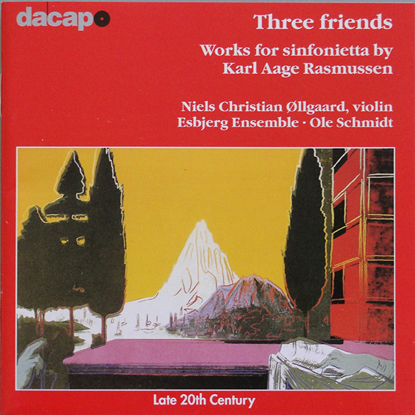
Second, Karl Aage Rasmussen’s “Three Friends”, has Warhol’s picture “The Anunciation” on the cover. This image came from Warhol’s series of Renaissance Details published in 1984. Rasmussen (born 1947) wrote “Three Friends” in 1995 and this recording was made in Esbjerg, Denmark, in May 1998.
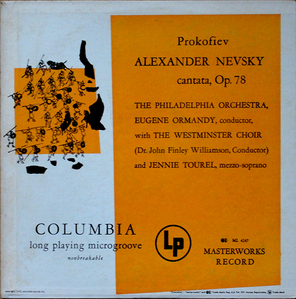
In addition, my copy of Prokofiev’s “Alexander Nevsky / Cantata #47” with the orange cover arrived today. It has the late pressed Columbia 6-eye labels with the word “unbreakable” to the left of the spindle hole indicating it to be a late pressing. As I have already stated in an earlier post, the 6-eye label was used on Columbia Materworks pressings between 1955 and 1962. The placing of “unbreakable” to the left of the spindle hole indicates that this LP was probably pressed nearer to 1962 than to 1955.
Other copies of this title with the same orange cover that have appeared on Ebay alla ppear to have the same 6-eye label. This supports my thesis that the various cover colour versions are probably later pressings than the original blue colour cover. I would be interested to know whether the green and pink cover versions have the 6-eye label or the original dark blue “masterworks” label. Perhaps readers could let me know.
Some time ago founder member of the Warhol Cover Collectors Club, Kevin Kinney, found a variant of the “MTV – High Priority” LP cover that few, if any, of us knew existed. Instead of the red shading to the MTV-logo on the front, the shading was yellow and the titles along the top of the front cover were in black print instead of white, red and blue. I’ve been checking every copy that I have seen on Ebay looking for a yellow version but to no avail. Then one came up a week or so ago and I was about to “buy it now” when it disappeared. Fellow collector Niklas L had seen it first and nabbed it! But, having sent Niklas some of my fabricated “Progressive Piano” and other covers for his collection he very generously thanked me by sending the yellow “MTV – High Priority” album together with André Heller’s “Stimmenhögen” LP. Even this turned out to be unusual. Two versions were listed on Rate Your Music – one on the Electrola and one on the HMV label. The copy Niklas sent me was also on the HMV label, but with a completely different catalogue number from those listed on RYM.
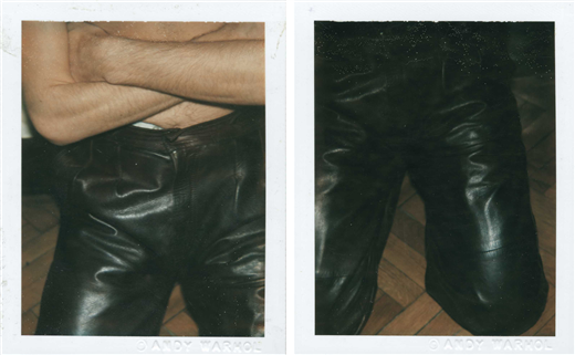
The only reason to have the Heller LP is the fact that the booklet inside the gatefold has a little Warhol drawing on one page (pictured above). In 1981 Heller was photographed by Warhol and two Polaroids from this session were recently sold by Christies.

The picture in the lyric booklet is probably Warhol’s portrait of Heller which, judging by Heller’s pose with arms crossed must have been done on that occasion. It fits with the Polaroids, which show him bare to the waist, arms crossed and wearing leather trousers. I suppose Heller chose to include the drawing to show that Warhol had done a portrait of him. I do not suppose that Warhol did the drawing specifically for this record cover. One could argue that the Swan Lake and Daphnis & Chlöe albums from 1955 with Warhol drawings fall into the same category, but Warhol did those drawings specifically for the albums and they illustrate the ballet content. However, one could say that the portraits on the covers of many albums definitely listed as being Warhol covers (Aretha Franklin, Billy Squier, Paul Anka, Liza Minnelli, John Lennon etc.) were not painted specifically for the record covers. So do I include the Heller album as a bona fide Warhol cover or not?
An unusual copy of Prokofiev’s “Alexander Nevsky” LP came up on Ebay last week. This had the original 1949 cover design but with orange colour blocks. I have previously seen blue, green and pink versions, but never an orange one. and I wonder if the colour variations were later pressings of the album. This one definitely is. The record has Columbia Records’ “6-eye” label rather than the Dark blue Columbia Masterworks label used since the introduction of the LP in 1948. According to Ron Penndorf’s Labelography the grey”6-eye” label was introduced in 1955 and phased out in 1962. As may be seen from the label picture, the designation “Unbreakable” appears to the left of the spindle hole, indicating – again according to Labelography – that this is a later pressing; probably late fifties or early sixties. I find it fascinating that Columbia chose to keep the original cover design from 1949 on this repressing rather than commission a new cover.
Damien Hirst has not yet designed many record covers. So far I have identified only twenty-three. I am primarily interested in those covers released on vinyl, but for completeness have also included CDs in my list on http://www.rateyourmusic.com (http://rateyourmusic.com/list/rockdoc/damien_hirsts_record_cover_art/). There are three quite rare vinyl issues: The most soughtafter is “Use Money, Cheat Death” by Damien (spellt on the record as Damian) Hirst that uses the Kate Moss portrait with half her face dissected away as the cover image. This picture was originally on the cover of the February 2006 issue of TAR magazine. The other two rarities are Dave Stewart’s “Greetings From the Gutter” and the original release of Joe Strummer & The Mescalino’s “Rock Art & the X-ray Style“, which has since been re-issued on vinyl with the same cover.
Three new Damien Hirst covers have been released so far this year. In May the group 30 Seconds to Mars released their fourth album “Love Lust Faith – Dreams” with Damien Hirst artwork. Quite pretentiously, they have released the album in three formats – a standard CD, a Super Deluxe Pack (price $295, and includes double white viny LPs a 100-page photo book, lithographs and an autographed CD) and a Super Duper Deluxe pack (price $999, which includes all the stuff in the Super Deluxe pack plus a pair of drumsticks, plectrums, a t-shirt, triad USB and a personalised message from the band.)
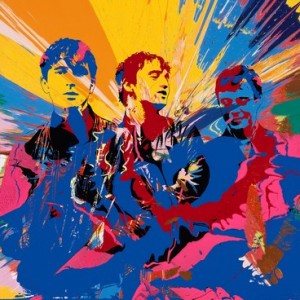
British group Babyshambles released their fifth full length album on 2nd September 2013 with cover art by Damien Hirst who used a photo of the band taken by Pennie Smith (who, you will remember, took the photo of The Clash used on their “London Calling” album.) NME reports on how Hirst came to design the cover “bassist Drew McConnell said: “It happened kind of naturally and in the spirit you’d hope for. We asked Damien to suggest someone to put something together, then to our amazement he offered to do it himself. The fact that he used a pic taken by Pennie Smith, who shot all those iconic photos of The Clash (Damien’s old pal Joe Strummer’s band), just makes it make even more sense.” “Nothing Comes to Nothing”, the first single from the album also comes in a Damien Hirst designed cover.
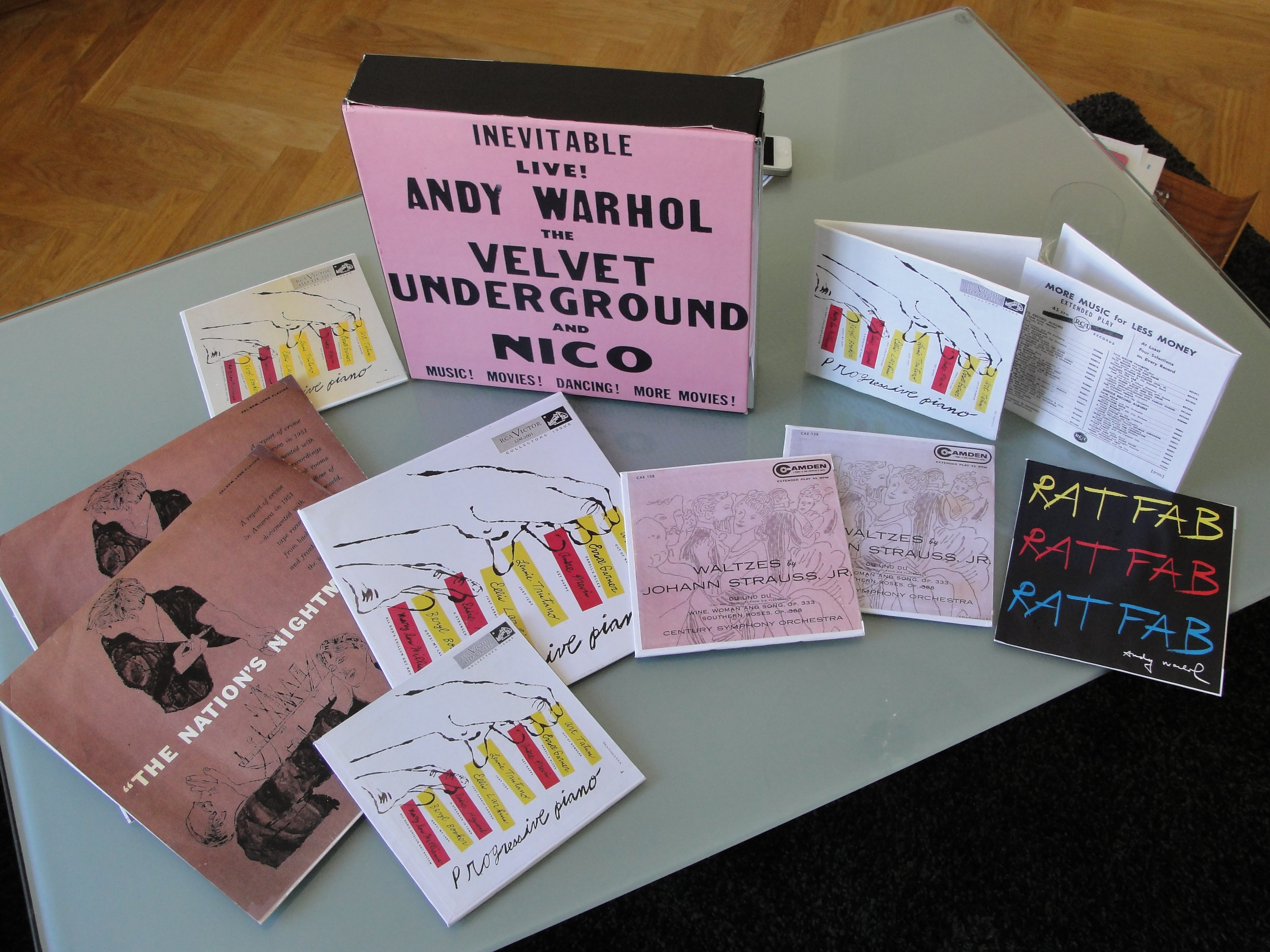
I blogged about my longstanding project to make mock-ups of rare or unobtainable Warhol covers and this weekend I realised my plan. I have made a number of copies of covers for the “Progressive Piano” album – as a 10″ LP, as well as single and double 7″ EPs and also covers for The “Waltzes by Johann Strauss, Jr.” EP. I have made two versions of this cover, one that includes the “Printed in U.S.A.” test at lower right and one that does not. I also amused myself by attempting to make reproduction “Nation’s Nightmare” covers. This side project proved more difficult that I had anticipated and I was satisfied with the result only after three rather ragged versions. But, the cover looks to be in far better condition than my original! I have managed to Photoshop out many of the marks of wear and tear and these covers have no edge splits. I could not resist the temptation to make a copy of the RATFAB cover, Just for fun.
I bought the box set of the “Warhol Live / Andy Warhol – The Record Covers, 1949 – 1987” when it was forst published in 2008. But my copy mysteriously disappeared a couple of years later. Frank Edwards supplied me with a replacement copy of “Andy Warhol – The Record Covers, 1949 – 1987”, for which I am eternally gratreful. But I missed the “Warhol Live” book. So I invested once more and the new set arrived yesterday. It really is a beautiful and interesting read. There is so much information that I had never known. It is worth checking out.

Warhol Live books together with some of the mock-ups of Warhol covers.
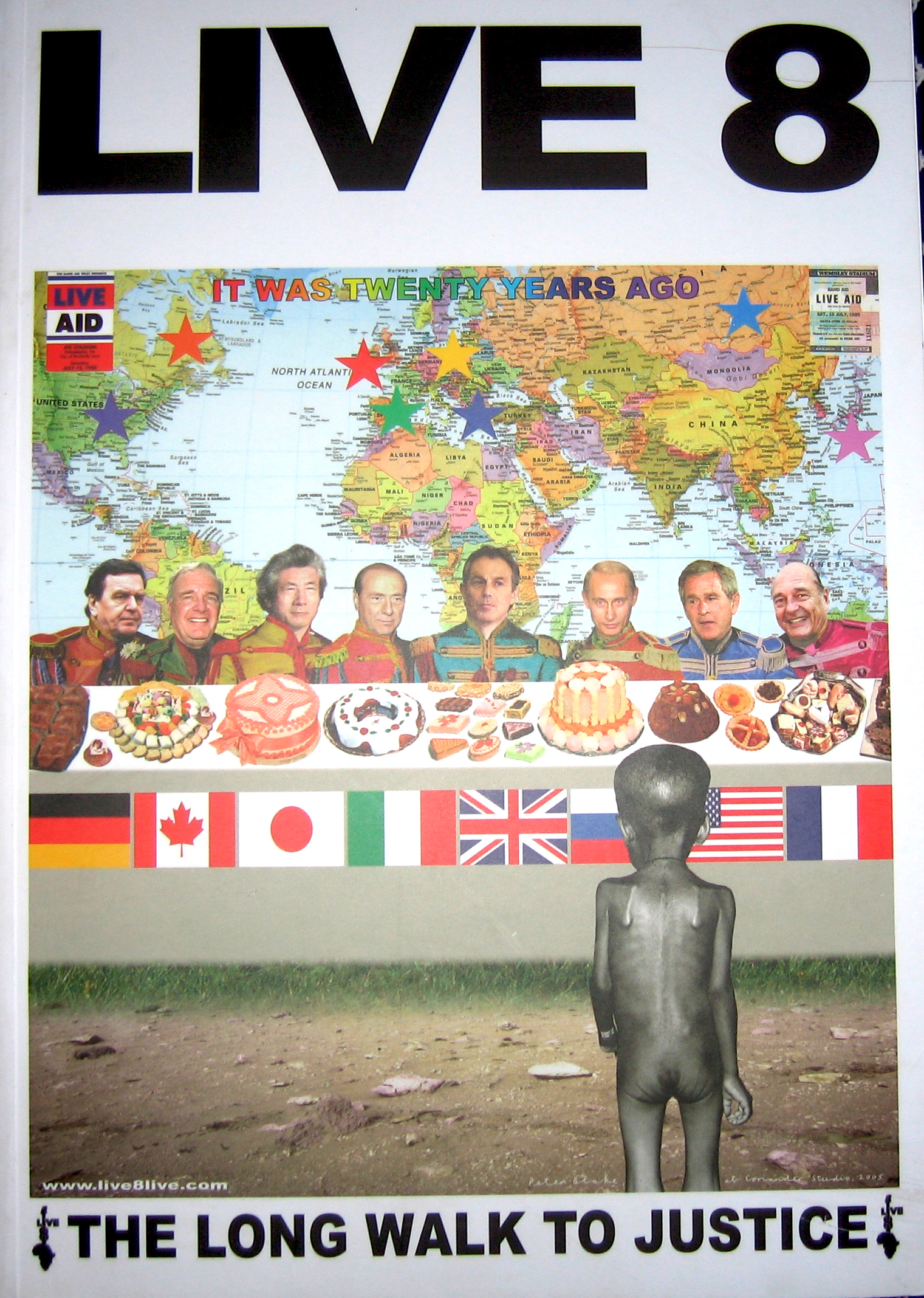
Sir Peter Blake is best-known for the cover to The Beatles’ “Sgt. Pepper’s Lonely Heart Club Band” album which he designed together with his then wife Jann Haworth and photographer Michael Cooper. In the forty-six years since that cover was released, Peter Blake has only designed 22 more covers of which 19 were actually released. One of the better-known released covers is the design for the “Do The Know It’s Christmas” single, released in 1984. What is less well-known is that Peter Blake also designed the poster and programme for the Live Aid and Live 8 concerts.
Until last month, I had not heard that he had also designed the cover for Q Magazine’s February 2006 issue that published a list of the 100 greatest albums of all time.
A copy of this classic Peter Blake design arrived last week, complete with targets, flags, drink logos and pictures of the record covers, so that I didn’t need to open the magazine to see that Radiohead’s “O.K. Computer” was voted best album of all time. By the way, it’s not an album I like at all. Peter Blake is quoted in the magazine as saying his favourite is Talking Heads’ “Remain in Light”, but that isn’t in Q’s list.
Another piece of useless information is that Peter Blake is, to my knowledge, only the second cover designer to actually appear on a cover that he had a hand in designing. He apears, dressed as Moses, on the cover of Madness’ de luxe compilation “Oui Oui, Si Si, Ja Ja, Da Da”. The other artist was Martin Kann, a Swedish designer responsible for most of the cover art for the Swedish band bob hund. He put himself on the cover of bob hund’s 1996 album “Omslag: Martin Kann” (literally – Cover: Martin Kann). I know that Andy Warhol’s portrait has appeared on several covers, but none on which he has had a hand in designing.