It has been a great week for my collection of Warhol covers. Forst I received the two CDs that Frank Edwards told me about. First, the Tobias Picker / Marc Bliztstein CD “Keys to the City / Piano Concerto”. This CD uses Warhol’s poster design for the Brooklyn Bridge centenary in 1983 as its cover image. Tobias Picker pianist and composer apparently has Tourette’s syndrome. But this doesn’t seem to affect his musicianship. He wrote the piano concerto “Keys to the City in 1982, when he was 28 years old, and it won the competition. Marc Bliztstein (born 1905-64) wrote his Piano Concerto in 1931. Bliztstein was murdered in Martinique in 1964.


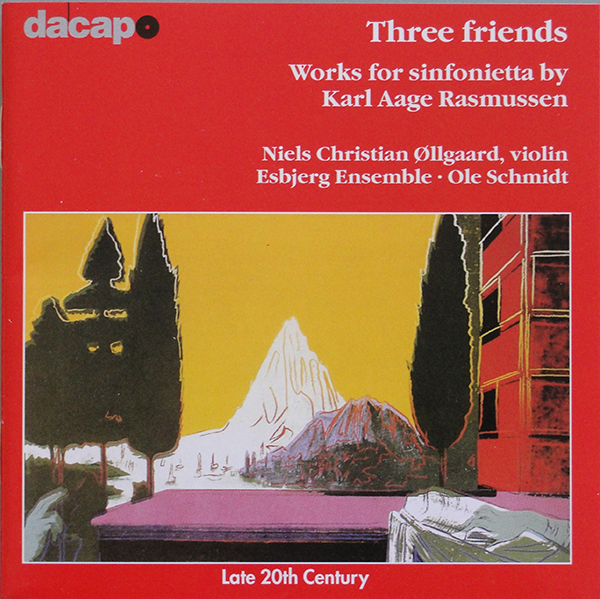
Second, Karl Aage Rasmussen’s “Three Friends”, has Warhol’s picture “The Anunciation” on the cover. This image came from Warhol’s series of Renaissance Details published in 1984. Rasmussen (born 1947) wrote “Three Friends” in 1995 and this recording was made in Esbjerg, Denmark, in May 1998.
In addition, my copy of Prokofiev’s “Alexander Nevsky / Cantata #47” with the orange cover arrived today. It has the late pressed Columbia 6-eye labels with the word “unbreakable” to the left of the spindle hole indicating it to be a late pressing. As I have already stated in an earlier post, the 6-eye label was used on Columbia Materworks pressings between 1955 and 1962. The placing of “unbreakable” to the left of the spindle hole indicates that this LP was probably pressed nearer to 1962 than to 1955.
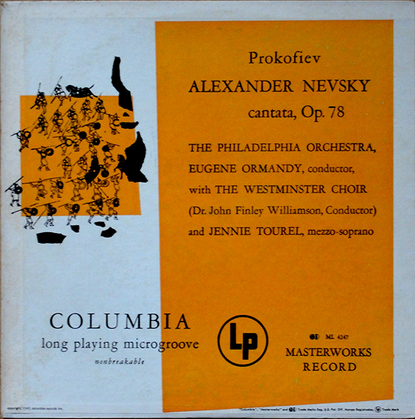
Other copies of this title with the same orange cover that have appeared on Ebay alla ppear to have the same 6-eye label. This supports my thesis that the various cover colour versions are probably later pressings than the original blue colour cover. I would be interested to know whether the green and pink cover versions have the 6-eye label or the original dark blue “masterworks” label. Perhaps readers could let me know.

Richard, your observation is correct: the green and pink cover versions are also later pressings with the grey 6-eye label. My copy of the orange version has an inner sleeve celebrating 10 years of Columbia LP’s, dating this album to 1958. And indeed, all albums mentioned on the sleeve were issued in 1958.
The label on the record is not the only way to state if it’s an original or a later pressing, also the manner in which the covers are printed.
Early pressings (1949): the front cover is printed directly on the cardboard of the cover, the text on the back is pasted on the cardboard. The texture of the cardboard is less smooth than the paper on the back. The cardboard also soils easily, or gets brown.
Later pressings (end Fifties): here the front cover with the Warhol drawing is a sheet pasted on the cover. The text on the back is printed directly on the cardboard, which is of a much better quality and has a different feeling than the cardboard of the early pressings: more glossy, stays white.
So I have 5 versions: covers of the original pressing were pale blue and dark greenish/blue – you can find these in different shades, not really different colors but the way the printing machines were adjusted, I think. Also the print of the Warhol drawing can be very different: from very sharp and fragile, to blurred with way too much ink.
I’ll send pictures of my 5 copies.
Cheers,
Guy
Thanks Guy. Great information as usual. i look forward to seeing pictures of all five colour versions!
Unfortunately, my orange cover has a plain white inner sleeve, so I can’t date it exactly. But if Labelology is correct this pressing should be from the late fifties to early sixties, so I suppose 1958 would be a good guess. What about the colour variation of the “Program of Mexican Music” covers. I only have the light green cover. I know the blue cover has the original dark blue label Masterworks record (as does my green one), but what about the darker green cover?
Cheers
Richard
I have two variations of Mexican Music: green and blue. Have have not yet encountered another one. In the past I have bought copies on eBay that I thought were different: on the pictures one looked yellow, another one darker green. But in the end when they arrived, they all had the same green cover. Pictures can deceive. I wonder if a third version really exists. What do you think? If anyone should have more different copies, please post a picture!
Nice additions to your collection Richard. And great and usefull information here in the comments aswell from Guy, thank you. 🙂
When you have a close look at the picture of the green Nevsky cover in Paul Maréchal’s cat. raisonné, you can see that the front cover is printed on a pasted-on paper, the text on the back is printed directly on the cardboard. This is a later pressing, from end Fifties.
It is safe to assume that these are the color variations:
early pressings (1949) light blue or dark blue – later pressings (end Fifties): green, orage and pink.
Thanks Guy! Cheers R
Skickat från min iPad