Some time ago founder member of the Warhol Cover Collectors Club, Kevin Kinney, found a variant of the “MTV – High Priority” LP cover that few, if any, of us knew existed. Instead of the red shading to the MTV-logo on the front, the shading was yellow and the titles along the top of the front cover were in black print instead of white, red and blue. I’ve been checking every copy that I have seen on Ebay looking for a yellow version but to no avail. Then one came up a week or so ago and I was about to “buy it now” when it disappeared. Fellow collector Niklas L had seen it first and nabbed it! But, having sent Niklas some of my fabricated “Progressive Piano” and other covers for his collection he very generously thanked me by sending the yellow “MTV – High Priority” album together with André Heller’s “Stimmenhögen” LP. Even this turned out to be unusual. Two versions were listed on Rate Your Music – one on the Electrola and one on the HMV label. The copy Niklas sent me was also on the HMV label, but with a completely different catalogue number from those listed on RYM.

The only reason to have the Heller LP is the fact that the booklet inside the gatefold has a little Warhol drawing on one page (pictured above). In 1981 Heller was photographed by Warhol and two Polaroids from this session were recently sold by Christies.
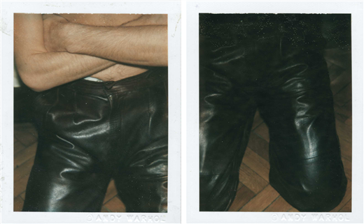
The picture in the lyric booklet is probably Warhol’s portrait of Heller which, judging by Heller’s pose with arms crossed must have been done on that occasion. It fits with the Polaroids, which show him bare to the waist, arms crossed and wearing leather trousers. I suppose Heller chose to include the drawing to show that Warhol had done a portrait of him. I do not suppose that Warhol did the drawing specifically for this record cover. One could argue that the Swan Lake and Daphnis & Chlöe albums from 1955 with Warhol drawings fall into the same category, but Warhol did those drawings specifically for the albums and they illustrate the ballet content. However, one could say that the portraits on the covers of many albums definitely listed as being Warhol covers (Aretha Franklin, Billy Squier, Paul Anka, Liza Minnelli, John Lennon etc.) were not painted specifically for the record covers. So do I include the Heller album as a bona fide Warhol cover or not?


An unusual copy of Prokofiev’s “Alexander Nevsky” LP came up on Ebay last week. This had the original 1949 cover design but with orange colour blocks. I have previously seen blue, green and pink versions, but never an orange one. and I wonder if the colour variations were later pressings of the album. This one definitely is. The record has Columbia Records’ “6-eye” label rather than the Dark blue Columbia Masterworks label used since the introduction of the LP in 1948. According to Ron Penndorf’s Labelography the grey”6-eye” label was introduced in 1955 and phased out in 1962. As may be seen from the label picture, the designation “Unbreakable” appears to the left of the spindle hole, indicating – again according to Labelography – that this is a later pressing; probably late fifties or early sixties. I find it fascinating that Columbia chose to keep the original cover design from 1949 on this repressing rather than commission a new cover.

Hi Richard, interested information about both the Heller and Nevsky albums. I hope you won the auction for the orange Cantata, i’ve only seen this orange cover once before. Do you know which color is most common?
Thanks, Niklas! I think the blue “Nevsky” is most common.
Congratulations, Niklas. Your “Nevsky” is in lovely condition. According to WCCC member Guy Minnebach, the blue version was the orginal cover colour and the green, pink an orange versions are later pressings. Your LP should have the original dark blue “Columbia Masterworks” labels. Later pressings probably all have the grey “6 Eye” labels.
Has anyone seen the cover of Columbia ML 4278 – Juiliiard String Quartet with illustrations that look exactly like the Nevsky Cover mentioned above? I have a copy with a Blue Label first pressing of the record inside. Can this be the missing third cover that Robert Jones reports was commissioned as Warhol’s first LP illustrations? I can send a picture of my copy if anyone would like to see it.
Michael, thanks for posting this question. There is a set of the Juillard String Quartet LPs on Ebay, including ML4278. The illustrations are definitely not by Warhol. Early Columbia LP covers all used the coloured blocks designed by Alex Steinweiss, but used a variety if designers, both in house at Columia and from outside. If I were to guess, I would suggest that Darryl Connelly did these illustations, but I cannot be sure. Many sellers put early Columbua LPs with similar colour blocks up for sale on Ebay as Warhol covers – notably the 10″ Salome cover and the 12″ Elijah series. All these were illustrated by Connelly, not Warhol.
Best regards, Richard
Richard, I have a number of early Columbia ML covers but only the one’s noted by Marechal – A Program of Mexican Music and Alexander Nevsky share the same “blotted line drawing” style (albeit different in composition) with the ML 4278 cover. The colored blocks notwithstanding, are you suggesting that Alan Steinweiss or Darryl Connelly copied, on ML 4278 and also on a panel of ML 4279, the “blotted line drawing” technique which is attributed to Warhol ? Is it possible that the third illustration Warhol produced was not used by Columbia at all? Isn’t it more likely that they paid for it and almost surely used it? Has anyone else ever served up this cover as the missing one of the trilogy of illustrations?
Thanks, Michael
Michael, You mention three covers that Warhol designed for Columbia. Well, there are three; “A Program of MExican Music”, “Alexander Nevsky” and “Nation’s Nightmare” (admittedly this was for Columbia Special Products, but still). I have never heard of any other covers rumoured to have been done for Columbia.
Steinweiss was art director at Columbia from 1938 to 1949, when he went freelance. He designed the LP cover package and the coloured rectangles. By the time the LP was launched in 1948 he was mainly directing. He had Jim Flora and Connely as assistants doing illustrations and would have commissioned outside commercial artists as well.
I would not call the illustrations on ML4278 “dot and blot”. There are a a number of blobs and lines round the illustrations, but the actual instruments and the portrait are drawn with solid lines. The shading is also unlike Warhol’s work.
I still don’t think is a Warhol cover.
Regards, Richard