It has been a great week for my collection of Warhol covers. Forst I received the two CDs that Frank Edwards told me about. First, the Tobias Picker / Marc Bliztstein CD “Keys to the City / Piano Concerto”. This CD uses Warhol’s poster design for the Brooklyn Bridge centenary in 1983 as its cover image. Tobias Picker pianist and composer apparently has Tourette’s syndrome. But this doesn’t seem to affect his musicianship. He wrote the piano concerto “Keys to the City in 1982, when he was 28 years old, and it won the competition. Marc Bliztstein (born 1905-64) wrote his Piano Concerto in 1931. Bliztstein was murdered in Martinique in 1964.
Warhol’s poster for the Brooklyn Bridge Centenary 1983.
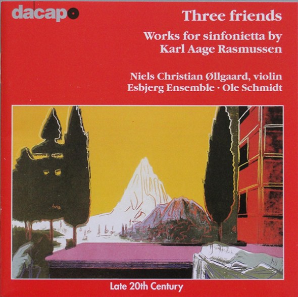
Second, Karl Aage Rasmussen’s “Three Friends”, has Warhol’s picture “The Anunciation” on the cover. This image came from Warhol’s series of Renaissance Details published in 1984. Rasmussen (born 1947) wrote “Three Friends” in 1995 and this recording was made in Esbjerg, Denmark, in May 1998.
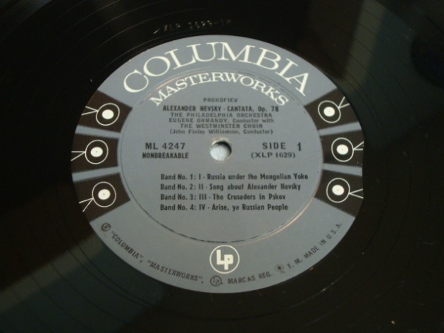
In addition, my copy of Prokofiev’s “Alexander Nevsky / Cantata #47” with the orange cover arrived today. It has the late pressed Columbia 6-eye labels with the word “unbreakable” to the left of the spindle hole indicating it to be a late pressing. As I have already stated in an earlier post, the 6-eye label was used on Columbia Materworks pressings between 1955 and 1962. The placing of “unbreakable” to the left of the spindle hole indicates that this LP was probably pressed nearer to 1962 than to 1955.
Other copies of this title with the same orange cover that have appeared on Ebay alla ppear to have the same 6-eye label. This supports my thesis that the various cover colour versions are probably later pressings than the original blue colour cover. I would be interested to know whether the green and pink cover versions have the 6-eye label or the original dark blue “masterworks” label. Perhaps readers could let me know.
Some time ago founder member of the Warhol Cover Collectors Club, Kevin Kinney, found a variant of the “MTV – High Priority” LP cover that few, if any, of us knew existed. Instead of the red shading to the MTV-logo on the front, the shading was yellow and the titles along the top of the front cover were in black print instead of white, red and blue. I’ve been checking every copy that I have seen on Ebay looking for a yellow version but to no avail. Then one came up a week or so ago and I was about to “buy it now” when it disappeared. Fellow collector Niklas L had seen it first and nabbed it! But, having sent Niklas some of my fabricated “Progressive Piano” and other covers for his collection he very generously thanked me by sending the yellow “MTV – High Priority” album together with André Heller’s “Stimmenhögen” LP. Even this turned out to be unusual. Two versions were listed on Rate Your Music – one on the Electrola and one on the HMV label. The copy Niklas sent me was also on the HMV label, but with a completely different catalogue number from those listed on RYM.
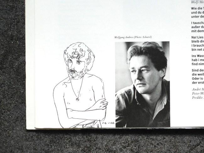
The only reason to have the Heller LP is the fact that the booklet inside the gatefold has a little Warhol drawing on one page (pictured above). In 1981 Heller was photographed by Warhol and two Polaroids from this session were recently sold by Christies.
Two original Polaroid prints of André Heller taken by Andy Warhol in 1981 recently sold at Christies.
The picture in the lyric booklet is probably Warhol’s portrait of Heller which, judging by Heller’s pose with arms crossed must have been done on that occasion. It fits with the Polaroids, which show him bare to the waist, arms crossed and wearing leather trousers. I suppose Heller chose to include the drawing to show that Warhol had done a portrait of him. I do not suppose that Warhol did the drawing specifically for this record cover. One could argue that the Swan Lake and Daphnis & Chlöe albums from 1955 with Warhol drawings fall into the same category, but Warhol did those drawings specifically for the albums and they illustrate the ballet content. However, one could say that the portraits on the covers of many albums definitely listed as being Warhol covers (Aretha Franklin, Billy Squier, Paul Anka, Liza Minnelli, John Lennon etc.) were not painted specifically for the record covers. So do I include the Heller album as a bona fide Warhol cover or not?
An unusual copy of Prokofiev’s “Alexander Nevsky” LP came up on Ebay last week. This had the original 1949 cover design but with orange colour blocks. I have previously seen blue, green and pink versions, but never an orange one. and I wonder if the colour variations were later pressings of the album. This one definitely is. The record has Columbia Records’ “6-eye” label rather than the Dark blue Columbia Masterworks label used since the introduction of the LP in 1948. According to Ron Penndorf’s Labelography the grey”6-eye” label was introduced in 1955 and phased out in 1962. As may be seen from the label picture, the designation “Unbreakable” appears to the left of the spindle hole, indicating – again according to Labelography – that this is a later pressing; probably late fifties or early sixties. I find it fascinating that Columbia chose to keep the original cover design from 1949 on this repressing rather than commission a new cover.
Damien Hirst has not yet designed many record covers. So far I have identified only twenty-three. I am primarily interested in those covers released on vinyl, but for completeness have also included CDs in my list on http://www.rateyourmusic.com (http://rateyourmusic.com/list/rockdoc/damien_hirsts_record_cover_art/). There are three quite rare vinyl issues: The most soughtafter is “Use Money, Cheat Death” by Damien (spellt on the record as Damian) Hirst that uses the Kate Moss portrait with half her face dissected away as the cover image. This picture was originally on the cover of the February 2006 issue of TAR magazine. The other two rarities are Dave Stewart’s “Greetings From the Gutter” and the original release of Joe Strummer & The Mescalino’s “Rock Art & the X-ray Style“, which has since been re-issued on vinyl with the same cover.
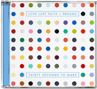
Three new Damien Hirst covers have been released so far this year. In May the group 30 Seconds to Mars released their fourth album “Love Lust Faith – Dreams” with Damien Hirst artwork. Quite pretentiously, they have released the album in three formats – a standard CD, a Super Deluxe Pack (price $295, and includes double white viny LPs a 100-page photo book, lithographs and an autographed CD) and a Super Duper Deluxe pack (price $999, which includes all the stuff in the Super Deluxe pack plus a pair of drumsticks, plectrums, a t-shirt, triad USB and a personalised message from the band.)
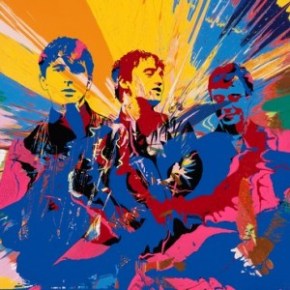
British group Babyshambles released their fifth full length album on 2nd September 2013 with cover art by Damien Hirst who used a photo of the band taken by Pennie Smith (who, you will remember, took the photo of The Clash used on their “London Calling” album.) NME reports on how Hirst came to design the cover “bassist Drew McConnell said: “It happened kind of naturally and in the spirit you’d hope for. We asked Damien to suggest someone to put something together, then to our amazement he offered to do it himself. The fact that he used a pic taken by Pennie Smith, who shot all those iconic photos of The Clash (Damien’s old pal Joe Strummer’s band), just makes it make even more sense.” “Nothing Comes to Nothing”, the first single from the album also comes in a Damien Hirst designed cover.
I blogged about my longstanding project to make mock-ups of rare or unobtainable Warhol covers and this weekend I realised my plan. I have made a number of copies of covers for the “Progressive Piano” album – as a 10″ LP, as well as single and double 7″ EPs and also covers for The “Waltzes by Johann Strauss, Jr.” EP. I have made two versions of this cover, one that includes the “Printed in U.S.A.” test at lower right and one that does not. I also amused myself by attempting to make reproduction “Nation’s Nightmare” covers. This side project proved more difficult that I had anticipated and I was satisfied with the result only after three rather ragged versions. But, the cover looks to be in far better condition than my original! I have managed to Photoshop out many of the marks of wear and tear and these covers have no edge splits. I could not resist the temptation to make a copy of the RATFAB cover, Just for fun.
I bought the box set of the “Warhol Live / Andy Warhol – The Record Covers, 1949 – 1987” when it was forst published in 2008. But my copy mysteriously disappeared a couple of years later. Frank Edwards supplied me with a replacement copy of “Andy Warhol – The Record Covers, 1949 – 1987”, for which I am eternally gratreful. But I missed the “Warhol Live” book. So I invested once more and the new set arrived yesterday. It really is a beautiful and interesting read. There is so much information that I had never known. It is worth checking out.
Sir Peter Blake is best-known for the cover to The Beatles’ “Sgt. Pepper’s Lonely Heart Club Band” album which he designed together with his then wife Jann Haworth and photographer Michael Cooper. In the forty-six years since that cover was released, Peter Blake has only designed 22 more covers of which 19 were actually released. One of the better-known released covers is the design for the “Do The Know It’s Christmas” single, released in 1984. What is less well-known is that Peter Blake also designed the poster and programme for the Live Aid and Live 8 concerts.
Until last month, I had not heard that he had also designed the cover for Q Magazine’s February 2006 issue that published a list of the 100 greatest albums of all time.
A copy of this classic Peter Blake design arrived last week, complete with targets, flags, drink logos and pictures of the record covers, so that I didn’t need to open the magazine to see that Radiohead’s “O.K. Computer” was voted best album of all time. By the way, it’s not an album I like at all. Peter Blake is quoted in the magazine as saying his favourite is Talking Heads’ “Remain in Light”, but that isn’t in Q’s list.
Another piece of useless information is that Peter Blake is, to my knowledge, only the second cover designer to actually appear on a cover that he had a hand in designing. He apears, dressed as Moses, on the cover of Madness’ de luxe compilation “Oui Oui, Si Si, Ja Ja, Da Da”. The other artist was Martin Kann, a Swedish designer responsible for most of the cover art for the Swedish band bob hund. He put himself on the cover of bob hund’s 1996 album “Omslag: Martin Kann” (literally – Cover: Martin Kann). I know that Andy Warhol’s portrait has appeared on several covers, but none on which he has had a hand in designing.
A recap. Between 23rd July and 31st August 2008, the first exhibition of Andy Warhol’s record cover art was shown at Piteå Museum, Piteå, in the north of Sweden. The exhibition was entitled “Happy Birthday, Andy Warhol” as it coincided with what would have been Warhol’s 80th birthday on 6th August 2008.
One month later, my friend Tomas Ersson, visited me and I told him about the exhibition and he mentioned that he had recently read an article in a magazine where a Swedish musician told a story about how Andy Warhol had designed the cover for a single by the band he had been in as a 15-year-old. Unfortunately, Tomas could not remember where he had read the article, but he promised to try to locate it. A few days later he mailed me the article and my hunt for the RATFAB single started.
I lost the article but have always credited Tomas with being the one who tipped me off on the existence of the cover. He has recently helped find the article again and here is the link: http://cafe.se/tomas-alfredsson/
The article is in Swedish and, coincidentally was published on Andy Warhol’s birthday, 6th August 2008, in the Swedish magazine Café. The article is actually an interview with Tomas Alfredsson, a Swedish film producer. At the end of the interview he was asked whether it was true that Andy Warhol had designed the cover for a single by the band in which he had been the drummer.
Here’s the text where he explains how Warhol came to design the cover.
Andy Warhol’s design for the RATFAB single cover.
TAW: “Till sist måste jag fråga om det är sant att Andy Warhol gjorde skivomslaget till ditt gamla rockbands enda singel. TA:– När jag var i 15-årsåldern var jag trummis i ett band som hette Ratfab, Roland And The Flying Albatros Band. Vår basist, Calle Häggqvist, hade en mycket originell farfar, Arne Häggqvist. Han bodde i en liten tvåa i Fruängen med sin stora konstsamling och anordnade litterära salonger i källaren. Arne var svensklärare, översättare, skribent och förläggare. Han introducerade Sartre på svenska, var ett socialt geni och lärde känna många intressanta, märkliga och berömda människor över hela världen. Han skrev Största cocktailboken, som mig veterligen fortfarande är den största cocktailboken. Arne var också konstexpert och skrev den första boken om hur man värderar konst.
TAW: Och han var vän med Andy Warhol? TA: – Han hade träffat Hemingway och Salvador Dali och översatt Dalis böcker. Och så kände han Andy Warhol. Varje sommar sålde Arne en tavla ur sin konstsamling för att finansiera en resa åt honom och barnbarnet Calle. Den här sommaren skulle de åka till New York och träffa självaste Andy Warhol på The Factory. När vi i bandet fick höra det här sa vi till Calle: ”Du måste fråga om han inte kan göra vår logotype!” Och när Calle satt där med Warhol så frågade han faktiskt. Warhol sa: ”Det kan jag väl göra.” Han tog fram ett Andy Warhol-brevpapper och gjorde några olika förslag som han signerade.
TAW: Hur såg de ut? TA: – Han skrev vårt bandnamn med fetkrita och så signaturen under. Vi blev alldeles febriga av det här och trodde att det skulle kompensera våra brister som musiker, vilket det förstås inte gjorde. Men vi tryckte i alla fall upp en singel och en t-shirt. Och det är ju angenämnt att få vara i sällskap med Velvet Underground och Rolling Stones, även om innehållet i vårt fall inte är lika rafflande som utsidan.”
Here follows a translation:
TAW: Finally, I have to ask if it is true that Andy Warhol designed the cover to your old rock band’s only single?
TA: When I was about 15 i was the drummer in a band calleed Ratfab, Roland and the Flying Albatros Band. Our bass player, Calle Häggqvist, had a very original grandfather, Arne Häggqvist. He lived in a little two-room flat in Fruängen with his huge art collection and organised litterary solons in the basement. Arne was a Swedish teacher, translator, writer and publisher. He introduced Sartre in Swedish, was a social genius and became acquainted with many interesting, remarkable, weird and famous people all over the world. He wrote “Största Cocktailboken2 (The Biggest Cocktail book), which is, as far as I know, still the biggest cocktail book. Arne was also an art expert and wrote the first book on how to evaluate art.
TAW: And he was a friend of Andy Warhol?
TA: – He had met Hemingway and Salvador Dali and translated Dali’s books. And he knew Andy Warhol. Every summer Arne sold a painting from his art collection to finance a trip for himslef and his grandson Calle. That summer they were going to New York and would meet Andy Warhol himself at The Factory. When the band got to hear of this we told Calle: “You must ask if he can make us a logo!” And when Calle satt there with Warhol, he actually asked him. “Sure I can.” He produced an Andy Warhol letterpaper and made a few suggestions that he signed.
TAW: What did they look like?
TA: – He wrote the band’s name in pastel and signed underneath. We were totally wild because of it and thought that it would compensate for our musical shortcomings, which, however, it did not. But we pressed a single and a T-shirt. And it was cool to find ourselves in the company of Velvet Underground and Rolling Stones, even if the contents in our case wasn’t as exciting as the outside.”
So, that’s the whole story. Thanks again Tomas Ersson for coming up with the goods!
There are some Andy Warhol record covers that just are not within an ordinary collector’s reach. One of these is his “Giant Size $1.57 Each” limited edition silkscreen, originally made for the 1963 “Popular Image Exhibition” at Washington D.C.’s short-lived Washington Gallery of Modern Art. In 1963. Warhol had a pile of record covers lying about his studio, he used these for one of his experiments and he silkscreened the “Giant Size $1.57 Each” design onto the record covers.. The image was probably taken from a simple newspaper advert. Seventy-five copies were made. They were individually screened and as the silkscreen was placed rather haphazardly over each cover, each has the image in a slightly different position. In addition, Warhol was not used to dosing the amount of ink required and the quantity passing through the screen also varied; on some copies it was so thick that it flaked off when dry (see the photo in Paul Maréchal’s book “Andy Warhol – The Record Covers 1949-1987”.)
Eleven artists were represented at the “Popular Image Exhibition” at The Washington Gallery of Modern Art. In addition to Warhol these included Tom Wesselmann, Claes Oldenburg, Jim Rosenquist, Robert Rauschenberg, Jim Dine, George Brecht, Jasper Johns, Roy Lichtenstein, John Wesley and Robert Watts and each was interviewed about his contribution. The interviews were collected on an LP with a cover design my Jim Dine and sold at the exhibition. Warhol took some of the LPs and put them in his cover. The exact number is unknown, however, probably not in all 75 of them. Some copies of the record in the original Washington Gallery cover have turned up for auction and some copies of the “Giant Size” cover with record have also been sold.
Jim Dine’s cover for the Popular Images Exhibition interview LP
In 1971, Warhol remade the record covers – this time in three series with spray painted backgrounds, 75 copies each on red, green and yellow backgrounds. I have seen at least one red copy sold with the LP from the 1963 exhibition. According to Paul Maréchal, Matt Wrbican at The Warhol Museum discovered a bundle of seventeen “Giant Size $1.57 Each” covers in Treasure Chest box 63.
One of the 17 covers found in box TC 63 at The Warhol Museum. (Photo by courtesy of Matt Wrbican)
When I was curating the “Happy Birthday Andy Warhol” exhibition in 2008 I made 10 digital copies of the “Giant Size $1.57 Each” cover to be sold at the exhibition. In addition I made three copies of each of the red, green and yellow covers (however, my yellow turned out more ochre than yellow).
The second cover that is, and will forever be, impossible to find is the “Progressive Piano” 10-inch LP and double 7-inch EP. The record was never released but lithographs of the cover designs for these are in The Warhol Museum. I have thought about making mock-ups of both versions ever since I first saw these designs. I have recreated the front covers of both the 7 and 10 inch versions (they have different catalogue numbers so I couldn’t just reduce the 10-inch to make the 7-inch version!)
The 10″ and 7″ versions of “Progressive Piano” and the cover in progress.
The picture shows the basic card cover for the 7″ version open. Under it is the card cover with the cover image superimposed. The 10″ version is shown on the left and the rear cover for the 7″ version on the right.
I have invented a rear cover for the 10-inch album as every RCA album has an individually scripted rear cover.
The most difficult part of the production of these covers has been finding the correct thickness card for the covers. Record covers nowadays are constructed of card that is considerably thinner than that used in the 1950s. Most card currently available is 1 mm thick or thicker and cannot be used for making a replica record sleeve. I had a stoke of luck while getting som photocopies made at a copy shop. They packaged my copies in an envelope with a cardboard back of exactly the right thickness for a record cover. This could be cut to size for the 7-inch covers. However, I still had to find larger sheets of card to make the 10-inch cover. As luck would have it, I found some special card in an art shop in central London that exactly fitted the bill.
The process nears completion. All that remains is to glue the rear cover art to the ready-cut cards and then glue over the front design to complete the covers. I feel a bit sad that a project that has been in gestation for four or five years is so near its conclusion. I will need a new project to deal with.
In 1992 Stefana Sabin published a German language biography of Andy Warhol and this was released as an audio book by Deutsche Gramophon in 2006 as part of the company’s series of monographs of various famous people. The text, divided into seven chapters, is read by Kerstin Hoffmann and Michael Hametner. The CD booklet has a picture of Andy Warhol credited to Ullstein Bild. Because the cover bears Andy’s portrait, I suppose one could (at a pinch) call this an “Andy Warhol cover”, but it is not designed or illustrated by Warhol, so I won’t be including it in my list. Another recording of Andy Warhol is a CD entitled “Uh Yes Uh No” released in 2002. I’m not entirely clear how or why this CD was released.
The CD booklet with photograph of Andy Warhol credited to Ullstein Bild.
Andy Warhol: “Uh Yes Uh No” CD.
I have also received a copy of Artie Shaw´s “Any Old Time” EP with the chain of clocks drawing on the reverse broken in two by the record title.
The reverse of the “Any Old Time” EP with the broken chain of clock faces.
In 2008 I started to compile a list of record and CD covers designed or illustrated by Andy Warhol on Rate Your Music’s site (www.rateyourmusic.com). I’ve been adding to this list continually as more and more covers with Warhol’s art have surfaced. My aim has been to produce a complete and accurate list.
In a recent post, I listed Warhol art on seven inch singles and EPs. I promised readers that I would continue with a list of singles and EPs from 1977 onwards. During my research for this new list, which is still in preparation, I noticed that I have failed to include several covers (including a couple of classic Warhol covers) on my master list on Rate Your Music. I must have had a serious blackout to miss including The Rolling Stones’ “Love You Live!” album or their promotional EP “The Rolling Stones” for that album! Further, there are a few other covers in my collection that I have failed to list. So I have had to photograph and list them. Among these are a couple of rare promotional CD singles taken from Paul Anka’s 1996 “Amigos” album. Anka reuses his Warhol portraits on all these releases. There is a duet with Anka singing his 1956 hit “Diana” together with Ricky Martin.
and his duet “Yo Te Amo” with Anthea Anka.
In addition, I’ve added a few new covers to my collection. I have added Walter Steding’s “Dancing in Heaven” LP and the “Secret Spy/My Room” single and Blondie’s bootleg picture disc “Picture This!” from 2002, that uses Warhol’s portrait of Debbie Harry on one side.
So now my list has grown to 102 covers. I’m still debating whether or not to include covers with images from films produced by Factory co-workers such as The Smiths’ covers for their first LP and the “Sheila Take a Bow” single or that use photographs of Superstars by Factory workers such as The Cult’s “Edie (Ciao Baby)” and various other covers with Edie Sedgwicks’s portrait. Observant readers will note that I have included Loredana Berté’s “Made in Italy” LP as well as the “Amica Notte / Movie” single.
I would appreciate comments on my Rate Your Music list with suggestions of covers that I may have missed and comments on whether or not to include covers by Warhol associates or stills from films.
On 12th September, 2013 Guy Minnebach pointed out a further four covers that I had not included on my list at Rate Your Music. These are: John Cale’s “Honi Soit”, John Lennon’s “Menlove Ave”, Liza Minnelli’s “Live at Carnegie Hall” and Billy Squier’s “Emotions in Motion”. Thanks, Guy! I’ve now added them making a total of 114 covers on the list.