Stones founder member Brian Jones had died in 1969 and the band hadn’t released and album since “Let It Bleed” that same year. Mick Taylor joined to fill Brian Jones’s shoes. But the group hadn’t been idle. They had begun recording new material for an album in March 1969 and come up with some of their strongest material. Further the new album, entitled “Sticky Fingers” was to be the first to be released on The Rolling Stones own record label (licensed to Atlantic Records). Mick Jagger had already approached Andy Warhol to suggest that he design the upcoming album’s cover.*
Mick Jagger’s 1969 letter to Andy Warhol sending him material and a copy of Sticky Fingers and asking him to design something wild.
Warhol had already discussed the idea of having a zip fastener on a record cover and this was his opportunity. I have already posted a fairly detailed account of the cover’s production in my February 2015 post on “The sources of Andy Warhol’s record cover art – The Rolling Stones“, so I won’t go into it again here.
The album was released on 23rd April 1971. The UK and European editions had the band’s name and the record title like rubber stamps over the model’s right thigh while the US version had both the band name and title placed over the models belt. The Stones gave the record the titillating catalogue number COC 59100 for both editions. A later US and Canadian re-issue had the catalogue number COC 39105. I have thus far not been able to find out when this was released. Both my copies are the 39105 version.
The UK/European cover.The US/Canadian cover.
However, in Spain, the cover was deemed too lascivious and a “politer” version illustrating sticky fingers covered in treacle was used.
The Spanish cover.
The rear cover photo on both the UK/European and US/Canadian versions was identical with the jeans-clad posterior on both. The Spanish cover used the photo of the Stones that graced the UK and US inner sleeves.
In 2015, a remastered and expanded version of the “Sticky Fingers” album with an extra LP of live tracks. This was reissued with a working zip but with the tongue logo on the zip’s puller. Simultaneously there were several variations including a double CD with the same cover image but without a working zip, a box set with CD and a book – again without the working zipper and a super deluxe box set with a triple CD, seven-inch single and photographs. The CD in this box does have a working zip. This is the second time that a CD with real zip has appeared. Incidentally, this reissue series also includes a double LP with the Spanish cover.
Just recently my friends at London’s A and D Gallery got hold of a copy of the 1971 US release (COC 39105) signed by Andy Warhol along with a signed copy of “Love You Live” which they passed on to me!
My signed “Sticky Fingers” LP.My signed “Love You Live” cover.
As many people know, Andy was not pleased by Mick Jagger adding the title to the front cover of the “Love You Live” album and usually refused to sign the front, preferring, as in this case to sign the inner spread. These two signed albums make a great addition to my collection of Warhol covers.
*Guy Minnebach points out that this letter cannot have anything to do with the decision to ask Warhol to design the “Sticky FIngers” cover as the letter refers to a hits package. Furthermore, Jagger sends a copy of the finished album with the letter, so the album CANNOT be “Sticky FIngers” as that was not recorded yet. The Stones DID ask Warhol to design a cover for their “Through the Past Darkly” hits album released in 1969, but apparently rejected Warhol’s design, which has thus far not been found.
I started to compile a list of all vinyl singles (seven and twelve inch) and extended play (EP) 7-inch records early in 2013 (see Andy Warhol Art on 45s, Part 1) and published it on 26th June 2013 with the intention of completing the list within a couple of weeks. However, the challenge proved greater than I had anticipated and it has taken me just over two years to get anywhere near a reasonably complete list of all the 45 RPM records that have cover art by Andy Warhol. Experience has taught me never to claim that a list like this is complete but this is as near as I can get just now. I am sure that more records will turn up as soon as this list is published. So, if you can see that I have missed any, do not hesitate to contact me and I will add them to the list.
Just a note about the conditions for inclusion on my list.
1. I have omitted compact disc singles – obviously, they are not on vinyl.
2. I have also excluded singles whose covers simply have a picture of the parent album on the reverse.
3. I have omitted European pressings of RCA singles that simply repeat the American issues.
My apologies for including the records listed in Part 1 of this list. I felt it best to make a new chronological list.
Note: No. 13 on this list, “Progressive Piano” was scheduled for release by RCA as a 10-inch LP and a 2 x 7-inch EP set, but appears never to have been issued. Only lithographs of the cover design exist in The Warhol Museum.
While on the subject of RCA EPs released in the 1950s, I would point out that the company released Byron Janis‘ recording of “Rhapsody in Blue / Grand Canyon Suite” and Erica Morini‘s recording of Tchaikovsky‘s “Violin Concerto” on both on LP and as 3 x 7-inch EP sets. The third RCA Bluebird record with illustration attributed to Andy Warhol is the “Porgy & Bess / Symphonic Dances” album also released on LP and, I suspect, even as a 3 EP set. I have thus far never seen the EP set of this recording so I have not included it in my list.
On 10th June 2015 The Rolling Stones‘ Album “Sticky Fingers” was rereleased on both vinyl and CD with added tracks. A box set including a repressing of the “Brown Sugar / Bitch / Let It Rock” EP was included in the box set with the same cover as the 1971 and 2011 versions, using the rear cover photo from the “Sticky Fingers” album on the rear.
So, there is my latest attempt at a complete list. Suggestions for additions are very welcome.
Since my previous post collecting all the record covers I could find that featured Kate Moss on their covers, I have come across five more.
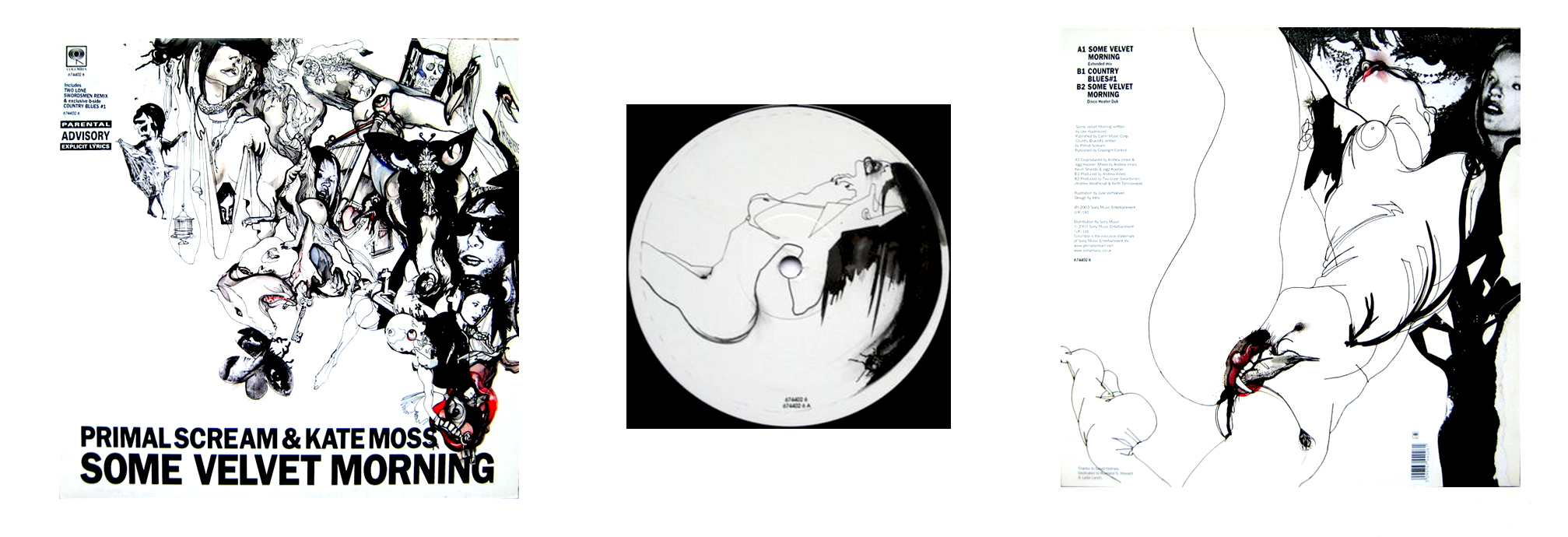
1. Primal Scream & Kate Moss – “Some Velvet Morning” – Columbia 12″ – 2003
2. Babyshambles – “Down in Albion” – Rough Trade 2LP – 2005
3. Babyshambles – “Shotter’s Nation” – Parlophone LP – 2007
4. The Unholy Two – “Kutter / Porkys” – Columbia Discount Records – 7″ – 2008
5. Various Artists Compilation – “Kate Moss for Longchamp” – Universal Music – 2010
Pete Doherty of Babyshambles had a much publicised relationship with Kate Moss and she wrote several songs for the group. Babyshambles‘ 2005 double album “Down in Albion” came in a plain beige cover but had colourful inner sleeves with a picture of Kate Moss on one of them.
Their next album “Shotter’s Nation“, released on 1st October 2007 had a possible picture of Kate Moss‘ back on the front cover.
Babyshambles’ 2007 album “Shotter’s Nation”. Is that a scantily clad Kate Moss standing on rthe right?
First there was Primal Scream‘s 12-inch cover of Lee Hazelwood‘s “Some Velvet Morning” which featured Kate Moss repeating the Roland S. Howard & Lydia Lunch version from 1982. Thanks to Carlos Soares for tipping me off about this cover.
Primal Scream’s 2003 12-ich single “Some Velvet Morning” featuring Kate Moss. Front cover (left), record label (centre) and rear cover (right).
Then in 2008 a group called The Unholy Two released a 7-inch single entitled “Kutter” b/w “Porkys” that featured a fold out cover with photocopied pictures of a naked Kate Moss. The photographs are from a 2005 portfolio by painter and photographer Chuck Close.
Composite of the cover of The Unholy Two’s “Kutter/Porkys” single.
A promotional CD from 2010 released by fashion house Longchamp featured a selection of tracks chosen by Kate Moss and featured cover photos from a Longchamp catalogue. The CD was simply titled “Kate Moss for Longchamps“.
Kate Moss 2010 CD for Longchamp.
So, assuming that the cover of Babyshambles‘ “Shotter’s Nation” does show Kate Moss there are at least sixteen record and CD covers that feature the iconic Kate Moss. So here is the complete list (in chronological order):
1. Primal Scream & Kate Moss – “Some Velvet Morning” – Columbia 12″ – 2003
2. Dirty Funker – Let’s Get Dirty” (1st pressing) – Spirit Music – DF 006 – 2006
3. Dirty Funker – Let’s Get Dirty” (2nd pressing) – Spirit Music – DF 006 – 2006
4. Babyshambles – “Down in Albion” – Rough Trade 2LP – 2005
5. Babyshambles – “Shotter’s Nation” – Parlophone LP – 2007
6. 6majik9 – “Kate Moss” – Music Your Mind Will Love You – mymwly0080 – 2007
7. The Unholy Two – “Kutter / Porkys” – Columbia Discount Records – 7″ – 2008
8. Damien Hirst & Kate Moss – Use Money, Cheat Death” – White Cube – DHKM 99 – 2008
9. Various Artists Compilation – “Kate Moss for Longchamp” – Universal Music – 2010
10. Bryan Ferry – “Olympia” – Vinyl Factory – Ltd edn 2 x LP – VF 021 – 2010
11. Bryan Ferry – “You Can Dance” – Vinyl Factory – Ltd edn 12″ – VF 019 – 2010
12. Bryan Ferry – “Heartache by Numbers” – Vinyl Factory – Ltd edn 12″ – VF 020 – 2010
13. Bryan Ferry – “Alphaville Remixes” – Vinyl Factory – Ltd edn 12″ – VF 022 – 2011
14. Bryan Ferry – “BF Base (Ode to Olympia)” – Vinyl Factory – Ltd edn 12″ – VF 023 – 2011
15. Bryan Ferry – “Shameless” – Vinyl Factory – Ltd edn 12″ – VF 024 – 2011
16. Bryan Ferry – “Alphaville” – Vinyl Factory – Ltd edn 12″ – VF 030 – 2011
john Lennon’s 1986 album “Menlove Ave” is probably the best known of his recordings that use Andy Warhol’s art. But there are some others and one, in particular, that has not previously been recognized.
Andy Warhol’s Polaroid pictures of John Lennon. Circa 1969.
The photo on the left bears a striking resemblance to the cover photo on Lennon’s album “Imagine”, released on 5th September, 1971. Only the position of the cloud is different.
John Lennon’s “Imagine” LP cover.
There may be an explanation for this, however. Photographer Iain Macmillan was a good friend of the Lennons. He had been introduced to John by Yoko at her 1966 exhibition at the Indica Gallery in London, where she first met John. Macmillan was commissioned to take the cover photo for The Beatles’ “Abbey Road” album and had take portrait photographs of John as well. It was he, apparently, that placed the cloud on the cover of the Plastic Ono Band’s “Live Peace in Toronto” 1969 album.
“Live Peace in Toronto” cover art.
The cover design of Lennon’s “Imagine” album is credited to Yoko Ono but Wikipedia’s article on the album credits the cover photo to Andy Warhol. Thus this album is a previously unrecognized Andy Warhol cover appearing only five months after Warhol’s cover design for The Rolling Stones’ “Sticky Fingers” LP. Several singles bear the same cover photo including Lennon’s “Jealous Guy”/”Going Down on Love” and versions of “Imagine”.
Macmillan’s Lennon portraits turned up first on Lennon’s posthumous “Menlove Ave” LP compiled by Yoko Ono and released in 1986. According to the story I have heard, Yoko approached Warhol with Macmillan’s Lennon photographs and asked him to paint two portraits for use on the album cover.
“Menlove Ave” LP front and rear art.
These portraits would reappear when Q magazine with the May 2005 edition which contained two CDs of John Lennon’s songs covered by other artists including Madonna, Oasis, Paul Weller, Wilco and Badly Drawn Boy, amongst others.
The Front covers of Q Magazine’s CDs “John Lennon Covered #1 and #2.”Andy Warhol’s two portraits of John Lennon.
There are other pressings that use Warhol’s Polaroid photos, including a 12-inch maxi and the 1971 Japanese “Imagine/It’s so Hard” 7-inch single.
The compact disc (CD) was developed jointly by by Philips and SONY and introduced in 1982, five years before Andy Warhol’s death in February 1987 following a gallbladder operation. As far as I can ascertain the only CD that used Warhol’s art that was released during his lifetime is the 1986 Aretha Franklin album “Aretha“. I have twenty-two of the 33 catalogued CDs in my collection that have cover art or portraits by/of Andy Warhol. The table lists all these that I have found.
CDs with Andy Warhol Art 1986-2009.
The compact discs:
Aretha Franklin‘s “Aretha” album released in 1986, was simultaneously released on LP, cassette and CD. Many older albums with Warhol art were later re-issued on CD. But I have not included re-issues in this list – thus no Velvet Underground & Nico or any of the Blue Note albums with Warhol art.
in 1988 Tobias Picker’s “Keys to the City” coupled with Marc Blitzstein’s “Piano Concerto”, was first released, on the CRI label. The booklet featured Warhol’s “Brooklyn Bridge” poster design on the cover (left). Warhol had created this print to celebrate the Bridge’s centenary in 1983. The CD was was re-issued in the 1990s with a modified cover (right).
Picker/Blitzstein: The original CD release (left) and the re-issue cover (right)
In 1990 John Cale and Lou Reed released “Songs for Drella”, their tribute to Andy Warhol. “Drella” was Warhol superstar Ondine’s nickname for Warhol – a contraction of Dracula and Cinderella – used by people at The Factory but apparently not appreciated by Warhol himself. The “self portrait” on the cover was taken by Billy Name. There was also a limited edition CD in a velvety Digipak version that only had the album title of the front cover together with Cale’s and Reed’s names.
“Songs for Drella” CD with a Warhol self-portrait visible behind Lou Reed and John Cale.
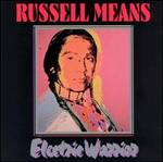
Russell Means, a famous native American activist, released “Electric Warrior” in 1993. The portrait on the booklet was taken from Warhol’s “The American Indian” series, originally published in 1976. Other portraits of Means from the series can be seen at http://www.skarstedt.com/exhibitions/2012-10-10_andy-warhol/.
Russell Means’ “Electric Warrior” CD with Warhol’s 1976 portrait.
The Warhol Museum opened the following year and a book and CD were published to commemorate its inauguration. The CD of Andy Warhol interviews “Warhol From Tapes” had a detail from “Flowers” printed on the CD. The book had the compact disc attached to the front cover, but there are also CDs in standard jewel cases.
The Warhol Museums 1994 inaugural book with CD.
In 1972, Paul Anka had commissioned Warhol to paint a series of portraits of him. Warhol delivered these in person to Anka, who was, at that time, appearing in Las Vegas. Anka used two of the portraits on his 1976 LP “The Painter” and in 1996 released a compact disc album of duets entitled “Amigos”. This was a Spanish language release with Anka duetting with such artists as Ricky Martin, Julio Iglesias and others, including his daughter Anthea Anka. Two compact disc singles were released from this album; a promotional single of “Diana” featuring Paul Anka and Ricky Martin and a standard CD single of “Yo te amo”, which Anka sings together with Anthea.
Paul Anka “Amigos” (left), “Diana” (middle) and “Yo te amo” (right).
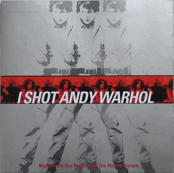
The soundtrack to the film “I Shot Andy Warhol”, released in 1996, starred Lili Taylor, Stephen Dorff and Jared Harris. The soundtrack was a compilation of various artists tracks.The choice of artists on this CD was eclectic. There was a track from The Lovin’ Spoonful, and others from R.E.M., Luna, The MC5 (“Kick Out the Jams” – one of my favourites), Love and a specially composed “I Shot Andy Warhol Suite” by John Cale.
The soundtrack album “I Shot Andy Warhol”.
The next classical CD, released the same year as “I Shot Andy Warhol”, was a promotional double CD entitled “Concert of Concerts, Opus 2″ released by NTT Data in Japan of works by Mozart and Mahler’s Symphony No. 5. The cover and the discs themselves all featured a drawing from Warhol’s sketches from his portfolio “Play Book for S Bruce from 2:30 to 4:00″ given to Stephen Bruce joint owner of New York’s Serendipity 3 restaurant.
NTT-Data “Concert of Concerts, Opus 2″ CD cover.
In 1997, Catalyst records released “Music for Merce” by The EOS Ensemble, conducted by Jonathan Sheffer, that used Warhol’s photographs of dancer and choreographer Merce Cunningham on the booklet.
“Music for Merce” the 1997 CD.
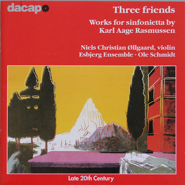
The next classical CD to appear was Karl-Aage Rasmussen’s 1998 “Three Friends”, which featured a detail from Leonardo da Vinci’s “The Annunciation” from Warhol’s “Details of Renaissance Paintings” prints from 1984. Another detail from another print from this series would appear on a CD cover in 2006.
Detail from Leonardo da Vinci’s “The Annunciation” on Rasmussen’s “Three Friends” CD.
The band Hopewell released its first album entitled “Contact” in 1998 with a cover picture of the Empire State Building from Warhol’s 1964 film of the building. The silent film lasts 8 hours and 5 minutes and was shot from the 41st floor of the Rockefeller Center.
Hopewell’s first album “Contact” used a still from Warhol’s film “The Empire State Building”.
John Cale released “Eat/Kiss –
John Cale’s “Eat/Kiss – Music From the Films of Andy Warhol” featuring a still from “Kiss”.
Music From the Films of Andy Warhol” in 1999, which features a still from Warhol’s film “Kiss” on the booklet’s cover.
In 2000, the Museum of Modern Art released a CD entitled “Open Ends – Musical Exploration in New York 1966-2000″. This is a compilation of various artists including The Velvet Underground, Yoko Ono, Sonic Youth, Yo La Tengo and The Fugs. The cover showed four colour variations of Warhol’s self portrait from 1966 – a work that resides in the Museum of Modern Art.
The booklet from “Open Ends: Musical Exploration in New York 1960-2000″. Released by the Museum of Modern Art.
A rather strange compact disc entitled “Andy Warhol – Amerykansi Mit” appeared in Poland in 2002. This is a twelve track CD with the majority of tracks by members of The Velvet underground, but also including tracks by Janis Joplin, Bob Dylan, The Animals and The Jimi Hendrix Experience.
Various Artists CD “Andy Warhol – Amerykanski Mit”.
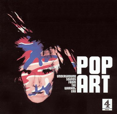
Two further compact discs were released in 2002 with Warhol art. “Andy Warhol – Uh, Yes, Uh, No” – a recording of Warhol quotes, and “Pop Art – Underground Sounds From the Warhol Era” another compilation of tracks by thirteen artists including (of course) Lou Reed, Iggy Pop, David Bowie, Roky Erikson, Debbie Harry, John Cale and Jackson Browne. The cover was one of Warhol’s 1984 self portraits.
Andy Warhol: “Uh Yes Uh No” CD.“Pop Art – Underground Sounds From the Warhol Era” compilation CD.
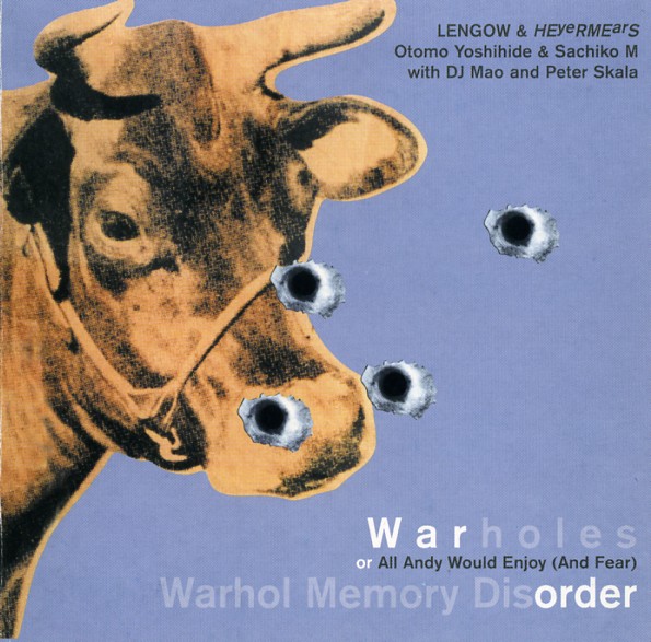
Another strange compact disc entitled “Warholes Or All Andy Would Enjoy (and Fear) / Warhol Memory Disorder” by Lengow & HEveRMEarS / Otomo Yoshide & Sachiko M with DJ Mao and Peter Skala used Warhol’s Cow wallpaper with added bullet holes as its cover image. I don’t have this CD and have no idea what tracks it contains.
Lengow & HEveRMEarS / Otomo Yoshide &
Sachiko M with DJ Mao and Peter Skala’s CD from 2003.
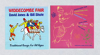
In 1993 David Jones (no, not the David Bowie David Jones) and Bill Shute released a cassette of “traditional songs for all ages”, with simple cover art, entitled “Widdecombe Fair“. The album was re-released in 2003 with new cover art.
The 1993 cover art for”Widdecombe Fair” (left) and the 2003 cover (right).
In 2004 another various artists CD by Cultura and entitled “Andy Warhol by Cultura” was released in Italy. This Digipak double CD included a booklet with several Warhol artworks, the use of which had been sanctioned by The Warhol Foundation.
Cultura compact disc.
A bootleg compact disc with early Velvet Underground tracks, recorded between January and April 1966 was released in Japan in 2005. The CD was called “The Velvet Underground at the Factory – Warhol Tapes”.
The Velvet Underground at the Factory – Warhol Tapes” CD.
The British music magazine Q released two CDs of covers of the music of John Lennon. These were cleverly titled “John Lennon Covered #1” and “John Lennon Covered #2“. Each 14-track CD included tracks by Oasis, Madonna, Paul Weller, Stereophonics and others.
John Lennon Covered #1 and #2.
Three compact discs featuring Warhol art were released in 2006. “The Mystery of Do-Re-Mi” a recording by the baritone Christopher Grabbitas accompanied on the lute by David Miller used a detail from another of Warhol’s “Details of Renaissance Paintings” series, This time using SandroBotticelli’s “The Birth of Venus“.
“The Mystery of Do-Re-Mi” with a detail of Warhol’s version of Botticelli’s Birth of Venus.
A second CD from 2006 was Brian Keene’s “Andy Warhol – A Documentary” which contained a specially composed soundtrack.
Brian Keene’s “Andy Warhol – A Documentary” CD featuring one of Warhol’s 1984 self portraits.
Several CDs have appeared in Germany on Warhol’s life and works. The first, a tranlation of Andy Warhol’s diaries was released under the title “Andy Warhol – Das Tagebuch” in 2006.
“Andy Warhol – Das Tagebuch”
While on the subject of Warhol’s life, Deutsche Grammophon released a series of CDs with programmes of biographies of famous people, one of whom was Andy Warhol. Stephana Sabin compiled the biography, which is in German.
Stephana Sabin’s biography of Andy Warhol.
The French music magazine Les Inrockuptibles released a compilation compact disc entitled “Le New York d’Andy Warhol” in 2007. The CD featured tracks by Lou Reed, Patti Smith, Television and others. The cover picture was David McCabe‘s photo of Andy with Edie Sedgwick taken in 1964 just after the release of Warhol’s film “The Empire State Building”.
Les Inrockuptibles CD “Le New York d’Andy Warhol”.
And in 2008 another German CD biography of Warhol appeared, this time written by Annette Spohn and called “Andy Warhol – Leben, Werk, Wirkung”.
Annette Spohn’s Warhol biography in German.
The Art Gallery of Ontario presented an exhibition of Warhol art entitled “Stars, Death and Disasters, 1962-1964″ in 2008. The exhibition was co-curated by film director David Cronenberg and the gallery released a CD of Cronenberg’s discussions of the exhibition. The CD was entitled “Cronenberg on Warhol” and featured two images of “Double Elvis on front and rear covers.
The Art Gallery of Ontario’s CD “Cronenberg on Warhol”.
In 2008 a re-issue of an old bootleg appeared on CD with a new cover. The Velvet Underground‘s “Psychedelic Sounds From the Gymnasium” is a concert recording from April 30th 1967. This album was originally released on vinyl in 2008 and this re-issue has a Warhol cover supplied by The Warhol Foundation.
“The Velvet Underground at the Gyymnasium” – a bootleg CD.
The final compact discs on my list are credited to MPHO (Mpho Skeef, a South African, now living in London). The are promotional various artist CD-rs and are released on the Wall of Sound/Parlophone label. Entitled “The Art of Pop featuring DJ Beware, Vols 1 and 2″, the cover art shows classic Pop Art images, not only by Warhol, but by Roy Lichtenstein, Jasper Johns and others.
MPHO’s “The Art of Pop featuring DJ Beware, Vol 1″ – a gatefold cover, shown here open.
And that takes us up to 2009. I have thus far not been able to find any compact discs released after this that feature Andy Warhol’s art. But I promise – I will keep on searching.
This post owes a big thank you to Guy Minnebach, who came up with several CDs that I had missed. Thank you, Guy.
Louis Thomas Hardin (a.k.a. Moondog, a.k.a. The viking of 6th Avenue) was born in Kansas in 1916 and was blinded in an accidental explosion when he was 16 years old. He attended various music schools for the blind but developed his own composing skill. Hardin moved to New York in 1942 where his original musicianship was recognised by many celebrated musicians, both from the classical and jazz fields. He wrote poetry and set many to music. He lived as a street musician between 1942 to 1972 wearing a viking cloak and a horned helmet which earned him the moniker “the viking of 6th Avenue.” Hardin adopted the Moondog alias in 1947 in honour of a dog who used at the moon. Hardin emigrated to Germany in 1974 where he lived for the remainder of his life. He died on 8th September 1999.
Originally released by Prestige Records in 1957, this LP has long been one I have been looking for. I suspected that this record was incredibly rare, but there are over fifty copies listed on http://www.popsike.com and two appeared on Ebay in the same week in May 2015. Both these copies’ front covers were considerably yellowed but they still sold for over $250 each. Needless to say, I didn’t win either of them!
The original record was recorded in 1956-7 and Reid Miles, Prestige record’s art director approached Andy Warhol to ask his mother Julia to write out Stewart Preston’s eulogy to Moondog in her characteristic calligraphic style. According to Paul Maréchal in “Andy Warhol: The Complete Commissioned Record Covers, 1949-1987” she wrote out the text but – as was her wont – the lines tended to slope up to right so Andy cut them into strips to fit onto the cover. The text was credited to Preston and the calligraphy to Andy Worhol’s mother – with Warhol wrongly spelt. Design was credited to Reid Miles and the credits were place vertically at lower right on the front cover.
“The Story of Moondog” has been re-issued several times. First in 2009 on the Honest John Records Label with an entirely different cover and then in 2010 on the 4 Men With Beards label with the original cover but without the Prestige 7099 on the front cover and with the credits to Stewart Preston and Andy Worhol ‘s [sic] mother and Reid Miles removed. The latest re-release in 2011 was in a numbered limited edition box set by DOXY Records with the same cover as the 4 Men With Beards release.
The 2009 re-issue of Moondog’s “the Story of Moondog”.
The album was re-released in a remastered version on CD in 2014 in Japan, once again on the Prestige Label. The Japanese seem to be particularly good at doing the re-issue job properly as evidenced by their CDs in mini LP sleeves. So the CD booklet recreates the original LP cover art – both front an rear covers exactly. The CD cost one-tenth of what one of the copies recently sold on Ebay cost!
“The Story of Moondog” CD from 2014. Note the “Prestige 7099” at top right and the minute credits along the lower right hand edge.
The CD has a poster showing the original LP rear cover and the CD itself is a copy of the LP’s original label, but with a new catalogue number.
The CD with a recreated Prestige record label.
I shall have to make do with the CD until a decent copy of the original LP turns up.
Isabelle Collin Dufresne (1935-2014) was born and educated in France but moved to New York aged about 18 to live with a sister. She met Salvador Dali and became his lover. Dali introduced her to Andy Warhol in 1963 and, at Warhol’s suggestion, she took the moniker “Ultra VIolet” – a reflection of her habit of dying her hair violet of purple. She was an artist in her own right and an author, publishing an autobiography entitled Famous for 15 Minutes: My Years with Andy Warhol in 1988.
One aspect of her career that Wikipedia fails to mention is the recording of an LP in 1973. Capital Records A & R man Jeffrey Cheen heard Ultra Violet singing in a club and approached her after the show to suggest she record an LP. According to the interview Paul Maréchal had with her in 2008, she took singing lessons after the invitation to make the record and these significantly altered her singing style, much to Cheen’s disappointment. He felt her voice before the singing lessons had a more natural feel. Ultra Violet designed the cover at The Factory. Warhol had taken a number of Polaroid pictures for the cover but Ultra Violet and Warhol could not agree as to which to use, so Ultra Violet chose a photograph taken in 1967 by photographer/jazz record producer Lee Kraft, which showed Ultra VIolet’s profile poking her tongue out. One of Warhol’s Polaroid pictures was placed on the back cover.
Back cover of Ultra Violet’s 1973 album with Warhol’s Polaroid picture.
Ultra Violet, in her interview with Paul Maréchal said that the album was never officially released, but copies were pressed and packaged and a number have found their way into collectors’ hands. Almost half of these copies have holes punched through the cover at top right, indicating that these albums are cut-outs, that could be sold at a lower price that the official $5.98 retail price. Some experts suggest that the hole indicates that the album was a promotional copy, but I doubt this.
Ultra Violet cover with cut-out hole at top right.
No one knows how many copies of the record exist. There are sixteen listed on Popsike.com, seven of which have the cut-out hole. There are only two copies catalogued on http://www.rateyourmusic.com, so I would hazard a guess that less than fifty copies in total have come to light, making this one of the rarest covers associated with Andy Warhol.
Collectors of Andy Warhol’s record cover art – and there are quite a few of them – have been waiting for this second edition of Paul Maréchal’s seminal work for quite some time. It was hoped that it would be launched during the “Warhol on Vinyl” exhibition at The Cranbrook Art Museum, but this was not to be. Anyway, it dropped into my lap yesterday. Paul Maréchal is an expert on Andy Warhol’s printed commercial works and has published “The Complete Commissioned Posters, 1964-1987” and “The Complete Commissioned Magazine Work” in addition to his seminal “Andy Warhol – The Record Covers, 1949-1987 – Catalogue Raisonné”, which was published in 2008 to coincide with the “Warhol Live” exhibition in Montreal.
It is amazing to think that not too much was known about Warhol as a designer of record sleeves prior to the arrival of Maréchal’s book and many people have become collectors because of it. Consequently, prices of the rare covers have escalated quite dramatically since it was published. Another result of the publication is the recognition that there may be more, as yet “undiscovered” record sleeves to be found and, so has proved the case. So it seems timely that a new edition of the book should appear.
So, who is this book for? Well, it will look great on the coffee table of any aficionado of vinyl record art. It is also a useful reference for potential sellers on Ebay and other online auction sites. But it doesn’t work for dedicated collectors of Warhol’s record cover art.
I regard myself as a fairly knowledgeable collector of Andy Warhol’s record cover art. I am a sort of purist in that I do not collect parodies of Warhol’s art on record or CD covers, but I do admit bootlegs and records and CDs released after 1987 (and there have been a considerable number). To date, I have over 120 individual covers in my collection. And “The Complete Record Covers, 1949-1987” comes as a disappointment to me. “The Complete Record Covers, 1949-1987” is in effect a reprinting of the first edition with the addition of twenty-one pages describing six “new discoveries”. Unfortunately the main part of the book has not been updated in any major way. I feel sure that Mr Maréchal has managed to find better examples of the covers pictured in the seven years since the first edition. He has not corrected some obvious errors and I shall bore you all by listing what I have found in the twenty-four hours since I got my copy home.
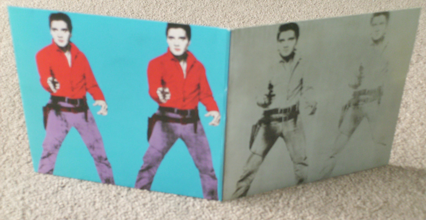
I will go through some issues that I have: Cover No. 1: “A Program of Mexican Music”: There is a (rarer) blue version of this cover, which is not mentioned. Cover No. 2: “Alexander Nevsky“: Pictured here is the green version of the cover, which along with a pink and orange version is a late 50s-early 60s reissue. The original 1949 cover was blue. We know that the green, pink and orange covers contained reissues as the record labels are the so called “six-eye” design rather than the dark blue Masterworks labels used in the late 1940s. Further his description of the standard format of early LP covers on the Columbia label omits the fact that it was the Company’s legendary art director Alex Steinweiss, who designed the basic format for these early covers with bold blocks of colour. Cover No. 6: “Madrigal’s Magic Key to Spanish”: This description should have been totally rewritten. We know now that there were only two volumes of records, not the “at least five records” that are mentioned in the book. In addition, I am convinced that Maréchal or one of his collector associates could have found a better looking copy to photograph for the book. Cover No. 7: “William Tell / Semiramide Overtures“. The book mentions that there is a double 7-inch EP set of this recording in addition to the 10-inch LP version pictured. But there are, in fact, at least two printings of the EP’s cover with differing rear covers. I would have like to see both variations pictured. Cover No. 13: “Chopin Nocturnes” played by Jan Smeterlin: Pictured is volume II of a two record set. The “Complete Nocturnes” in a slip case is mentioned but I feel that pictures of all three would warrant a place. Cover No. 16: The Joe Newman Octet – “I’m Still Swinging“: The various 45 RPM EPs are mentioned. They differ from the pictured LP in that the title is in blue rather than red. Picturing these would be a bonus for collectors. However, I don’t think adding pictures of the EPs from LP Cover No. 17 would add extra information, though they could be shown for completeness. Cover No. 22: “The Story of Moondog“: I confess I like the worn and dogeared picture of this cover shown in the book. The album is very rare and I imagine finding a better copy would be difficult, so I wouldn’t change it. Mention might, however, be made of the reissues of this LP (and this applies to the Archie Shaw as well). Covers Nos 20, 21, 23 and 24: Kenny Burrell “Kenny Burrell“, Johnny Griffin “The Congregation” and Kenny Burrell “Blue Lights, Volumes 1 and 2“: There have been numerous reissues of these covers that could be mentioned. There are colour variations of the last two that perhaps could have been pictured. Cover No. 24: “Tennessee Williams Reading from The Glass Menagerie…” A number of colour variations of this cover have appeared since the first edition of the book and some have the record’s catalogue number at bottom right rather that at the top. Cover No. 25: I love this cover! So much so that I recreated it in 2013 for my own collection to celebrate the 50th anniversary of its production. Maréchal own one of the original 75 signed and numbered copies on a white background. This work was created by Warhol together with Billy Klüver and produced these by spray-painting record sleeves and then silkscreening the text – which was obviously borrowed from a newspaper advert or a supermarket sign – onto the coloured cover. As Maréchal notes in the book – there are five colour variations. White, red, green, yellow and orange. And I have never seen a picture of the orange cover. Maréchal speculates that the white defects on his cover are caused by the ink being applied too thickly and later peeling off. Having silkscreened this design myself I can inform him that the defects occur naturally as the paint is pulled over the screen. A set of my reproduced “Giant Size $1.57 Each” resided in The Cranbrook Art Museum as part of its collection of Warhol vinyl records. Cover No. 27: The East Village Other “Electric Newspaper – Hiroshima Day – USA Vs Underground“: Maréchal motivates the inclusion of this album because of the Warhol’s contribution to the record – a track called “Silence“. Maréchal credits Warhol as the composer, stating he composed it in 1932. Which he notes as being highly unlikely. Possibly this short track is a homage to John Cale’s 4:33 a record of silence. Anyway, the cover has nothing to do with Warhol or The Factory and, in my opinion, has no place in this book. Cover No. 29: “The Velvet Underground & Nico“: This is possibly Warhol’s most important and famous record cover. The record certainly is one of the most important records in popular music. The story behind the cover is more complicated than is stated in the book. The cover is remarkable for a number of reasons not mentioned. First, gatefold covers were unusual in 1967 and generally reserved for double albums. The Beatles’ “Sgt. Pepper’s Lonely Hearts Club Band” released after “The Velvet Underground & Nico” was another exception. The original rear cover of “The Velvet Underground & Nico” showed a photo of the band in concert with a light show showing the actor Eric Emerson, who had not been consulted in advance. When Emerson saw the cover he demanded payment. Rather than pay Verve Records, who released the album, recalled as many copies as they could find and stuck a large black label over the photograph. The photograph was airbrushed to remove Emerson on later printings. I feel this could have been mentioned and, as this is such an important recording, even pictures of the various printings included. Interestingly, recent reissues of this LP have included Emerson’s portrait. Cover No. 32: The Rolling Stones “Sticky Fingers“: Along with “The Velvet Undergound & Nico” this is another of Warhol’s most important and best-known covers. There are subtle differences between the US and European releases of this album with the band’s name and the record title placed over the model’s right thigh on the European version and placed over the belt on the US version. Further there are other records that use the same design; a Mexican single (“Azucar Morena“) and EP and the European “Brown Sugar” single used the album’s rear cover design on the rear of the single’s picture cover. There was even a shaped picture disc that used the same design. The cover’s zipper originally had a large handle (if that is the right word) but this had to be changed to the smaller handle pictured in the book as it damaged covers packed together with them. Cover No. 34: Ultra Violet “Ultra Violet“. Ultra Violet is quoted in the book as saying that this album was never released. It certainly is rare and only about twenty copies have appeared on Ebay. Almost half of these have the hole cut at the cover’s top right – a sign that the album is a “cut out” and therefore could be sold in record sales for a lower price than the recommended standard price. This suggest to me that the record was actually released, although Capitol Records could have pressed up a number of copies and then just decided to put them out on sale. There is a film of Warhol’s involvement in the making of this cover in The Warhol Museum. Cover No. 36: The Rolling Stones “Love You Live“: Most original copies of this double album have coloured inner sleeves. There are promo copies with black and white inner sleeves (with the same design as the standard ones) and some later reissues also have these black and white inner sleeves (that actually look like silver – a colour Warhol loved). What is missing from Maréchal’s book is a mention of the promotional EP for this record, simply called “The Rolling Stones“. The cover shows four of the Polaroid pictures used in the cover design and on the plastic tablecloth pictured in the book. There is even a picture disc of the promo EP, which Guy Minnebach suspects is a bootleg. Cover No. 40: Loredana Berté “Made in Italy“: According to Maréchal, Berté met Warhol in New York and cooked him Italian dishes. Christopher Makos took the photograph used on the cover and on a couple of singles (not mentioned in the book). I’m not one hundred percent convinced that Warhol was “commissioned” to do this cover and I am in two minds as to whether or not it should be included. Okay, it is a Factory product, so it’s in. Cover No. 43: Original Soundtrack “Querelle“: No mention here of the single “Every Man Kills the Thing He Loves” taken from the album with the same cover picture. Cover No. 44: The Rolling Stones “Emotional Tattoo“: This bootleg album first appeared in 1983. There were two versions (in identical covers) one on black vinyl and one on orange vinyl. This album is the only bootleg with Warhol art that is pictured in the book, although mention is made in the album’s description of three other bootlegs; Debbie Harry’s picture disc which is called “French Kissin‘” (in fact it is an LP entitled “Picture This!“), a Velvet Underground bootleg entitled “More Bermuda Than Pizza” (available as both a black vinyl LP and a picture disc) with artwork credited to Warhol – but it doesn’t look like Warhol’s work. And The Falling Spikes “Screen Test: Falling in Love With the Falling Spikes” which uses a detail from Warhol’s “Flowers” print. There are three cover variations of this last bootleg. I feel that if “Emotional Tattoo” is included, then several more bootlegs should be too. I’ll return to some other important ones later. Cover No. 45: Miguel Bosé “Made in Madrid” and “Milano-Madrid“: The “Fuego ” single is mentioned but not the “Non Siamo Soli” single. There is even a 12-inch version of “Fuego“. Cover No. 47: “The Smiths“: It is stretching it to include this cover as Warhol was certainly not commissioned to do this one. Cover No. 50: Debbie Harry “Rockbird“: This cover is a Stephen Sprouse design. He obtained Warhol’s permission to use the Camouflage painting as a backdrop to the portrait of Debbie Harry taken by “Guzman”. Guzman is the Canadian duo Constance Hansen & Russell Peacock and I think they should be named in the book. Warhol was certainly not commissioned to do this cover! But it is very much in a Warholian style with four colour variations. Cover No. 51: MTV “High Priority“. Warhol’s last cover not completed before his death in February 1987. Since the first edition of the book, a second variation of this cover has been found with the shading to the “M” of MTV logo in yellow rather than the commoner red. Also, the yellow version has the song titles on the front cover in black and does not have a barcode on the rear suggesting to me that it may have been a promo.
Now onto the “New Discoveries“. Covers Nos. 54 and 55: RCA Victor Bluebird releases. Byron Janis and Erica Morini. These LPs, probably released in 1957, are generally accepted as having illustrations by Warhol. There is, however, a third LP in the series – excerpts from “Porgy and Bess” coupled with Grieg’s “Symphonic Dances” (LBC 1059) that has an illustration suspiciously like a Warhol drawing. This one is not included. I wonder why. Cover No. 56: Walter Steding “Secret Spy“: Interesting that this cover is included. It has pictures from Warhol’s music video. But there is another cover with similar provenace – Curiosity Killed the Cat’s video for their “Misfit” single. Warhol even appears in this video. Why isn’t this single included? The Swedish band Enola Gay released a single “Döda djur” in 1981 with Warhol’s picture “The Kiss” featuring Bela Lugosi. Should his be included? And why not include The Silver Apples’ “Fractal Flow” single with its Warhol portrait of band member, and former Factory associate, Simeon. Should Lou Reed & John Cale’s “Songs for Drella” and the single “Nobody but You” also be included?
So, now what about those bootlegs and later recordings? In his essay on Cover No. 29 (“The Velvet Underground & Nico“), Maréchal mentions Warhol’s film “Symphony of Sound” (1966). Stills from this film have been used on at least two album covers; “The Velvet Underground Live With Lou Reed” – an official release on the Mercury label – and on a bootleg. Then there are at least three other Velvet Underground bootlegs: “Paris 1990“,which features a fluorescent Warhol flower on the cover, “NYC” and “Orange Disaster” – both with prints from Warhol’s “Deaths and Disasters” series. Another Rolling Stones bootleg “Lonely at the Top” appeared in late 2014, probably too late for a mention in this volume, which reused one of Warhol’s Mick Jagger portraits on its cover. And while on the subject of The Rolling Stones and Warhol’s Jagger portraits, there is a black and white version of the same portrait as used on the “Emotional Tattoo” and “Lonely at the Top” albums on the rear cover of Suntory D R Y Beer’s bootleg “Mick Jagger in Japan” (1988).
And on to CDs.
Maréchal does not mention any CDs. But here is just a list of some of the ones I know about.
1. Cultura by Cultura (2004)
2. Tobias Picker/Marc Bliztstein – “Keys to the City/Piano Concerto” (1988)
3. Christopher Galitas – “The Mystery of Do-Re-Mi” (2008)
4. Russell Means – “Electric Warrior” (1993)
5. “Andy Warhol from Tapes” – book with CD from the inaugural show at The Warhol Museum (1994)
6. Paul Anka -“Amigos” (1996)
7. Paul Anka & Ricky Martin – “Diana” (1996)
8. Paul Anka & Anthea Anka – “Yo Te Amo” (1996)
9. Karl-Aage Rasmussen – “Three Friends” (1998),
the list goes on and on… (I have compiled a better list in another Recordart post. Check that out if you are interested.
My final conclusion Serious collectors of Andy Warhol’s record cover art were certainly hoping for great things from this second edition of Paul Maréchal’s seminal book. However, I think Prestel must have pressured Paul Maréchal to keep the new edition cheap by reusing all the pages from the first edition and only allowing the addition of the “New Discoveries”. I am sorry for him that this opportunity to make a really superb second edition was thwarted. I am sure he would have liked to have been able to do a better job. Maybe he will do it some day.
My blog is usually about record design and some of my favourite cover designers. This post is about an icon who appears on record covers.
According to a dictionary an icon is either: a devotional painting of Christ or another holy figure, typically executed on wood and used ceremonially in the Byzantine and other Eastern Churches, OR
a person or thing regarded as a representative symbol or as worthy of veneration.
I don’t suppose anyone would argue that supermodel Kate Moss is a 21st Century icon. Her face is on the covers of fashion magazines and there are coffee table books of photographs of her. She has even appeared on record sleeves. The first one that I have been able to identify is Dirty Funker‘s “Let’s Get Dirty” which used Banksy‘s Kate Moss portrait from 2005
Banksy’s Warhol style Kate Moss portraits (2005)
Apparently Kate Moss bought one but it was stolen in 2010 together with other Banksy works that she had bought.
Dirty Funker‘s use of Banksy‘s Kate Moss’ portrait on his record sleeve was not authorised by Banksy. But hey ho, who cares? A first pressing showed only Moss‘ face with no title or other text, while a second (more common) had a black Dymo tape with the record’s title across Moss‘ eyes on the front and across her mouth on the rear.
First and second pressings of Dirty Funker’s “Let’s Get Dirty” 12-inch single.
The February 2008 number of TAR Magazine contained a photographic essay of Kate Moss. And the magazine’s cover was adorned with Damien Hirst‘s portrait of Kate, with the right side of her face dissected down to the muscles.
TAR Magazine cover and the record sleeve.
The following Year Hirst released a single-sided 12-inch single in an edition of 666 copies pressed on white vinyl that used the TAR Magazine picture on its cover.
Bryan Ferry released his thirteenth album “Olympia” on 25th October 2010. The album was released as a CD, CD with DVD, a collectors’ edition with extra tracks as well as a limited edition LP. He seems to have been besotted with Kate as the album and five singles’ covers taken from it all bear Kate‘s portrait. There is a video of the photo shoot for the cover photo
The Olympia cover.
The Vinyl Factory in London released five limited edition 12-inch singles from the album in 2010 and 2011. All with cover photographs of Moss. These are “You Can Dance” (2010), “Shameless Remixes” (2010), “Alphaville” (2011), “Heartache by Numbers” (2011) and “BF Bass (Ode to Olympia) (Remixes)” (2011). The portraits of Kate Moss on these covers are by british photographer Adam Whitehead (born 1973).
You Can Dance cover.Shameless Remixes cover.Alphaville cover.The limited edition version of Alphaville.Heartache By Numbers cover.BF Bass (Ode to Olympia) Remixes cover.
Thus I have been able to find ten covers with portraits of Kate Moss released in less than 10 years. I think this fulfills the second definition of an icon. Perhaps I have missed a cover or two. Readers are very welcome to let me know of any I have missed.
When I first tried to collect all known record covers designed or illustrated by Andy Warhol I counted about sixty-five covers. I wanted to put on an exhibition of his record covers and but I had little knowledge about his early work in the 1950s and had no idea there were colour variations of some of the early covers. Paul Maréchal’s book “Andy Warhol: The Record Covers 1949-1987. Catalogue Raisonné” had not yet been published. I had the great good fortune to have made contact with Warhol collector Guy Minnebach who helped put on the exhibition by lending some of these early covers.
Since 2008 there has been an enormous amount of new knowledge about Warhol’s record cover art, greatly aided by Paul Maréchal’s book. Several record covers have been identified as being illustrated by Warhol. So the search has continued. Over the past months I have managed to find a further four Warhol sleeves; two vinyl covers and two CDs.
There has been considerable debate as to whether the three albums released in 1957 on RCA Victor Bluebird Classical label were illustrated by Warhol. However, they are now generally accepted as being Warhol covers. These three albums are:
– Byron Janis: Gershwin’s “Rhapsody in Blue” coupled with Grofé’s “Grand Canyon Suite” (LBC-1045)
– Indianapolis Symphony Orchestra (Sevitsky, cond.) Gershwin’s “Porgy and Bess” coupled with Grieg’s “Symphonic Dances” (LBC-1059).
– Erica Morini: Tchaikovsky’s “Violin Concerto” (LBC-1061)
I suppose the acid test of their acceptance will be seeing whether they are included in Paul Maréchal’s new book “The Complete Commissioned Record Covers” due to be published in early 2015. [Note added January 21st, 2016: The second edition of Maréchal’s book includes the Tchaikovsky “Violin Concerto” but does NOT include the “Porgy & Bess / Symphonic Dances” covers.)
Tchaikovky’s Violin Concerto.Cover of the “Porgy & Bess / Symphonic Dances” album.Byron Janis recording of “Rhapsody in Blue” and “Grand Canyon Suite”.
Rarest of these three is, without doubt, the “Porgy and Bess / Symphonic Dances” and I had been looking for a copy since 2008 and just before Christmas 2014 I found one in lovely condition that I could afford. That completed my collection of the three Bluebird Classics albums.
From the sublime to the cor blimey. Like most other collectors of Warhol covers I keep regular checks of what is on sale on Ebay and other internet markets. There is one seller from Germany who manages to find some interesting records and CDs with covers by famous artists, not only by Warhol. It is always worth checking what is on offer on that site. Then trying to find the same item cheaper elsewhere. Well, I saw the Diana Ross “So Close” 7-inch single in a poster pack on the site with a ridiculous starting price. So the search began to find a cheaper copy. About ten minutes later the mission was accomplished.
The Diana Ross “So Close” single in its poster cover.
As readers of this blog may remember I have made mock ups of several extremely rare early Warhol covers. Among these was a cover for a double EP with the”Progressive Piano” design. As Warhol cover collectors know this disc was never released, but I wanted to add the cover to my collection. Lithographs of cover designs for both a 10-inch and 7-inch version exist in The Warhol Museum. So, having found the front cover image, I needed to find a rear cover that would possibly have been used. I went to the double EP of Toscanini’s recording of the William Tell and Semiramide Overtures on the RCA Victor label. It transpires that there are at least two variants of the rear cover design. The one I used is:
The rear cover used on the “Progressive Piano” mock-up.
I have now managed to find the record with the alternative rear cover:
The alternative rear cover on the “William Tell” Overture” .
Perhaps I shall decide to make an alternative “Progressive Piano” sleeve using this rear cover.
Again, I saw a couple of CD from this German Ebay seller; both at rather inflated prices. One is a various artists CD called “Open Ends: Musical Exploration in New York 1960-2000” released in 2000 by the Museum of Modern Art. The cover image is nine of Warhol’s 1967 self portraits. ANd I found a cheaper copy after a short Internet search.
The booklet from “Open Ends: Musical Exploration in New York 1960-2000”. Released by the Museum of Modern Art.
Also on the German seller’s site was a CD entitled “The Mystery of Do-Re-Mi” with baritone Christopher Gabbitas accompanied by lutist David Miller with a starting price of $49. I found one on Amazon for $4. The cover uses a detail of Warhol’s rendering of Botticelli’s “The Birth of Venus” from his Renaissance Details series from 1987. Another CD that used another image from the same series was Karl-Aage Rasmussen’s “Three Friends: Works for Symphonetta” from 1993 that uses Warhol’s “The Annunciation”.
“The Mystery of Do-Re-Mi” by Christopher Gabbitas and David Miller. Image from Warhol’s “Birth of Venus”.
I also thought I had bought a copy of The Velvet Underground’s bootleg LP “Psychedelic Sounds From the Gymnasium”. But, I had not read the article description and was somewhat disappointed to find that I had ordered the CD. But the cover image is the same as that on the LP.
The Velvet Underground’s “Psychedelic Sounds From the Gymnasium”.
So there, I have been able to add another six Warhol covers added to my collection. There are still more out there. Some extremely rare and some not so rare. I will never manage to collect all the record and CD covers that have art by Andy Warhol, but I’m going to keep trying.