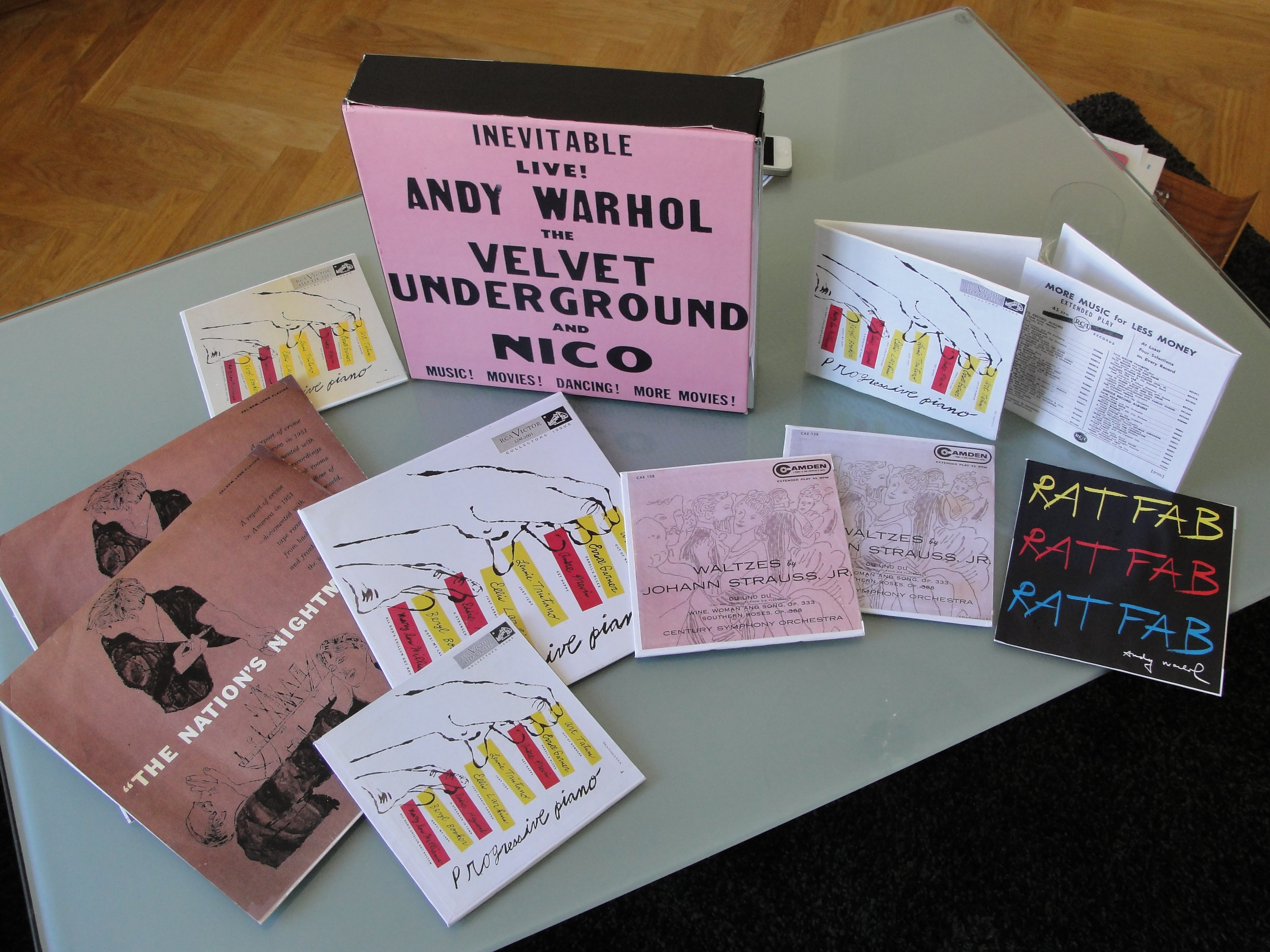
It feels like Christmas when four additional Andy Warhol covers can be added to my collection. Two are releases I had not been aware of until very recently. The four covers are:
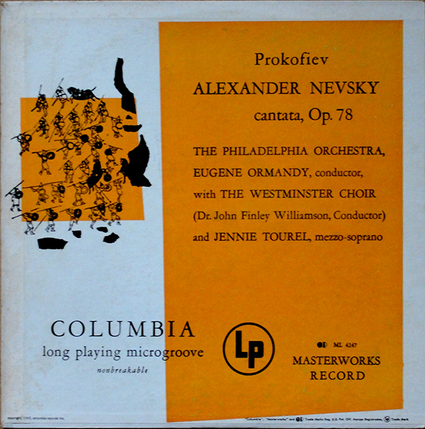
1. Tchaikovsky – Violin Concerto played by Erica Morini and the Chicago Symphony Orchestra, conducted by Desiré Defauw.

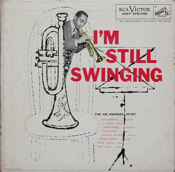
2. The Joe Newman Octet – I’m Still Swinging, double gatefold EP – 45 EPB-1198.
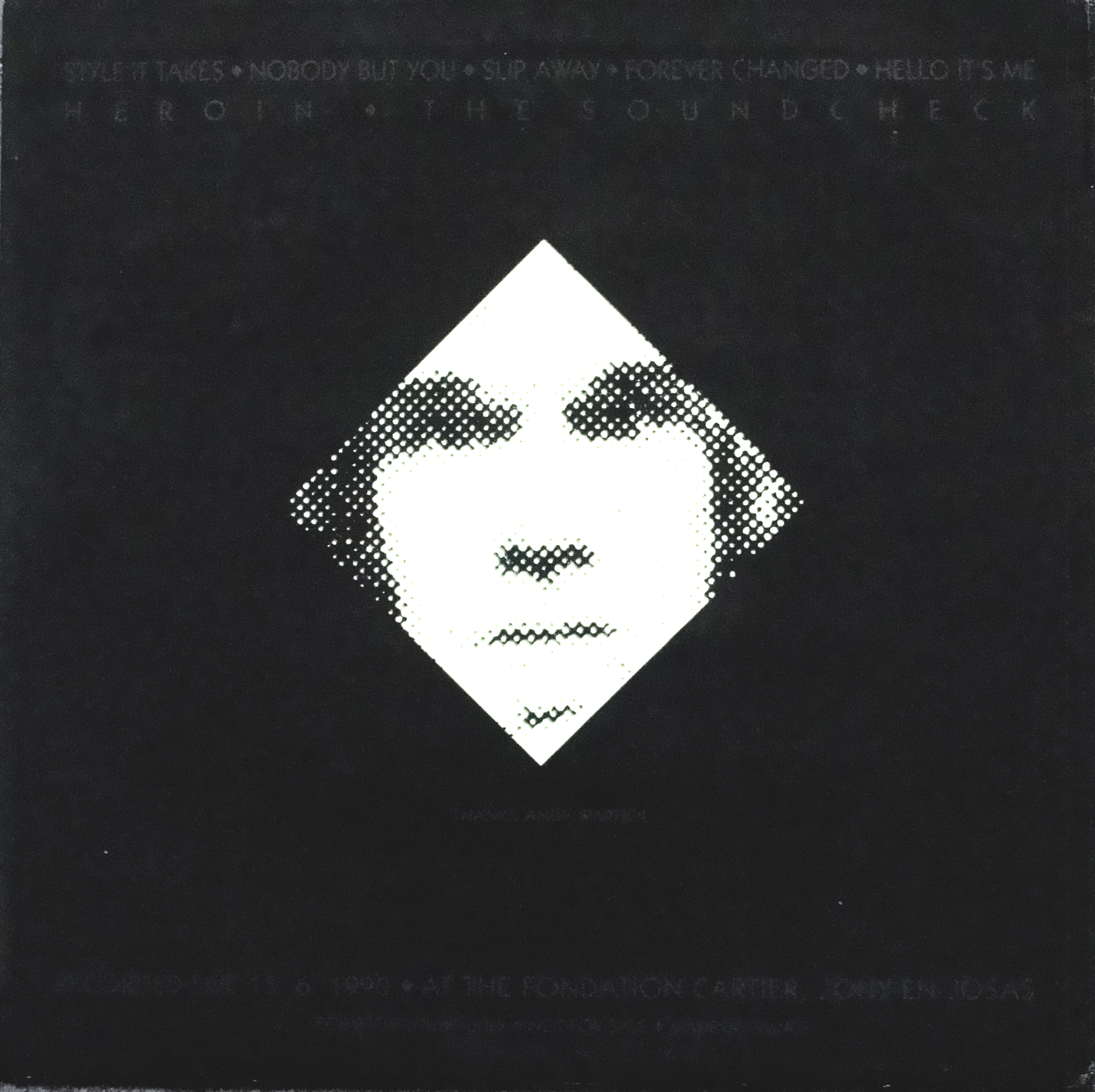
3. Velvet Underground – Paris 1990 – Bootleg “promotional” LP.

4. The Falling Spikes (Velvet Underground) – Screen Test: Falling in Love With the Falling Spikes (1987 re-issue):

1. The Byron Janis recording of Gershwin’s “Rhapsody in Blue” coupled with Grofé’s “Grand Canyon Suite” on the RCA Victor Bluebird label has an illustration of a piano and orchestra generally accepted as being by Andy Warhol. This recoeding was released both as a 12″ LP and a three 7″ EP box. Its sister release, the recording of Tchaikovsky’s Violin Concerto by Erica Morini and the Chicago Symphony Orchestra, conducted by Desiré Defauw, on the same label has an illustration of a double base done in the same style and probably by Andy Warhol. I have a copy of the 12″ LP, generously given me by Frank Edwards. Until recently, I had not been aware of a three EP box similar to the Byron Janis recording, then one came up on Ebay and found its way into my collection.
2. The Joe Newman Octet’s “I’m Still Swinging” has been released as a 12-tract LP and an 8-track double EP and single EPs. I have one of the single EPs and recently acquired the German pressing of the single EP. Now I succeeded in finding the double EP version.
3. A short while ago, Guy Minnebach told members of the Warhol Cover Collectors Club about a Velvet Underground bootleg of a live show recorded in Paris on 11th June 1990, cleverly entitled “Paris 1990”. I was lucky to find a mint copy from a seller in Texas. This cover has a reproduction of an early Warhol flower on the front cover and a portrait of Warhol on the reverse. The images fluoresce in the dark! So cool!
4. Frank Edwards discovered the re-issue version of the bootleg album by the Falling Spikes, later to metamorphose into The Velvet Underground. The re-issue “Screen Test: Falling in Love With the Falling Spikes” LP has the same detail from Warhol’s “Flowers” painting as the original 1985 release, but has a red card cover and includes two postcards. I found this one on Discogs and made a good deal with the seller. So now I have all three versions; one with the black and white cover, one with the blue flower and now even the red cover.
It seems a stranghe coincidence that I should receive the two Velvet Underground albums just days after founder member, Lou Reed, died. Anyway, four interesting and unusual additions to my collection.