Once again a record cover turns up to prove that my previously “complete” collection of an artist’s record cover art isn’t complete.
I’m trying to write a discography of Sir Peter Blake’s record cover art and had produced a first draft when it occurred to me to do a search of Discogs’s database. Discogs logs credits to many (most?) of the records, CDs and cassettes catalogued there and users can easily choose to search for individual musicians, record producers or, indeed, graphic artists. My rather belated search turned up a surprise:
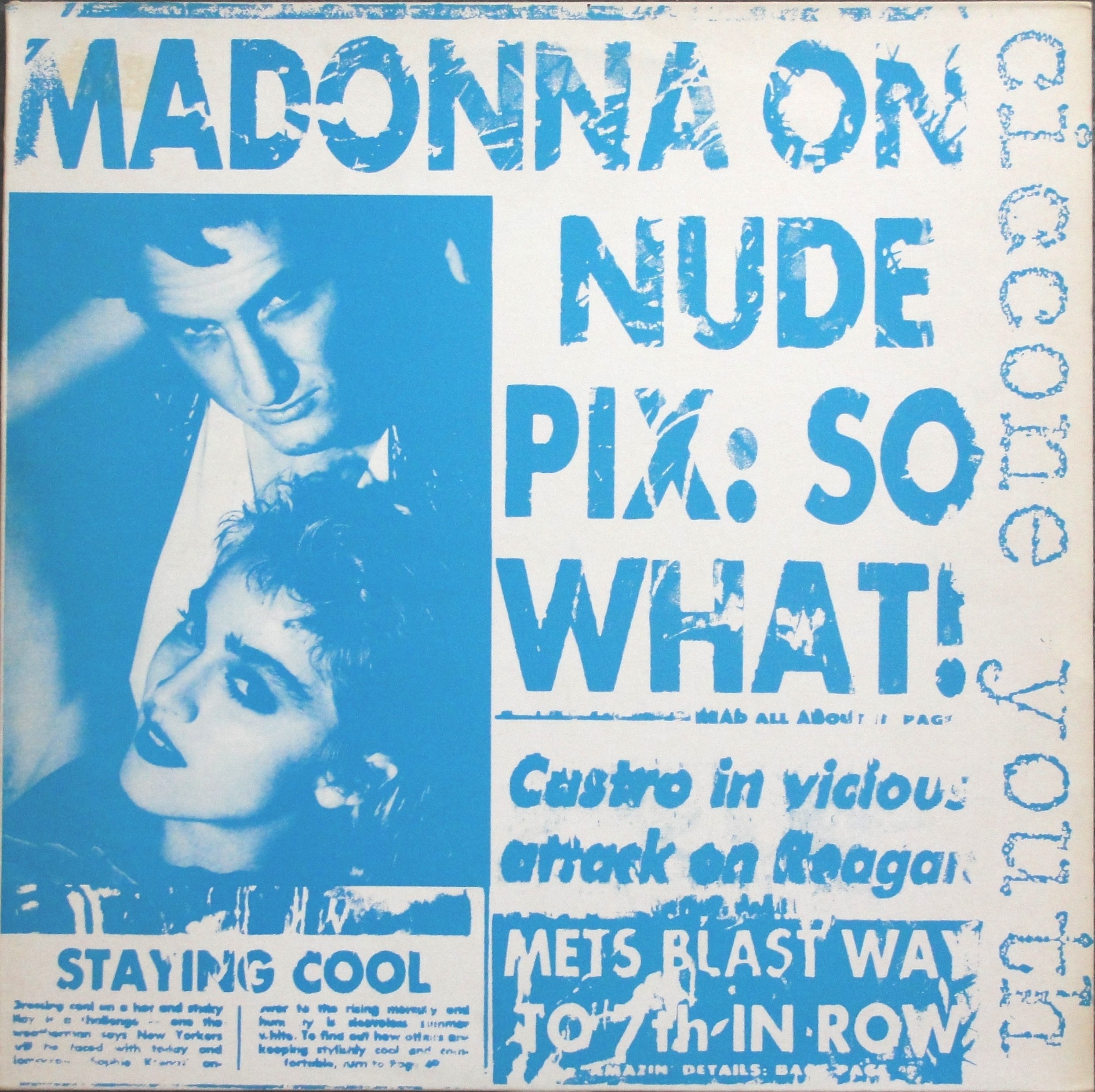
The Fall’s I’m Frank promotional 12″.
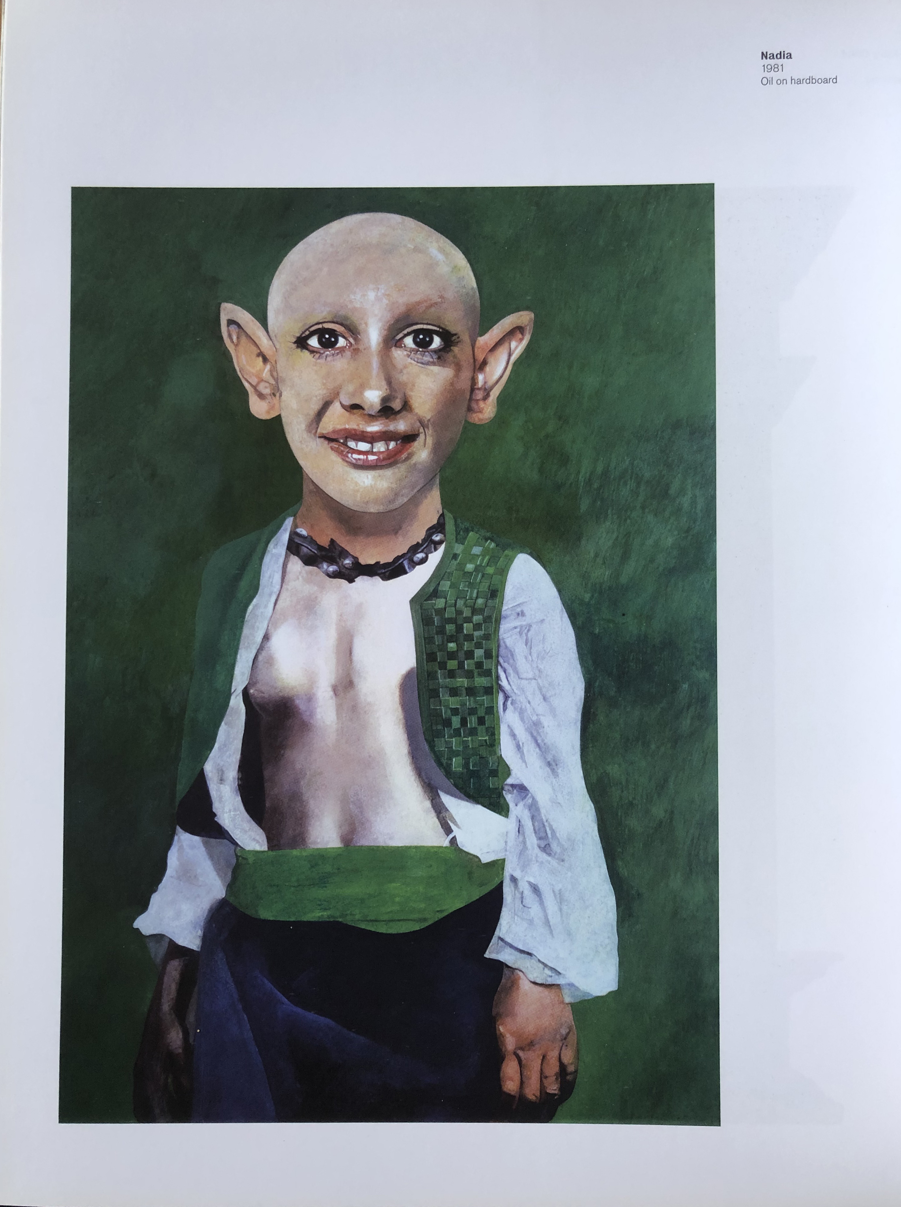
I had never seen this cover before but it certainly looks like a Peter Blake painting and the rear cover gives Peter Blake the credit. So I sent an email to Sir Peter’s gallery, the Waddington Custot Gallery in London, to enquire about the source of the painting. Unfortunately they had not handled a painting like this but assured me they would ask Sir Peter if and when an opportunity arose. I’m still waiting for a possible reply to that. It turns out that this is painting by Blake called Nadia, oil on hardboard (29.2 x 21.6 cm / 11.5 x 8.5 inches), painted in 1981. It was exhibited in the Peter Blake retrospective at the Tate Liverpool in 2007 and there’s a full page picture of Nadia on page 120 of the exhibition catalogue Peter Blake : a Retrospective, published by the Tate.
Peter Blake’s Nadia. From the Peter Blake: a Retrospective catalogue.
The Nadia painting is in the collection of the Rhode Island School of Design (RISD) Museum in Providence, Rhode Island, U.S.A., one of three paintings by Peter Blake in the museum’s collection. It was previously in the Richard Brown Baker collection of Postwar Art and was donated to the RISD in 1995 — thus after it was used on this record sleeve.
I just wonder how The Fall came to choose this as their record cover art. They do not credit the RISD Museum.
This U.S., 1990, four-track, promotional EP seems quite rare. I can’t quite understand how it managed to slip under my radar for so long, but I managed to find one on Discogs and it arrived this week (23 rd September) to “complete” my Peter Blake collection. I now eagerly await the next Peter Blake cover I have never seen. It’s bound to turn up soon.
I have only seen Sonic Youth live once. That was at Hultsfred”s Festival in 2002. The concert can be seen on YouTube. I don’t remember too much about the show, only Kim Gordon’s pink dress and that I thought there were very few people gathered for such a major band. The video, however, makes it look like there was a huge crowd.
I recently discovered that Kim Gordon was an art school-trained artist as well as a musician and that she had designed record covers. Quite unknowingly, I actually had one of her cover designs in my collection — Ciccone Youth’s 12″ maxi single Into the Groove(y)/Burnin’ Up. It was Guy Minnebach who pointed this out.
Kim Gordon’s cover for Ciccone Youth’s single.
Sonic Youth have used other monicas than Ciccone Youth. In 2004 the band released an album called simply Sonic Nurse, with Richard Prince’s painting of a nurse as its cover art. There were four different paintings on this beautiful cover.
Richard Prince’s Nurse paintings.
This was my first contact with Richard Prince’s art. To my mind it established a relationship between him and Sonic Youth. Prince is known as a painter and photographer and has even used found objects such as cars. He is also a musician and in 2015 recorded a song, Loud Song and released it on a CD.
Loud Song CD with photo of Richard Prince’s barn covered in vinyl records.
There was an exhibition of Richard Prince’s art in 2016 called It’s a Free Concert Now and for that exhibition Prince produced a limited edition, single-sided 12″ picture disc with the same title and two tracks, It’s a Free Concert Now and Loud Song. There were 25 numbered and signed copies and 25 unnumbered, unsigned copies.
Richard Prince used a detail from one of Kim Gordon’s paintings for the cover of his limited edition 12″ single Loud Song released in 2016. One edition of 250 was signed and numbered and the record pressed on white vinyl. However, my copy, while signed, is unnumbered and the record is pressed on black vinyl. I don’t know the size of this edition.
The front and rear covers of Richard Prince’s Loud Song 12″ (note the signature on the left of the back cover). Painting by Kim Gordon.
In 2019, The Warhol Museum in Pittsburgh released a double album by Gordon, Bill Nace, Steve Gunn & John Trusinsky of the Sound for Andy Warhol’s KISS concert, held the previous year atthe Museum. The cover art was made up of stills from Andy Warhol’s Kiss film. The clear vinyl records also had similar stills on their labels.
Sound for Andy Warhol’s KISS.
A further Kim Gordon cover has appeared. The band Talk Normal released a 7″ single called Lone General in 2011 with cover art by Gordon, with very abstract impressionistic drips! This limited edition single was released on both black and clear vinyl.
The cover of the Lone General 7″ single.
I am on the lookout for more covers by both Richard Prince and Kim Gordon to add to my collection.
Record cover art has become a recognised field of collecting and exhibitions of record cover art are now quite common. Some of us collect specific artists, some collect a particular type of music (heavy metal or hip hop seem popular) while others collect more generally and have collections solely based on record covers’ artistic merit. The first collector I came in contact with was Guy Minnebach, who has an amazing collection of Andy Warhol’s record cover art. Through him I got to know to know Frank Edwards who at first collected Warhol’s record covers but later branched out to collect more generally, including a wide variety of covers by various artists. Frank Edwards’s collections have been exhibited at the Cranbrook Art Museum.
As a follower of Mike Goldstein’s Album Cover Hall of Fame blog I have had the opportunity to see a number of record cover art exhibitions online and Mike recently tipped me off about one he thought I should have seen — the Visual Vinyl exhibition at Schunk, Heerlen, The Netherlands, which ran from 28th November 2015 — 6th March 2016. Mike had just got hold of the exhibition catalogue. A beautiful 232 page hard cover book. The exhibition, curated by Lene ter Haar and Cynthia Jordens, showed hundreds of record covers from Jan van Toorn’s amazing collection ranging from the commonplace, like Andy Warhol’s Velvet Underground & Nico Banana cover to more obscure releases by the Fluxus group. Many very rare covers were included and the book has pictures of a whole host of them. In the book’s final pages Jan van Toorn describes his collecting philosophy and then presents a discography of his collection listing 2200 covers ordered alphabetically by designer/artist. You won’t find any record industry designers — no Steinweiss, Jim Flora, Aubrey Powell, Roger Dean — but Peter Blake & Jann Haworth (Sgt. Pepper) and Richard Hamilton (The Beatles) are in. So are Banksy and Damien Hirst. Art bands like Sonic Youth get included.
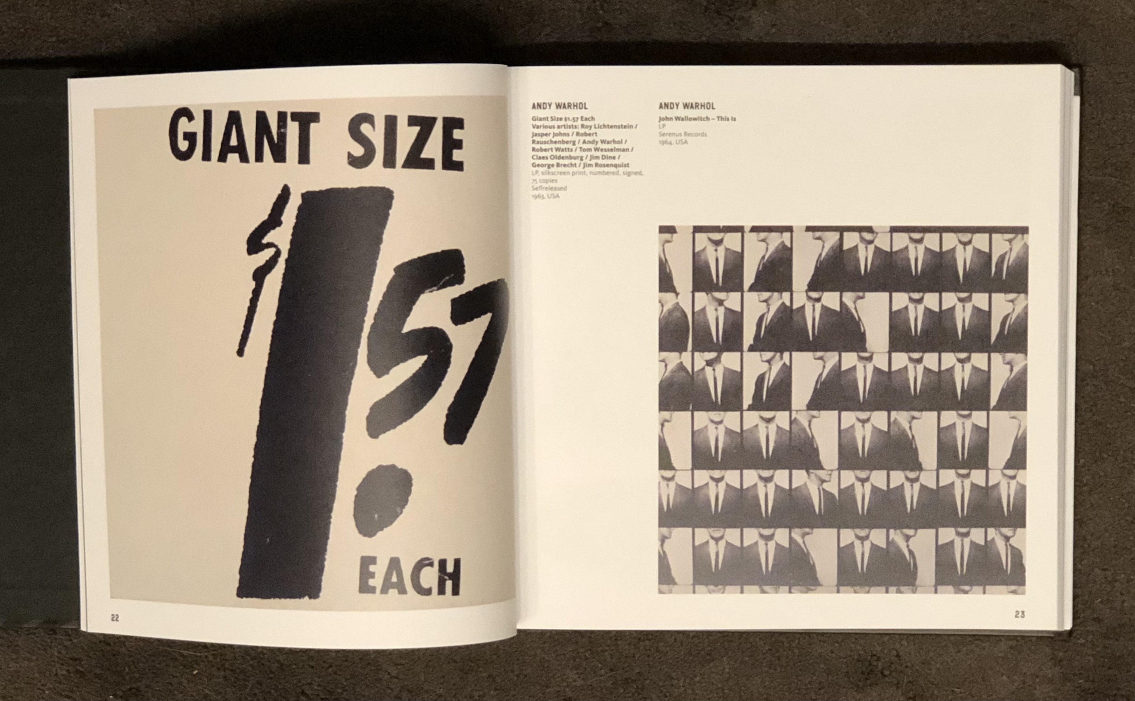
Jan van Toorn lists several covers by David Shrigley in his discography, but none is pictured in the book. He also has one of Andy Warhol’s Giant Size $1.57 Each covers from the numbered limited edition of 75 copies made by Billy Klüver for German gallery owner Heiner Friedrich in 1971.
However, van Toorn doesn’t seem to know the history behind this record cover. He suggests that these 75 covers were all that Warhol produced. In fact, it was Swedish engineer turned artists’ assistant. Billy Klüver who had made the eleven interviews with the pop artists included in the Popular Image Exhibition in Washington D.C. in 1963 who asked Warhol to help make covers for the LPs of the interviews that he had had pressed for the exhibition (at the show, they were sold in envelopes designed by Jim Dine, together with the exhibition catalogue.) Klüver obviously had records over and in 1963 he and Warhol screen printed hundreds of covers, some with white backgrounds, others with green, red, orange or green spray-painted backgrounds that Billy Klüver took charge of. When Heiner Friedrich, a German gallery owner, asked for a limited edition, Klüver took 75 white covers with records and asked Warhol to sign and number them and Friedrich sold them at his gallery. Klüver later sold copies of the coloured covers, some with records, some without. And a few of the white variety were sold at Andy Warhol’s first international retrospective at Stockholm’s Moderna Museet in January-February 1968.
The Visual Vinyl book is a great addition to my library.
I’ve been thinking about writing this post for quite a long time. I bought Blur’s Think Tank album on vinyl and as a limited CD when it came out in October 2003. I also managed to find the promotional CD of the album with the now famous handstamped “Petrolhead” logo. Petrolhead even appeared stamped on the label of a white label, promotional 12″,
The front cover of Blur’s Think Tank promotional CD with the Petrolhead logo.
The 12″ four-track promotional 12″.
When I saw this almost central stamp on the CD I wasn’t really convinced that the logo was a handstamped motif and thought it was probably printed. However, I had seen many copies online with the stamp in different places that convinced me that the logo must have been handstamped. I had heard about some copies of the promo CD that didn’t have the Petrolhead stamp, but I hadn’t actually seen one until a new acquaintance, Paul Coombs, sold me a copy together with another copy of the CD promo with the stamp.
Paul Coomb’s copy of the Think Tank promo CD without the Petrolhead logo.
Then there is a rumour of another version of the Think Tank promo CD that has a pink baby’s handprint (or in some cases a pink baby’s footprint.)
A possible version of the Think Tank promo CD.
However, I’ve never actually seen a physical version of this, only the image online. Can anyone verify that this version actually exists?
I enjoy visiting the A & D Gallery in Chiltern Street, London, on my regular visits to spend time with my aged mother. I enjoyed the banter with my friends, the late Daniel Brant and Helen Clarkson (who now runs the gallery). I learnt a whole lot about pop art, and in particular about Andy Warhol’s art, from these experts. Daniel had sold a couple of signed copies of the Rolling Stones’ “Love You Live” album in previous years and I had told him hat I would be interested in a copy should he ever find another. Three or four years ago he mailed me that he had included copies of “Sticky Fingers” and “Love You Live” in an auction and I was lucky to be able to buy them.
My signed “Sticky Fingers” LP.
Late in 2018, I met John Peter Nilsson, from Moderna Museet, in Stockholm during the Warhol 1968 exhibition at the museum in Stockholm. I pointed out that one of the eight Andy Warhol designed record covers on display (by The East Village Other) was NOT designed or illustrated by Warhol. And I mentioned that I had a complete set of Warhol covers. John Peter suggested that, when the exhibition moves to Moderna in Malmö in March 2019, my collection would look great in the Malmö exhibition space so I agreed to lend my records to the exhibition.
Just prior to collecting the records I came across an autographed copy of Paul Anka’s 1976 album “The Painter” signed by both Andy Warhol and Paul Anka. Apparently, Warhol signed the cover outside The Factory in December 1986, just two moths before he died, and Paul Anka signed it later.
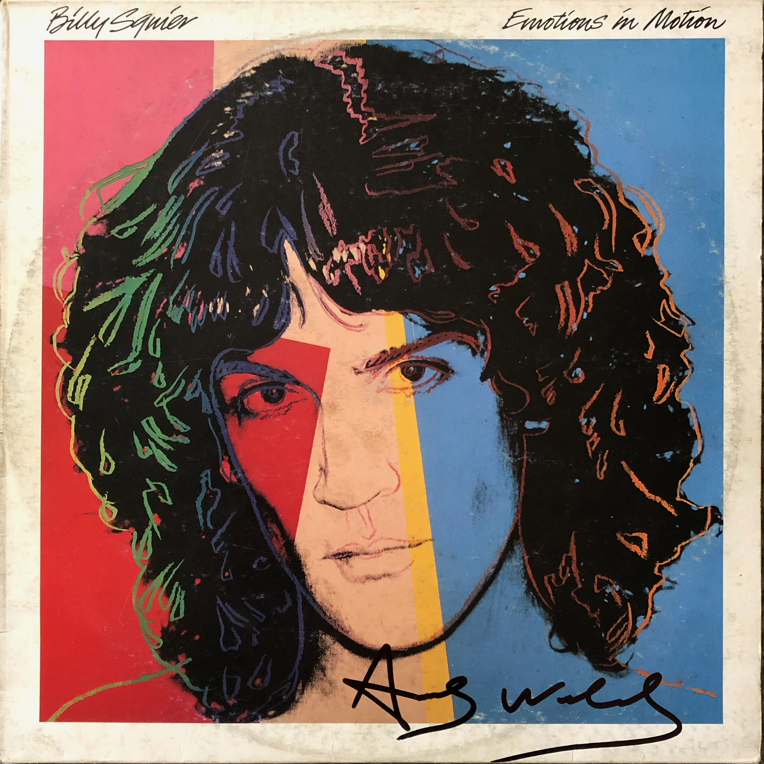
Most recently I found a copy of Billy Squier’s “Emotions in Motion” album signed by Andy Warhol. Unusually, this is an Italian pressing. The provenance is from a gallery in Rome that bought the album from Anita Pallenberg.
Billy Squier’s “Emotions in Motion” signed by Andy Warhol.
Apparently, this was signed in for Anita at The Factory in 1985. I’m a little suspicious, however.The signature soesn’t look 100% and I wonder how Anita Pallenberg happened to have her Italian copy of the album with her in New York… Perhaps I’m being too suspicious, though.
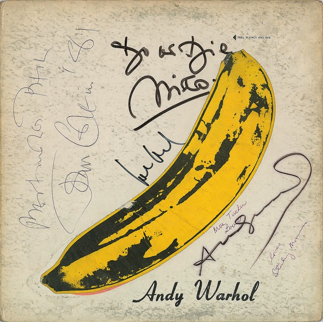
But the signed album any Warhol collector really wants is, of course, a copy of The Velvet Underground & Nico!
“The Velvet Underground & Nico” signed by the band and Andy Warhol.
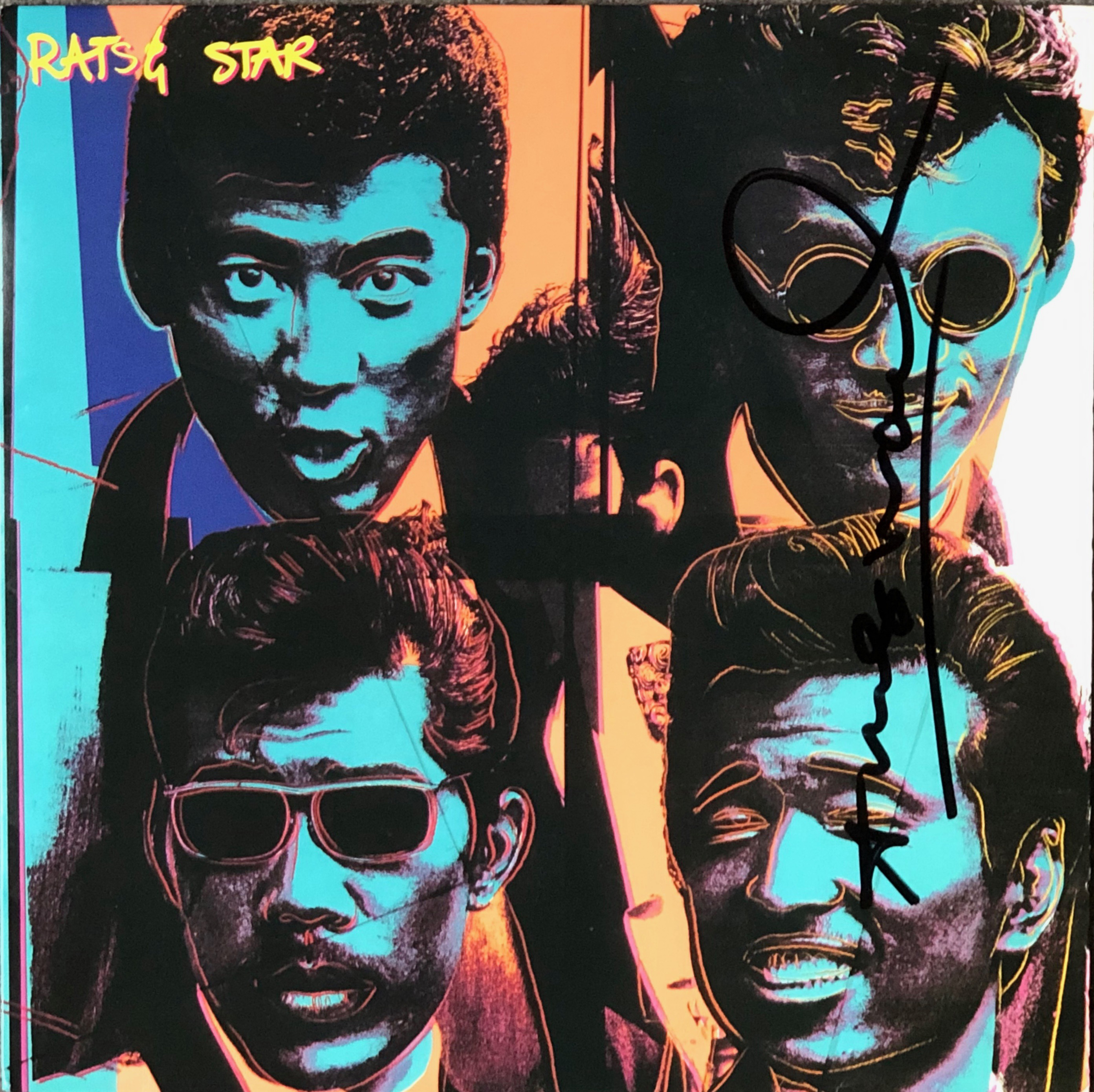
My friend and fellow collector of record cover art, Stefan Thull, decided in October to sell part of his amazing collection and among the records he was prepared to part with was his signed copy of Rats and Star’s “Soul Vacation” album that he sold to me.
“Soul Vacation” by Rats and Star signed in 1983 in Japan when Andy Warhol met the band.
I had heard of Robert del Naja in my research into the roots of Banksy‘s art and learnt that del Naja–alias 3D–was a leading figure in Bristolian street art long before Banksy started decorating Bristol’s streets. Banksy has acknowledged 3D as a major influence. I knew also that del Naja was a member of Massive Attack. Del Naja has even been suspected of actually being Banksy. despite Banksy‘s ex-agent Steve Lazarides stating that he had seen Banksy at a Massive Attack gig.
I got hold of Robert del Naja‘s book “3D and the Art of Massive Attack” last autumn and wrote a post about it last October. A couple of months ago I bought a copy of Massive Attack‘s “Heligoland”–the limited edition version from The Vinyl Factory, with its spangly cover.
Massive Attack’s “Heligoland package with 2 LPs, CD & booklet.
I then saw a copy of The Vinyl Factory’s limited edition (1000 copies) of Massive Attack‘s “Atlas Air” 12″ offered together with a copy of Very Nearly Almost (VNA) magazine No. 26 which featured an article on 3D for the amazing sum of £300! And the VNA magazine was the regular version, not the limited edition one. I picked up a copy of VNA no. 26 for the princely sum of £15!
The standard shop version of VNA Magazine No. 26.
and decided that I would try to get the “Atlas Air” and “Splitting the Atom” 12″-ers too. I was lucky enough to find a seller in Germany who could supply both! They arrived a couple of days ago and I’m really pleased I got them. The cover art is magnificent.
The limited edition of “Atlas Air”. My copy is No. 085/1000.
The limited edition of “Splitting the Atom”. My copy is No. 576/1000.
I decided that I would buy the limited edition of “3D and the Art of Massive Attack“, too. Said and done! My copy was number 149/350 and includes a print by 3D (from a run of 1325 copies, an expanded version of the ordinary book called “Protection” and, not least a single sided 12″ entitled “Vermona“–which is only available in this box set.
The box set of “3D and the Art of Massive Attack”.
The cover of the book of 3D‘s art and the print (on hardboard) and the “Vermona” single sided 12″ with 3D‘s etching on the reverse.
The standard version of the book (left) and the limited edition, numbered version (right).
I’m waiting for the remastered reissue of “Mezzanine“, Massive Attack‘s magnificent 1998 album. A special 3 LP version with coloured vinyl will be released in late January 2019 to celebrate its 20th anniversary. The stag beetle cover photo is by Nick Knight and the remastered vinyl package will come in a heat-sensitive box with more photos by Knight and 3D.
You already know that I am inordinately proud of my collection of records and CDs with cover art by the artist known as Banksy. Many of the vinyl releases with Banksy‘s cover art, particularly the “unofficial” ones, were released as limited editions. Dirty Funker (just one of DJ Paul Glancy‘s aliases) released two remixes as 12-inch singles with cover art by Banksy: “Let’s Get Dirty“, from 2006, appropriated Banksy‘s famous Kate Moss portrait, and “Future“, released in 2008, featured Banksy‘s “Radar Rat” design (in five different limited edition covers, probably each of 1000 copies).
a. Front of first pressing of Dirty Funker’s “Let’s Get Dirty” 12-inch single.
b. Back of first pressing of Dirty Funker’s “Let’s Get Dirty” 12-inch single.
There were two editions of the “Let’s Get Dirty” 12-incher, both limited–the first edition, which showed only Banksy‘s Kate Moss portrait with no artist, title or tracklisting, or even a barcode. The front image showed Kate‘s head against a red background, while on the rear cover she had a pale green background. This edition must have been significantly more limited than the second edition which showed Kate‘s portrait with a Dymo strip over her eyes on the front cover giving the artist and record’s title. On the rear the strip was placed over Kate‘s mouth giving the tracklisting.
Second pressing with “Dymo” band
b. back of second pressing of Dirty Funker’s “Let’s Get Dirty” 12-inch single.
This week a printer’s proof of the first edition “Let’s Get Dirty” cover was advertised on Ebay. The seller had bought it in 2007 and now was sadly selling it. He thought there might have been about ten copies printed in 2006 (the print is dated 18th January 2006) and makes an interesting addition to both my Banksy and my collection of record and CD covers featuring Kate Moss.
Printer’s proof sheet for the “Let’s Get Dirty” cover.
I have an almost complete collection of records and CDs with cover art by the enigmatic Banksy. I started collecting Banksy cover in 2008, when prices were usually very reasonable–with many records costing as little as £6.99. A few rarer items cost up to £100. The only exceptions were the two covers ostensibly sprayed by Banksy himself. These are the 1999 12″ promotional single “Four (4 x 3)” by the Capoiera Twins and the promotional double LP “Melody A.M.” by Röyksopp. In July 2010 I was contacted by a DJ who was getting married and offered me his copy of the Röyksopp album, which I, naturally, snapped up. By 2016 I had almost all the records and CDs with Banksy cover art with the exception of the original Paris Hilton CD (the one with the sticker on the outside of the front of the jewel case), and the Capoeira Twins 12″.
“Four (4 x 3)” by the Capoiera Twins (BLOWP008).
Numbered promo for Röyksopp’s 2001 album “Melody A.M.” – handstencilled by Banksy.
When, in April 2016, I was invited to show my collection in the major Banksy retrospective “War, Capitalism & Liberty” at Rome’s Palazzo Cipolla, these missing covers irked me. I had made a limited edition copy of the Capoiera Twins cover–almost indistinguishable from the real thing–and that would fill one of the gaps. Suddenly two copies of the first pressing of the Paris Hilton CD appeared on Ebay and I was lucky enough to get one in time for it to travel to Rome with the rest of my collection.
I have been looking for a copy of the Capoiera Twins’ 12″ ever since I first heard about it in 2008 without success. I missed a couple of copies early on, but then no further copies seemed to turn up other than in art galleries at inflated prices, until August 2017.
The stencil used for the cover art was also used on a wall in Bristol–I presume after it had been used for the record covers–at Portland Square (post code BS2 8SA).
Banksy’s Capoeira Twins stencil in Portland Square, Bristol.
According to a seller of a copy of the record, Banksy gave 25 copies of the white label promotional record to friends and supporters, while the remaining 75 copies were sent to DJs and reviewers with no indication of the band name or the record title on the cover or record but with an A4 letter that Blowpop asked to be returned a couple of weeks prior to the release date. The record was a trip hop single that failed to garner much attention when it came out. I suppose the DJs who received copies played them a couple of times and filed them away or–as was common in the nineties and early 00s–sold them to secondhand record shops (one owner owned up to selling his copy in the early 2000s £1,99), or simply chucked them away. And–had it not been for the Banksy cover–would probably never have been heard of again.
A couple came up for sale on Ebay in around 2008 and, if I remember correctly, sold for £400-600. In the last couple of years the prices of vinyl records with Banksy art covers has increased dramatically and suddenly four or five copies of the Capoeira Twins “4 x 3” have been auctioned off for amazing prices of £5000-6000! Another sold in October for a bargain £4223.23. A further two copies appeared in Great Yarmouth, Norfolk, in November and I snatched one of them, the other selling for £6,500.
There is another hand sprayed Banksy cover that has also increased dramatically in price recently. I refer to Röyksopp’s “Melody A.M.” promotional double LP.
Just as I was about to buy my copy of the Capoiera Twins record, a new record with Bnaksy art appeared. This was another white label 12″ single “Funk tha Police” by a band called Boys in Blue that had Banksy’s “Rude Copper” as its cover art. This is said to be a limited edition of 100 copies, so I duly invested.
The cover of the Boys in Blue’s 12″ single “Funk tha Police”.
Thus, as of November 2017, my collection of records and CDs with Banksy art is complete. I’ll have to keep watch for newer covers, of course, but it feels like my job is done here.
Addendum 6th May 2022. As you can read in my later post on this rare promo, I discovered that I’d been sold a fake — and it wasn’t until I could compare with a genuine copy that I discovered this.
It has been my ambition to collect all record covers with Andy Warhol‘s art. Most of the seventies and eighties covers are relatively easy to find and shouldn’t cost the earth (an exception is Ultra Violet‘s eponymous LP from 1973), but the earlier ones, particularly the fifties covers have become increasingly expensive. And the original “Velvet Underground & Nico” (1967) along with many of it’s reissues are becoming increasingly expensive.
I have long searched for decent copies of Moondog‘s “The Story of Moondog“. While copies of the Moondog album do pop up relatively frequently on Ebay, most are in pretty poor condition with severely discoloured covers, but I had the great good fortune to find a near mint copy on Discogs which I bought as a Christmas present to myself.
The other major hole in my collection was John Wallowitch‘s second album for Serenus Records called “This Is (The Other Side of) John Wallowitch“. This album doesn’t come up for sale very often and bidding goes crazy on good copies. A reasonable copy popped up on Ebay in late January and despite having depleted my funds the previous month for the Moondog album, I managed to win it with a not too outrageous bid.
Front and rear covers of “This Is (The Other Side of) John Wallowitch”, 1965.
As can be seen, Wallowitch chose as the rear cover picture to reuse the “photo booth” photos taken by Warhol that were on the front cover of his previous Serenus Records release “This Is John Wallowitch“. It’s sort of ironic that the “Man of a Thousand Faces”, as stated on the front cover, is portrayed on the rear from the chin downwards, so one cannot see any of the thousand faces (actually, there are only 56 photos, or parts of photos on the cover, not thousands).
So now there are two of Warhol’s original covers and one bootleg that I need to complete my collection of Warhol’s record covers. These are the pink version of Prokofiev’s “Alexander Nevsky, Cantata Op 78” and the unobtainable “Night Beat” promotional box set that Guy Minnebach wrote about in his Andy Earhole blog (https://warholcoverart.com/2017/03/25/night-beat-rarest-of-the-rare/). Though I do have the facsimile box of the latter.
The remaining bootleg I am still looking for is the limited edition of Keith Richards‘ “Unknown Dreams” (Outsider Bird Records, OBR 93009).
Keith Richards’ bootleg “Unknown Dreams” with Warhol’s car drawing cover.
Sergei Prokofiev‘s cantata “Alexander Nevsky, Opus 78” was written in 1938 as the soundtrack to Sergei Eisentein’s film of the same name. “Alexander Nevsky” was Prokofiev’s third film score; the others being “Lieutenant Kije” (1934) and “The Queen of Spades” (1936).
The first American performance took place on 7 March 1943 in an NBC Radio broadcast with Leopold Stokowski conducting the NBC Symphony Orchestra and Jennie Tourel (mezzosoprano) as soloist. Eugene Ormandy gave the first concert performance of “Alexander Nevsky” a fortnight later, on 23rd March 1943 with the with the Philadelphia Orchestra, the Westminster Choir , and Rosalind Nadell as soloist and in 1945 recorded the work in English for Columbia records with Jennie Tourel as soloist. The recording was forst released as a a 78 RPM album with cover art by Alex Steinweiss.
Alex Steinweiss’ cover for the 1945 recording of Alexander Nevsky.
When Columbia Records introduced the 33 1/3 RPM long playing album in 1948 many of the old 78 RPM recordings were released in the new format. Alex Steinweiss, Art Director at Columbia, had not only designed the cover structure for the LP . The very first Columbia LP covers used a generic design based on the simplified capital of a Corinthian column.
First cover design for Columbia LPs.
Steinweiss‘ next development was a new basic design layout with space for an illustration.
Early Columbia LP cover with illustration.
Then his layout evolved with large blocks of colour on the front over which the record’s title and other information were printed. He also provided space for an illustration. These covers were introduced in 1949 and Steinweiss, who by this time was inundated with work, commissioned outside artists to provide the illustrations. These included the young Andrew Warhol as well as Jim Flora, and less well known artists such as Darryll Connoly. The 1949 re-issue of Ormandy‘s recording of “Alexander Nevsky” used this cover variation.
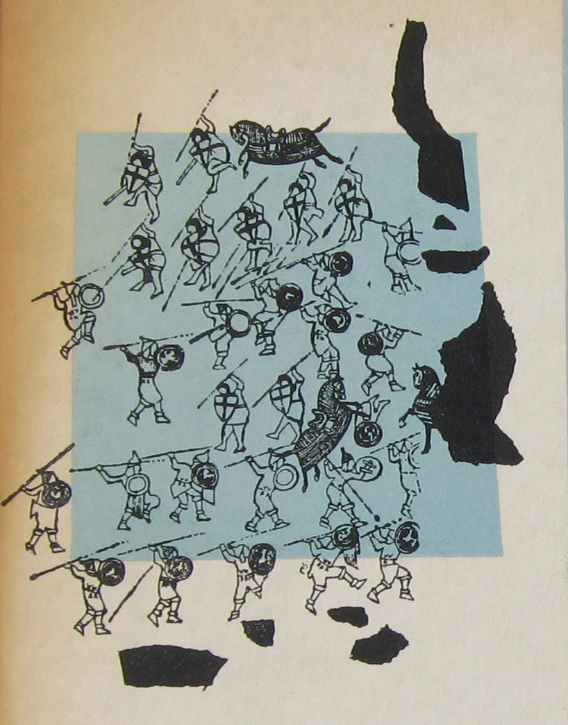
Andrew Warhola had graduated from the Pittsburgh College of Art and moved to New York to start work as a commercial artist. He contacted record companies trying to get commissions. Columbia Records was one he contacted. Steinweiss gave the young artist three commissions. The “Alexander Nevsky” was the second after Warhol‘s illustration for the re-issue of Columbia’s record “A Program of Mexican Music” by Carlos Chavez. Ten years had passed since Eisenstein‘s film was made but it was probable that Warhol saw the film at some stage. Guy Minnebach suggests that the his drawing was probably made from a film still.
Warhol’s illustration for the cover of Alexander Nevsky showing the “Battle on the Ice”.
The first pressing–identifiable by the dark blue label “Columbia Masterworks” labels on the record itself and the fact that the front cover slick was pasted onto the front of the cover, that folded over onto the rear and included the information on the spine.
The first Columbia Records LP label was dark blue.
this first issue’s cover appeared in two shades of blue: the most common is a shade of pale
blue, but there is also a darker turquoise variation.
Sometime later, in the late 1950s or early 1960s, Columbia re-released this album.By this time the method of manufacturing LP covers had changed and the rear slick was pasted on first and overlapped the edges of the front cover and the spine text was now printed on the rear slick. Front slicks were then pasted onto the front, leaving a small margin of visible rear slick.
The lower right corner of the 1950s Nevsky cover showing the front cover slick overlapping the rear slick.
At least three different colour variations of This re-issue’s records had the modernised Columbia Records labels, known as the “six-eye” label because of the six Columbia logos at three and nine o’clock.
Columbia Records’ “six-eye”label introduced in the mid 1950s.
Three colour variations of the front cover art were produced over the years. I don’t know if this was intentional or due to the printers’ own decisions. There were green, orange and pink covers.
I had hoped to be able to picture my own pink copy, but I haven’t managed to find one yet. This picture is from a recent Ebay sale that I bid on, but failed to win.
I only found my copy of the turquoise cover in early January 2017 and thought at first sight that it was one of the later green covers, though with the record with the dark blue label. I had to compare them to see the difference.
The picture shows the green cover on the left and the turquoise cover on the right. The difference is obvious, even without being able to see the difference in the way the covers are constructed.