
Sergei Prokofiev‘s cantata “Alexander Nevsky, Opus 78” was written in 1938 as the soundtrack to Sergei Eisentein’s film of the same name. “Alexander Nevsky” was Prokofiev’s third film score; the others being “Lieutenant Kije” (1934) and “The Queen of Spades” (1936).
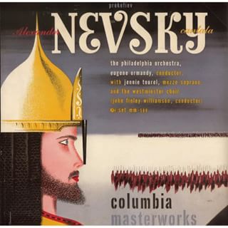
The first American performance took place on 7 March 1943 in an NBC Radio broadcast with Leopold Stokowski conducting the NBC Symphony Orchestra and Jennie Tourel (mezzosoprano) as soloist. Eugene Ormandy gave the first concert performance of “Alexander Nevsky” a fortnight later, on 23rd March 1943 with the with the Philadelphia Orchestra, the Westminster Choir , and Rosalind Nadell as soloist and in 1945 recorded the work in English for Columbia records with Jennie Tourel as soloist. The recording was forst released as a a 78 RPM album with cover art by Alex Steinweiss.
When Columbia Records introduced the 33 1/3 RPM long playing album in 1948 many of the old 78 RPM recordings were released in the new format. Alex Steinweiss, Art Director at Columbia, had not only designed the cover structure for the LP . The very first Columbia LP covers used a generic design based on the simplified capital of a Corinthian column.

Steinweiss‘ next development was a new basic design layout with space for an illustration.

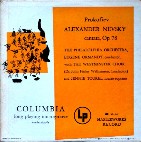
Then his layout evolved with large blocks of colour on the front over which the record’s title and other information were printed. He also provided space for an illustration. These covers were introduced in 1949 and Steinweiss, who by this time was inundated with work, commissioned outside artists to provide the illustrations. These included the young Andrew Warhol as well as Jim Flora, and less well known artists such as Darryll Connoly. The 1949 re-issue of Ormandy‘s recording of “Alexander Nevsky” used this cover variation.
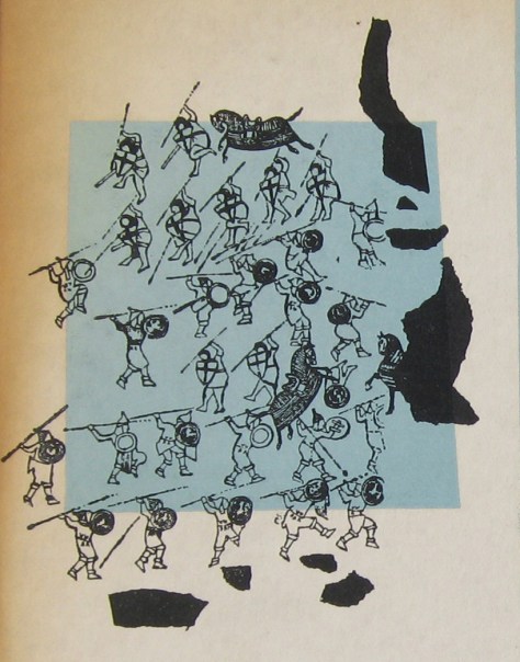
Andrew Warhola had graduated from the Pittsburgh College of Art and moved to New York to start work as a commercial artist. He contacted record companies trying to get commissions. Columbia Records was one he contacted. Steinweiss gave the young artist three commissions. The “Alexander Nevsky” was the second after Warhol‘s illustration for the re-issue of Columbia’s record “A Program of Mexican Music” by Carlos Chavez. Ten years had passed since Eisenstein‘s film was made but it was probable that Warhol saw the film at some stage. Guy Minnebach suggests that the his drawing was probably made from a film still.
The first pressing–identifiable by the dark blue label “Columbia Masterworks” labels on the record itself and the fact that the front cover slick was pasted onto the front of the cover, that folded over onto the rear and included the information on the spine.

this first issue’s cover appeared in two shades of blue: the most common is a shade of pale


blue, but there is also a darker turquoise variation.
Sometime later, in the late 1950s or early 1960s, Columbia re-released this album.By this time the method of manufacturing LP covers had changed and the rear slick was pasted on first and overlapped the edges of the front cover and the spine text was now printed on the rear slick. Front slicks were then pasted onto the front, leaving a small margin of visible rear slick.

At least three different colour variations of This re-issue’s records had the modernised Columbia Records labels, known as the “six-eye” label because of the six Columbia logos at three and nine o’clock.

Three colour variations of the front cover art were produced over the years. I don’t know if this was intentional or due to the printers’ own decisions. There were green, orange and pink covers.


I had hoped to be able to picture my own pink copy, but I haven’t managed to find one yet. This picture is from a recent Ebay sale that I bid on, but failed to win.
I only found my copy of the turquoise cover in early January 2017 and thought at first sight that it was one of the later green covers, though with the record with the dark blue label. I had to compare them to see the difference.

The picture shows the green cover on the left and the turquoise cover on the right. The difference is obvious, even without being able to see the difference in the way the covers are constructed.

You write that “Steinweiss gave the young artist three commissions. The “Alexander Nevsky” was the second after Warhol‘s illustration for the re-issue of Columbia’s record “A Program of Mexican Music” by Carlos Chavez.” What was the third commission? Thanks in advance for the info.
…Ah, that is the $10000 question! Rumour has it that Steinweiss gave Warhol a commission to illustrate three covers, but collectors have so far only identified the Mexican Music and Nevsky. As you probably have seen many try to sell other covers (such as the 10″ Salome and the three LP Elijah set that were probably designed by Darryl Conolly) as Warhol designs.
The reason I was asking about the third commission is that I have an LP of that vintage that looks like the Chavez and Nevsky covers. This is Columbia Masterworks ML 4214 – Vaughan Williams Symphony #6 / Messiaen’s Ascension – conducted by Leopold Stokowski. I can send you a photo of this through regular email — not sure how to send it from this format. You might find it by going to Google and typing in messiaen warhol, which, when I did that, took me to my Pinterest page.
Thanks, Peter Banks
Peter! Thanks for the tip about the Vaughan Williams/Messaen cover, that I just looked at. The drawings don’t look like Warhol drawings. My suggestion wuld be these are more Darryl Connolly illustrations. He is a great undung hero of Columbia cover art.
Thanks for the info. I just thought (wishful thinking?) that the drawing in the upper right had that splotchy effect that you often see in Warhol drawings. But you are the expert, and Connolly makes sense as the artist of this cover. I still like this and other covers that Steinweiss. Connolly. Flora and others from that time period created. Thanks for all the great info on your blog.
Regards, Peter Banks
Thanks, Peter!
Warhol usually based his early illustrations on some picture. The illustration at upper right on the Vaughan Williams cover is a London skyline. I don’t know what the original illustration was. But I don’t really think the fireworks look like Warhol’s dot-and-blot technique.
We’ll just have to keep searching for that mythical third Columbia Warhol cover…
Cheers
Richard
Last weekend I bought some old Columbia LPs. Not until I got them home and was cataloging them, did it occur to me that I might be holding “that mythical third Columbia Warhol cover.” The LP is Columbia ML 4278 – Bartok String Quartets 1 & 2 by the Juilliard String Quartet. Hate to be a pest about this, but it does look “like Warhol’s dot-and-blot technique” in the Bartok portrait and around the violins. You can find this image on my Pinterest board or in the Google Images by typing in Juilliard Bartok. What do you think?
Thanks, Peter Banks
Peter! I feel like I’mbeing tested! I’ve looked st the Juillard Quartet’s recordings of Bartok’s string quartets. The LP you refer to is part one in a three-part series of Columbia LPs. I assume that these LPs were originally released as 78s. The LP versions all seem to be pressed with Columbia’s 6-eye labels uded from the mid to late fifties and early sixties. This suggests that the LPs were designed considerably later than the early Warhol covers and a long time after Steinweiss had resigned from Columbia (it was he who commissioned Warhol in 1949). My feeling is that the covers of volumes 2 and 3 are definitely NOT illustrated by Warhol. Thus I feel that it is unlikely that volume 1 is by him.
The Juilliard SQ’s Bartok String Quartet set is a “monaural recording that was made in 1950 by the group’s founding members” (as stated in an Amazon Editorial Review — https://www.amazon.com/Bartok-String-Quartets-1950-Recordings/dp/B00005Q63A). If you look up these records in Discogs, it shows that these records were first released on the Blue Columbia Masterworks label in the ML-4000 series which began in 1948. As you said in your Alexander Nevsky article above, these records were re-released “sometime later, in the late 1950’s or early 1960’s” on the grey 6-eye label that was introduced by Columbia in 1955 (this is the copy I have). So these covers were most likely made in 1950 (as shown by the copyright date in the left corner of the record’s front cover). And stylistically, SQs 1 & 2 look more like Warhol’s splotchy, dot-and-blot technique than Connelly’s style. I think this is an interesting little question, and I appreciate your patience with my quibbles and comments.
Peter! I am truly embarrassed.. . I had not done my research properly when I replied. I finally checked Discogs last night and saw the original 1950 cover (green which included the record with the early dark blue label) in contrast to all the others that I had seen (orange and brown) before I replied. According to Wikipedia, the Juilliard Quartet made their first recording (it was for Columbia Records) in 1949, so there would not have been a 78 rpm version.
As you point out the recordings were made in 1950, which would put the cover art in the right time frame for a Warhol illustration. The blotches of black ink round the designs are reminiscent of those on the covers of “A Program of Mexican Music” and, particularly, “Alexander Nevsky”.
The copyright date on the covers of the 6-eye records doesn’t necessarily mean that they were printed in 1950. You can tell the difference between a 1950 printing and a later one by the fact that the early covers had a front cover slick that was laid over the edges of the rear cover slick while on the later covers the front slick folded over onto the rear. But the copyright date would still be 1950.
So… the cover art for SQs 1&2 does look different from that on SQs 2&3 which looks similar to that on SQs 4&5, however, I’m not convinced it is by Warhol. I had better get a copy to look at properly!
All these questions are really interesting and in future I promise to do my research properly before replying.
Peter! I’ve just got hold of a copy of ML 4278-one of the 6-eye re-issues and closer inspection confirms in my opinion that the drawings are NOT by Warhol. Just look at the cello, the horizontal hatching is so totally unlike Warhol’s style, that I can’t imagine him doing it.
Cheers!
I don’t know if anyone will read this, but I have a complete set of Alexander Nevsky Cantata with the Steinweiss Cover circa 1945 (Roman Guard) The Philadelphia Orchestra/ Eugene Normandy/Jennie Tourel. Set mm-580. 5 records. Sleeves are in excellent shape, Dark Blue Columbia Masterworks Label. it’s the old thick vinyl, looks hardly played. How rare is this?
Hello Mike!
Of course someone will read your question-me!
The primary interest in the 1940s Ormandy/Philadelphia Orchestra recording of the Alexander Nevsky is for the 1949 reissue on LP with its cover illustration by a Young Andy Warhol. Collectors of Alex Steinweiss covers might be interested in the original 78 RPM album and prices for these have increased in recent years and are being offered on Ebay for anywhere between $80 and $350, with some sellers hoping for higher prices.
I hope this helps.
Cheers, Richard
Thank you Richard for the info.
👍
I’m interested in knowing if Andy Warhol was involved in creating pamphlet size fold out artwork for Columbia Records Catalogs in 1949. I have two such pamphlets that measure 3 1/4″ x 5 1/2″. They both have June 1949 printed near the very top. One of the images on the front depicts art work for the LP “Salome” which looks very much like Warhol’s style.
eHi Pete—Interesting question! I haven’t heard about any pamphlets that Warhol was involved in. About the Salome album: When people started collecting Warhol covers twenty-odd years ago, the Salome cover was suggested to be by Warhol. However, we now know that he only illustrated three covers for Columbia—the reissue of the Concert of Mexican Music 10-inch LP (released in both a green and a blue cover), the Alexander Nevsky (released in at least five colours) and, for Columbia Special Products, the The Nation’s Nightmare album.
I don’t know who did the Salome cover, but it wasn’t our Andy.
I’d love to see pictures of the pamphlets.
Regards
Richard