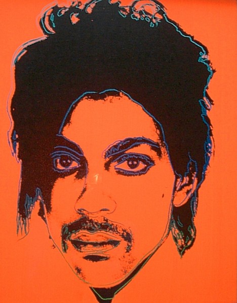
As readers of this blog may have read, I started researching the circumstances of Andy Warhol’s death. I planned to write a scientific article aimed at publication in a reputable medical journal and and had, basically, finished writing the article.
However, in my studies I found references to Andy Warhol having been admitted to hospital in 1973 for “kidney stones”. I wanted to find out more about this and and an Internet search turned up a reference to Bob Colacello’s 1990 book “Holy Terror-Andy Warhol Close Up”. For those who may not recognise Colacello’s name, he was headhunted by Warhol in 1970 and made editor of Warhol’s Inter/WIEW (the original spelling of what became Interview magazine). He was a close associate of Warhol’s from then on, until Warhol died. So I had to get hold of Colacello’s book to find the reference.

While doing so, I saw an advert for Victor Bockris’s 1989 Warhol biography “The Life and Death of Andy Warhol”. Well, well; I thought I had better read this to see if it shed more light on the circumstances leading up to and the consequences of Warhol’s untimely death.

Both these books were published relatively soon after Warhol’s death and included interviews with his many associates. As soon as I started to read Bockris’s fantastically well researched book, I realised there was a lot more medical history that I had hitherto included in my medical paper. It really was a case of throwing out my original manuscript and starting again.
The Warhola family were immigrants to the US from Miková in Slovakia. Andy’s father, Andrej (1886 – 1942), had married Julia Justina Zavacá (1892-1972) in 1909 (and she gave birth to a daughter in 1914, who died just six months old). Andrej emigrated to Pittsburgh at about that time and could not afford to send for Julia until 1921. As Bockris points out, the Warhola family lived in pitiful conditions in prewar Pittsburgh. Andrej worked hard, travelling far and wide after work as was often away from Pittsburgh for weeks or months. Despite his travels, he and Julia had three sons, Paul (1922 – 2014), John (1925 – 2010) and Andrew (1928 – 1987). Andrej died when Andrew was just 13.
The younger Andrew was a sickly child. He had swollen eyes when he was 2 years old and when he was four he fell on streetcar tracks and broke his right arm–but it wasn’t treated until several months later! At six he caught scarlet fever and developed rheumatic fever and chorea (St. Vitus’s Dance”) afterwards. He was initially kept in bed for four weeks and was thought to have got over it but when he was about to return to school he didn’t want to go and his legs gave out under him. It wasn’t appreciated that he had a relapse and he was back in bed for a further four weeks, during which time Julia encouraged him to draw.
Andrej was a thrifty man and saved as much as he could. However, the family could not afford to educate their two older sons, but when Andrej died he made Julia promise that his savings should be used to send Andrew through college. Julia fulfilled this promise.
Andy stated that he had had three nervous breakdowns as a child. It is impossible to decide exactly what he meant by “nervous breakdowns, but he remained an anxious child with several phobias. Most prominent among these was his fear of hospitals that probably developed when his mother was operated on for colon cancer in 1944, when Andy was 16, and forced to have a colostomy. And later, his fear of flying. He was also afraid of the dark, and this would allow him to work (or party) into the early hours. In addition, he developed strange dietary habits, living mainly on candy. And even as an adult, he would refuse to eat ordinary food. Andy began to lose hair relatively early and started to wear wigs from about the age of 25. He also felt he was ugly and that his nose was too bulbous and, in 1956, he had a nose job (which he felt made matters worse). He complained that his skin was blotch and he had rashes round his genitals, which was said to make him sky of showing himself nude and thus affected his relationships.
As Bob Colacello revealed, Andy’s “kidney stones” were, in fact, gallstones–the first time he developed symptoms of the disease that would force him to submit to an operation fourteen years later. Warhol was always careful t avoid fatty foods or those with cream in case this gallbladder problems would recur.
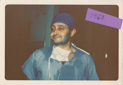
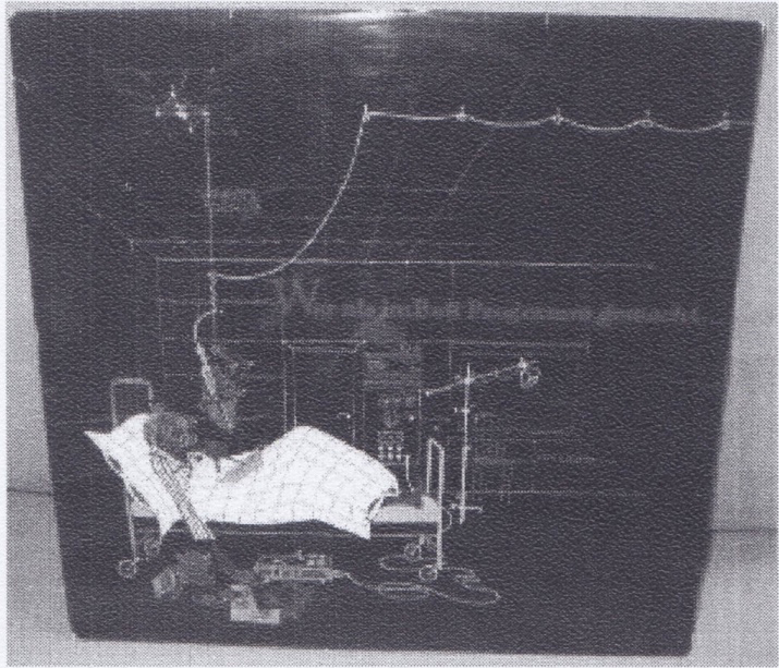
Towards the end of 1986 he was in almost constant abdominal pain. In January 1987 he went to Milan for the opening of his Last Supper paintings exhibition. He was really unwell during the trip and on his return contacted his dermatologist (who was treating him with fillers) on St. Valentines’ day to ask for painkillers. She refused to give him stronger tablets and convinced him to get an ultrasound scan, which confirmed that his gallbladder was enlarged and that he needed an operation. He saw Dr Bjorn Thorbjarnarson, a well-renown surgeon who had removed the Shah of Persia’s gallbladder, on 17th February. The same day, despite his pain, he took part in a celebrity fashion show and was photographed together with Miles Davis looking rather haggard.
Andy didn’t want an operation and said that he would make Dr Thorbjarnarson rich if he didn’t operate. However, Andy was admitted to the New York Hospital on 20th February for operation the following day.
That is Andy Warhol’s somewhat expanded medical history. Blake Gopnik is said to be writing yet another Warhol biography that promises to me more racy, delving deeper into Warhol’s sex life to dispel the image of Warhol’s celibacy. Stay around for further reports.