Followers of this blog will be happy to learn that I silkscreened T-shirts with the RATFAB design in sizes from ‘S’ to ‘XXL’. I’m pretty happy with the results. I also managed to print a couple more shirts with the “Giant Size $1.57 Each” design.

I have now packed the sets of “Giant Size $1.57 Each” covers, the “Night Beat” boxes, the t-shirts and diverse other goodies and sent them off to my fellow Warhol Cover Club members. I hope the packages arrive in time for Christmas and that everyone is happy with my work!
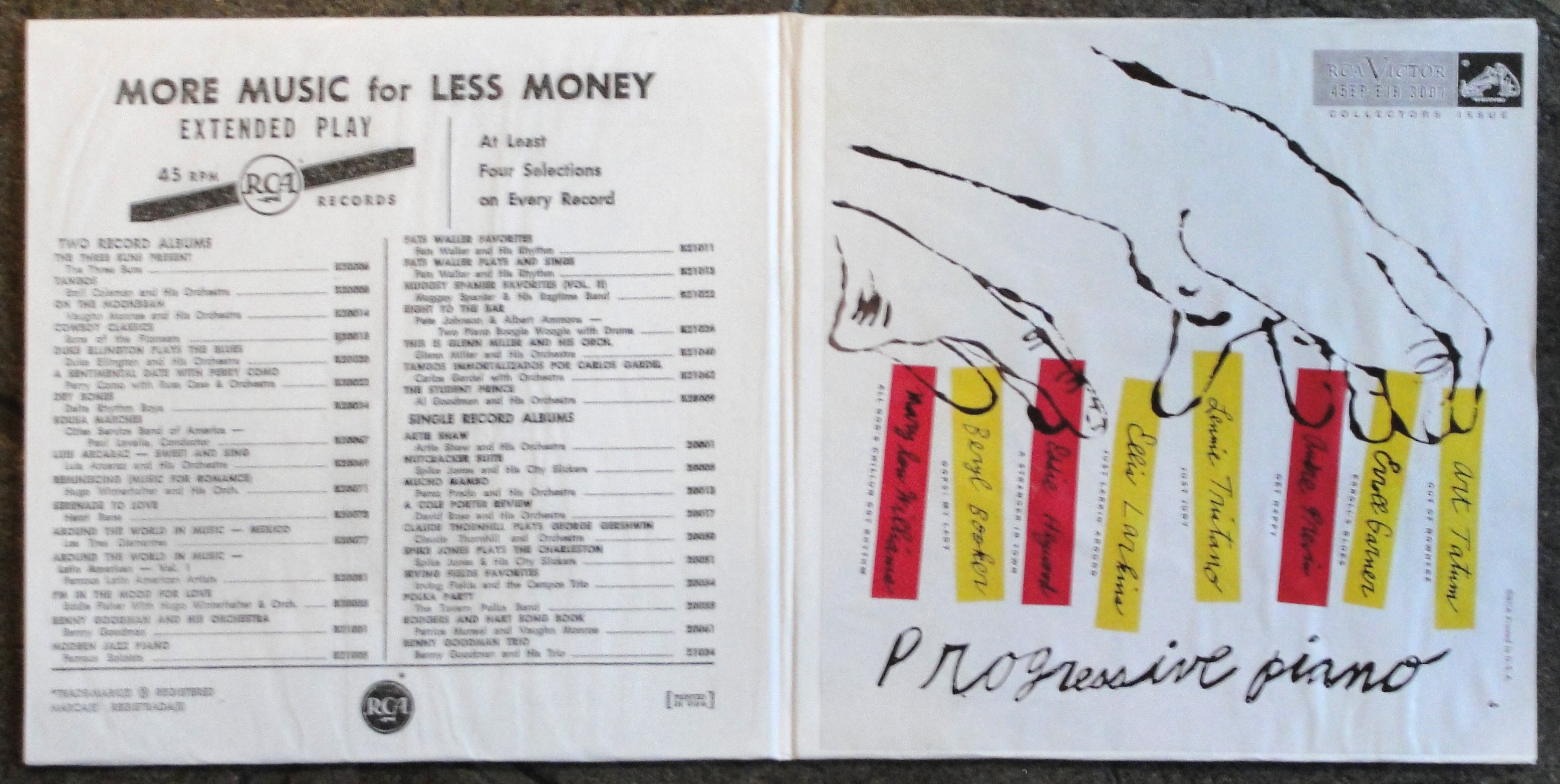
I have also completed my “Progressive Piano” ten inch LP and seven inch EP set. My first attempts at making a cover for this unreleased record were for a ten inch cover and a single seven inch sleeve. All I had were copies of the lithographs of the cover images for both ten and seven inch versions, but no liner notes for the ten inch or reverse for the seven inch cover.
So I set about writing liner notes and making a layout for the reverse of the ten inch. I had to find, copy and add RCA logos, catalogue numbers and place them as they would have appeared had the record actually been released. My elementary Photoshop skills were not really up to doing a one hundred percent perfect job. But after much reworking I was satisfied and printed up slicks to glue to my already made card sleeves. Then all that remained was to fix the cover slick over the front of the cover. Voilá, a complete cover.

I thought making the seven inch sleeve would be a doddle. I printed the cover slick for the seven inch and copied the rear from another RCA seven inch EP and put the two together.

But – this seven inch cover listed eight titles. And everyone knows that only four tracks will fit on a a seven inch EP. So this release would have had to be a DOUBLE EP. Oooh! So it was back to the drawing board.
This time I took the cover image from the ten inch version (I still can’t explain my reasoning on this), reduced it to the correct size for a seven inch and used the same rear cover design as I had for the single EP.
I had no inner liner notes so the inner spread was blank.
This, I decided, was totally unsatisfactory. I had to at least add a tracklisting and some liner notes if the reproduction was to be at all convincing. I went through a number of RCA gatefold EP sets and found an Ames Brothers EP from the early fifties that contained a list of other “Popular Long Play and Extended Play” titles, which I felt could be modified to suit my purposes. Said and done! I remade the layout of the liner notes I had already produced for the ten inch version of “Progressive Piano” and scaled them down and replaced the track listing. Then paired the liner notes with the list of popular jazz and classical titles that I had made after the list on the Ames Brothers’ EP.

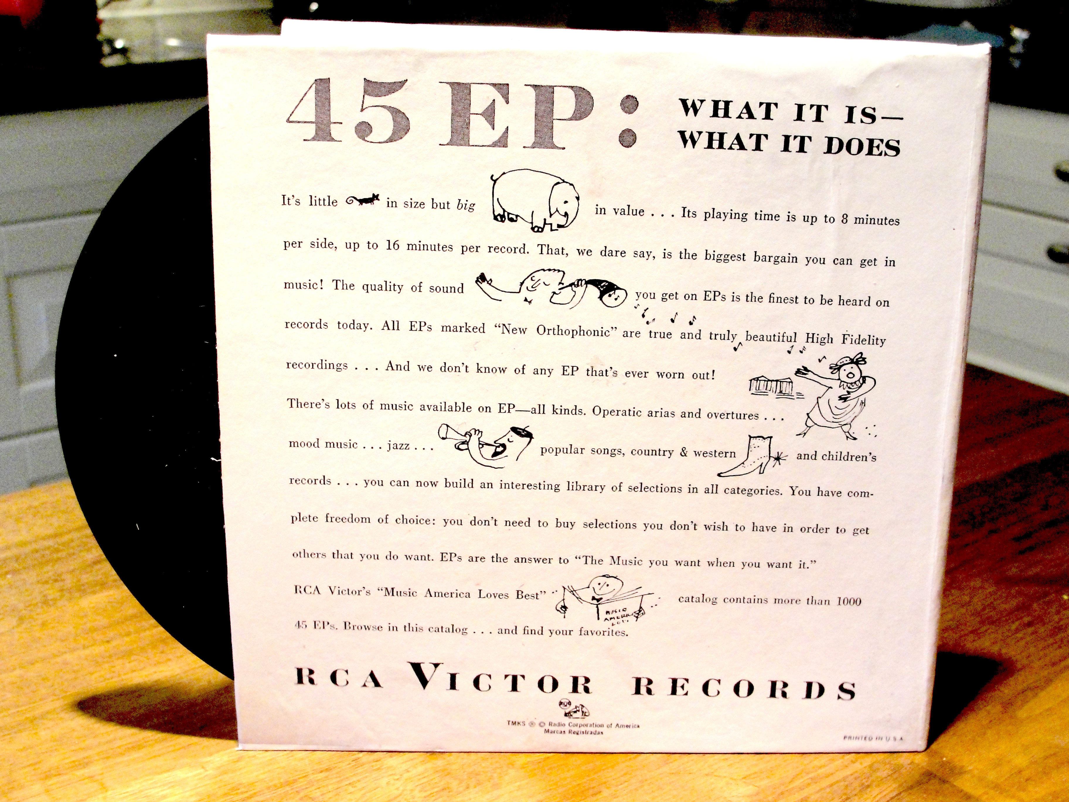
Then I made copies of the reverse from the seven inch “William Tell” double EP set – a design I have seen used on several of RCA’s gatefold seven inch EP sets and glued that to pre-cut cards in the form of a gatefold. Then stuck the inner within and – hey presto! – a more authentic gatefold “Progressive Piano” EP set.
Finally, this design satisfied my obessional desire for accuracy.
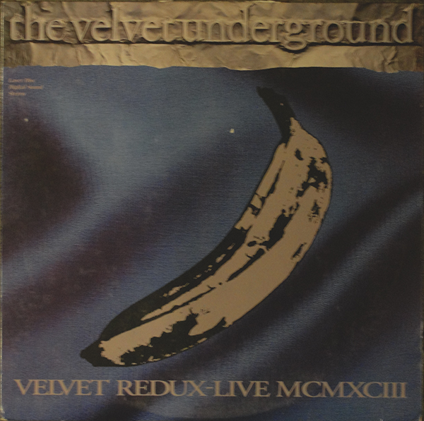
And, as if all this wasn’t enough, I received a copy of the Velvet Underground’s 1993 live album entitled “Velvet Redux – Live MCMXCIII” recorded in Paris on 15th-17th June 1993. The concert was released on double CD, abridged single CD, video and Laserdisc. I bought the laserdisc version as it has a 12″ LP-style cover.
There are not many record or CD covers with an Andy Warhol connection that I am missing. I have saved myself a few thousand dollars by making my own copies of the rarest covers. I have the “Night Beat” box, “Waltzes by Johann Strauss, Jr.” and “Progressive Piano” covers in addition to all the other early Andy Warhol record sleeve art that I have collected.
Now, I need to think up some new projects to occupy my thoughts over the coming holidays.
