I thought my collection of Klaus Voormann’s record covers was complete until I read that he was responsible for the covers of a couple of albums released in Germany in 1981. One by Heinz Rudolf Kunze entitled “Reine Nervensache”, and the other by Marius Müller-Westernhagen entitled “Stinker”. There was even a single, “von Drüben / Dicke” with similar cover art released from the album. Somehow I had missed these covers.

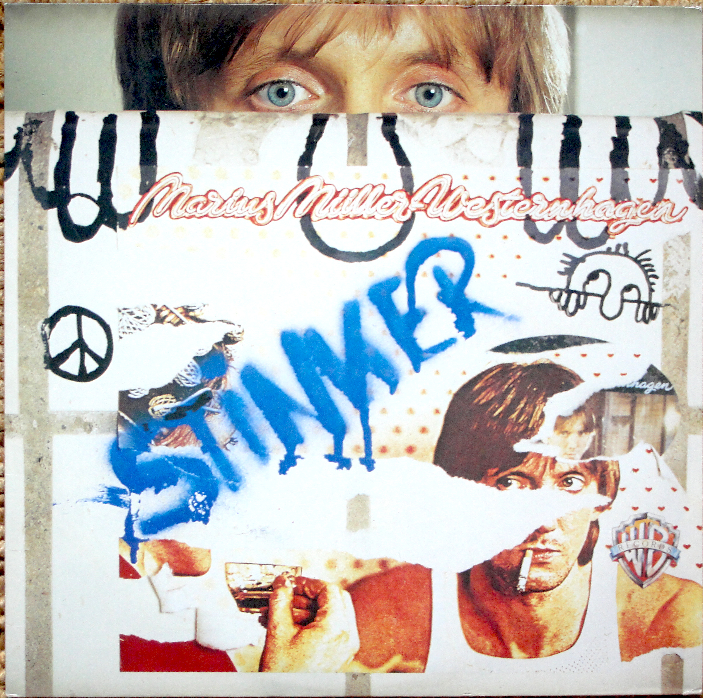

Luckily, there were several reasonably priced copies of both albums and the single for sale at various sites, so obtaining them was relatively easy.
I knew that Klaus Voormann’s own album “A Sideman’s Journey” was released in a limited edition box but, as I had already bought the album on vinyl, which included a limited edition poster of the cover art, I felt I didn’t need the box set as well. However, I saw a description of the box which mentioned that the poster included was signed by Klaus but I felt the £120-£140 cost, was excessive. A month ago, though, I saw a secondhand, almost mint copy for sale for less than half that price, so I jumped at the opportunity.

The box contains a book, a CD, a DVD in addition to the signed poster. A nice addition to my collection.
Everyone knows that Klaus Voormann is a close friend of The Beatles. He designed the cover of their “Revolver” album, for which he received a Grammy in 1967. Klaus was also a member of The Plastic Ono Band and played on the “Live Peace in Toronto” album from 1969.
A few months ago I was offered one of Klaus Voormann’s rare prints. An image of John Lennon and Paul McCartney in the canteen at Abbey Road during the recording of The Beatles’ “Revolver” album. This was an edition of 40 all signed and numbered in pencil by Klaus Voormann. Mine is number 33.

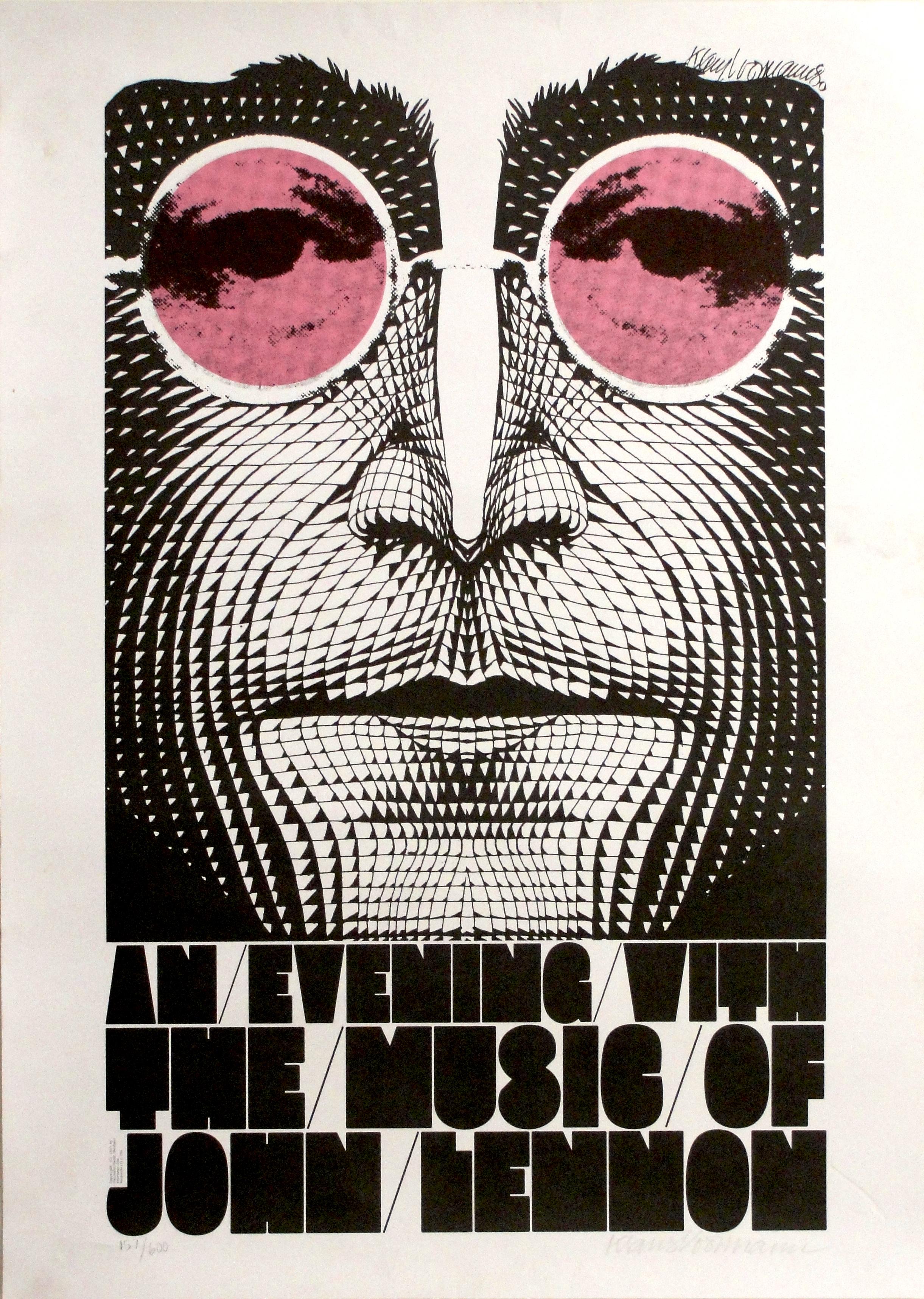
This print joins the one I already have of “An Evening with the Music of John Lennon”, which I received when I sold my record collection in May 2013.
I know that Klaus has also produced a print of Paul McCartney. I still have to find that one.
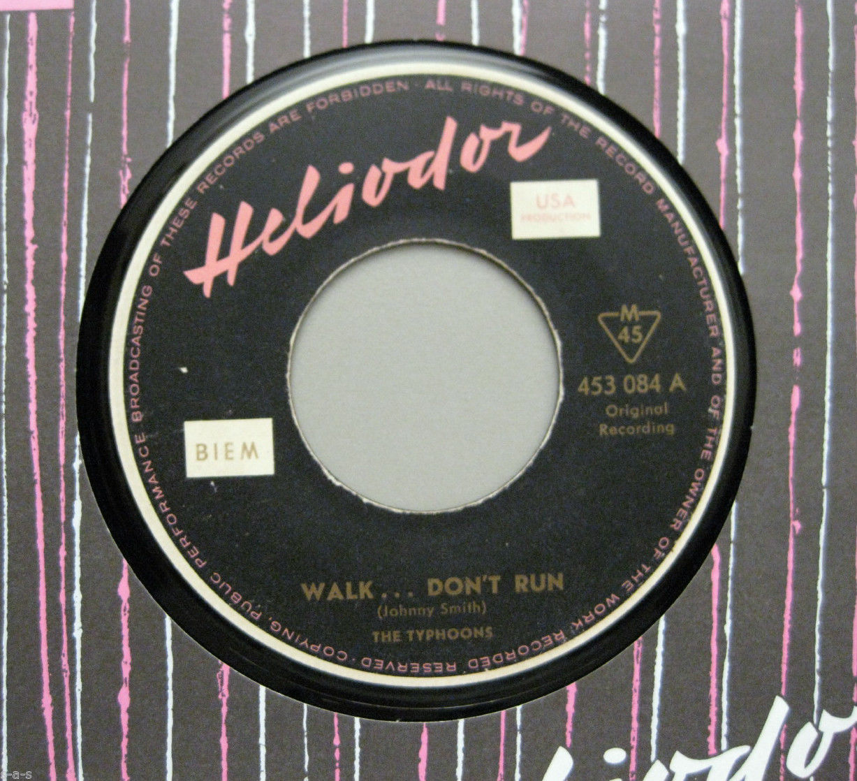
The first commercial record cover that Klaus Voormann designed was for The Typhoons’ single “Walk, Don’t Run / Parisian Heiress”only released in Germany on the Heliodor label in 1960. I once saw a copy of the cover with no record sell on Ebay for over $100! I have made my own copy of the cover and now I have found a copy of the record to put inside it.

So, now I wonder if there are any more Klaus Voormann record covers out there still to be found.