Category Archives: Andy Warhol art

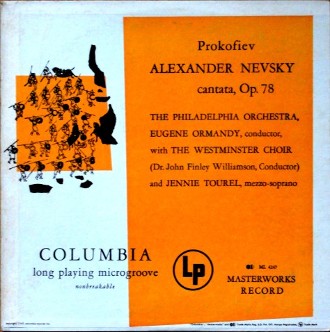
Alexander Nevsky – Columbia ML 4247 With 1949 Illustration by Andy Warhol

Sergei Prokofiev‘s  cantata “Alexander Nevsky, Opus 78” was written in 1938 as the soundtrack to Sergei Eisentein’s film of the same name. “Alexander Nevsky” was Prokofiev’s third film score; the others being “Lieutenant Kije” (1934) and “The Queen of Spades” (1936).

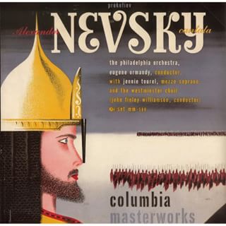
The first American performance took place on 7 March 1943 in an NBC Radio broadcast with Leopold Stokowski conducting the NBC Symphony Orchestra and Jennie Tourel (mezzosoprano) as soloist. Eugene Ormandy gave the first concert performance of “Alexander Nevsky” a fortnight later, on 23rd March 1943 with the with the Philadelphia Orchestra, the Westminster Choir , and Rosalind Nadell as soloist and in 1945 recorded the work in English for Columbia records with Jennie Tourel as soloist. The recording was forst released as a a 78 RPM album with cover art by Alex Steinweiss.
steinweiss-nevsky
Alex Steinweiss’ cover for the 1945 recording of Alexander Nevsky.

When Columbia Records introduced the 33 1/3 RPM long playing album in 1948 many of the old 78 RPM recordings were released in the new format. Alex Steinweiss, Art Director at Columbia, had not only designed the cover structure for the LP . The very first Columbia LP covers used a generic design based on the simplified capital of a Corinthian column.

column-columbia-cover
First cover design for Columbia LPs.

Steinweiss‘ next development was a new basic design layout with space for an illustration.

early-columbia-cover-2
Early Columbia LP cover with illustration.

Then his layout evolved with large blocks of colour on the front over which the record’s title and other information were printed. He also provided space for an illustration. These covers were introduced in 1949 and Steinweiss, who by this time was inundated with work, commissioned outside artists to provide the illustrations. These included the young Andrew Warhol as well as Jim Flora, and less well known artists such as Darryll Connoly. The 1949 re-issue of Ormandy‘s recording of “Alexander Nevsky” used this cover variation.

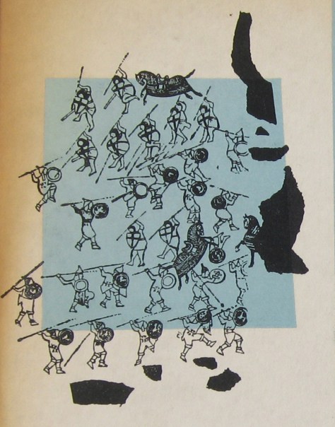
Andrew Warhola had graduated from the Pittsburgh College of Art and moved to New York to start work as a commercial artist. He contacted record companies trying to get commissions. Columbia Records was one he contacted. Steinweiss gave the young artist three commissions. The “Alexander Nevsky” was the second after Warhol‘s illustration for the re-issue of Columbia’s record “A Program of Mexican Music” by Carlos Chavez. Ten years had passed since Eisenstein‘s film was made but it was probable that Warhol saw the film at some stage. Guy Minnebach suggests that the his drawing was probably made from a film still.
nevsky-illustration
Warhol’s illustration for the cover of Alexander Nevsky showing the “Battle on the Ice”.

The first pressing–identifiable by the dark blue label “Columbia Masterworks” labels on the record itself and the fact that the front cover slick was pasted onto the front of the cover,  that folded over onto the rear and included the information on the spine.

nevsky-turquoise-label1
The first Columbia Records LP label was dark blue.

this first issue’s cover appeared in two shades of blue: the most common is a shade of pale

blue, but there is also a darker turquoise variation.

Sometime later, in the late 1950s or early 1960s, Columbia re-released this album.By this time the method of manufacturing LP covers had changed and the rear slick was pasted on first and overlapped the edges of the front cover and the spine text was now printed on the rear slick. Front slicks were then pasted onto the front, leaving a small margin of visible rear slick.

nevsky_orange_600-corner
The lower right corner of the 1950s Nevsky cover showing the front cover slick overlapping the rear slick.

At least three different colour variations of This re-issue’s records had the modernised Columbia Records labels, known as the “six-eye” label because of the six Columbia logos at three and nine o’clock.

nevsky_green_six-eye
Columbia Records’ “six-eye”label introduced in the mid 1950s.

Three colour variations of the front cover art were produced over the years. I don’t know if this was intentional or due to the printers’  own decisions. There were green, orange and pink covers.
nevsky_grn_frnevsky_orange_frprokofiev-pink

I had hoped to be able to picture my own pink copy, but I haven’t managed to find one yet. This picture is from a recent Ebay sale that I bid on, but failed to win.

I only found my copy of the turquoise cover in early January 2017 and thought at first sight that it was one of the later green covers, though with the record with the dark blue label. I had to compare them to see the difference.

The picture shows the green cover on the left and the turquoise cover on the right. The difference is obvious, even without being able to see the difference in the way the covers are constructed.

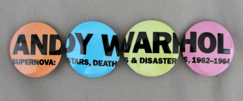
Andy Warhol – Supernova: Stars, Deaths & Disasters 1962-1964. 2006 Exhibition at Art Gallery of Ontario.

In June 2013 I bought a press kit from the Art Gallery of Ontario’s Andy Warhol exhibition entitled “Supernova: Stars, Deaths & Disasters” which ran from July 8th to October 22nd, 2006. The exhibition was guest curated by film director David Cronenberg and the press pack contained two tickets for the exhibition, the hardcover catalogue and a CD entitled “Cronenberg on Warhol” housed in a gatefold sleeve with Warhol‘s “Elvis I” on the front and “Elvis II” on the rear. In addition to the press pack the Art Gallery of Ontario produced a limited edition poster of the “Elvis I and II” in an edition of (I think) 1000 and a set of four pins advertising the exhibition.

Elvis1&2

There are copies of the print on Ebay offered at over CAD 2000, which seems excessive for such a large run of prints. But, until recently, I had never heard of the four pin set.
Warhol buttons

I thought these were unusual and rather cool so I bought myself a set to add to the press pack. I have decided to pass on the Elvis I & II print as it is on the CD cover.

John Lennon’s Records and Compact Discs with Andy Warhol Art

john Lennon’s 1986 album “Menlove Ave” is probably the best known of his recordings that use Andy Warhol’s art. But there are some others and one, in particular, that has not previously been recognized.

John and Yoko Lennon and Andy Warhol were friends. I’m sure they basked in each others’ glory. Andy Warhol took Polaroid photos of John and two of these were recently auctioned at Christies (https://onlineonly.christies.com/s/pop-culture/john-lennon-97/3106/).

Andy Warhol's Polaroid pictures of John Lennon. Circa 1969.
Andy Warhol’s Polaroid pictures of John Lennon. Circa 1969.

The photo on the left bears a striking resemblance to the cover photo on Lennon’s album “Imagine”, released on 5th September, 1971. Only the position of the cloud is different.

John Lennon's "Imagine" LP cover.
John Lennon’s “Imagine” LP cover.

There may be an explanation for this, however. Photographer Iain Macmillan was a good friend of the Lennons. He had been introduced to John by Yoko at her 1966 exhibition at the Indica Gallery in London, where she first met John. Macmillan was commissioned to take the cover photo for The Beatles’ “Abbey Road” album and had take portrait photographs of John as well. It was he, apparently, that placed the cloud on the cover of the Plastic Ono Band’s “Live Peace in Toronto” 1969 album.

"Live Peace in Toronto" cover art.
“Live Peace in Toronto” cover art.

The cover design of Lennon’s “Imagine” album is credited to Yoko Ono but Wikipedia’s article on the album credits the cover photo to Andy Warhol. Thus this album is a previously unrecognized Andy Warhol cover appearing only five months after Warhol’s cover design for The Rolling Stones’ “Sticky Fingers” LP. Several singles bear the same cover photo including Lennon’s “Jealous Guy”/”Going Down on Love” and versions of “Imagine”.

Macmillan’s Lennon portraits turned up first on Lennon’s posthumous “Menlove Ave” LP compiled by Yoko Ono and released in 1986. According to the story I have heard, Yoko approached Warhol with Macmillan’s Lennon photographs and asked him to paint two portraits for use on the album cover.

"Menlove Ave" LP front and rear art.
“Menlove Ave” LP front and rear art.

These portraits would reappear when Q magazine with the May 2005 edition which contained two CDs of John Lennon’s songs covered by other artists including Madonna, Oasis, Paul Weller, Wilco and Badly Drawn Boy, amongst others.

John Lennon Covered #1 and #2.
The Front covers of Q Magazine’s CDs “John Lennon Covered #1 and #2.”
Andy Warhol's two portraits of John Lennon.
Andy Warhol’s two portraits of John Lennon.

There are other pressings that use Warhol’s Polaroid photos, including a 12-inch maxi and the 1971 Japanese “Imagine/It’s so Hard” 7-inch single.