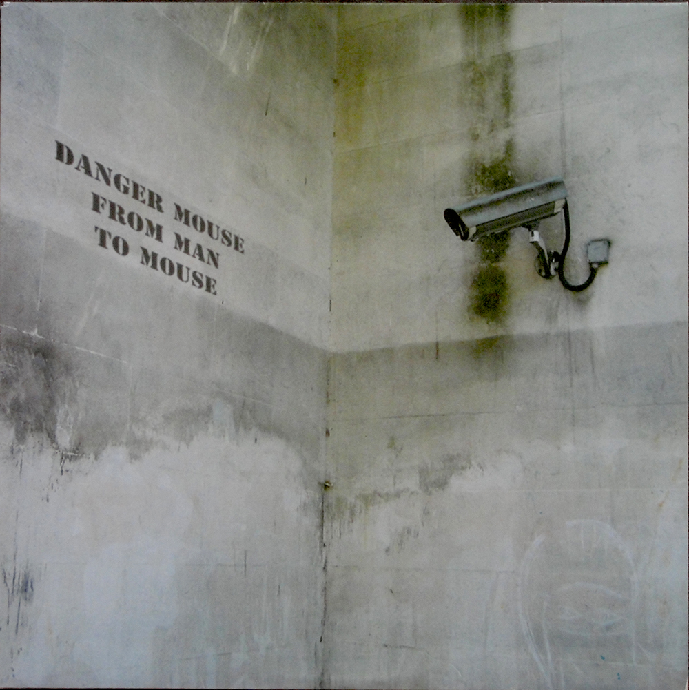
When LPs were first invented in 1948, the covers weren’t terribly exciting. By the mid fifties many classical releases had chosen to borrow classical paintings for cover images. At the same time graphic designers were making original art for record covers; people like Alex Steinweiss, Jim Flora , Neil Fujita, Andy Warhol, and Reid Miles among others. Records of popular music, though, mainly relied on photographs of the bands or singers. By the mid sixties, particularly in Britain, many musicians in up-and-coming bands had an art school background and insisted on designing their own covers. Design companies, some independent and some part of record companies were common by the 1980s. Hipgnosis is probably the most famous independent design company, record labels like Factory (Peter Saville), 4AD (Vaughan Oliver, Nigel Grierson and Chris Bigg) and Fetish (Neville Brody) had their own in house designers. And so borrowed art sort of disappeared from record covers.
But suddenly, in 2001, the Strokes burst in on the music scene. And the cover of their first album “s This It”caused an immediate controversy. Julian Casablancas had chosen Colin Lane’s photo of Lane’s then girlfriend’s right hip with her resting her black-gloved hand on her rear end as the cover art. Lane, who only took about ten Polaroids in this session, has explained that he was just trying to take a sexy picture. The Chanel glove had been left behind from an earlier photo shoot and Lane just asked his. girlfriend to put it on. A year or so later, Casablancas was going through Lane’s portfolio and was immediately taken with the photo.
But this was considered too daring for the US market. It was feared that Walmart and K-Mart might nor stock such a ‘daring’ cover. So Julian Casablancas contacted RCA product manager Ryan Gentles and asked to replace the photo with a bright, psychedelic graphic. The graphic is actually a zoomed-in photograph of subatomic particle tracks inside a liquid hydrogen bubble chamber taken by Patrice Loiez.
This was the third album to use the same photo! First was Bruce BecVor on his 1988 album “The Nature of Things”, and two years later Prince used bits of it on the cover of “Graffiti Bridge”.
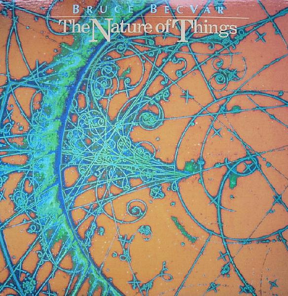
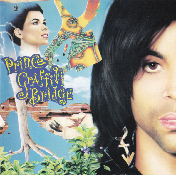
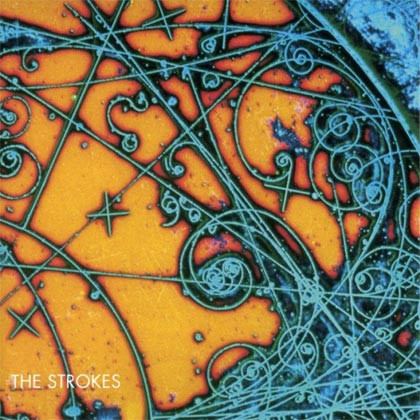
Bruce Becvor’s The Nature of Things ,Prince’s Graffiti Bridge and the Strokes’ U.K & Europe cover for: Is This It”.
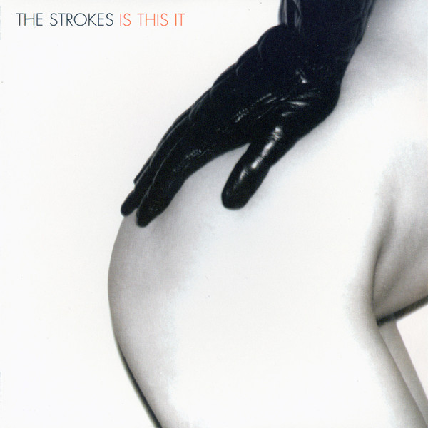
The cover of Is This Is as Julian Casablancas intended.
The Is This It album was planned to be released in October 2001, but because of the September 11 attack on New York, the band withdrew the New York City Cops track from the US album and replaced it with “When It Started”.
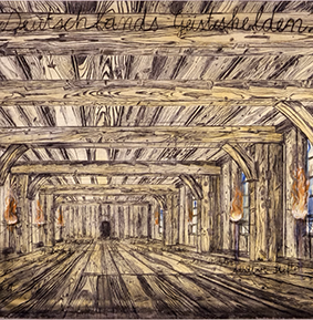
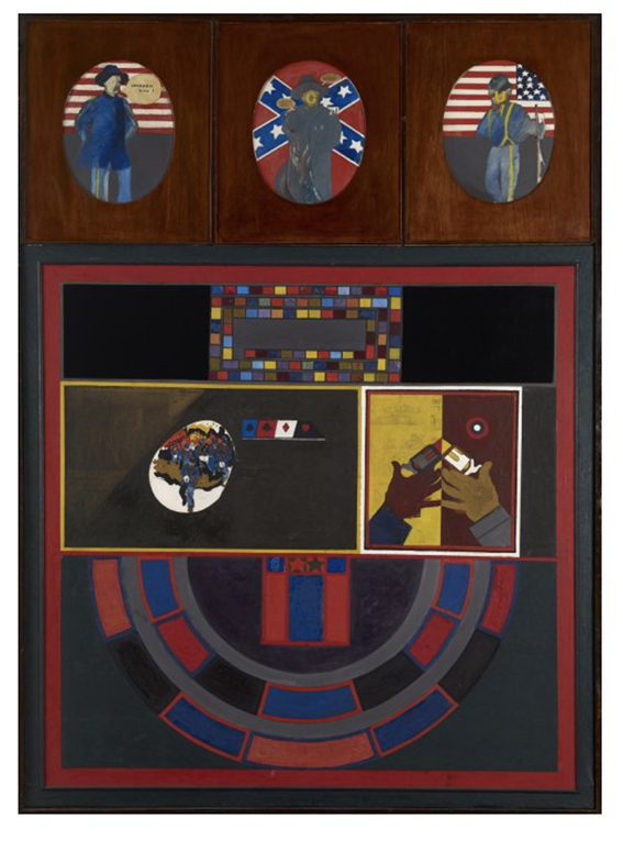
For Room on Fire“, the Strokes’ second album from 2003, Casablancas chose two widely different artworks from two artists from the same generation, Peter Phillips (1939-2025) and Anselm Kiefer (born 1945). The front cover of Room on Fire shows Phillips’ 1961 painting War/Game. while the album’s rear cover has Kiefer’s(literally: Germany’s spiritual heroes) from 1973. Both these works are anti-war paintings.
The “Fire” and Wood Themes: Room on Fire is an album deeply rooted in anxiety, relationship friction, and internal intensity. Casablancas wanted the artwork to literally look like it was “on fire” or radiating heat.
The Role of the Kiefer Painting: Anselm Kiefer’s Deutschlands Geisteshelden depicts a vast, oppressive, wooden hall—resembling a grand hunting lodge or a Nordic hall—with burning torches lighting up the pillars. According to forum discussions among fans on Reddit, the band chose to frame and tint the image so that the fiery, glowing tones matched the “Room on Fire” motif perfectly. The wooden textures of the hall also mirrored the polished wood textures found in Peter Phillips’ front cover painting, unifying the album’s presentation. [1, 2]
Phillips, a founding member of the British pop art movement, was a contemporary of David Hockney and R. B: Kitaj at the Royal College of Art and was one of four pop artists featured in the B.B.C.’s Monitor programme “Pop Goes the Easel” in March 1962, together with Peter Blake, Pauline Boty and Derek Boshier.
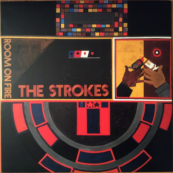
Here’s Phillips’ painting currently in the Buffalo AKG Art Museum.
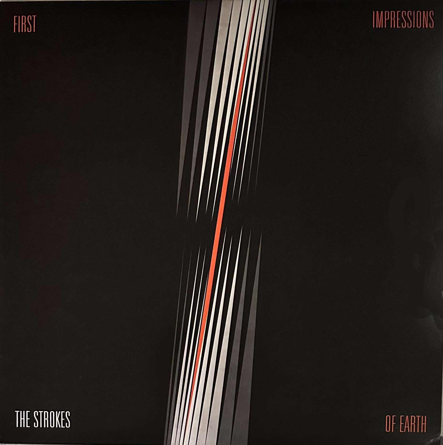
First Impressions of Earth, released in 2005, had an even more abstract cover. Casablancas decided to give all the Strokes covers after Is This It more abstract covers, and this album has a 1968 painting Ohne Titel by Lothar Quinte, a German avant-garde artist, while the rear cover is Matematik der Intuition (Hommage á ARP) by Günther Fruhtrunk from 1961. The record labels have designs by Fornacetti and the trifold poster has fifteen panels, thirteen of which give a song’s lyrics on an artwork background. Only Evening Sun (track 13, co-written by Julian Casablancas and the Strokes’ drummer Fabrizio Moretti) is the exception and has no dedicated artwork or artist credit associated with it.
The thirteen tracks with each one’s artwork:
– You Only Live Once → lanthanum aluminate photo (Michael Davidson)
– Juicebox → “Rocketship” (Alex Schomburg)
– Heart in a Cage → “The Brain” (Henry Groskinsky)
– Razorblade → “Scout” (Richard Phillips)
– On the Other Side → multiple works (Guido da Siena, Rembrandt,
Samuel van Hoogstraten, Master of Saint-Germain-des-Prés)
– Vision of Division → “The Continuous Monument” (Superstudio)
– Ask Me Anything → music notes / “Yellow Room” (Milton Glaser)
– Electricityscape → Image #BB1863 (John Foxx)
– Killing Lies → Etoffe & Tapis Etrangers Plate 19 (Benigno Crespi)
– Fear of Sleep → “West 83rd St.” photo (Jeff Prant)
– 15 Minutes → “Loew’s Paradise Theater” (Henry Groskinsky)
– Ize of the World → “Gun Barrel Eyes” (Milton Glaser)
– Red Light: “Leopard” (1967) — Mel Ramos
This diversity of art shows Casablancas’ particular interest in 60s abstrct art.
The Deluxe Digipak CD of First Impressions of Earth includes a 35-page booklet with each artwork on separate pages.
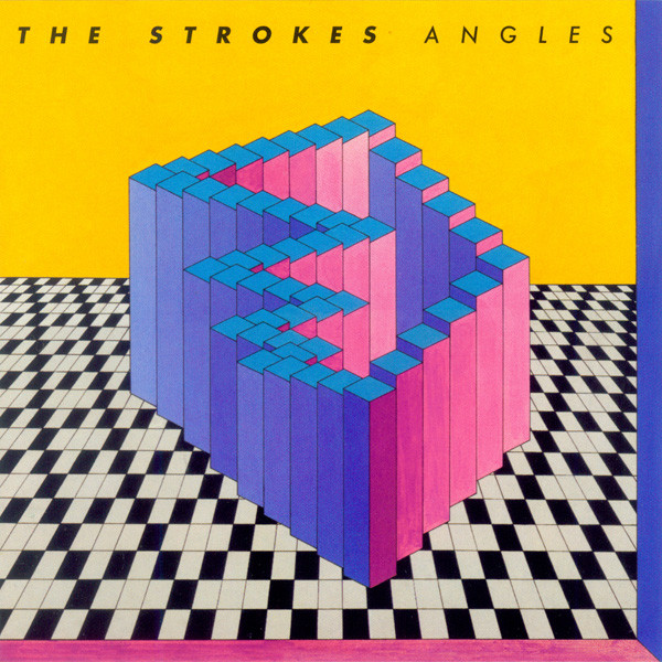
The next Strokes album was Angles, released in 2011. The album was designed by Lizzie Nanut and Casablancas chose the Belgian artist Guy Pouppez’s untitled painting that he licenced from Pouppez’ daughter. The dazzling, multi-dimensional stairwell-like geometric pattern captures the fractured, multi-perspective approach of the record perfectly.
The Strokes had an intial five-album deal with RCA Records and their fifth album, Comedown Machine , was released two years after Angles and with a completely different type of cover art. The oversized vintage RCA logo and tape-box design are widely seen as a dry, slightly sarcastic way of marking that the contractual obligation was finished (the opening track is even called “Tap Out”). The Strokes did no publicity for the album and refused to tour the album, allowing it to quietly sit.
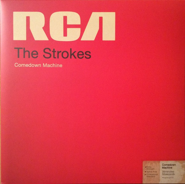
Art direction was by Brett Kilroe and band drummer Fabrizio Moretti and Design by Brett Kilroe and Tina Ibañez. Still-life photography: Jason McDonald.
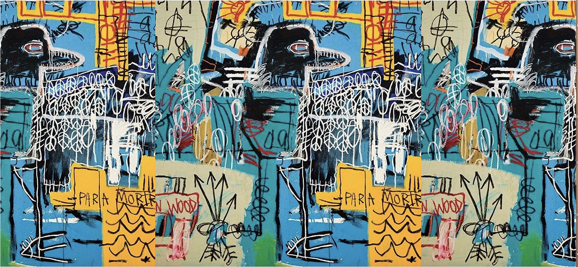
Album number six: is The New Abnormal with a radically different presentation for the vinyl release. Instead of a card cover the record is housed in a 180g / Clear APET plastic outer sleeve that also contains the cover art and a large poster of the Basquiat painting–the central detail from Jean-Michel Basquiat’s Bird on Money painting from 1981. Casablancas licenced the work, which is owned by the Rubell family, from the Estate of Jean-Michel Basquiat (via their licensing agent Artestar). The whole package was designed by Tina Ibanez. Really great packaging.
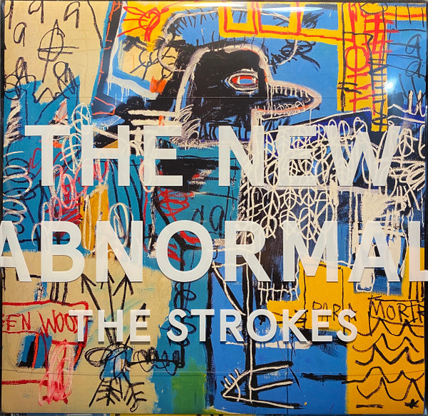
The album title and the band’s name are on a large sticker affixed to the shrink wrap. Collectors who want to keep the sticker when opening the seal must either cut it off and store it in the plastic cover or peel it and stick onto an outer protective plastic cover. I solved the problem by opening the shrink wrap along the top margin, allowing me to keep the shrink wrap intact and still be able to remove the record!
The Strokes’ latest album, the 2026, Reality Awaits strikes an immediate chord with me as I collect record covers by arch appropriator, Richard Prince and the front cover image is one of Prince’s most famous appropriations from his 1989 Cowboys series that Prince lifted from Marlboro advertisements. Even the record labels have the Marlboro Man image.
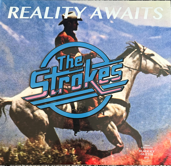
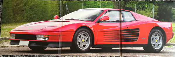
Again, the band logo is on a large sticker on the shrink wrap, though the album title is this time printed on the cover. The centrefold of the trifold cover has designer Johann Rashid’s photograph of a a 1980s Nissan 300ZX (with the caption “In the flesh, it’s even sexier”).
I congratulate Julian Casablancas on his impeccable taste in art! And he’s given me added interest in the Strokes’ album covers. They are worth collecting for the album covers alone!